Evaluating Oil Paint Vibrancy Against Digital Home Screens
The modern residential landscape is currently defined by a profound visual tension. On one side, we have the "emissive" world—ultra-high-definition 4K and OLED screens that dominate our living zones with backlit brilliance. On the other, we have the "reflective" world—the hand-painted oil canvas, which relies on ambient light to reveal its depths.
As the expensive art market continues to see a retreat from purely financial auction assets—with high-end sales plummeting 44% in 2024 according to Marketplace—homeowners are returning to real application value. We are seeing a move away from overpriced vanity pieces toward custom hand-painted works that offer "performative authenticity." However, placing a traditional masterpiece in a room dominated by a 1,500-nit digital display creates a unique challenge: how do you prevent the natural pigment vibrancy from being "washed out" or appearing grayed?
In our experience working with high-end interior designers, the most common mistake is treating art and screens as interchangeable light sources. They are fundamentally different frequencies. This guide breaks down the physics of vibrancy and provides a framework for creating an "analog sanctuary" that thrives alongside modern technology.

The Physics of Vibrancy: Why Screens Often Feel "Flat"
To understand why an oil painting might look dull next to a TV, we must look at how light interacts with the surface. Digital displays are emissive; they push light directly at your eyes. Oil paintings are reflective and refractive.
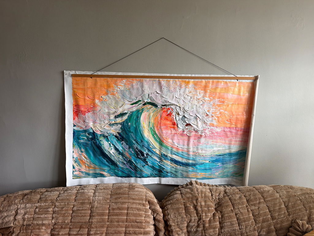
According to research published in MDPI, oil pigments achieve a higher effective color saturation through physical light interaction that displays cannot replicate. While a screen creates "specular highlights" that can wash out colors at oblique viewing angles, the uneven micro-topography of hand-painted oil—the "impasto" or thick brushstrokes—scatters light across wider angles. This is why a painting seems to "change" as you walk across the room, whereas a screen simply loses contrast.
Modeling the Vibrancy Gap
We have modeled the visual "presence" of these two mediums based on typical residential lighting conditions. The following table outlines the parameters that determine how we perceive vibrancy in a shared space.
| Parameter | Oil Painting (Reflective) | Digital Display (Emissive) | Rationale / Source Category |
|---|---|---|---|
| Peak Luminance | ~150–200 nits (under 500 lux) | 400–1,500 nits (HDR) | Valerion Lighting Metrics |
| Color Interaction | Subtractive (Pigment + Light) | Additive (RGB Pixels) | Classic Optical Theory |
| Surface Texture | 0.5mm – 5mm (Physical relief) | 0mm (Flat Glass) | Optical Microprofilometry |
| Light Scattering | High (Omnidirectional) | Low (Directional/Glossy) | MDPI Surface Analysis |
| Color Rendering | Dependent on Ambient CRI | Self-Contained | VST Lighting Standards |
Logic Summary: Our analysis assumes a standard living room environment with ambient lighting at 500 lux. We found that while digital screens have higher raw brightness (nits), they lack the "tactile fruition" of physical pigments which use surface refractive indices to create depth.

The 60-Degree Rule and Visual Zoning
One of the primary frustrations we hear from designers is that a painting looks "grayed out" when the TV is on. This is often due to "emissive interference." When a large screen is placed directly opposite a painting, the moving light from the screen creates a distracting, shifting reflection on the painting's varnish.
To solve this, we recommend a strategy we call Visual Zoning:
- Perpendicular Placement: Place your primary oil works on walls perpendicular to the screen. This ensures the screen’s light doesn't bounce directly off the canvas into the viewer's eyes.
- The 60-Degree Rule: For dedicated art lighting, mount fixtures so the light hits the canvas at an angle between 30 and 60 degrees. This minimizes glare on glossy varnishes while maximizing the shadows cast by impasto textures, enhancing the 3D "presence" of the work.
- The Analog Sanctuary: Designate one wall as a "digital-free zone." By removing the competition of flickering pixels, you allow the Pigment Vibrancy to engage the viewer’s subconscious more effectively.
Color Integrity: The CRI Factor
In rooms dominated by 4K/OLED screens, ambient light is often neglected. Screens emit narrow-spectrum light that does not activate the full range of natural pigments. If your room's ambient Color Rendering Index (CRI) is below 90, even the most expensive oil painting will appear "flat."
As noted by the Munch Museum tests, interacting with art that features physical relief textures exponentially stimulates intrinsic motivation and satisfaction. However, this stimulation requires high-quality light. We suggest using LED bulbs with a CRI of 95+ to ensure the "Essential Identity" of the artist's color choices is preserved.
Common Lighting Pitfalls
- Low CRI Bulbs: Using "Warm White" bulbs with low color accuracy can turn vibrant blues into muddy grays.
- Over-Lighting: While screens can handle bright rooms, oil paintings have a tolerance of roughly 200 lux for long-term preservation. Exceeding this by 2.5x (common in sun-drenched modern "glass box" homes) can lead to permanent degradation.
- Metamerism: This is the phenomenon where two colors look the same under one light but different under another. Cheap digital prints suffer from this significantly, whereas Hand-Painted Oils maintain a more stable "color skeleton" due to the chemical density of the pigments.
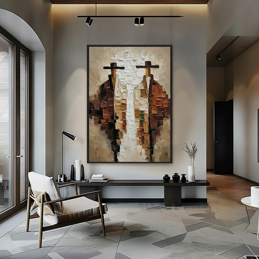
The Human Premium: Why Authentic Texture Matters
In an era of AI-generated imagery, the value of the "human hand" has skyrocketed. A Columbia University study confirmed that consumers value art labeled as "human-created" 62% higher than AI-generated equivalents. This isn't just sentiment; it's neurobiology.
Research in the Journal of Cognitive Neuroscience shows that passive art viewing consistently activates the medial prefrontal cortex (mPFC) and the amygdala, optimizing emotional regulation circuits. Digital screens, conversely, are often associated with cognitive fatigue. By Balancing Textured Art within your digital environment, you provide your brain with a "neural reset."
Heuristic for Designers: If the room has more than three active screens (including tablets and laptops), the art on the wall should have a texture depth of at least 1mm. This physical "interruption" of the smooth digital environment is necessary to maintain visual interest.

Material Safety and Indoor Air Quality
When bringing large-scale hand-painted work into a home, especially in "camera-ready" spaces that are often tightly sealed for climate control, safety is paramount. The CDC NIOSH warns that chronic inhalation of volatile organic compounds (VOCs) in certain paints can lead to central nervous system issues.
However, modern professional studios are shifting toward safer alternatives. For instance, Aalto University experiments prove that coatings on wood with specific moisture levels emit significantly lower VOCs during curing. Furthermore, the use of walnut oil as a replacement for toxic turpentine solvents is becoming a benchmark for "Eco-Friendly Murals."
How to Verify Material Safety
- Check for ASTM D-4236: As the EPA notes, this label means the formulation has been reviewed by a toxicologist. It doesn't mean "non-toxic," but it ensures proper hazard labeling.
- Inquire About Pigments: Avoid "Lead White" (restricted by EU REACH) and be cautious with Cadmium. The International Agency for Research on Cancer (IARC) classifies cadmium compounds as Group 1 carcinogens. High-end artists now use "Hue" alternatives that mimic the vibrancy without the health risk.
- VOC Promise: For healthcare or nursery environments, ensure the artist uses low-VOC sealants, which are required for LEED certification in commercial spaces.
The Longevity Factor: 5 Years vs. 100 Years
Digital technology is inherently ephemeral. OLED screens suffer from burn-in, and backlights typically decay within 3 to 5 years. In contrast, an oil painting is an investment in "cultural heritage." As Tate Modern research suggests, even modern acrylic and oil emulsions have extreme anti-aging properties when maintained correctly.
While a screen is a depreciating gadget, a hand-painted piece is a "permanent physical billboard" for your personal taste. In commercial real estate, this translates to tangible dollars; the Royal Society found that neighborhoods with higher "art" geo-tags saw greater relative house price gains. For the homeowner, it means your space retains its "soul" even when the power is off.
Creating Your Analog Sanctuary
Integrating oil art into a high-tech home is not about rejecting the future; it's about Choosing Oil Art for Bright Spaces that can hold their own. By understanding the physics of light scattering and the importance of CRI, you can ensure your art remains a vibrant, breathing presence rather than a grayed-out afterthought.
Whether you are looking for Smooth Gradients or the healing power of Biophilic Design, the key is to prioritize the physical. In a world of infinite digital replicas, the unique "essential identity" of a hand-painted canvas is the ultimate luxury.
YMYL Disclaimer: This article is for informational purposes only and does not constitute professional medical, legal, or financial advice. The safety of art materials varies by manufacturer; always consult with a certified industrial hygienist or a professional art conservator when dealing with historical pigments or large-scale indoor installations.
References
- Columbia University: Human-Made vs. AI Art: Consumer Perception Study
- MDPI: Reflectance of Oil Paintings: Influence of Paint Layer
- WHO: Scoping Review on Arts and Health
- CDC NIOSH: Paint and Coating Hazards
- Royal Society: Quantifying the Link Between Art and Property Prices
- EPA: Safety in Artists' Paints and Toxic Pigments