The Architectural Paradox: Balancing Expansive Glass with Cultural Depth
Large architectural windows are often the crown jewel of modern residential design, yet they present a significant challenge for interior curation: the "vanishing wall." As floor-to-ceiling glass expands to capture natural light and outdoor vistas, the available surface area for physical art shrinks. This creates a tension between the outdoor view and the indoor culture.
Recent shifts in the global art landscape suggest that homeowners are moving away from purely financial art assets. According to Marketplace.org, high-end auction sales for "vanity" pieces plummeted 44% in 2024, signaling a retreat toward art with "real application value." For the design-conscious homeowner, this value is found in hand-painted works that harmonize with specific room dimensions and lighting conditions rather than just filling a space.
While the Art Basel and UBS Art Market Report 2024 confirms a massive $65 billion global market, the true luxury lies in the "essential identity" of the work. Research from The University of Chicago indicates that digital replicas and NFTs often lack the "soul" or artist’s presence that consumers perceive in physical canvases. In a room dominated by the transparency of glass, a hand-painted oil painting provides a necessary tactile "anchor."
Heuristics for Sizing Art in Window-Dominant Spaces
When walls are limited to narrow piers between windows or adjacent spans, standard "one-size-fits-all" hanging rules fail. We must look at the architectural "datum" and the "view corridor" to ensure the art doesn't look lost or cluttered.
The 75% Rule for Pier Walls
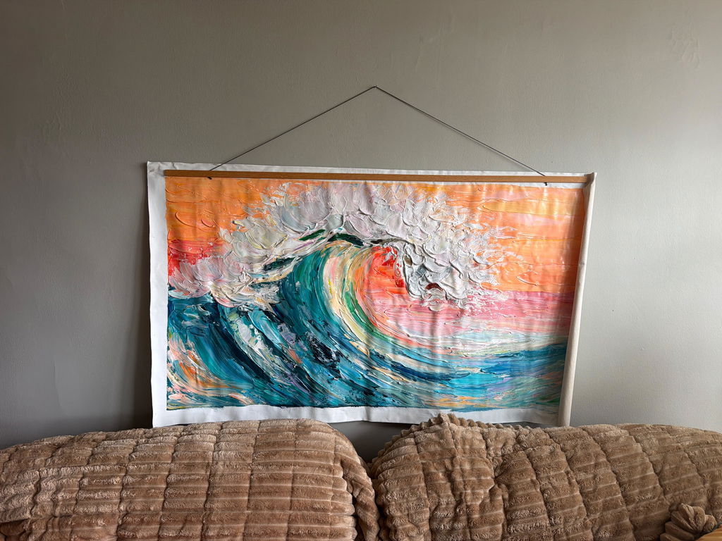
For narrow walls located between two windows (pier walls), a common designer heuristic is the 75% Rule. The horizontal width of the artwork should occupy approximately 75% of the wall's width. This prevents the piece from appearing "lost" in a sea of drywall while maintaining enough breathing room (typically 4–6 inches on each side) to avoid a cramped aesthetic.
The Asymmetrical Weighting Strategy
In rooms with expansive glass, the visual weight is naturally pulled toward the window. To counterbalance this "void," the wall opposite the window should carry significantly more visual weight.
Logic Summary: Spatial Weighting Model Our analysis of high-visibility living zones assumes the window acts as the primary focal point. To achieve balance, we model a 70/30 distribution:
- Opposite Wall: 60–70% of total room art area (to ground the space).
- Adjacent/Pier Walls: 20–30% of total room art area (to transition the eye).
- Boundary Condition: This model may not apply if the window faces a dark courtyard or lacks significant light.

Scaling for the View Corridor
The "view corridor" is the sightline from the primary seating area to the window. Art on adjacent walls should be tall enough to anchor the room—typically two-thirds of the wall height—but its center point should be adjusted. While the "57-inch eye-level rule" is standard, rooms with floor-to-ceiling windows often require hanging art at a 63–66 inch center point. This is because viewers in these spaces are predominantly standing to look at the view, and a lower placement can obstruct the architectural lines of the window headers.
| Placement Scenario | Recommended Width Ratio | Height Alignment | Rationale |
|---|---|---|---|
| Narrow Pier Wall | 50–60% of wall width | Align top with window transom | Prevents "clutter" in tight vertical strips. |
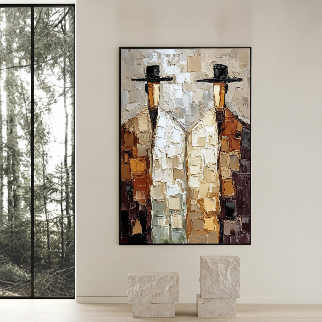
| Adjacent Large Wall | 75–85% of wall width | 2/3 of total wall height | Counterbalances the visual "void" of the glass. |
| Opposite Window | 60–70% of wall width | Standard 57-60" center | Minimizes glare while providing a solid focal point. |
Managing Light: The Physics of Glare and Texture
Large windows bring the beauty of natural light, but they also introduce "veiling glare," especially on dark pigments or high-gloss oil finishes. Understanding the optical properties of your art medium is critical for "decision safety."
The 45-Degree Lighting Rule
Oil paintings with heavy impasto (thick, textured brushwork) are best viewed with 45-degree side-lighting. This angle catches the ridges of the paint, creating highlights and shadows that emphasize the artist's hand. Placing such a piece directly opposite a large window often results in a "washed out" look where the glare obscures the depth of the color.
According to research from the Getty Conservation Institute, the refractive index of the surface is the root cause of color saturation. When light hits the uneven surface of an oil painting, it scatters. Using the Kubelka-Munk equation, conservators explain that the ratio of absorption to scattering determines how "rich" a color appears. In high-light environments, hand-painted pigments outperform prints because the physical thickness of the paint allows for internal light scattering that a flat print cannot replicate.
Longevity and Fade Resistance
Homeowners often fear that sunlight will destroy their investment. While all materials degrade over time, modern oil and acrylic mediums are engineered for resilience. The ASTM D4303 Standard defines lightfastness by simulating years of indoor illumination behind filtered glass.
Modeling Note: UV Degradation We estimate that a high-quality oil painting with a UV-protective varnish can maintain its color integrity for 50+ years in a room with filtered architectural glass (assuming 1260 MJ/m² of radiant exposure). This estimate is based on Micom Laboratories' ASTM D4303 testing parameters.
The Neuroaesthetics of "Human-Made" Art
Why does a hand-painted mural or canvas feel different than a high-definition print? The answer lies in our brain's response to creative labor.
The mPFC Activation
A systematic review published in NCBI shows that viewing authentic art consistently activates the medial prefrontal cortex (mPFC) and the amygdala, which are core to emotional regulation. Furthermore, a Columbia University study revealed that consumers value art labeled "AI-generated" 62% lower than authentic human-created art. In a high-visibility living space, the "camera-ready" aesthetic is only half the battle; the other half is the "emotional resonance" felt by guests and inhabitants.
Biophilic Benefits
In modern architecture, "biophilic design"—incorporating natural elements—is a key trend. The University of Central Arkansas notes that nature-themed art produces the same stress-reduction effects as being outdoors. In a room with large windows, nature-themed hand-painted art acts as a bridge, extending the outdoor view into the interior walls.

Safety and Environmental Integrity: The IAQ Promise
For homeowners, especially those with young families, the chemical composition of art materials is a valid concern. The "luxury" of a hand-painted piece should not come at the cost of Indoor Air Quality (IAQ).
VOC Emissions and Curing
Traditional oil paints were often associated with toxic solvents like turpentine. However, modern practices have shifted. Research from Aalto University shows that VOC emissions from high-quality coatings plummet during the curing process. By the time a "preview-and-approve" piece reaches your home, it has typically passed the peak emission phase.
The EPA warns that indoor air pollution can be significantly higher than outdoor levels. This is why selecting art that uses low-VOC paints is a prerequisite for achieving LEED or WELL certifications in high-end residential developments.
The Heavy Metal Factor
Professional-grade pigments sometimes contain heavy metals like Cadmium or Cobalt for their unique vibrance. While the IARC classifies Cadmium as a Group 1 carcinogen, the risk to the homeowner is virtually zero once the paint is bound in a dried polymer or oil matrix. The real risk is "ingestion" or "inhalation of dust" during the creation process. For the buyer, the focus should be on ensuring the piece is properly varnished, which "locks" the pigments and prevents any micro-particulate shedding.
Implementation: Avoiding Costly Scale Mistakes
The fear of a "costly mistake" is the primary barrier to purchasing large-scale art. To ensure "decision safety," we recommend a multi-step visualization process.
- Painter’s Tape Mock-up: Use blue painter's tape to outline the 75% rule on your pier wall. Remember that a 1.5-inch gallery wrap adds physical depth that a flat tape line doesn't capture. If the space feels "crowded" with the tape, reduce the width by 5%.
- The Architectural Datum Check: Align the top edge of your artwork with an existing architectural line, such as the window transom or the top of a door frame. This creates a cohesive "datum" that makes the art feel like a part of the building rather than an afterthought.
- The "Preview-and-Approve" Model: This model is essential for high-visibility zones. By reviewing the texture and color under digital simulation before the final brushstroke, you ensure the piece harmonizes with the specific natural light levels of your room.
Support Induced Discoloration (SID)
A non-obvious pitfall for large canvases is Support Induced Discoloration. As noted by Golden Artist Colors, water-soluble impurities in cotton or linen canvases can be drawn into the paint layer during drying, causing yellowing. High-end studios prevent this by applying a specialized "Gloss Medium" or "Gesso" barrier. When commissioning large works for sun-drenched rooms, always verify that the substrate has been properly sealed.
The Economic Impact of "Artful" Real Estate
Investing in large-scale, hand-painted art is not just an aesthetic choice; it’s a value-add for the property. A Royal Society CAR model analysis found that neighborhoods with higher "art geo-tags" saw greater relative gains in house price rankings.
In the commercial sector, the NCREALTORS report highlights how public art projects, like those in Chicago's Millennium Park, drove $1.4 billion in real estate growth. For the homeowner, a large, well-placed mural or canvas transforms a functional wall into a "commercial landmark" within the home, increasing "camera-ready" appeal for future resale.
Summary of Spatial Strategy
Designing around large windows requires a departure from traditional gallery rules. By prioritizing the 75% Rule for pier walls and the Asymmetrical Weighting Strategy for the room at large, you respect the architecture while asserting your cultural identity.
The transition from "vanity auction pieces" to "application-value art" represents a maturing market where the quality of the pigments, the safety of the materials, and the psychological impact of the brushwork take center stage. Whether you are choosing a large art piece for a grand feel or balancing texture with minimalist decor, the goal remains the same: a harmonious space where culture and nature coexist.
Disclaimer: This article is for informational purposes only and does not constitute professional architectural, medical, or legal advice. Regarding chemical safety and VOCs, always consult with a certified industrial hygienist if you have specific health concerns or pre-existing conditions.
Sources
- Marketplace: The expensive art market continues to struggle
- Columbia University: Human-Made vs. AI Art Perception Study
- NCBI: Neurological mechanisms of creative arts
- Getty Conservation Institute: Color Science and Pigment Mixture
- EPA: Indoor Air Quality and Low-VOC Paints
- Royal Society: Quantifying the link between art and property prices
- Tate: The Tate AXA Art Modern Paints Project