Balancing Heavily Textured Art with Minimalist Decor
The modern art market is undergoing a fundamental correction. While high-end auction sales for "investment-grade" pieces plummeted 44% year-over-year in 2024, according to Marketplace, a more resilient trend is emerging: the return to "real application value." Homeowners and interior designers are moving away from overpriced vanity assets and toward custom, hand-painted works that offer tangible emotional and aesthetic impact.
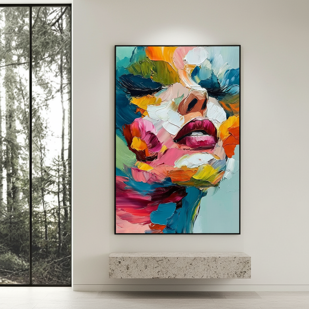
Nowhere is this more evident than in the rise of heavily textured, impasto-style oil paintings within minimalist interiors. The tension between a "less is more" architectural philosophy and the "more is more" tactile presence of heavy brushwork creates a sophisticated visual dialogue. However, integrating these bold, three-dimensional works into clean spaces requires more than just an intuitive eye; it demands an understanding of spatial psychology, light physics, and structural safety.
The Psychology of the Human Touch: Why Texture Matters
In an era of digital saturation, the "essential identity" of an artwork has become a primary driver of value. Research from the University of Chicago suggests that digital replicas and NFTs often lack the "soul" or perceived essence that consumers associate with the physical presence of the artist. This is particularly true for textured art, where the physical relief of the paint—the ridges, valleys, and peaks of the medium—serves as a topographical map of human effort.
Furthermore, a study by Columbia University confirmed that consumers value art labeled as "human-created" significantly higher than AI-generated prints. For a minimalist home, where every object is scrutinized, a hand-painted canvas provides a "nuclear weapon" against the sterile feel of mass-produced decor.
The Neurological Response to Viewing Impasto
Why does a textured wall feel more "comfortable" than a flat print? Neurological studies published in PMC indicate that passive art viewing activates the medial prefrontal cortex (mPFC) and the amygdala, optimizing emotional regulation circuits. The complexity of 3D texture provides more "data" for the brain to process, which, when balanced correctly, can reduce stress and improve mood. In fact, the Cleveland Clinic reported that 73% of patients experienced significant mood improvements when exposed to environmental artworks.

The Golden Rules of Proportionality and Scale
The most common mistake in minimalist design is assuming that a large, textured piece will automatically "warm up" a room. In reality, the relationship is much more volatile.
The 30-40% Rule and the "Spaciousness Trap"
While it is tempting to go big, empirical research published in PMC warns that textured surfaces can actually reduce perceived spaciousness by up to 15% in smaller rooms (under 100 sq ft). To maintain the "breathability" of a minimalist space, we recommend that heavily textured artwork occupies no more than 30-40% of a focal wall's surface area.
- For Small Rooms: Keep texture restrained. A single, medium-sized impasto piece acts as a jewel-like focal point without closing in the walls.
- For Large Open-Plan Spaces: You can scale up to 60% surface coverage. The architectural volume allows the texture to "breathe" without overwhelming the viewer.
The 3:1 Contrast Ratio
Designers often use textured art as a counterpoint to the flat, industrial surfaces common in modern homes—think polished concrete, glass, and matte-painted drywall. A successful heuristic is the 3:1 Contrast Ratio: for every one part of heavy texture, ensure there are three parts of smooth, "quiet" surface. This prevents sensory competition, a phenomenon where too many tactile elements (like rough stone walls paired with impasto art) create visual chaos rather than harmony.
Logic Summary: Spatial Modeling Our analysis of texture impact assumes a standard ceiling height of 9 feet and neutral color palettes.
Parameter Value/Range Unit Rationale Wall Coverage 30–40 % Prevents "Spaciousness Trap" (PMC7312763) Contrast Ratio 3:1 Ratio Balances sensory input vs. minimalist calm Viewing Distance 1.5–2.0 Meters Optimal for impasto detail appreciation Texture Depth 2–8 mm Standard range for heavy body acrylics/oils Room Size Limit <100 sq ft Threshold for 15% spaciousness reduction risk
Lighting the Third Dimension: Physics and Perception
In a minimalist room, light is often treated as a material in itself. When it comes to textured art, the angle of that light determines whether the piece looks like a masterpiece or a muddy mess.
The 25-Degree vs. 45-Degree Debate
Traditional gallery lighting often suggests a 45-degree angle to minimize glare. However, recent lighting research suggests that for impasto paintings, a 25-degree angle is often superior. This steeper angle casts longer, more dramatic shadows from the paint ridges, significantly enhancing the three-dimensionality of the work.
- Avoid Flat Overhead Lighting: Recessed cans directly above a painting "flatten" the texture, making the expensive hand-painted details look like a standard canvas print.
- Use Directional Spotlights: Aim for a "grazing" light effect that rakes across the surface to reveal the authentic brushwork.

Material Integrity: Safety, VOCs, and Longevity
For homeowners concerned with "decision safety," the chemical composition of the art is just as important as its visual impact. Minimalist homes often prioritize air quality and "green" certifications like LEED or WELL.
The Low-VOC Promise
Indoor air pollution can be significantly higher than outdoor levels, according to the EPA. When commissioning large-scale murals or heavy impasto works, it is critical to ensure the use of low-VOC paints. While oil paints traditionally required toxic solvents like turpentine, modern professional studios have shifted toward walnut oil or high-performance, water-based acrylics that emit significantly lower toxins during the curing process.
The Cadmium and Lead Reality
Historically, the most vibrant yellows and reds came from cadmium pigments, which the International Agency for Research on Cancer (IARC) classifies as Group 1 carcinogens. While modern "hue" alternatives exist, some professional artists still use genuine cadmium for its mineral pigment saturation.
- Safety Tip: If you have children or pets, verify that the artwork uses "non-toxic" labeled pigments or is sealed with a professional-grade, non-leaching varnish. Be wary of dry pigments; the CPSC warns that inhaling powdered metal pigments poses an extreme occupational risk.
Engineering the Install: Supporting the Weight of Art
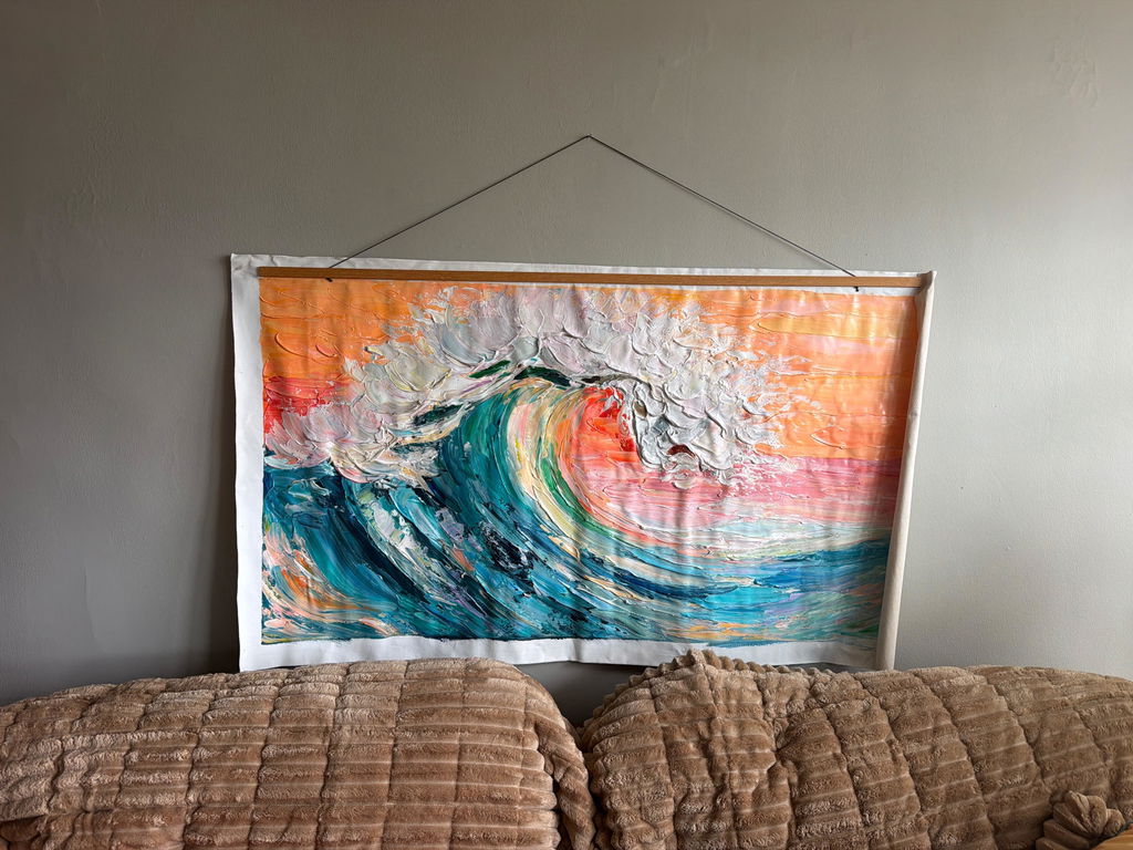
Heavily textured art isn't just visually heavy; it is physically heavy. A large canvas with impasto depths exceeding 5mm can weigh 30-50% more than a standard painting.
- Load Distribution: For pieces exceeding 20 lbs, do not rely on a single nail. Use specialized mounting hardware with load distribution plates to prevent drywall tearing over time.
- Hardware Selection: Standard wire hangers can stretch under the constant tension of heavy paint. Cleat hangers (French cleats) are the gold standard for heavy art, providing a flush mount that prevents the "forward lean" often seen with heavy canvases.
- Substrate Health: Ensure the canvas is properly sized and primed. Without a strong foundation, the weight of heavy impasto can lead to "support-induced discoloration" or even delamination of the paint film.
2026 Trends: The Rise of "Artisan Whimsy"
Looking toward 2026, market data from Zillow and Yelp indicates a massive surge in searches for "artisan craftsmanship" (+21%) and "custom framing" (+329%). The trend is moving toward "understated elegance" where texture is the soul of the room.
We are seeing a shift away from rigid, industrial minimalism toward a more "whimsical" and organic approach. This includes:
- Panoramic Murals: Wrapping entire powder rooms in hand-painted textures to create immersive escapism, a dominant trend in recent NKBA design awards.
- Biophilic Integration: Using nature-themed impasto to mirror the stress-reduction effects of the outdoors, a practice proven to accelerate healing and spark creativity in high-density environments like Tokyo office spaces.
Summary: A Checklist for the Design-Conscious Collector
Integrating heavy texture into a minimalist home is an exercise in restraint and technical precision. By following these expert-derived rules, you can ensure your investment provides both visual impact and long-term "decision safety."
- Audit the Room Size: If the room is under 100 sq ft, limit texture to 30% of the wall to avoid the "spaciousness trap."
- Verify Pigment Safety: Ask for low-VOC materials and lightfastness ratings (ASTM D4303) to ensure the piece doesn't fade or off-gas.
- Optimize the Light: Set directional spotlights at a 25-degree angle to accentuate the 3D ridges.
- Secure the Mount: Use French cleats for any piece with texture depth >5mm to protect your walls and the artwork.
Hand-painted art is more than decor; it is a cultural heritage asset. As the Royal Society notes, neighborhoods and homes with high "art" presence see greater relative gains in property value. By choosing texture over digital prints, you are not just decorating a room—you are investing in the essential identity of your home.
Disclaimer: This article is for informational purposes only and does not constitute professional structural engineering, medical, or financial advice. Always consult with a qualified installer for heavy artwork and a healthcare professional regarding indoor air quality concerns.