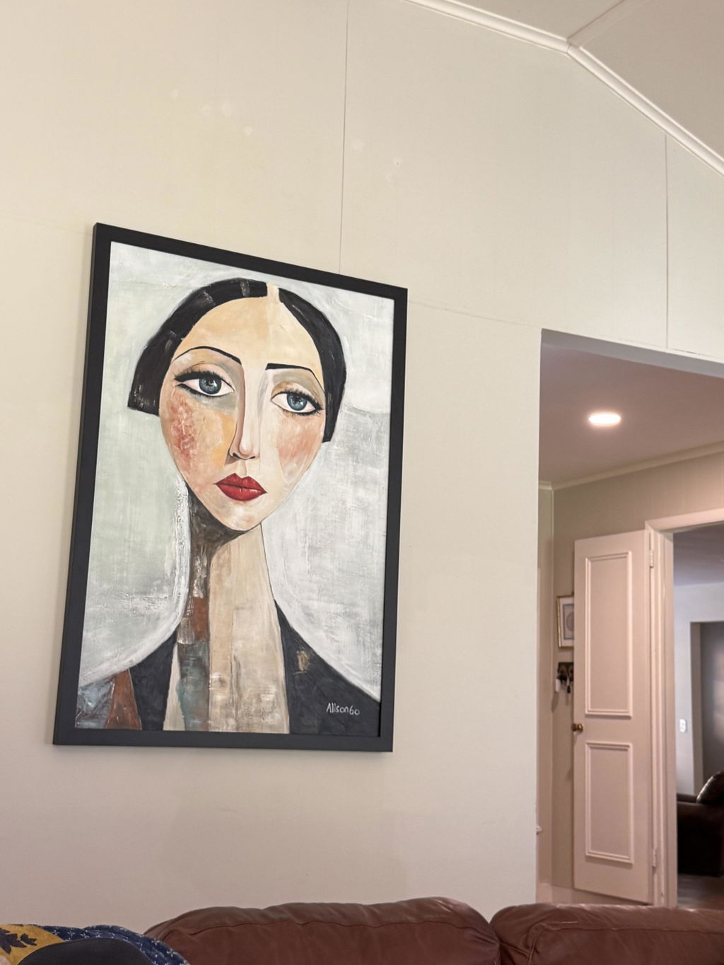
Artist collections can help a home feel connected without making every room look identical. The useful approach is to repeat one or two visual cues—such as palette, mark-making, texture, scale, or mood—then let each piece respond to its own wall, furniture, lighting, and purpose. Treat the collection as a comparison framework, not a promise that every work will coordinate.
Why Artist Collections Create Cohesion Without Matching Everything
A cohesive home usually has a recognizable visual relationship between rooms, not a set of identical pictures. When you compare several works by one artist together, you can spot recurring color relationships, surface energy, subject choices, or mood and decide which of those traits belong in your space. A design perspective from Martha Stewart on choosing art for interiors also supports deliberate repetition with room for variation.
Matching repeats the same or nearly identical treatment. Coordinating repeats a limited visual thread while allowing the artwork to change. Collecting around a recognizable visual language can go further: a living room might take the strongest, most expansive piece, while a hallway or bedroom uses a quieter work that still feels related. None of these approaches guarantees a finished-room result.
Start with the rooms rather than the collection name. Consider how each space is used, what furniture is already there, the available wall area, natural and artificial light, and whether the rooms share a sightline. A color connection may work across a hallway, while a large shift in scale or mood may be more appropriate between a social room and a bedroom. If you want a broad starting point for comparison, you can browse original art, then narrow the list by room and visual role.
The Visual Traits to Compare Across an Artist Collection
Use six traits to compare candidate works: palette, mark-making, subject matter, texture, scale, and mood. For each piece, write a short note covering its dominant colors, visual energy, subject or feeling, surface presence, dimensions, and intended room. The goal is to identify a shared trait—not to copy every trait in every room. A practical artwork-buying checklist can provide additional bounded context, but it does not replace checking each listing.
Palette and Mark-Making
Compare dominant, supporting, and accent colors instead of searching for exact matches. A work can connect to a room by echoing a secondary hue, or it can introduce a deliberate contrast that gives the space more energy. The important comparison is how the color relationship looks beside the room's furnishings and nearby art.
Mark-making adds a second layer. Loose, energetic marks may feel out of place beside very restrained furnishings, while a quieter work may lose impact in a highly active room. Compare the movement, density, and visual rhythm of the marks rather than assuming that shared color is enough. Browse abstract paintings when you want to compare different levels of visual movement, but assess each listing on its own terms.
Subject Matter and Mood
Related mood can connect rooms even when the subjects differ. Calm, open imagery may suit a bedroom or reading area, while a more animated subject may fit a dining or living space. Choose the emotional register you want to experience in each room, not just the subject that appears most often in a collection.
Personal response matters as much as decor compatibility. If a piece keeps drawing your attention for a specific theme, color, or sense of movement, record that reason. A home can feel more collected when the works reflect a consistent point of view, but personal resonance is not a guarantee that the piece will solve a room's scale or placement problem.
Texture and Surface Presence
Use texture as a supporting visual link, then check how the room's light affects it. Natural light, lamps, and glare can change how color, surface variation, and mood read throughout the day, so a work that looks balanced in a thumbnail may feel more dominant—or more subdued—in person.
Do not infer a work's medium, process, or authenticity from visible texture, a signature, a certificate, or a collection title. For an online shortlist, note what the listing actually says about the work and separate that information from your visual impression. Texture can help you compare surface presence; it does not independently prove that a piece is original.
Scale and Spatial Rhythm
Assess dimensions against the wall, nearby furniture, and the main viewing position. A piece that matches the palette can still feel underpowered on a broad wall, crowded above furniture, or too visually forceful for a narrow passage. Record the wall area and furniture relationship before treating a work as a serious candidate.
Variation in size can create a deliberate sequence across rooms, especially when the pieces are viewed from different distances. In connected spaces, however, a dramatic change in scale may need a transition piece or a quieter sightline. Compare visual weight as well as the listed dimensions; do not rely on a fixed ratio or universal spacing formula.
Matching, Coordinating, or Intentionally Varying the Rooms
There is no single correct way to arrange artwork across a home. Exact matching can feel orderly, coordination offers flexibility, and intentional variation can keep a multi-room collection personal. Choose based on the rooms' relationship, shared sightlines, and the amount of contrast you want to live with. Magnolia's perspective on choosing artwork is useful as editorial context, not as a guarantee.
| Approach | Connection method | When it may fit | Main risk |
|---|---|---|---|
| Matching | Repeats very similar colors, subjects, scale, or presentation | A compact area where you want a controlled, quiet look | Repetition can make separate rooms feel staged or limit future choices |
| Coordinating | Repeats one or two cues, such as a palette or surface energy, while changing subject or scale | Several rooms that need a relationship without identical treatment | Too many repeated cues can still feel formulaic; too few may read as accidental |
| Intentionally varying | Allows stronger differences in style, subject, or intensity while using one bridge element | Homes where each room has a distinct purpose or personality | Competing differences can feel random if adjacent rooms have no visual transition |
For example, different subjects may coordinate through a related palette, while different media may connect through texture or frame treatment when those details are actually verified in the listings. A pivot piece between rooms can soften a strong change in mood. These are options to test, not guaranteed formulas. The visual thread across rooms can be a useful planning destination if you want to continue thinking about cross-room relationships.
A Practical Sequence for Building a Multi-Room Art Plan
Build the plan from the home outward. This keeps the collection from dictating every room and gives each purchase a clear job.
-
Map rooms and sightlines. Note each room's function, wall area, furniture, lighting, viewing position, and visible transitions. Mark where a piece will be seen from another room and where it will stand alone.
-
Choose the visual thread. Select one or two traits to repeat, such as a family of colors, a calm or energetic mood, a type of mark-making, or a related sense of texture. Write down what is allowed to vary—subject, intensity, scale, or composition—so “cohesive” does not become “identical.”
-
Select the anchor. Choose the work that best establishes the home's intended mood and visual energy at a usable scale. It is a reference point, not a template that every later piece must copy. If you are building gradually, scale a collection by adding only works that have a clear room and role.
-
Add varied supporting works. For each candidate, record the intended room, dimensions, dominant trait, variation role, and sightline. A supporting work might repeat the palette but lower the intensity, or repeat the mood while changing subject and scale. If artist-led browsing is part of your plan, you can browse the Liam O'Connell collection as a navigation step, but do not assume a collection-wide look or current availability without checking each listing.
-
Review fit and purchase details. View the shortlist room by room rather than judging isolated thumbnails. Remove any piece that works only because of exact color but creates a scale, texture, or energy conflict. Before checkout, verify the current listing and store information instead of relying on a saved assumption.
A simple shortlist record can use these columns: room, wall or furniture context, dimensions, shared trait, variation role, lighting concern, sightline, and listing questions. This makes it easier to edit the group before you commit to several purchases.
The Final Cohesion Check Before You Buy
A shortlist is ready when its connection is visible but not forced, each piece has a credible room context, and the transaction details are clear enough for an informed decision. Use three separate checks rather than treating collection membership as sufficient evidence.
Visual fit
- Can you name the one or two traits that connect the works?
- Does each piece contribute some variation in subject, intensity, scale, or mood?
- Are you evaluating the actual colors and visual energy rather than assuming the collection label tells you enough?
Room fit
- Do the dimensions make sense beside the wall, furniture, and primary viewing position?
- Have you considered natural light, artificial light, and possible glare?
- Do adjacent works feel connected from shared sightlines, or do they compete for attention?
- Does the mood suit the room's function and your response to the work?
Purchase readiness
- Have you checked who is selling the work, what the listing says about the piece, and what “original” means in that specific listing?
- Are the dimensions, medium or presentation details when provided, and availability clear enough for your decision?
- Have you checked current delivery, return, refund, and other store terms on the relevant pages?
- Have you saved the product page, receipt, and important seller communications? The FTC's online shopping guidance recommends checking sellers and products before buying and keeping purchase records.
If several answers remain uncertain, keep the work on the shortlist rather than treating a visual cue or document as conclusive proof of authenticity. Recheck the live listing before you add original artwork for sale to your cart, because product details and purchase terms can change.
FAQs
Artist collections can raise practical questions about room layout, the amount of variation you want, and the details stated on each listing. Use these answers to test edge cases without treating collection membership as a guarantee.
How Many Artists Should I Include in a Cohesive Home Art Collection?
There is no fixed number. One artist can simplify continuity across rooms, while multiple artists may work when you deliberately connect a trait such as palette, scale, texture, or mood. If the home has open sightlines, test the transition between adjacent works; if rooms are visually separate, you may allow more independence.
How Do I Choose the First Artwork for a Multi-Room Collection?
Choose the piece that best establishes the mood, visual energy, and usable scale you want—not necessarily the largest or most colorful work. Use it as a reference for later decisions, then allow supporting pieces to vary. If the first piece has no plausible room or wall context, it is not a useful anchor yet.
Can Different Art Styles Work Together in the Same Home?
Yes, but test the bridge rather than assuming contrast will look intentional. Pair different styles or media when at least one element—such as palette, texture, scale, or mood—creates a relationship. View the works from shared sightlines and remove a candidate if too many differences compete at once.
How Far Apart Should Artwork From the Same Artist Be Placed?
Do not use a fixed-distance answer. Let wall dimensions, furniture scale, visual pauses, and common viewing positions guide the placement. Pieces that feel repetitive when seen together may need more separation or a different room; pieces that lose their relationship across a long transition may need a connecting work.
What Should I Check on an Original Artwork Listing Before Adding It to My Cart?
Check the seller identity, dimensions, medium or presentation details when provided, availability, delivery information, and current return or refund terms. Ask what “original” means in that listing and whether supporting documents are described. Save the page, receipt, and communications so you can compare what was offered with your purchase record.