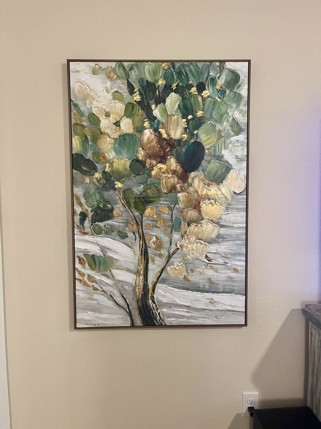
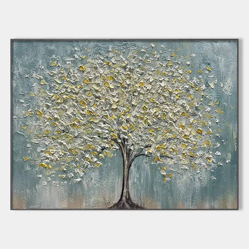
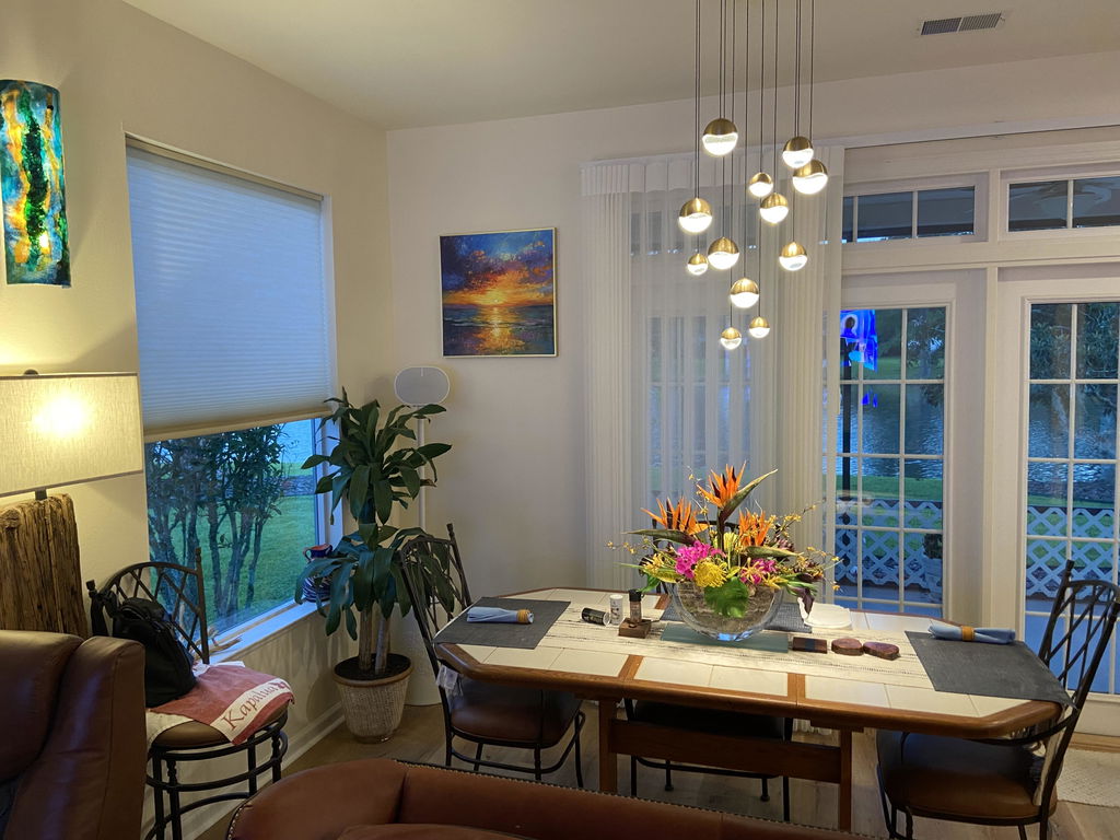
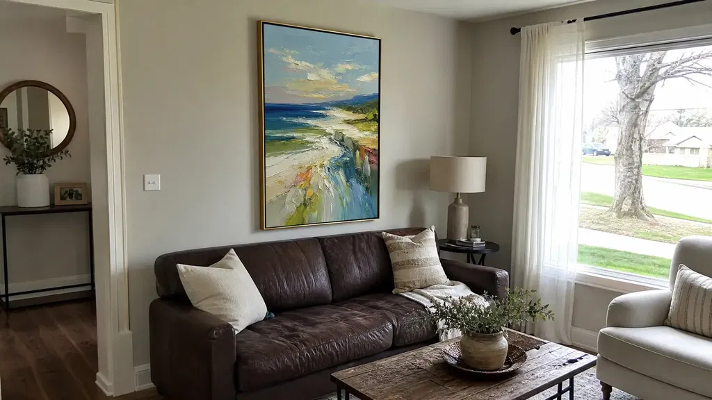
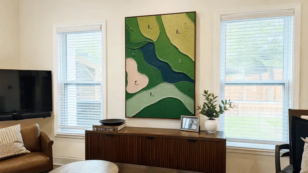
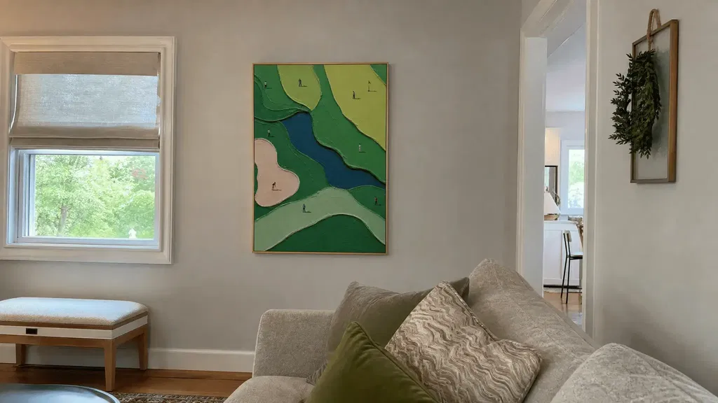
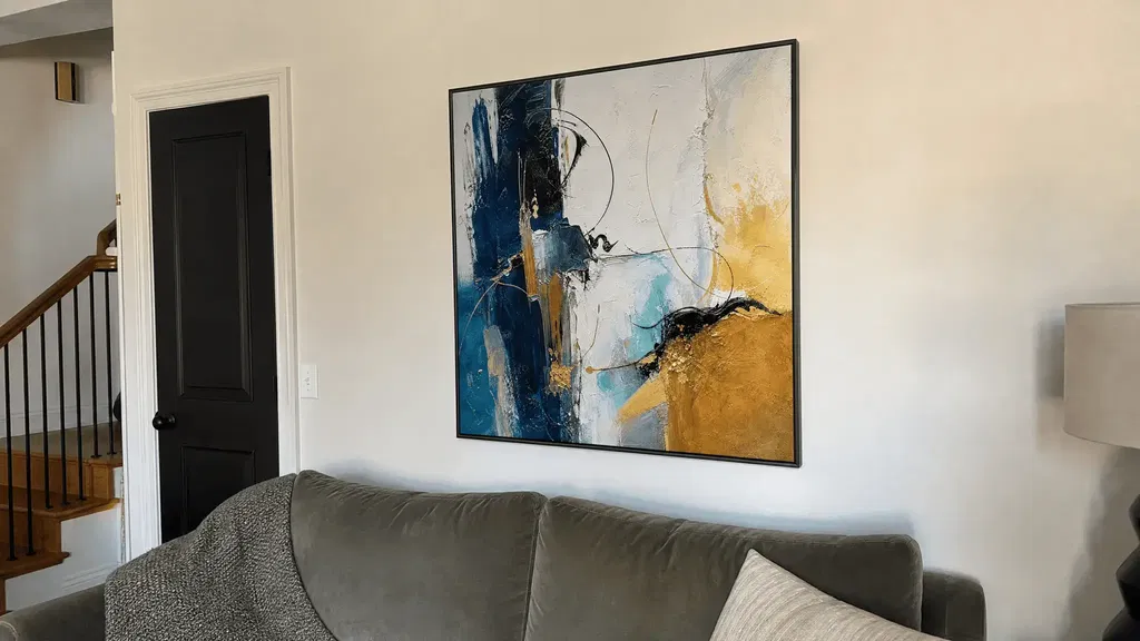
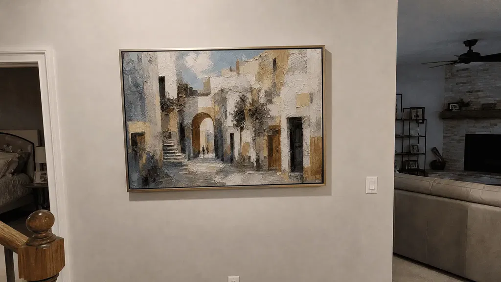
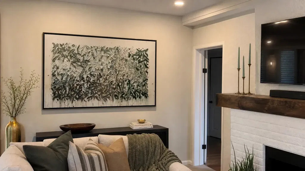
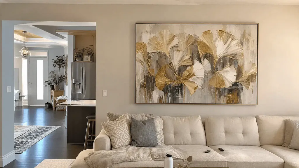
Colorful abstract wall art can feel sophisticated rather than chaotic when the composition has a clear lead color, surrounding neutrals provide visual breathing room, contrast suits the room, and the artwork’s texture and scale are judged in place. The goal isn’t to match every pigment or follow a universal proportion rule. It’s to decide which visual signal should lead, then reduce competing signals before you order.
Use the checks below for a neutral living room, bedroom, entryway, or design-forward space with existing patterns. They’ll help you compare a large colorful abstract art piece with the wall, furniture, finishes, lighting, and normal viewing distance instead of judging it from a product page alone.
Choose a Lead Color Before Adding More Saturation
Start by identifying one hue that visually organizes the artwork. A one-lead-color approach is a useful styling heuristic: supporting colors can relate to the room without every shade needing an exact match. Depending on the composition and the space, this hierarchy can make colorful abstract wall art easier to integrate.
Look for the largest or most persistent hue rather than the brightest small mark. Then identify no more than two room elements that can echo it through temperature or value: perhaps the sofa, rug, wood tone, or a small accessory. A warm color in the artwork might relate to warm wood, while a cool blue-green could connect to a rug or upholstery without duplicating the exact pigment.

Take a photo of the wall with the sofa, rug, floor, and largest finish visible. Circle the artwork’s lead color and mark the two room echoes. If several colors in the artwork are equally loud and the room already contains strong patterns, treat that as a not-fit signal—or simplify a nearby pillow, textile, or accent before adding more decor.
For a deeper composition-focused comparison, see our guide to choosing abstract art. Use it to refine the relationship between color, composition, and the room rather than to search for one universally sophisticated palette.
Control Contrast for a Polished, Not Chaotic, Effect
Contrast determines whether the artwork becomes a clear focal point or a quieter transition. Higher contrast can add energy when the room can give the piece visual priority; lower contrast can integrate more gently when patterns, dark finishes, or several focal points already compete.
Bright Art for Neutral Rooms
Bright abstract art for modern rooms often works best when it carries most of the color and the walls, furniture, and accessories provide visual breathing room. Compare the artwork with the room’s largest surfaces and its actual lighting, not only with a white product-page background. Keep palette echoes selective: repeating every bright hue in pillows, objects, and textiles can make the room feel busier rather than more coordinated.
A neutral room doesn’t have to be empty to support color. Check whether the sofa, floor, rug, and curtains create a calm enough field for the artwork to lead. If those surfaces already contain bold patterns or strong light-dark shifts, a quieter transition may work better than another high-impact contrast.

High-Contrast and Low-Contrast Pairings
| Pairing | Visual energy | More suitable when | Main risk to check |
|---|---|---|---|
| Higher contrast | Creates a stronger focal point and clearer separation from the wall or furniture | The room needs a primary color event and can tolerate another assertive signal | The art competes with a patterned rug, dark finish, or existing focal point |
| Lower contrast | Creates a quieter transition between the artwork and its surroundings | The room already has visual activity or several materials demanding attention | The piece loses presence or looks disconnected from the wall |
| Selective contrast | Keeps one or two marks prominent without repeating the full palette | You want color but need the rest of the room to remain composed | Small accents accidentally multiply every strong color |
Use contrast as a room-specific choice, not a quality ranking. Look at the art from the room’s normal viewing distance and list the existing high-contrast elements before choosing a similarly dramatic piece.
Coordinate With Furniture and Finishes
Check the room’s strongest anchors in this order:
- Compare the sofa or bed with the artwork’s overall value and temperature.
- Check the rug, since its pattern and color density may compete more than a small accessory.
- Review the flooring and the largest wall or architectural finish.
- Note the most visible accent, such as a chair, lamp, or oversized object.
- Use nearby wood or metal finishes as supporting cues rather than exact color targets.
If both the artwork and the room’s accessories demand attention, simplify or relocate one competing accent. That practical edit can do more for a polished result than adding another matching object. After the contrast check, you can browse abstract canvas artwork as a navigation path for comparing compositions, not as proof that one collection suits every room.
Use Texture and Composition as Visual Restraint
Texture describes both the look and feel of a surface, including visible effects created by marks, lines, and tonal variation. The National Gallery of Art’s definition of texture is useful here because a product image can show visual texture without proving a particular material, thickness, or construction.
Judge surface activity alongside color density and composition. A heavily active image may need simpler nearby decor, while a smoother composition may leave more room for a patterned rug or dimensional accessories. Texture can add another visual signal; it isn’t automatically more luxurious or sophisticated.
| Composition and surface cue | Room condition to compare | What to inspect online | Risk to manage |
|---|---|---|---|
| Smoother-looking surface with open areas | The room already has woven textiles, pattern, or dimensional objects | Overall image and how much visual space surrounds the marks | The art may feel too quiet against a highly active room |
| Clearly visible surface variation with dense marks | The room has relatively restrained furniture and accessories | Overall, close-up, angled, and side-lit views | Color, pattern, and texture may all compete at once |
| Strong directional marks or layered visual movement | The wall is seen from several angles or at close range | Whether the movement remains legible from the normal viewing position | A passage or entry may feel more visually intense than a seating area |
Ask one question before treating texture as a benefit: does it add a distinct surface signal beyond the color and marks already present? Compare the artwork with woven rugs, bouclé upholstery, patterned fabrics, and other tactile surfaces. If you need to describe impasto, oil, acrylic, thickness, or construction, use product-specific facts; a close-up image alone isn’t enough. You can browse textured wall art when surface activity is the remaining feature to compare, while keeping the collection link navigational.
Match Artwork Scale to the Wall and Furniture
Artwork feels more anchored when its size and orientation make sense with the usable wall, nearby furniture or architecture, and the way the room is actually viewed. Scale is relative to its surroundings, so Tate’s discussion of scale supports contextual judgment rather than a universal residential ratio. Measure first, then mock up the actual dimensions.
Above a Sofa, Bed, or Console
Use this three-step check before comparing listings:
- Measure the furniture or architectural feature that will sit below the artwork, then record the usable wall width and height around it.
- Compare the artwork’s listed width and orientation with that anchor, while accounting for trim, doors, shelves, and open wall.
- View the mockup from the room’s normal seating, entry, or standing position. Tate’s explanation of perspective reinforces why distance changes how size and detail are perceived.
This method is more reliable than deciding from an isolated listing image. A wide piece may suit a broad seating wall, but a large format isn’t automatically right for every main wall. For more context, use this wall art size guide as a follow-up, without treating any single ratio as mandatory.
Narrow Walls, Hallways, and Entryways
For a narrow wall or passage, check these conditions before choosing a large format:
- Measure usable width after accounting for trim, doors, switches, and circulation.
- Review the sightline from the entry and the closest normal viewing position.
- Compare whether color density and surface activity feel stronger at close range.
- Choose horizontal or vertical orientation according to the wall shape and sightline, not an assumption that one orientation is always better.
- Mock up the artwork at approximate dimensions and inspect both the full passage and the close view.
A piece that feels balanced from across a living room can feel crowded in a hallway. If the wall, doorway, and artwork all create strong edges, a quieter composition or smaller visual footprint may be the better fit. The large art above seating guide can help with comparison, but it shouldn’t replace your measurements.
Run a Room-Photo and Swatch Check Before You Buy
Use this five-step workflow to test colorful abstract wall art against the room before adding it to your cart. It narrows the decision without pretending that a screen, swatch, or mockup can reproduce the final artwork exactly.
- Photograph the room. Take the picture from the usual entrance or seating position, with the sofa or bed, floor, rug, wall, and major finishes visible. Include the lighting conditions you actually use.
- Identify the lead color. Mark the artwork’s most persistent hue and decide whether it has a natural relationship to one or two existing room elements. If no color leads and the room is already busy, pause before ordering.
- Compare swatches in context. Place physical or digital swatches for the wall, upholstery, rug, and wood finish alongside the room photo or mockup. Glidden recommends large swatches tested in your own space and lighting; use that principle as a comparison aid, not as a guarantee of final artwork color. Light and viewing conditions can change how color appears, so evaluate the piece beyond the white product-page background.
- Mock up scale and placement. Use the artwork’s listed dimensions, mark the approximate shape on the wall photo, and inspect it from both the full-room view and the normal close-range position. Check trim, doors, furniture, and circulation.
- Choose the remaining fit path. If color is the unresolved need, browse colorful abstract paintings. If composition is the priority, compare abstract canvas artwork. If surface activity is the deciding feature, browse textured wall art. These are navigation choices; supplied collection information does not verify an individual piece’s dimensions, materials, framing, or texture depth.
When the mockup shows color, pattern, texture, and scale all competing, simplify one nearby signal or choose a quieter option. If texture matters, inspect overall, close-up, angled, and side-lit imagery and look for product-specific material information before drawing conclusions. These checks reduce avoidable surprises, but they can’t guarantee the final color or surface effect under every screen and lighting condition.
Questions to Ask Before Choosing Colorful Abstract Art
Use these questions for the edge cases that are easiest to miss during online shopping.
How Do I Keep Colorful Abstract Art From Overwhelming a Room?
Remove or relocate one nearby pattern or saturated accent before rejecting the artwork. Then preserve usable wall space and compare the mockup from the room’s normal seating or entry position; if the piece still competes with the largest room signal, it may be the wrong fit for that wall.
Can Bright Abstract Art Look Sophisticated in a Neutral Room?
Yes, conditionally. Let the artwork carry most of the color, then check the room in both daylight and evening lighting to see whether the neutrals and restrained accessories provide enough visual breathing room. If the wall looks controlled in daylight but busy under artificial light, reduce nearby accents before ordering.
Should Colorful Abstract Art Match the Sofa or Curtains Exactly?
No exact match is required. Compare undertone and value first, then use one or two small echoes. If a nearly matching fabric looks visibly off beside the artwork, use a broader warm-or-cool relationship instead of adding more mismatched accessories.
How Much Empty Wall Should Remain Around Large Colorful Art?
Don’t use one universal clearance number. Measure the usable wall around trim and furniture, mock up the actual dimensions, and judge whether the artwork has breathing room from the normal viewing distance. Also check the closest sightline, since an entryway may need a different visual balance than a sofa wall.
Is Textured Colorful Art a Good Choice for a Dim Room?
It depends on the room’s natural and artificial light. Inspect close-up and angled imagery, then compare the piece at the actual viewing distance to confirm that color separation and surface detail remain legible. If the texture disappears or the colors merge in the dimmest condition, choose a clearer composition or improve the lighting before ordering.