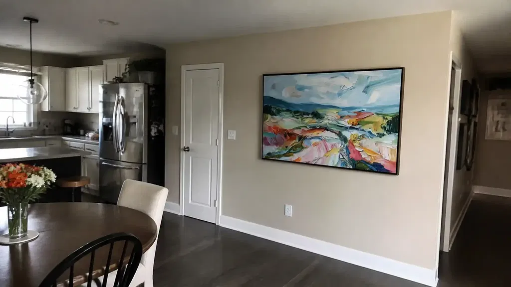
Art above a dining room buffet works best when the piece feels tied to the furniture, not floating over it. If you are choosing art above a dining room buffet, start with width, then check hanging height, then decide whether a wide single piece, a pair, or a small grouping fits the wall. In most dining rooms, the best answer is the one that looks balanced from both the table and the doorway.
Start With the Buffet and Wall Width
The first sizing check is simple: compare the art to the buffet, not just to the empty wall. A good starting band is art that spans roughly two-thirds to three-quarters of the buffet width, which keeps the composition anchored without looking cramped or oversized. That range is a guide, not a law, but it helps avoid the most common mistake: choosing art that is too narrow and gets visually swallowed by the furniture two-thirds to three-quarters of the width.
Here is a practical way to use it:

| Buffet and Wall Situation | Best Fit | Why It Works |
|---|---|---|
| Wide buffet with open wall space | One horizontal statement piece | It echoes the long furniture line and feels clean from a distance |
| Wide buffet but the wall still needs more presence | A diptych or calm two-piece set | It fills width without forcing one oversized frame |
| Narrow sideboard or tight nook | Smaller horizontal art or a compact vertical exception | It keeps the wall from feeling crowded or top-heavy |
| Offset furniture under an architectural break | A centered grouping or a narrower piece | It respects the room shape instead of fighting it |
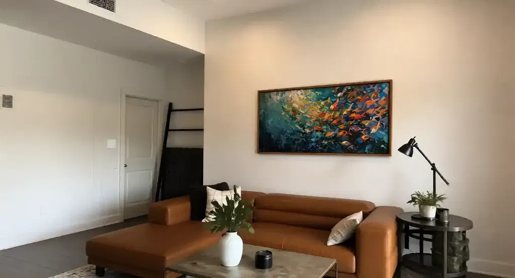
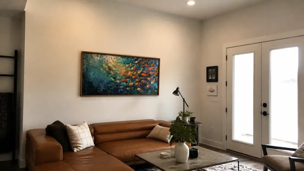
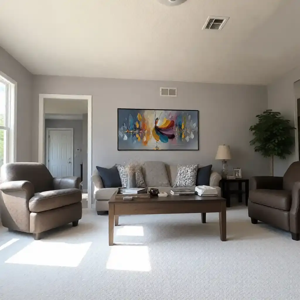
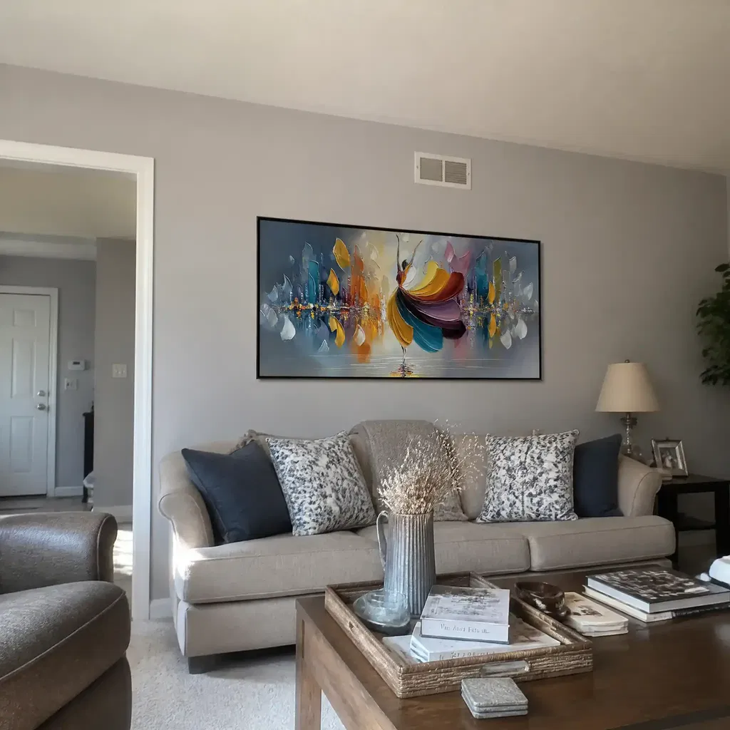
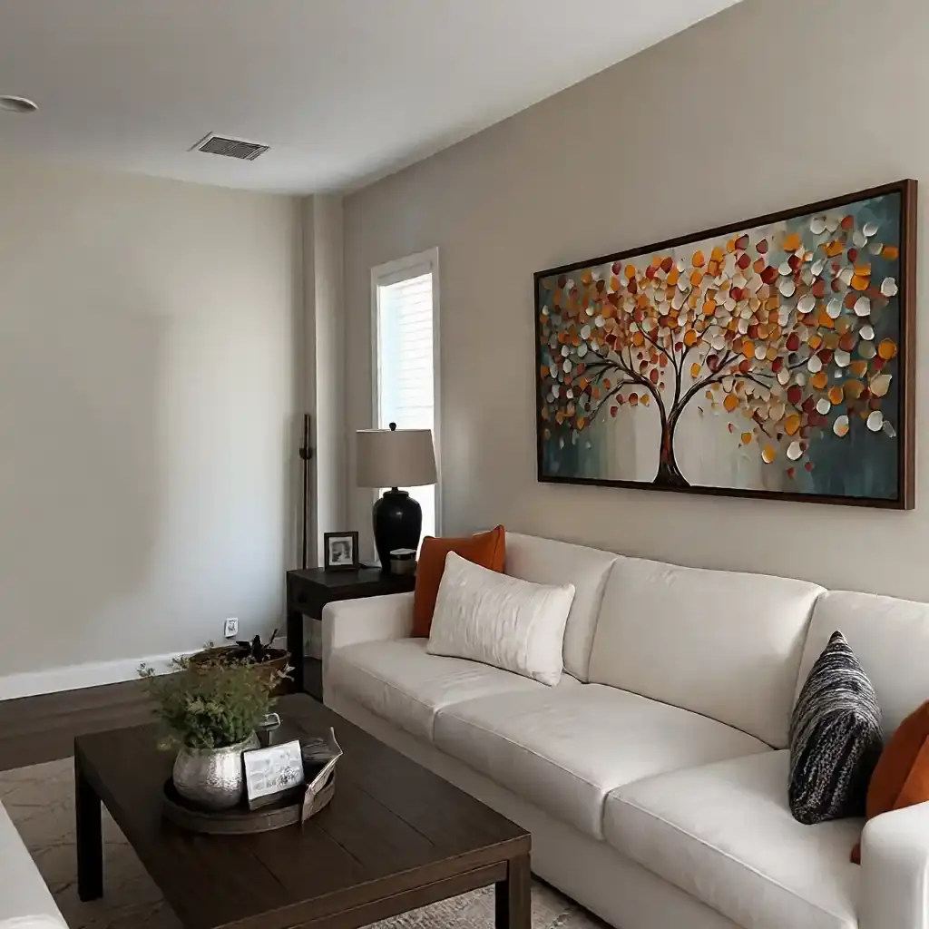
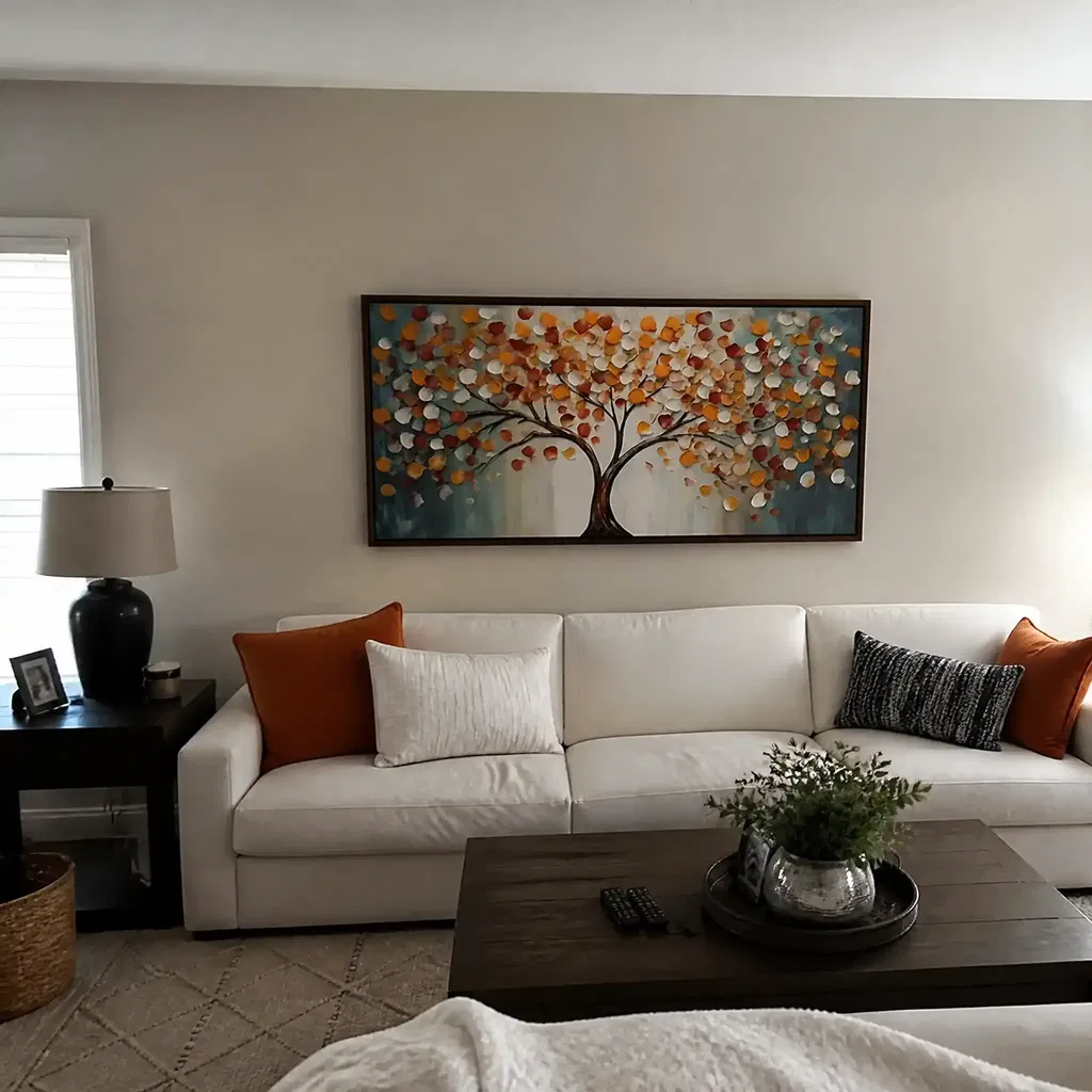
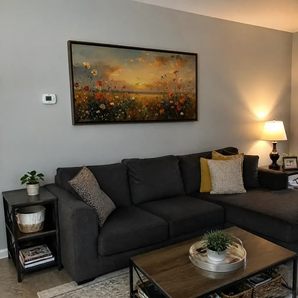
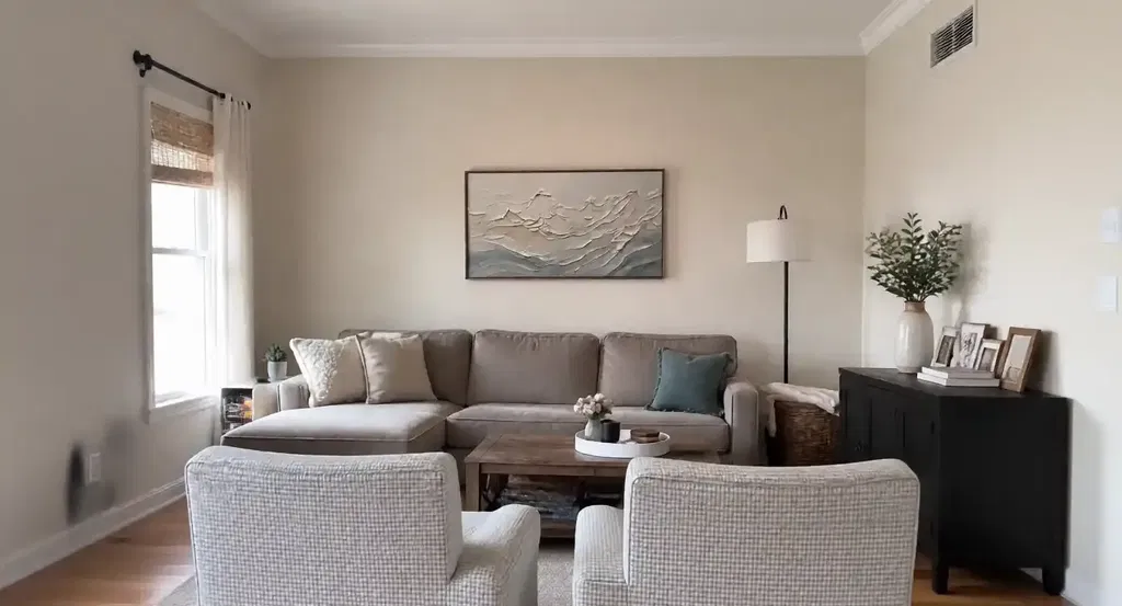
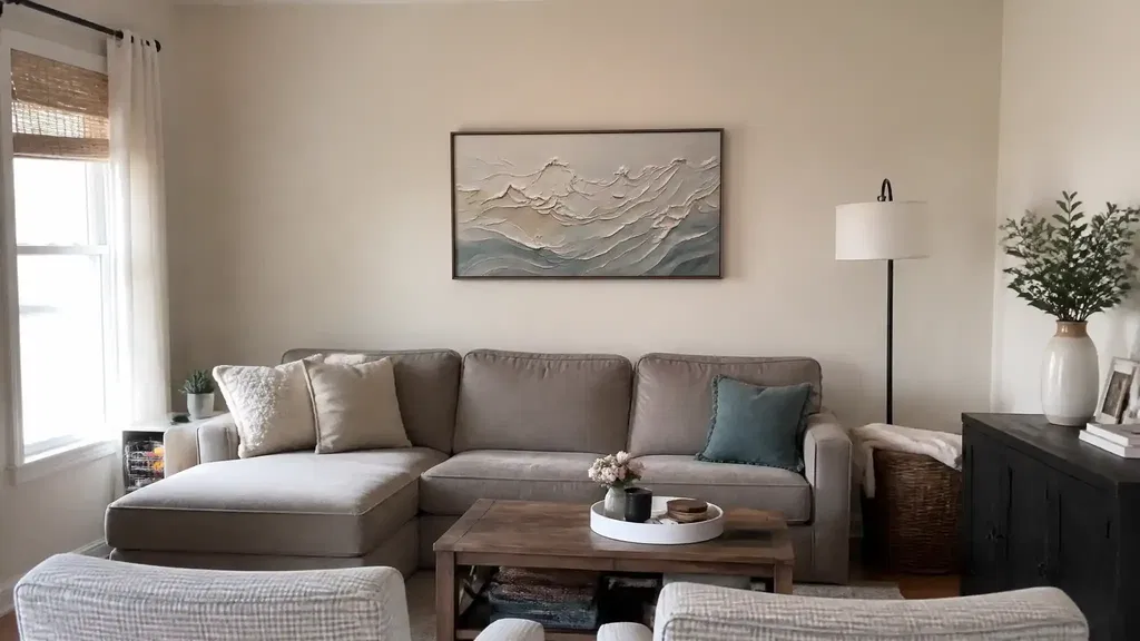
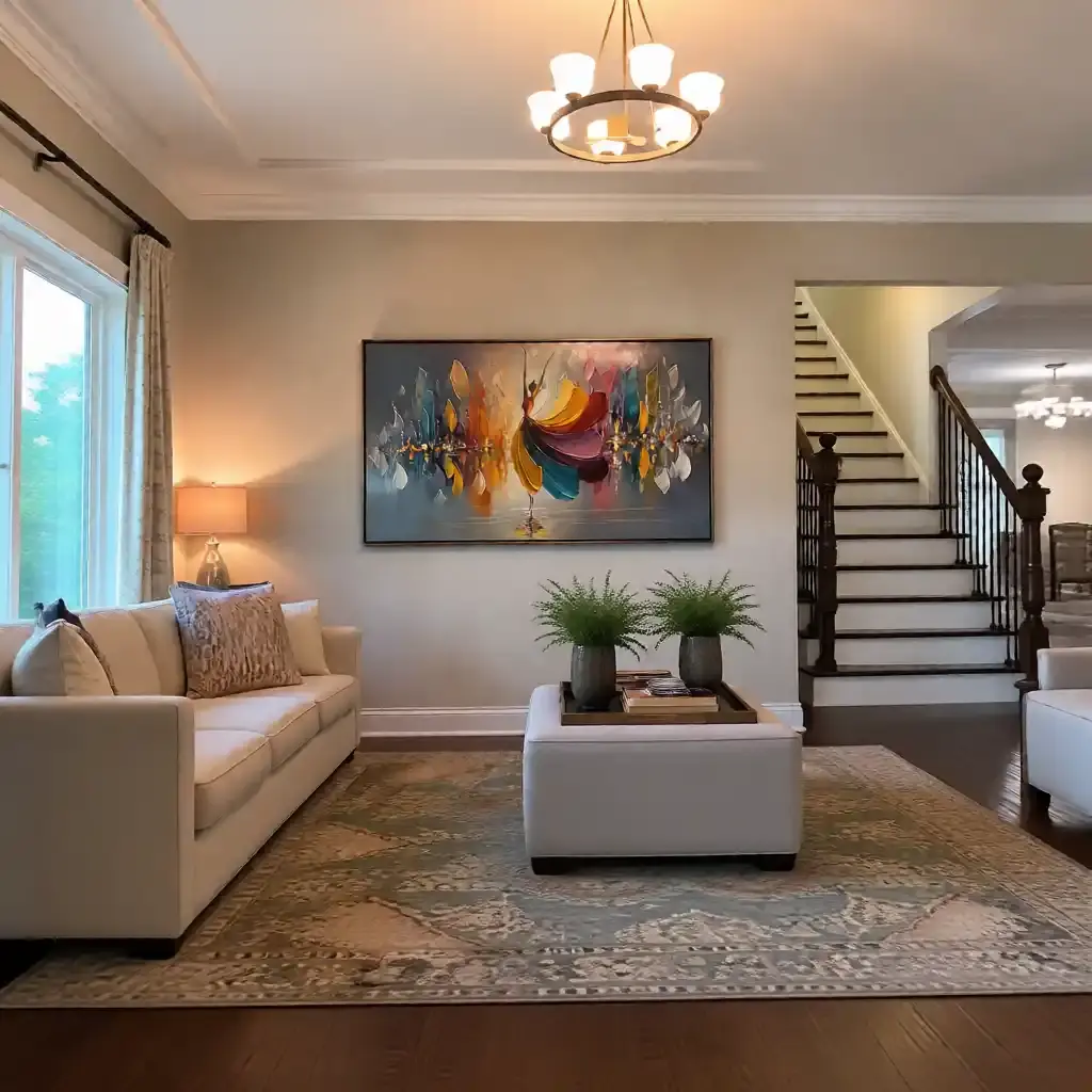
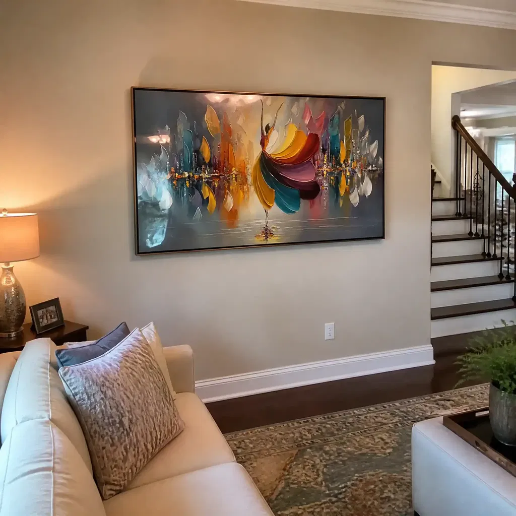
A horizontal format usually looks the most natural above a buffet because it mirrors the buffet's silhouette horizontal format over a buffet. That does not mean every vertical piece is wrong. It means a vertical format needs a clear reason, such as a narrow wall bay, a tall inset, or an offset layout where width is limited. If the buffet is long and the wall is open, a wide piece or a calm grouped layout is usually the safer buy.
If you want a quick buying filter, use this decision sentence: if the art does not occupy enough of the buffet's width to feel related to it, the room will usually read as incomplete rather than styled. The better choice is the piece that solves the proportion problem first and the color problem second. For a deeper size cross-check, see our dining buffet sizing guide and compare long horizontal art before you buy.
Hang It at the Right Height
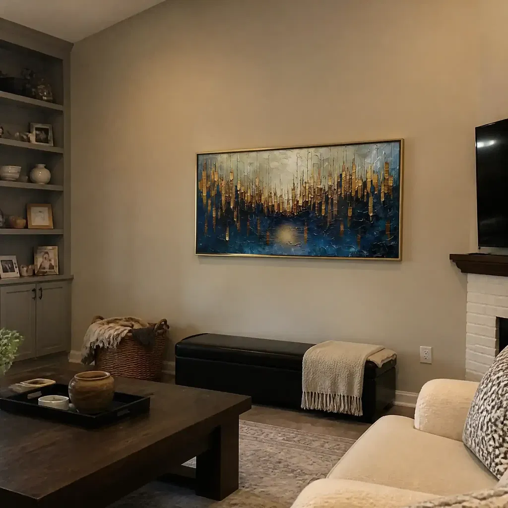
Height matters because dining rooms are seated-view spaces. The most useful baseline is to keep the bottom edge of the art about 6 to 10 inches above the buffet surface, which preserves a visual connection without crowding the furniture six to 10 inches above the buffet. If the gap gets much larger, the art can start to feel detached; if it gets too tight, the wall can feel cramped.
For dining rooms, a lower centerline often feels better than the standing eye-level rule used in galleries, because people usually view the wall while seated lower dining-room sightline and gallery standards are meant for standing viewing, not dining tables seated viewing balance. In plain English, that means you should not hang the piece so high that it looks right only when you are standing across the room. The art should still belong to the buffet when you are sitting at the table.

Adjust for Ceiling Height and Frame Depth
Ceiling height changes how much breathing room the arrangement can take. A taller room can handle a little more visual space above the buffet if the art is also wide enough to stay grounded. In a lower room, the same gap may feel too loose, so the composition usually needs to sit closer to the furniture. The right answer is the one that keeps the buffet and the art reading as one unit.
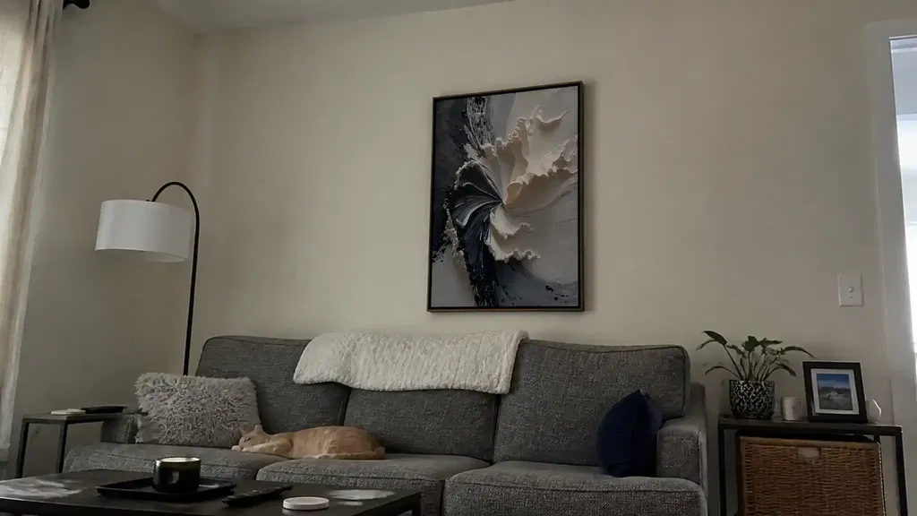
Frame depth matters too, especially in dining areas with chair movement or a narrow traffic path. Accessibility guidance from ArtsWA's artwork presentation guidelines treats wall projection as a practical clearance issue, not just a style detail. For shoppers, that means thick float frames, deep stretched canvases, or layered textures should be checked for how far they project and whether they feel bulky near a walkway or the back of a chair.
A useful decision sentence is this: if the piece is visually strong but projects too far into a tight dining path, it can feel less polished even when the size is right. In that case, a flatter frame or a shallower profile usually makes the wall easier to live with.
Match the Format to the Dining Room
The safest format above a buffet is usually one wide horizontal piece, especially when the wall is open and the room needs a calm focal point. That shape feels intentional because it works with the buffet instead of competing with it. If you prefer a softer look, a pair of pieces can spread the visual weight without making the wall feel heavy. A three-piece arrangement can also work when the wall needs a little more width coverage but still benefits from rhythm and breathing room.
Spacing between pieces matters as much as the pieces themselves. Too much separation makes the grouping feel accidental; too little can make it feel busy. The goal is a composition that reads as one connected area above the furniture, not a row of unrelated objects. That is why panoramic art often feels easier to place in dining rooms than highly segmented layouts.
Color and texture should support the room's mood, not rescue a weak proportion. Calm neutrals, softened contrast, and a restrained palette usually feel more polished in dining spaces because they let the table setting and lighting do some of the work. Texture can add depth and warmth, but buyers often want real-room photos and side-angle views before choosing a textured piece, because that is where finish and surface detail become obvious. If you are comparing options, browse horizontal wall art options and compare gold and grey panoramic art with horizontal seascape art to see which mood fits your room.
Choose a Look That Feels Intentional
Once the proportions are right, use a short shopping checklist to narrow the field. First, confirm that the width feels right above your buffet. Second, check whether the shape matches the wall, because a long buffet usually wants a long visual line. Third, decide whether you want the room to feel calm, dramatic, or airy, then choose color and texture to match that mood. A balanced piece is not just decorative; it helps the buffet read as part of the room design.
This is where the sizing rules become a buying decision. If a piece looks stylish in isolation but feels undersized above your buffet, it is probably not the best fit. If the frame depth seems heavy, or the palette fights the room lighting, keep looking. You can also use how art scale changes a room and choose art by room size to sanity-check the choice before checkout.
For a dining room, the best piece is usually the one that looks finished from a seated angle, not just from across the store page. We recommend checking the wall-to-furniture balance, then choosing the format that keeps that balance intact rather than forcing a favorite image into the wrong shape.
A Quick Buffet Wall Checklist
- Does the art span about two-thirds to three-quarters of the buffet width?
- Does the bottom edge sit close enough to feel connected, usually around that 6 to 10 inch zone?
- Does the shape suit the wall, with horizontal art leading unless the room clearly needs a vertical exception?
- Does the frame depth feel comfortable for chair clearance and traffic flow?
- Does the full arrangement look balanced from both standing and seated views?
If any answer is no, the wall probably needs a different size, shape, or hanging height before you buy. The fastest path is to compare a few dining-room-ready options side by side, then choose the piece that matches your buffet width and room mood most cleanly.
FAQs
How Wide Should Art Be Above a Dining Buffet?
A strong starting point is about two-thirds to three-quarters of the buffet width. If the piece falls well short of that band, it can look undersized; if it goes far beyond it, the buffet may disappear visually. Use the buffet width first, then adjust for wall span and architecture.
What Is the Best Height to Hang Art Above a Buffet?
The bottom edge usually works best around 6 to 10 inches above the buffet surface. That keeps the art connected to the furniture without crowding it. If the room is mainly viewed while seated, check the height from the dining table, not just from standing.
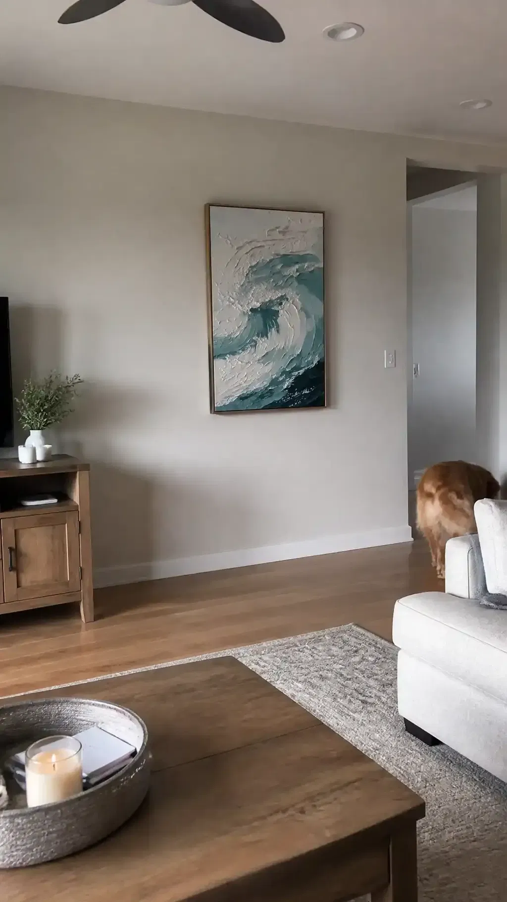
Can I Use a Vertical Piece Over a Dining Buffet?
Yes, but only when the wall shape supports it, such as a narrow bay, a tall inset, or an offset layout. On a wide open wall, a vertical piece often feels disconnected unless it is part of a deliberate grouping. If the buffet is long, horizontal usually remains the safer choice.
What Works Better Above a Buffet: One Large Piece or a Set?
One large piece usually feels cleaner and simpler, while a set can help fill a wider wall without one oversized frame. Choose a set when you want rhythm and width coverage, and choose one piece when you want a calmer focal point. The better option is the one that keeps the buffet and wall in proportion.
How Do I Make Dining Room Wall Art Feel More Polished?
Keep the piece centered, keep the scale tied to the buffet, and choose a frame or finish that suits the room lighting. Polished dining-room art usually looks intentional because the width, height, and mood all agree. If one of those three feels off, the wall will usually read as unfinished.