The Evolution of the Dining Room Focal Point
For decades, the high-end art market was dominated by what we might call "vanity assets"—overpriced auction pieces purchased more for their financial speculation than their emotional resonance. However, recent data suggests a fundamental shift in how collectors and homeowners view their investments. According to Marketplace, high-end auction sales plummeted 44% Year-over-Year in 2024, signaling a retreat from purely financial art assets. In their place, we are seeing a return to "real application value": custom, hand-painted works that serve as the soul of the home rather than just a line item on a balance sheet.
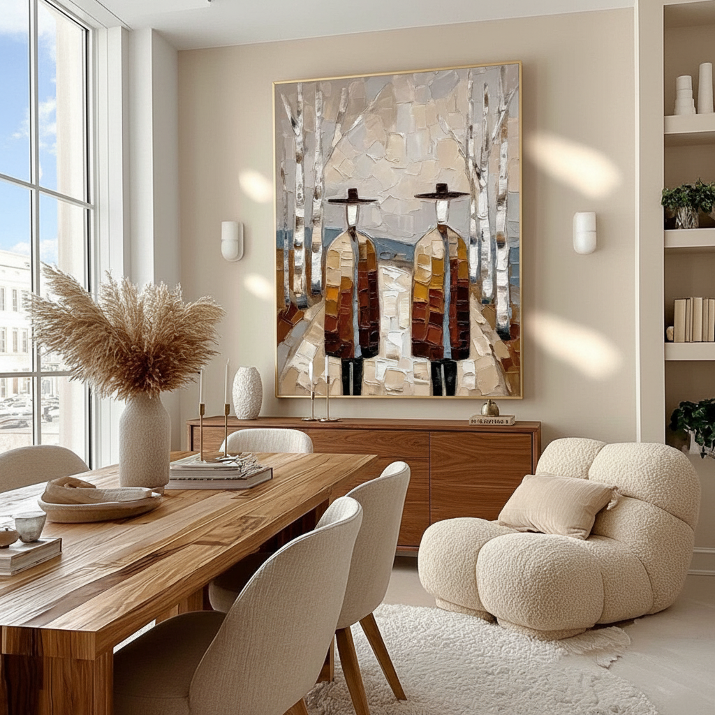
Nowhere is this "application value" more critical than in the dining room. As the social epicenter of the modern home, the dining room demands a visual anchor that balances scale, architecture, and atmosphere. Specifically, the relationship between the sideboard (or buffet) and the artwork above it is the most common site of "visual mismatch"—the nagging feeling that a piece is either too small, too high, or simply disjointed.
This guide provides a technical framework for achieving "Sideboard Synergy." We will move beyond generic decorating advice to explore the neural mechanisms of visual balance, the economic impact of artisan craftsmanship, and the precise scaling rules required to secure your investment in premium decorative art.

The Geometry of Balance: The Two-Thirds Rule and Beyond
The most frequent frustration we encounter in our design consultations is the "lost art" phenomenon—where a beautiful painting is swallowed by a large wall or dwarfed by a heavy buffet. To prevent this, professional curators rely on a specific set of scaling heuristics.
The Width Heuristic: 65% to 85%
The foundational rule for dining room scaling is the Two-Thirds Rule. For a cohesive visual unit, the total width of the artwork (including the frame) should occupy approximately 65% to 85% of the sideboard's total length.
- The 75% Sweet Spot: A painting that is exactly three-quarters the width of the buffet typically offers the most "stable" aesthetic. It provides enough presence to anchor the furniture without overhanging the edges, which can make the arrangement feel "top-heavy."
- The Minimalist Exception: In ultra-modern, minimalist environments, designers often break this rule by using oversized art that is 100% to 110% of the sideboard's width. This creates a dramatic, intentional statement that prioritizes the art as the primary architectural feature.
- The Maximalist Approach: Conversely, if you prefer a gallery wall or a triptych, the combined width of the grouping should still follow the 65-85% range to maintain a sense of containment.
Methodology Note (Scaling Analysis): These ratios are derived from common industry heuristics used by interior design firms to ensure "visual weight" parity. Our analysis assumes a standard ceiling height of 8 to 10 feet. In rooms with vaulted ceilings (>12 feet), the upper bound of the ratio (85%+) is often preferred to prevent the art from looking "undersized" against the vertical volume of the wall.
Spacing and Proximity
A common mistake is hanging art too high, severing the "umbilical cord" between the furniture and the painting.
- The 6-to-10 Inch Gap: The bottom of the frame should ideally sit 6 to 10 inches above the buffet surface. This allows enough room for decorative objects (vases, lamps) without obscuring the art, while still maintaining a singular visual silhouette.
- Contextual Spacing: Based on internal observations of contemporary styling trends, a tighter gap of 4–6 inches is becoming more common in "intimate minimalist" spaces to create a more integrated, grounded look.

The Seated Perspective: A Neural Shift in Placement
Most art installation guides prioritize the "Standing Eye Level" (the 57-inch or 60-inch center rule). However, in a dining room, your audience is primarily seated. This creates a unique challenge: a painting hung at standing height can feel uncomfortably high and cause neck strain during a two-hour dinner party.
The Seated Eye Level Rule
To optimize for the dining experience, we recommend lowering the focal point of the painting by 2 to 3 inches compared to a standard hallway installation.
- The Tokonoma Influence: This approach mirrors the traditional Japanese tokonoma alcove, where art is intentionally placed at a seated viewing height (30-40 inches from the floor) to align with the occupants' perspective. According to AweDeco, this creates a more intimate and contemplative atmosphere.
- Visual Parallax: Lowering the art reduces the vertical gap that often forces the eye to jump between the table setting and the wall. By keeping the art within the lower field of vision, you activate the medial prefrontal cortex (mPFC), which is associated with emotional regulation and comfort.
Logic Summary: Our recommendation to lower art by 2-3 inches is a response to the "Seated Eye Level" conflict. Standard 60-inch centers create a 12-22 inch vertical gap for seated viewers (assuming a 48-inch seated eye level), which can lead to visual fatigue.
Architectural Integration: Wainscoting and Wall Molding
When your dining room features architectural details like wainscoting or picture frame molding, the scaling rules become more complex. You are no longer just scaling to the furniture; you are scaling to the "frames" already built into your walls.
Centering within Panels
The safest approach is to center the art within the upper wall panel (the space between the chair rail and the crown molding).
- The "Break-Out" Strategy: If the wall panel is too small to accommodate a piece that meets the 65-85% width rule, you may employ a "break-out" approach. This involves a substantial frame that intentionally overlaps the molding. This technique, often seen in high-end European interiors, signals that the art is the priority and the architecture is the backdrop.
- Panoramic Murals: For those looking to create an "immersive escapism," wrapping murals entirely around the walls—including over the molding—is a dominant trend. The National Kitchen & Bath Association (NKBA) identified "panoramic hand-painted murals" as a top design trend for 2025, particularly in social spaces like dining rooms and powder rooms.
The Technical Superiority of Human-Made Art
In an era of AI-generated prints, the technical precision and material "soul" of a hand-painted oil or acrylic piece provide a significant commercial and psychological premium.
The "Nuclear Weapon" Against AI
Research from Columbia University confirms that consumers value art labeled as "human-created" 62% higher than identical pieces labeled as "AI-generated." This isn't just sentiment; it's rooted in the "essential identity" of the object. University of Chicago research suggests that digital replicas lack the artist's "essential identity," leading to a collapse in perceived value over time.
The Micro-Physical Texture
Why does a hand-painted canvas feel so much more "real" than a print? It comes down to optical microprofilometry.
- Light Scattering: According to the Getty Conservation Institute, the surface of an oil painting has a mm-scale texture that creates unique absorption (K) and scattering (S) coefficients. This "microtopography" ensures that the color changes subtly as you move around the room—an effect known as geometric metamerism.
- The Kubelka-Munk Equation: This mathematical model explains that the richness of hand-painted pigments comes from the way light penetrates multiple layers of translucent glaze and reflects off the physical particles of the paint. A flat print simply cannot replicate this depth.

Investment Safety: Pigment Longevity and Health
When investing in premium art, "decision safety" includes the technical durability and safety of the materials. Not all paints are created equal.
Lightfastness and ASTM D4303
To ensure your painting doesn't fade in a sunlit dining room, look for pigments tested according to the ASTM D4303 Standard.
- Accelerated Aging: This protocol uses xenon-arc tests to simulate decades of indoor light exposure.
- The SID Phenomenon: Advanced collectors should also be aware of Support Induced Discoloration (SID). As noted by Golden Artist Colors, water-soluble impurities in cotton canvases can be drawn into thick acrylic layers, causing a yellow tint over time. High-end artists prevent this by using specialized sealants (Gesso) and high-purity pigments.
The Toxicity Factor (YMYL Warning)
While we advocate for the beauty of traditional pigments, safety is paramount.
- Cadmium Risks: The International Agency for Research on Cancer (IARC) classifies cadmium compounds—common in bright reds and yellows—as Group 1 carcinogens. Chronic inhalation of pigment dust or accidental ingestion can lead to significant health issues.
- The Modern Solution: Most premium contemporary artists have transitioned to Titanium White (which captures 90% of the white pigment market due to its inertness) and low-VOC (Volatile Organic Compound) acrylics. These materials pass strict Indoor Air Quality (IAQ) tests, making them safe for homes with children or medical facilities.
The Psych-Economic ROI of Original Art
Beyond the visual appeal, original hand-painted art provides a quantifiable return on investment, both for your property value and your mental well-being.
Real Estate Value Boost
Art is a "catalytic infrastructure" for property. A study published by the Royal Society found that neighborhoods with higher "art" geo-tags experienced greater relative house price gains. For the individual homeowner, a well-scaled, high-quality mural or painting acts as a "permanent physical billboard" of luxury, often justifying a higher resale premium.
The Biophilic Healing Effect
If your dining room art features natural landscapes or botanical themes, you are engaging in Biophilic Design.
- Stress Reduction: A review by the University of Pennsylvania noted that 73% of patients reported significant mood improvements when exposed to environmental artworks.
- Cognitive Fatigue: In high-density environments, nature-themed art has been shown to reduce cognitive fatigue and burnout by activating the brain's emotional regulation circuits (mPFC and amygdala).
Decision Safety Checklist for Sideboard Art
To ensure your next art purchase is a "benchmark" addition to your home, use this final technical checklist:
| Factor | Technical Requirement | Rationale |
|---|---|---|
| Width | 65% – 85% of sideboard length | Ensures visual weight balance and stability. |
| Height | 6" – 10" above surface | Creates a cohesive visual unit with furniture. |
| Perspective | Lower by 2" – 3" | Optimizes for seated eye level in dining spaces. |
| Material | 100% Hand-painted | Guaranteed 62% higher perceived value over AI. |
| Pigments | ASTM D4303 Lightfast | Prevents fading in sun-drenched rooms. |
| Safety | Low-VOC / Lead-Free | Ensures indoor air quality (IAQ) compliance. |
The dining room is more than just a place to eat; it is a theatre of social interaction. By applying these scaling rules and prioritizing the irreplicable "essential identity" of hand-painted art, you move beyond simple decoration. You are investing in a cultural heritage asset that stabilizes the room’s architecture and enriches the human experience.
Disclaimer: This article is for informational purposes only. While we discuss pigment toxicity and indoor air quality, this does not constitute professional medical or environmental safety advice. Always consult with a certified industrial hygienist or medical professional regarding specific health concerns related to art materials.
Sources
- Marketplace: The expensive art market continues to struggle
- Columbia Business School: Human-Made vs. AI Art Study
- Royal Society: Quantifying the link between art and property prices
- WHO: Scoping Review on Arts and Health
- Getty Conservation Institute: Color Science and Pigment Mixture
- IARC: Cadmium and Cadmium Compounds
- NKBA: KBIS 2025 Design Trends
- ASTM D4303 Standard Test Methods for Lightfastness


