Wabi-Sabi textured paintings work best when they look calm, finished, and intentional, not simply rough or incomplete. If you are shopping for wabi sabi wall art, start with three checks: the scale should suit the wall, the palette should stay muted, and the placement should leave enough breathing room for the texture to read as part of the room.
What Makes Wabi-Sabi Textured Paintings Work
In shopping terms, Wabi-Sabi textured art usually leans into beauty in imperfection, soft irregularity, and a surface that feels organic rather than polished. That matters because the look should suggest quiet presence, not visual noise. A piece can have visible brushwork, plaster-like depth, or uneven edges and still feel refined if the whole composition stays restrained and balanced.
The best wabi sabi wall art usually gives you one clear focal point instead of many competing details. If the texture feels loud from across the room, it often shifts away from serene modern decor and toward something more decorative than restful. For living rooms, bedrooms, and entryways, the key question is whether the piece feels deliberately calm from both close range and several steps away.

Choose the Right Scale for the Wall
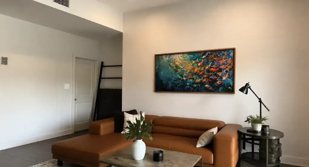
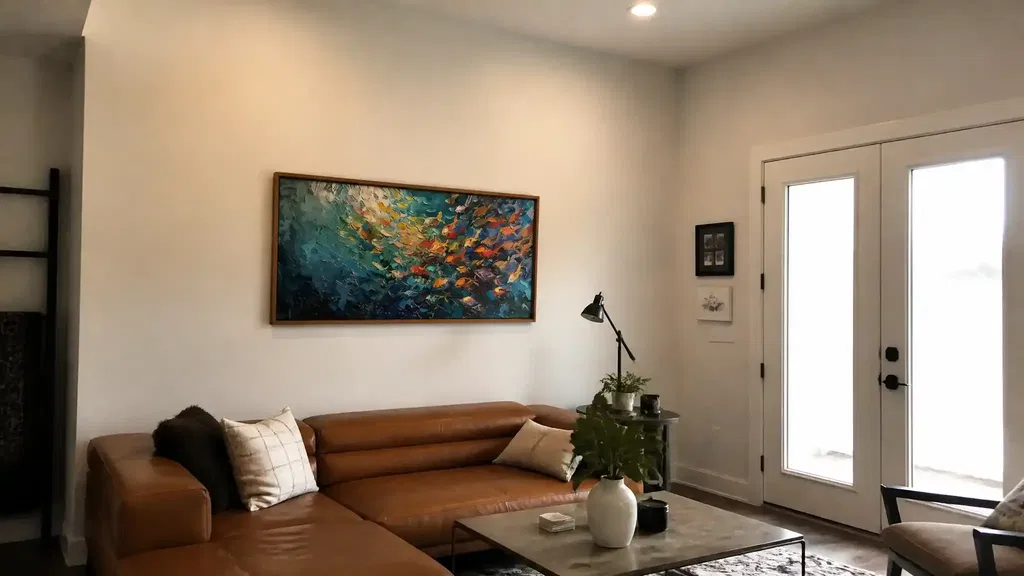
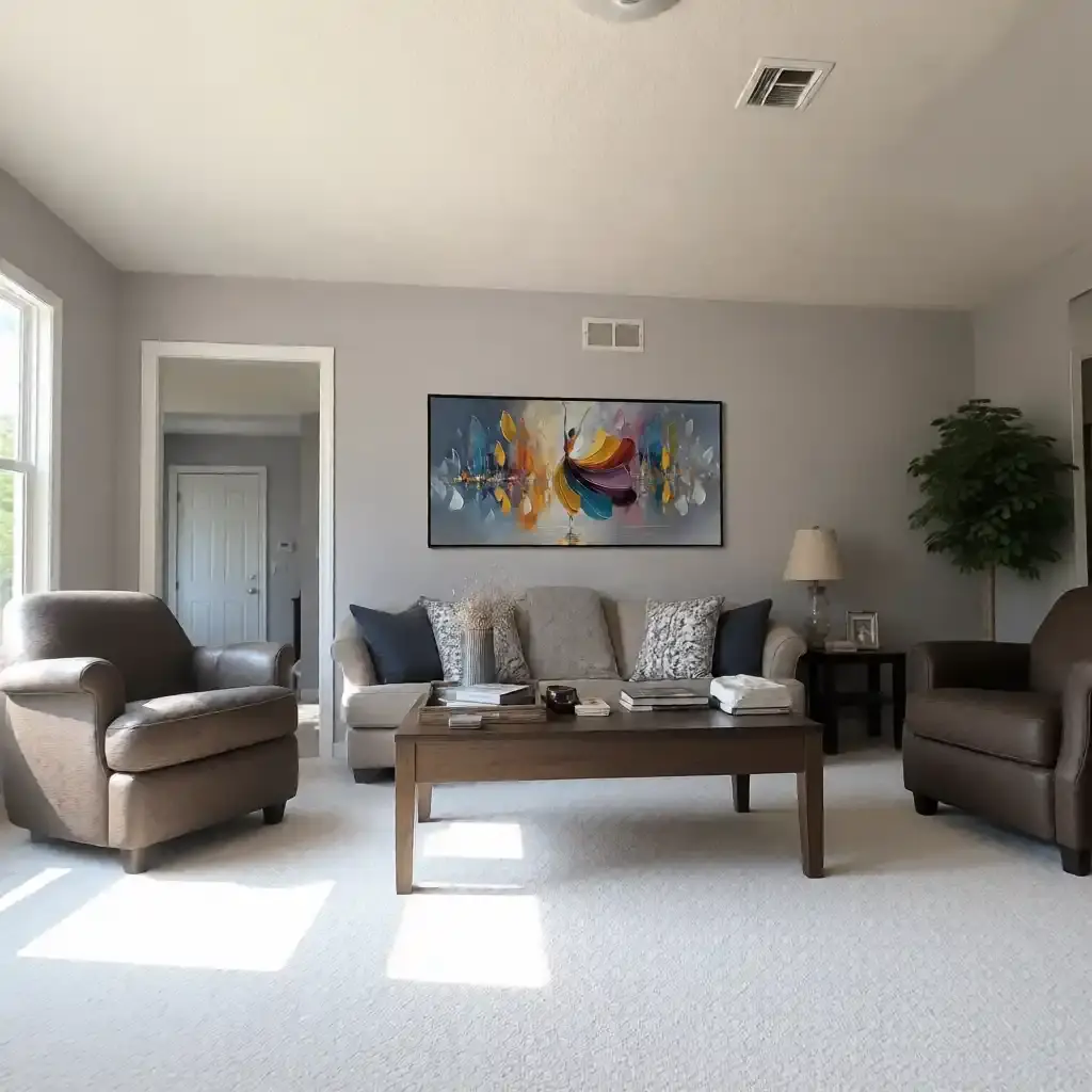
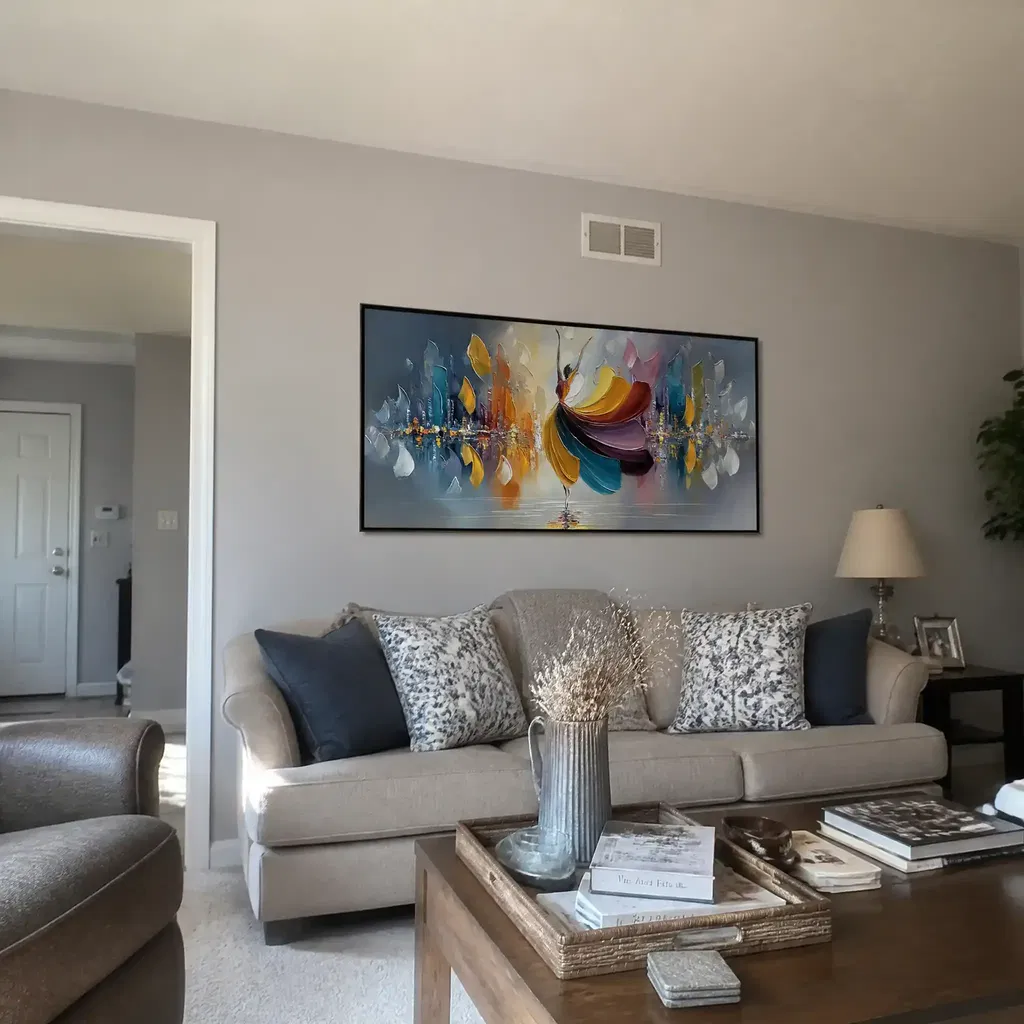
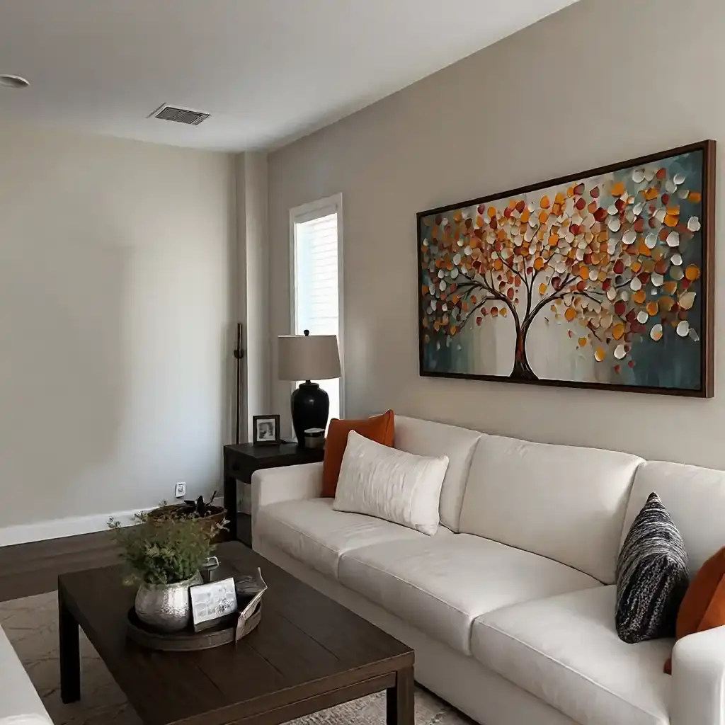
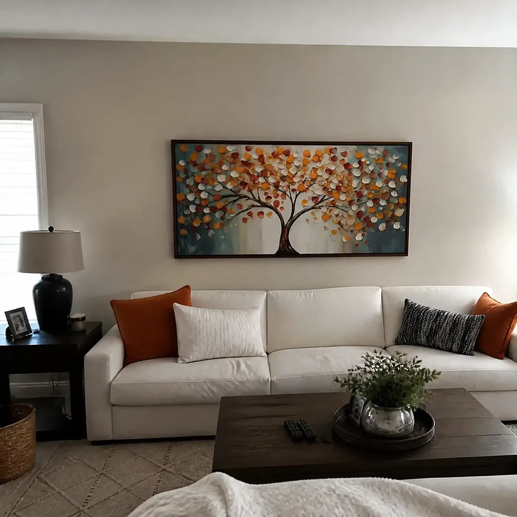
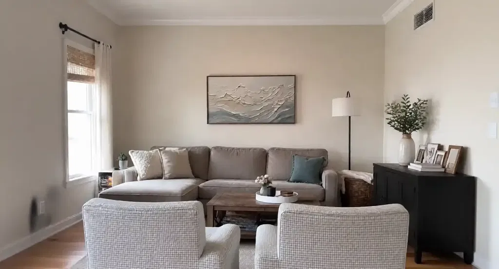
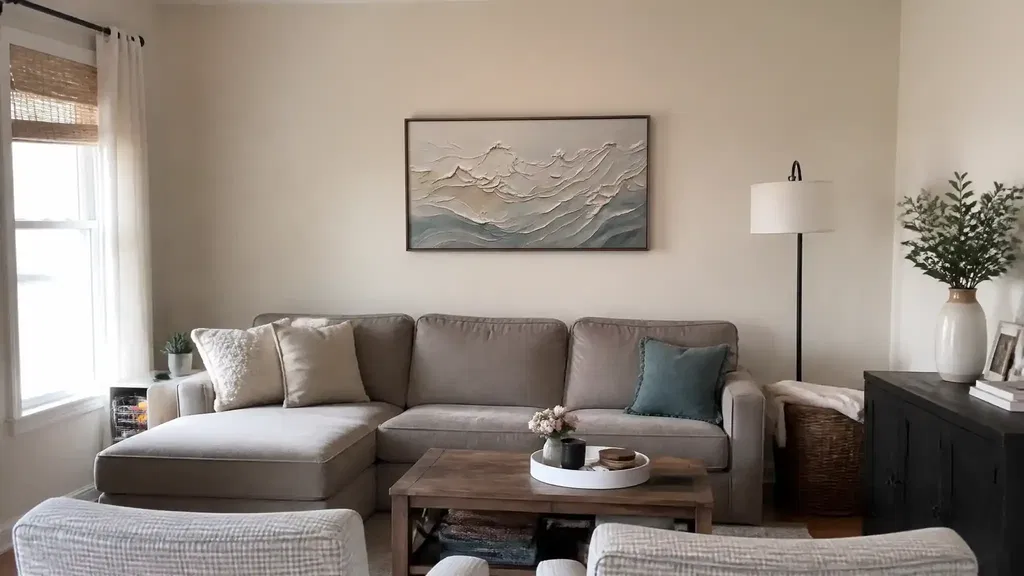
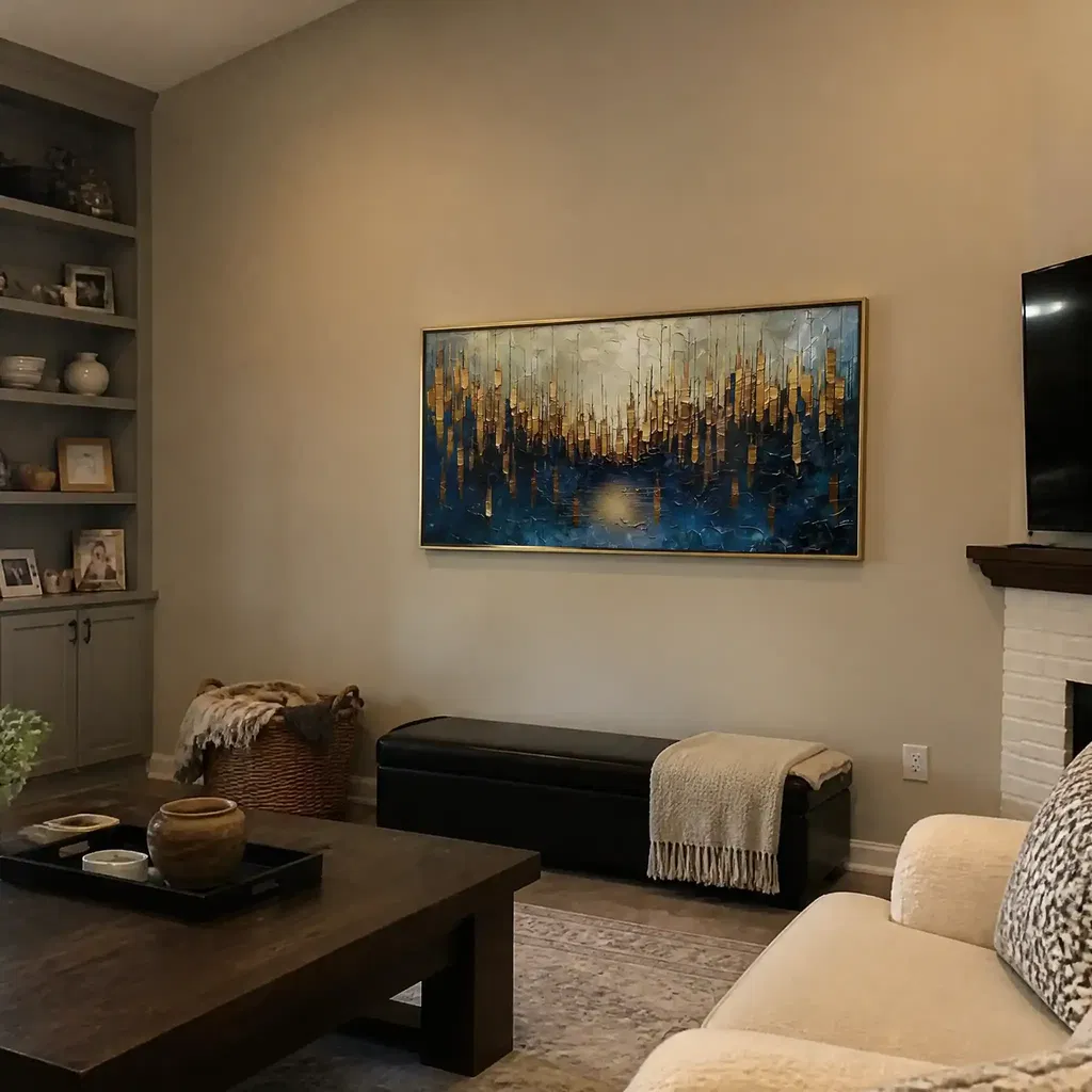
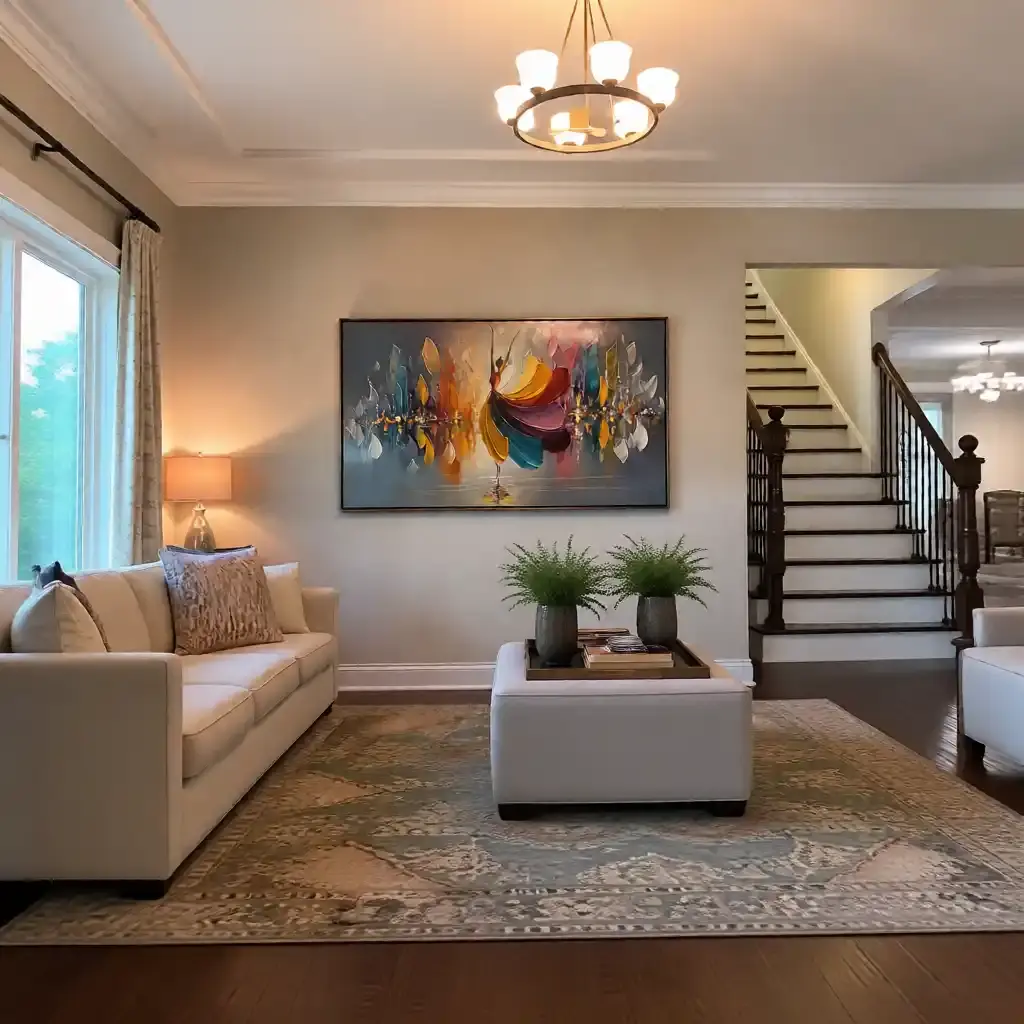
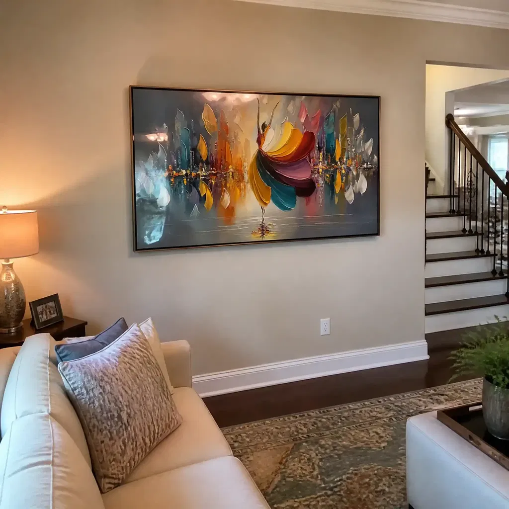
Scale changes the whole read of wabi sabi art for living room walls. A piece that is too small can look accidental, while one that is proportioned to the furniture feels grounded. For artwork above furniture, a common starting point is roughly two-thirds to three-quarters of the furniture width. That rule gives you a practical range instead of forcing a single exact size.
For a sofa, use the sofa width as your first reference, not the blank wall by itself. That usually keeps the artwork connected to the seating area instead of floating above it. In a narrow hallway or entry wall, a single vertical or compact rectangular piece often feels calmer than multiple smaller items, especially when the wall has limited width. If the room already has strong furniture lines, one larger statement piece is often the quieter choice.

If you want a simple decision sentence, use this one: if the artwork spans about two-thirds to three-quarters of the furniture width, it usually feels balanced; if it is much smaller, the wall can start to feel unfinished.
The same scale logic applies to art size and room feel, which is why oversized walls and undersized pieces rarely look serene together. When in doubt, choose the piece that can hold its own visually without crowding the furniture below it.
Pick a Muted Palette That Feels Intentional
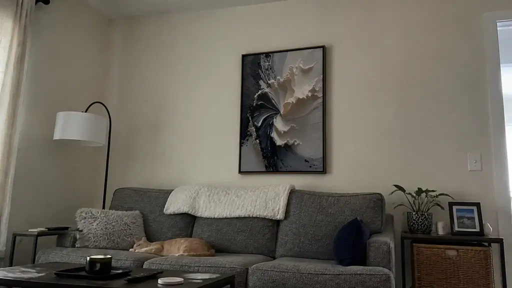
Neutral wabi sabi wall art ideas usually work because they keep the palette soft enough to support the room instead of competing with it. Warm white, beige, stone, taupe, clay, and soft gray are all safer starting points than high-contrast color stories. Those families tend to feel calmer in modern interiors, especially when the surrounding furniture is already minimal or warm neutral.
A useful rule is simple: lower contrast usually reads quieter, while stronger contrast reads more graphic. That does not mean contrast is bad, but it changes the mood. If your room already has dark wood, black metal, or busy textiles, a lower-contrast painting will usually do more to reduce visual friction. If the room is extremely plain, a slightly deeper neutral can give the wall enough presence to avoid looking washed out.
For buyers comparing neutral wall art, the best palette is the one that supports the room's existing finishes, not the one that looks nicest in isolation. Natural light matters too. A warm neutral can feel soft in daylight and flatter in evening light, while a cooler gray may read a little sharper in a north-facing room. The goal is not perfection; it is a palette that feels settled next to your sofa, bedding, or console.
Place Texture Where It Reads Calm, Not Busy
Placement matters as much as color for japandi style textured paintings and Wabi-Sabi pieces. Texture reads most intentionally when the wall has a clear job, such as sitting above a sofa, anchoring a bed, or defining a quiet entry wall. If the art is placed in a crowded zone with several decorative objects competing for attention, the texture can feel busy instead of serene.
A practical guide for art above furniture is to keep the bottom edge about 6 to 10 inches above furniture. That gap helps the piece feel connected to the sofa, bed, or console rather than suspended too high. The surrounding space matters too. In Wabi-Sabi, the negative space around the piece is part of the design, so the wall should give the artwork room to breathe.
If you want the calmest result, use texture where the rest of the room stays relatively simple. A soft sofa, plain bedding, or a restrained entry table lets the painting feel intentional. If the room already has a lot of pattern, shine, or sculptural furniture, the artwork should usually stay quieter so the whole space does not feel overworked.
Wabi-Sabi vs Japandi: Choose the Better Fit
The easiest way to separate wabi sabi vs japandi art is to look at how organic the surface and composition feel. Wabi-Sabi usually leans more irregular, tactile, and naturally imperfect. Japandi usually feels cleaner, more structured, and a little more polished. Neither one is better; the right choice depends on the furniture and visual discipline already in the room.
If your room has soft curves, natural wood, and relaxed layering, Wabi-Sabi texture usually fits easily. If your room already has crisp lines, thin-profile furniture, and strong minimal structure, a Japandi-leaning piece may read more coherent. That is the main buying distinction: choose the artwork that matches the room's existing level of order.
A good decision sentence is this: if the room needs warmth and softness, Wabi-Sabi usually wins; if the room already feels clean and structured, a Japandi-leaning piece is often the better fit.
For shoppers comparing minimalist pieces or neutral wall art, the question is not which style is trendier. It is which one looks like it belongs beside your furniture without adding friction.
A Quick Buying Checklist for Serene Spaces
Use this quick filter before you buy any wabi sabi wall art:
- Check the scale against the furniture width. If it is far smaller than the sofa, bed, or console, it may lose the calm focal-point effect.
- Check the palette in the room's real light. Warm neutrals and earth tones usually feel safest in serene modern spaces.
- Check the texture level. More texture can add depth, but if you know you will resent upkeep, treat heavy texture as a skip signal rather than a compromise.
- Check the placement. Leave enough negative space and keep the piece visually connected to the furniture below it.
- Check the overall fit. If the artwork feels intentional next to the room's finishes, it is probably the right direction.
If you are still deciding, compare a calm neutral option first, then verify size and texture before checkout. We also recommend checking whether the piece fits your room's structure before you commit, especially if you are choosing between a softer Wabi-Sabi look and a cleaner Japandi-leaning one.
FAQs
What Is Wabi-Sabi Wall Art?
It is wall art that typically favors organic texture, muted color, and an imperfect but intentional feel. The easiest shopping test is simple: if the piece looks calm, natural, and finished without feeling glossy or overdesigned, it is moving in the Wabi-Sabi direction.
What Colors Work With Wabi-Sabi Decor?
Warm neutrals, soft whites, taupe, stone, beige, and earthy tones usually fit best. The strongest check is your room's existing finishes, because a palette that matches your light, wood tones, and textiles will feel more settled than one chosen only from a product photo.
How Big Should Wabi-Sabi Art Be Above a Sofa?
A solid starting point is a piece that spans about two-thirds to three-quarters of the sofa width. If the art falls much smaller than that, it can look underscaled; if it overwhelms the sofa, the room can feel crowded instead of calm.
Can Wabi-Sabi Textured Paintings Work in a Japandi Room?
Yes, if the texture stays restrained and the palette does not fight the room's cleaner lines. The best fit is a piece that adds warmth without making the space look more organic than the rest of the furniture can support.
What Should I Check Before Buying Neutral Wabi-Sabi Wall Art?
Check scale, palette, texture level, and placement together, not one at a time. The final question is whether the piece looks intentional in the room. If it feels like it belongs beside your furniture, it is probably a strong fit.