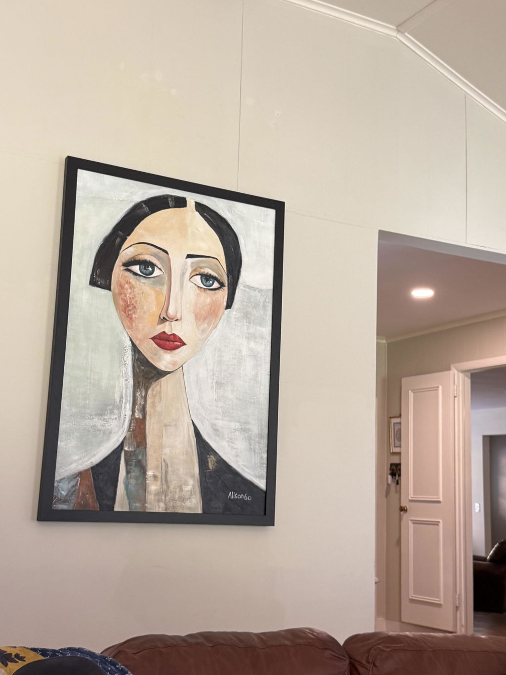
If you are shopping for wabi sabi wall art, the short version is this: look for pieces that feel quiet, imperfect, grounded, and human. In buyer terms, wabi-sabi is less a fixed visual formula and more a way to judge whether the artwork creates ease in a room. Wabi-sabi is usually described as an aesthetic rooted in impermanence, simplicity, and the beauty of imperfection, which is a useful starting point when you are sorting trend language from real fit.
That matters because many shoppers ask what is wabi-sabi wall art when they really want to know whether a piece will work in their home. The most useful answer is that it usually signals muted color, tactile surfaces, soft asymmetry, and a handmade feel. It can be abstract, neutral, organic, or heavily textured, but it should not feel overproduced or overly polished.
What Wabi-Sabi Means for Buyers
For buyers, the value is emotional first. Wabi sabi wall art tends to soften hard interiors, reduce visual noise, and support a slower-feeling space. If that is the effect you want, the style can work in bedrooms, living rooms, entryways, and work areas that need calm without becoming bland.
The same idea shows up in plain-language explainers of wabi-sabi as a philosophy: the point is not perfection, but a more accepting view of natural variation. That is why the shopper's job is not to prove authenticity. It is to decide whether the piece looks calm, restrained, and believable in the room where it will hang.

Philosophy Versus Style
Is Wabi-Sabi an Art Style or Philosophy?
The cleanest answer to is wabi-sabi an art style or philosophy is: both, but it begins as a philosophy. EBSCO frames wabi-sabi as a worldview first, not just a look, and that distinction helps buyers make better decisions. The philosophy values transience, restraint, and natural wear, while the style borrows those ideas and translates them into objects, surfaces, and composition.
Research on a broader aesthetic worldview helps explain why the same artwork can feel wabi-sabi in one room and merely neutral in another. Room context, scale, and surrounding materials all matter. A piece can be visually close to the style without feeling right if the setting is too glossy, too busy, or too high contrast.

For shoppers, that means you do not need a piece to be literally Japanese or traditionally handcrafted to feel wabi-sabi. You do need it to communicate calm, humility, and visual imperfection in a believable way. In practice, the style is most convincing when it avoids symmetry for symmetry's sake, embraces subtle variation, and leaves breathing room in the composition.
Why Buyers Confuse the Two
The confusion often comes from marketing language. A lot of art gets described as wabi-sabi because it is beige, abstract, or textured. But not every neutral piece is wabi-sabi. Buyers usually sense this when something looks trendy but emotionally flat.
Community discussions on Reddit show the same pattern: shoppers often search for the term loosely, then get redirected toward textural abstract and neutral calm pieces. That is useful context, because it reflects how people actually shop for homes, even if the label itself gets used loosely.
If a piece can only be described by color, it may not be enough. If it has a sense of natural movement, softness, and honest material character, it is closer to the idea buyers usually mean when they say wabi sabi wall art.
The Visual Signals to Look For
Texture That Shows Hand-Crafted Depth
The most reliable clue is the overall mood, but texture is usually the first thing buyers notice. A strong wabi sabi abstract painting neutral palette often uses clay, sand, stone, oat, taupe, charcoal, or bone-like tones. Those colors feel stable and easy to layer with wood, linen, plaster, ceramic, and other organic materials.
Texture matters just as much. Buyers looking for earthy textured art for calm homes should pay attention to visible brushwork, layered surfaces, imperfect edges, or depth that suggests hand-built materiality. A flat print can still work, but it usually needs a strong sense of restraint and atmosphere to feel wabi-sabi rather than merely decorative.
Neutral Colors With Soft Contrast
Contrast should feel gentle rather than dramatic. Beige, beige-gray, cream, warm white, muted brown, and soft stone tones usually support the look better than sharp black-white contrast or bright accent colors. In many rooms, that softer range is what lets the art settle in instead of competing with furniture.
Think of the palette as a background for the room's texture, not the main event. A restrained color story helps the surface details do more of the work. That is why some shoppers respond to a wabi-sabi piece even when they cannot describe it precisely: the color is quiet enough to let the texture and composition carry the mood.
Imperfection Without Visual Clutter
Form should feel relaxed. Look for asymmetry, open space, imperfect geometry, or abstract shapes that seem discovered rather than designed to a rigid grid. Works that feel too crisp, too glossy, or too digitally polished often lose the softness that buyers associate with the style.
Avoid pieces that try too hard to look distressed. Artificial aging, muddy finishes, or overdone rustic effects can make art feel staged. Wabi-sabi is not the same as shabby or unfinished. It should feel intentional, not accidental.
Scale and Finish for Calm Rooms
Scale changes how peaceful a piece feels. A larger artwork with minimal movement can create a tranquil focal point, while a smaller piece may feel intimate and collected. Neither is better; they simply serve different rooms.
Matte or softly reflective finishes usually read calmer than glossy ones. If the room already has lots of shine from metal, glass, or lacquer, a quieter finish can make the whole wall feel more grounded. For a deeper look at warm, grounded styling, this guide on wabi-sabi textured paintings for earthy interiors is a useful browse path.
How to Choose One for Your Room
Start With the Room's Job
Choose the artwork based on what the room needs to feel like. In a bedroom, wabi-sabi art should help the room feel slower and softer. In a living room, it can anchor a seating area without competing with furniture. In a home office, it can reduce visual stress while still feeling refined.
If you are shopping for a workspace, this guide to office wall art with textured focus may help you think about concentration and tone. For that kind of room, the question is not whether the art is decorative enough. It is whether it keeps the wall interesting without pulling attention away from the work.
Match Material Feel, Not Just Color
A room with lots of smooth finishes often benefits from artwork with visible texture. A room already full of woven, rustic, or handmade elements may need a quieter piece so it does not become visually crowded. The goal is balance.
If your furniture is sharp and modern, a wabi-sabi piece can add softness. If your room already leans organic and relaxed, choose something understated so the art supports the environment instead of repeating it too strongly. This is where shopping by mood is more useful than shopping by trend.
Use Scale to Control Calm
Scale changes how the art reads from across the room. A large piece with a quiet composition can settle a wall with very little visual effort. A smaller piece can feel more intimate, but it may need help from the surrounding decor to avoid feeling accidental.
If you want the art to quietly settle the space, look for a piece with enough presence to hold the wall without needing bright contrast. If you want a more layered gallery feel, combine a restrained piece with other organic elements rather than filling the wall with many competing images.
For category browsing, abstract wall art paintings and abstract paintings for sale are practical places to compare tone and finish. If you are cross-shopping adjacent moods, the boho collection can also help you separate soft organic styling from more neutral wabi-sabi direction.
Check Whether It Still Feels Like You
The best purchase is not the most on-theme one. It is the one that feels natural in your home over time. A piece can be wabi-sabi in theory but wrong for your room if it clashes with your furniture, lighting, or everyday habits.
To test fit, imagine the art in morning light, evening light, and in the background of daily life. If it still feels calm, honest, and easy to live with, it is likely a good candidate.
When a Piece Is a Good Fit
A piece is a good fit when it gives you the feeling you were looking for before you started shopping. For many buyers, that means the room feels less stiff, less loud, and more complete. Wabi sabi wall art works best when it supports the atmosphere rather than trying to dominate it.
A simple final check helps: does the piece have the mood, texture, palette, and composition you want, and does it still fit the room once you imagine it on the wall? If the answer is yes, you are probably close.
Quick Fit Check
- Calm mood
- Visible texture or surface variation
- Soft, earthy palette
- Restraint in composition
- Good fit for the room's light and finish levels
If you are comparing options, take one more look at Earthen Blanca, Earthen Weave, or Earthen Veil and match the visual language to your room.
FAQs
What Is Wabi-Sabi Wall Art?
It is wall art that uses quiet color, texture, restraint, and some irregularity to create a calm mood. In shopping terms, wabi sabi wall art is less about a strict category and more about whether the piece feels grounded in the room.
Is Wabi-Sabi an Art Style or Philosophy?
It starts as a philosophy and often becomes a style in art and interiors. For buyers, that means the term can describe both the idea behind the piece and the visual cues you see on the page.
What Should I Check Before I Buy?
Look at the image, the finish, the palette, the scale, and the composition. If the listing says wabi-sabi but the piece looks glossy, busy, or highly graphic, it may not match the calm, textural look you want.
What Rooms Fit This Look Best?
Bedrooms, living rooms, reading corners, and home offices usually fit best. These rooms benefit from art that feels soft and settled rather than loud.
If you want a room that feels grounded, gentle, and lived-in, wabi-sabi is worth considering. Start with the mood you want, then choose the texture, tone, and scale that support it.