Textured wall art can work well in an office when it stays calm, fits the wall, and adds depth without turning into visual noise. For most home offices and workspaces, the best office wall art is restrained in color, balanced in scale, and quiet enough to sit behind a desk or camera without competing with screens. The goal is not to make the room louder. It is to give the space a finished, professional backdrop that still feels composed after a full workday.
What Makes Textured Art Work in Offices
Calm Over Clutter
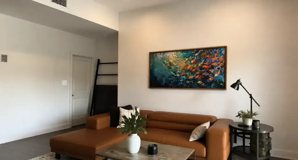
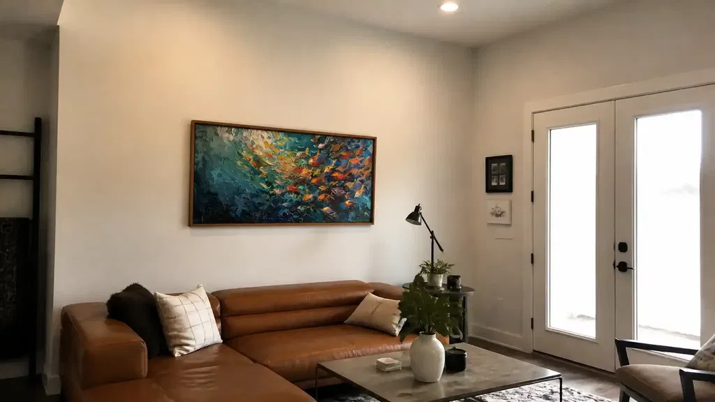
In a workspace, office wall art should act like a steady background, not a second focal point. Pieces with limited contrast and a controlled palette are usually easier to live with near monitors, task lamps, and busy desktop setups. That is why a calm office atmosphere is often a better target than decoration with a lot of movement. WELL’s nature and place guidance supports the idea that nature-inspired visual elements can contribute to well-being in offices, but the practical takeaway is simpler: choose art that feels composed, not distracting.
Texture That Adds Depth
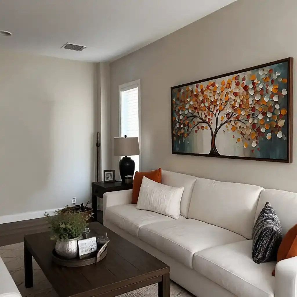
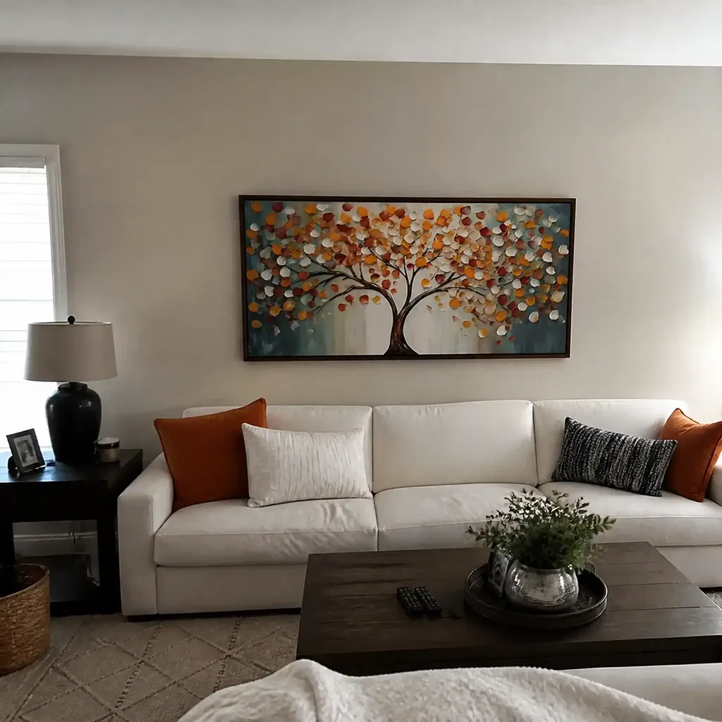
Texture works best when it creates interest through surface variation instead of through loud color or sharp geometry. A little relief can make neutral walls feel intentional, and it can keep a room from looking flat. For a closer look at how surface variation changes the way art reads, see how impasto shadows create depth. In office use, the rule is straightforward: the more demanding the work session, the more the texture should behave like background depth rather than foreground drama.
Color Palettes That Stay Professional
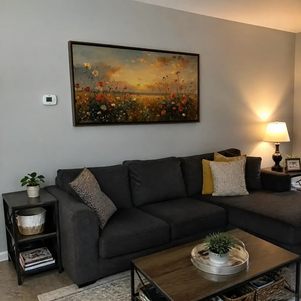
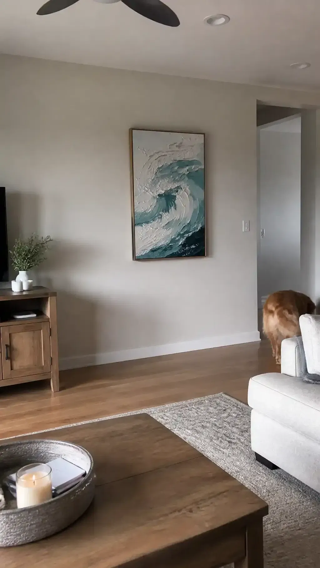
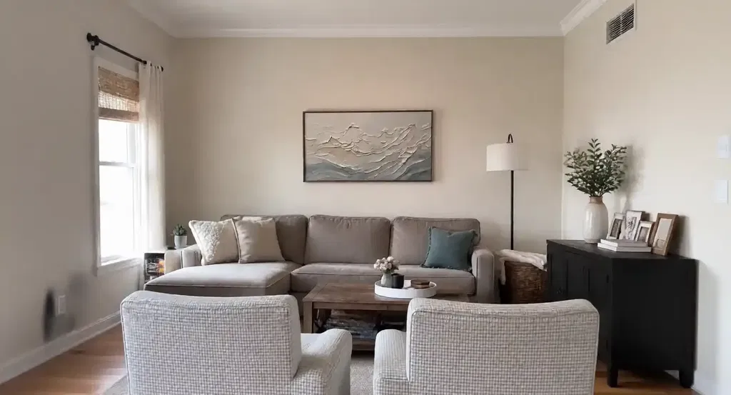
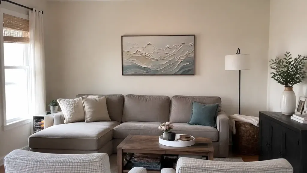
Muted beige, gray, off-white, softened blue, and muted green are common office-friendly directions because they usually stay visually quiet over long hours. That does not mean brighter color is wrong, but it does mean you should ask whether the palette will still feel easy after a week of staring at it between meetings. A restrained palette also helps the piece work with furniture, flooring, and trim instead of fighting them. In a small office, that harmony matters more than trend-driven color.
Size, Scale, and Viewing Distance
Matching Art to Furniture Width
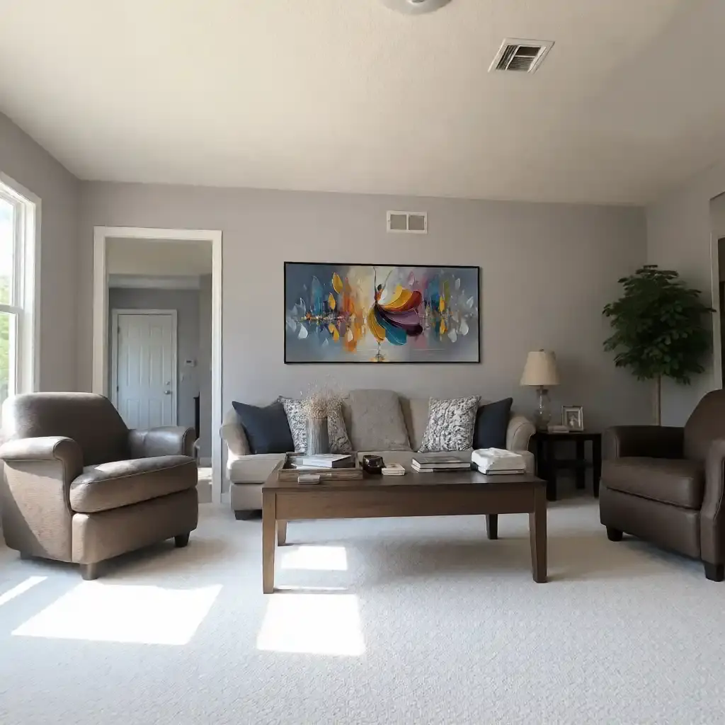
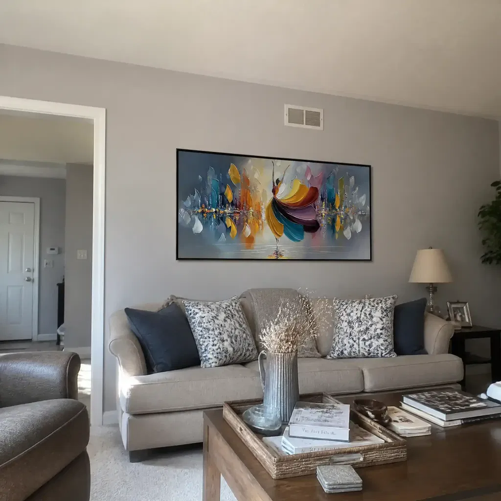
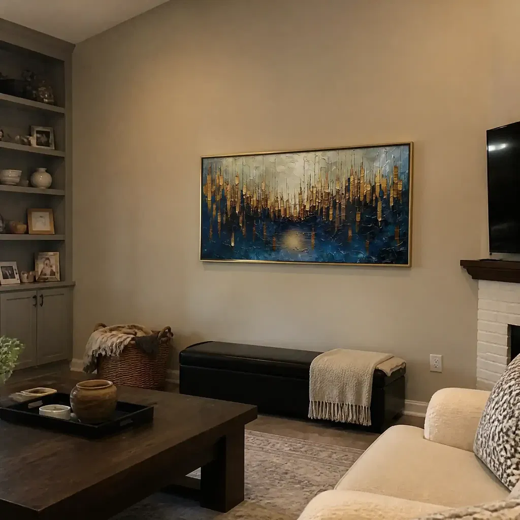
Scale is one of the fastest ways to tell whether office wall art will feel balanced or awkward. A practical starting point is the two-thirds width heuristic: artwork often looks best when it spans about two-thirds of the width of the furniture below it. Use that as a guide over a desk or credenza, not as a rigid rule. If the piece is much narrower, it can feel adrift. If it is much wider, it can overpower the room.
Reading Detail at Desk Distance
Home offices usually put you closer to the art than a living room does, so detail matters more. Fine brushwork, tight patterning, and busy surface movement can read as texture from across the room but turn into clutter when you sit down. That is where the viewing-distance guide helps: if you can see the piece from your normal desk position, the detail should still feel clear, not busy. In smaller rooms, cleaner compositions usually age better because they stay readable at close range.
Choosing One Statement Piece or a Pair
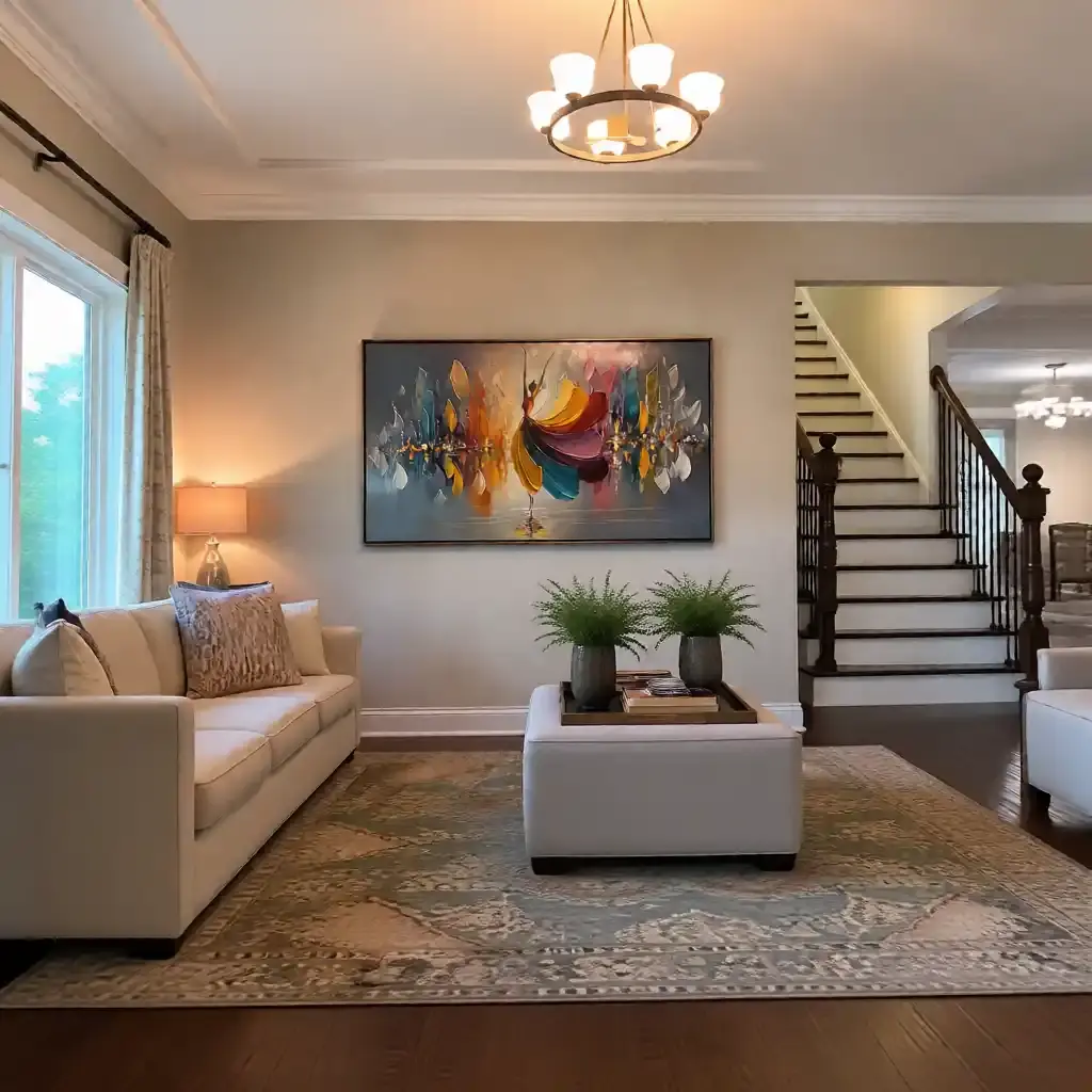
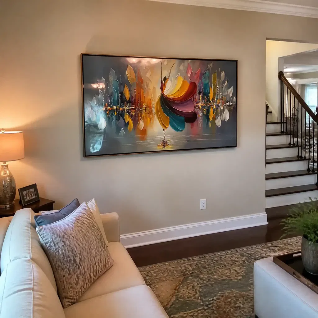
A single larger piece is usually the safer choice when the wall needs a calm anchor. It keeps the room looking intentional and gives the eye one place to land. A paired arrangement can work, but it needs symmetry, spacing, and enough wall width to avoid looking fragmented. Multiple small works are more likely to feel busy in a workspace, especially if they each carry strong contrast or heavy texture. If the room already has a lot of furniture, one focused piece is often enough.
Avoiding Oversized Visual Weight
Large textured art is not automatically better just because the wall is empty. In a compact office, oversized relief or dense composition can make the room feel heavy, especially above a desk. If the wall is broad but the room is small, a lighter palette and more open composition usually keep the space from feeling boxed in. The best office wall art should feel anchored to the room, not like it is taking over the whole work zone.
Texture, Color, and Visual Density
| Office Condition | Best Texture Level | Best Color Direction | Visual Effect | Best Use Case |
|---|---|---|---|---|
| Small home office | Subtle to moderate | Off-white, beige, soft gray | Quiet and light | Behind a desk or on a narrow wall |
| Large executive office | Moderate | Beige, muted blue, muted green | Polished and composed | Credenza wall or private suite focal point |
| Client-facing workspace | Refined, controlled | Neutral with one softened accent | Professional without glare | Visitor-facing wall or reception area |
| Shared work area | Low to moderate | Gray, beige, earth tones | Stable and low-noise | Hallway, collaboration zone, or open-plan buffer |
The easiest way to judge texture and color is to think about how much the piece asks for attention. Matte or lower-reflectivity surfaces are often quieter near screens and task lighting, which is why they tend to work better in offices than glossy finishes do. That is a practical pattern rather than a hard rule, but it is a useful one. When the room already has strong furniture, visible tech, or active circulation, keep the art visually simpler.

If you want a neutral direction without losing depth, neutral wall art styling is a good reference point. In practice, the best office wall art is often the one that looks calmer the longer you stare at it.

Where to Use It in Home and Corporate Spaces
Behind the Desk
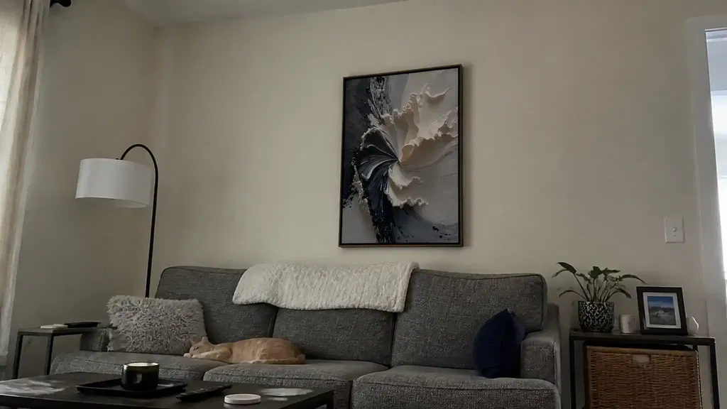
The wall behind your desk is the most sensitive placement because it affects both your own sightline and your camera background. Choose a calm piece with controlled contrast so it frames the workspace instead of fighting it. Strong black-and-white patterning or dense movement can feel lively in a showroom, but it is often too active behind a monitor. For remote workers, controlled contrast for video calls is a useful standard: keep the background clean enough that the art supports the frame rather than becoming the main event.
Client-Facing Walls
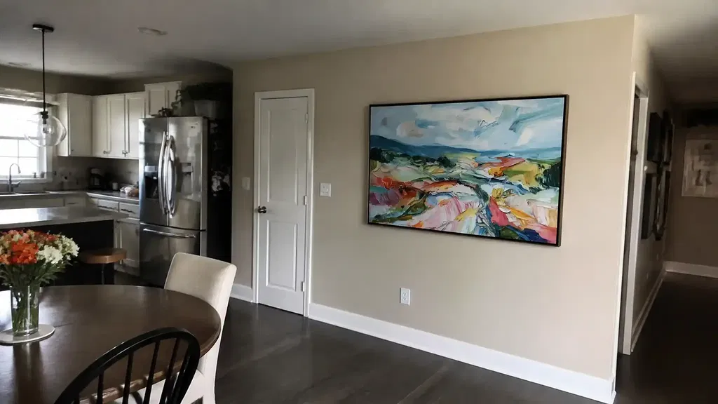
In private offices, consulting rooms, and executive suites, the art can carry a bit more presence, but it still needs discipline. A refined textured piece can signal polish without feeling cold. This is where calm office wall art ideas matter most: the work should look deliberate from the doorway and still feel restrained once someone sits down. If the room is used for meetings, avoid anything that becomes a conversation about the art itself unless that is part of the room’s purpose.
Shared Work Areas
Shared work zones need the lowest visual drama. Multiple people will pass the wall at different angles, and that makes busy texture more likely to read as clutter. A broad, quiet piece can ground the room without distracting from collaboration or circulation. If the area already has a lot of motion, keep the art simple enough that it does not compete with whiteboards, shelving, or open pathways. In these spaces, office wall art should support order first and style second.
Video Call Backgrounds
For camera-facing walls, controlled contrast matters more than fine detail. Busy surfaces can break up on screen and create more visual noise than they do in person. A textured piece with moderate scale, smooth color transitions, and low shimmer usually reads better in compressed video. If the wall is visible in most meetings, this is where restraint pays off most. A piece that looks calm in person and on camera is usually the safest choice for hybrid work.
What to Avoid in a Focused Workspace
There are a few clear not-a-fit signals. If you are highly sensitive to visual distractions, very active texture can work against the calm backdrop you want. If the surface is hard to verify online, buyers often look for side-angle views and brushstroke detail to judge whether a piece is genuinely textured, and that uncertainty can slow the decision. And if upkeep worries you, remember that heavier texture can make dust and cleaning feel more noticeable than on a flat print. Those are practical objections, not dealbreakers for everyone, but they matter.
The safe rule is simple: choose textured wall art when you want depth, but skip the most dramatic surfaces if the room already feels busy or if you do not want extra maintenance attention. In a work setting, the best piece is the one that still feels easy after the novelty wears off. That is especially true for people who spend long hours at a desk or who use the room for client calls.
A Simple Selection Checklist
- Define the wall first: measure the furniture width, open wall area, and where your eyes sit when you work.
- Choose the visual intensity: if the room is busy, keep the texture and contrast lower.
- Match the scale: a piece near two-thirds of the furniture width is usually a practical starting point.
- Confirm the placement: behind a desk, the art should stay calm on camera and at desk distance.
- Compare a few final options before buying: browse neutral office art or modern abstract options.
If you want the quickest path, start with the calmest piece that fits your wall and your camera angle, then compare one or two stronger options against it. That keeps the choice practical instead of overcomplicated.