Wabi sabi wall art feels warm when the palette stays earthy, the texture reads intentional, and the piece supports the room instead of floating above it. If you want calm art that feels organic rather than stark or unfinished, focus first on color, surface depth, and how the work will live beside wood, linen, stone, and other natural materials.
What Makes Wabi-Sabi Feel Warm
Color, Not Just Minimalism
Wabi-Sabi is a Japanese aesthetic that values simplicity, imperfection, and impermanence, and that matters here because warmth usually comes from the way the colors behave, not from minimalism alone.Wabi-Sabi as a design philosophy In warm rooms, earthy neutrals such as sand, clay, taupe, muted olive, soft white, and gentle gray usually feel more inviting than high-contrast black and white. That is why an earthy neutral palette often works better for wabi sabi wall art than a sharper, cooler palette.
The practical check is simple: if your room already leans warm, the art should echo that warmth rather than fight it. A beige-toned piece beside oak furniture or a clay-toned painting near linen drapery usually reads calmer than a hard monochrome piece. In other words, the color should support the materials you already have.

Texture That Softens the Room
Texture is what keeps Wabi-Sabi from feeling flat or overly controlled. Visible brushwork, raised paint, and surface movement can help a wall feel grounded because light catches the texture differently across the day, creating a softer shadow pattern. That kind of texture that casts soft shadow makes the piece feel more lived-in and less like a printed rectangle.
For shoppers, the decision is not "Do I want texture?" so much as "How much surface movement does this room need?" A room with simple furniture and smooth upholstery usually benefits from more visible texture. A room that already has woven rugs, slatted wood, or patterned textiles often needs a quieter surface so the wall does not become visually busy.
What Warmth Looks Like in Practice
Warm Wabi-Sabi art should feel calm, imperfect, and intentional at the same time. It should look like it belongs in the room, not like it was added as an afterthought. That means softened edges, earthy depth, and enough visual variation to feel organic without turning restless.
A good shortcut is to imagine the piece from across the room. If it still reads as soft and grounded from the sofa, bed, or front door, it is probably closer to the look you want. If it only makes sense up close, it may not carry enough warmth or scale for the space.
How to Choose Earthy Wabi-Sabi Artwork
| Room Mood | Best Palette | Texture Depth | Best-Fit Outcome |
|---|---|---|---|
| Soft neutral room | Beige, sand, warm white, light taupe | Subtle to medium | Feels calm and breathable without adding visual weight |
| Warm earthy room | Clay, olive, beige, muted gold, soft brown | Medium | Feels grounded and connected to wood, linen, and stone |
| Warm room needing a focal point | Deeper earth tones with layered neutrals | Medium to bold | Adds presence without turning stark or glossy |
Use that matrix as a fit check, not a ranking. A softer neutral piece works best when the room already has strong texture or strong furniture lines. A richer earth-toned piece is usually the better choice when the wall needs more presence and the rest of the room is still quiet.

For living rooms, the safest choice is often the option that balances warmth and scale. For bedrooms, the better choice is usually the quieter one with lower contrast. Entryways can handle a little more surface movement, but the composition still needs to read quickly because people usually see it in passing.
If you are still deciding how much color you want, start with earthy neutral wall art, then compare it with minimalist wall art if you are trying to keep the room lighter overall.
Styling Wabi-Sabi Textured Paintings in Warm Rooms
Living Room Placement That Feels Grounded
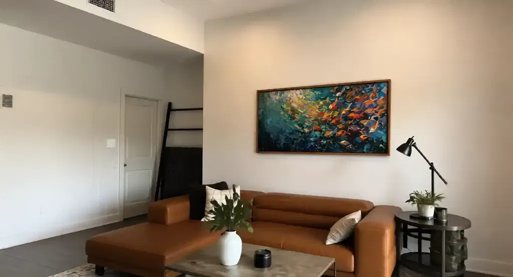
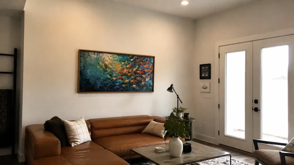
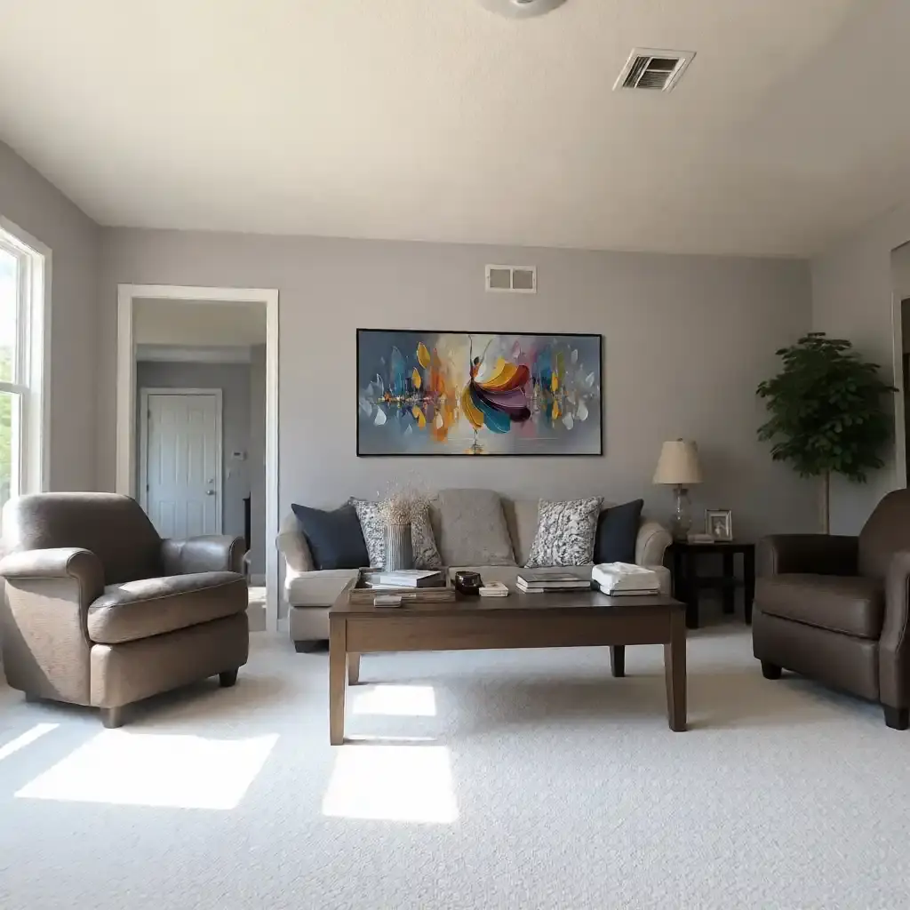
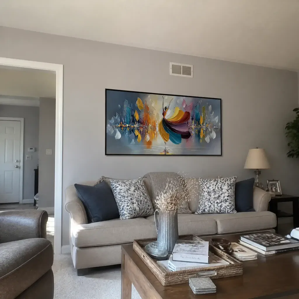
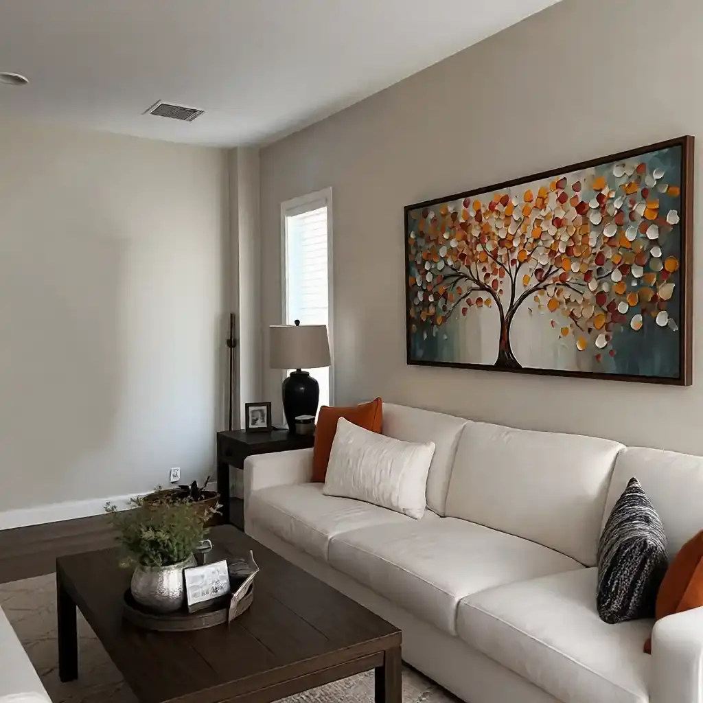
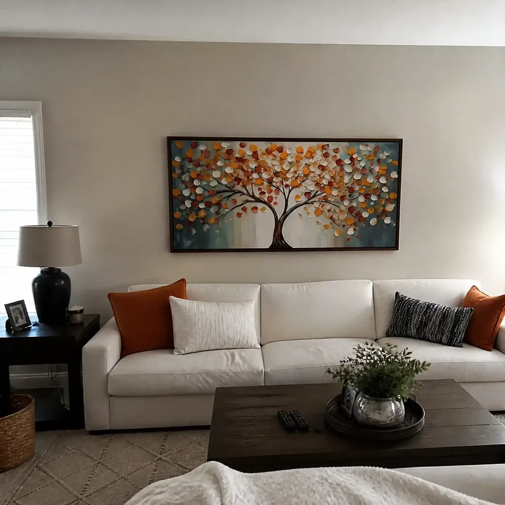
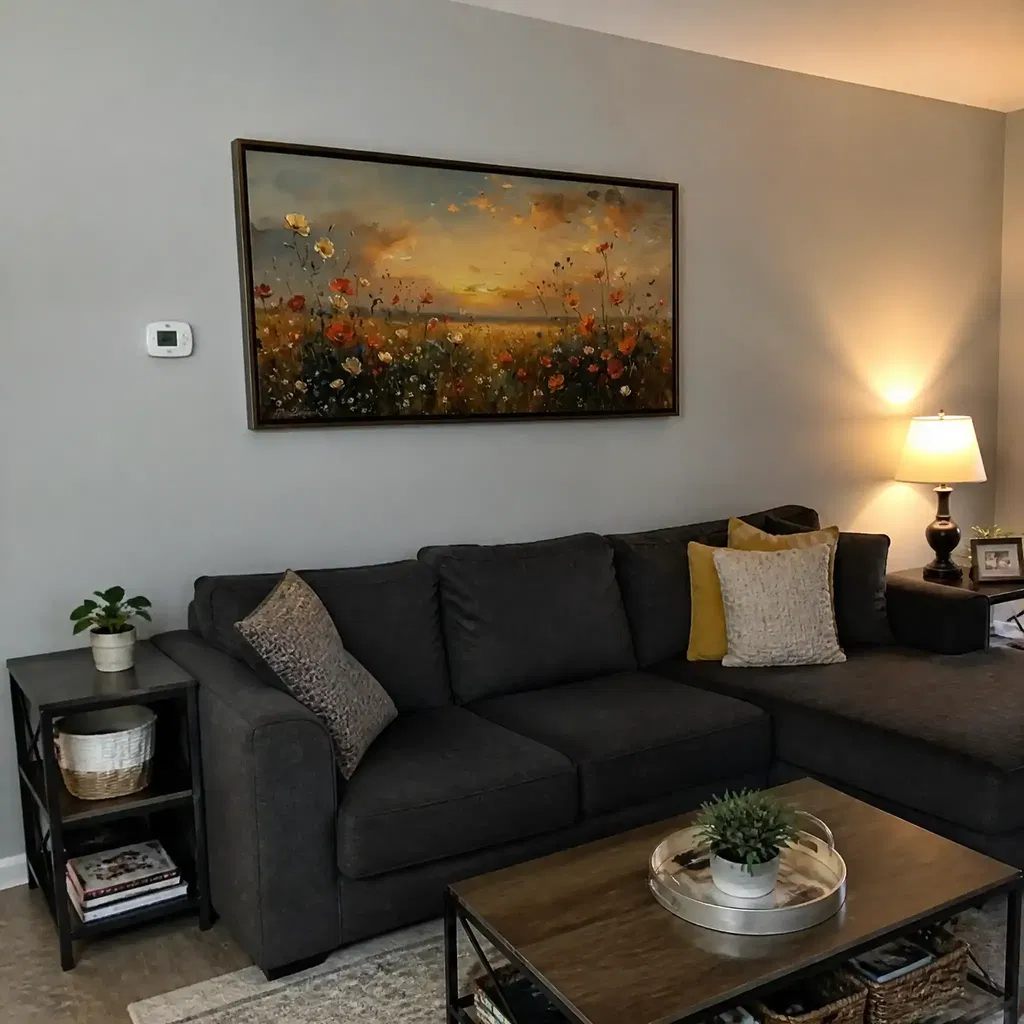
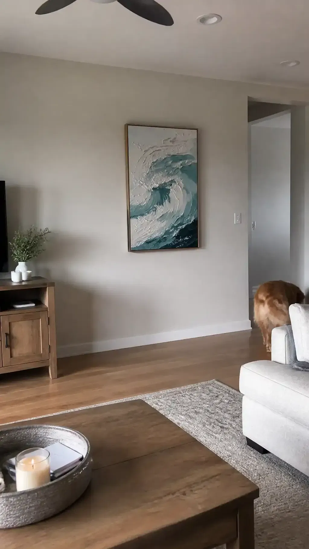
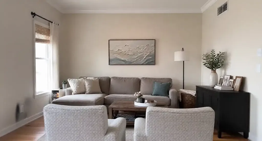
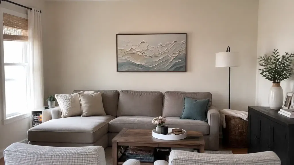
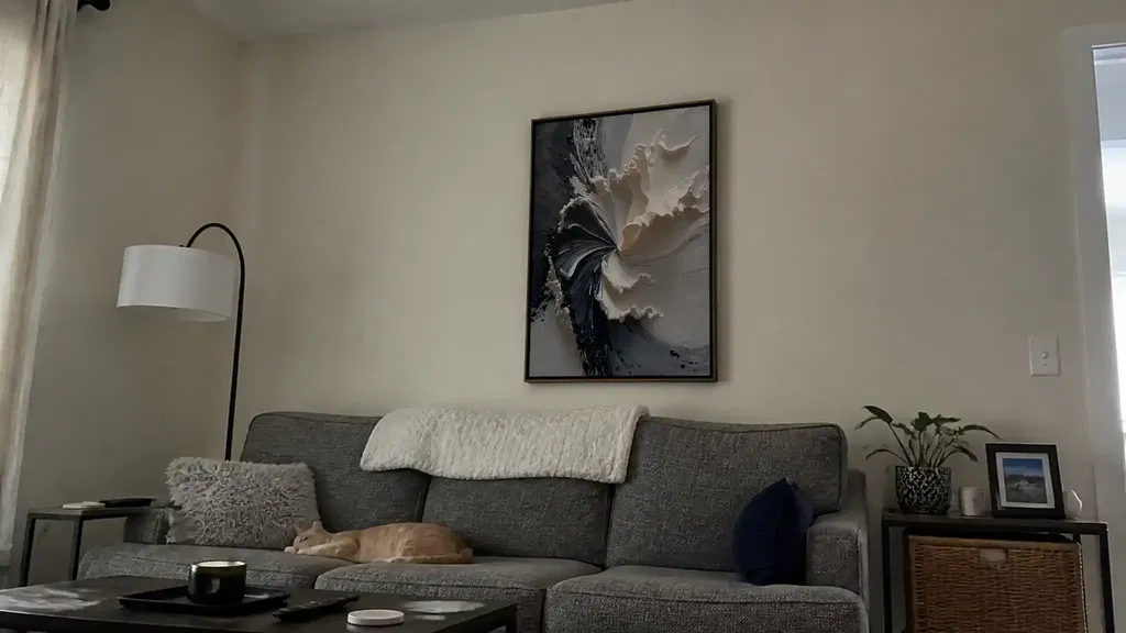
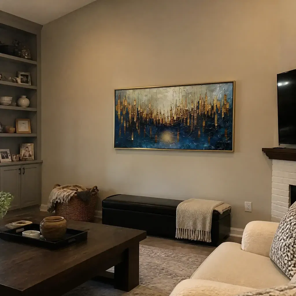
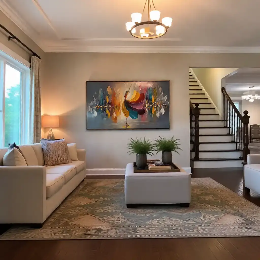
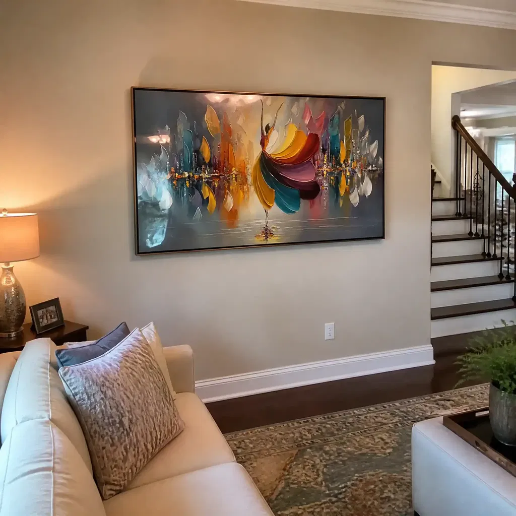
In a living room, Wabi-Sabi textured paintings usually work best when they anchor a seating area or sit above a console with enough breathing room around them. If the wall is large, a single calm focal piece often looks better than several small pieces competing for attention. That is especially true in rooms that already use wood, boucle, linen, or ceramic accessories, because those materials reinforce the same organic mood.
Organic textures in a warm room tend to feel more polished when the artwork and furniture share the same relaxed, hand-touched quality. The goal is not perfect symmetry. The goal is a room that feels layered without feeling crowded.
Bedroom Styling That Stays Calm
Bedrooms need lower stimulation, so a Wabi-Sabi piece there usually benefits from softer contrast and quieter surrounding decor. If the room is already warm and restful, a muted neutral painting can help keep the mood steady. If the room feels empty, a slightly richer earth-toned piece can add comfort without making the space feel louder.
For bedside walls and dresser placements, keep the art aligned with the room's quietest zone. A piece that feels strong enough for a living room may be too active for a bedroom if the surface movement is too busy. The best layering wood, linen, and ceramic usually happens when the artwork echoes, rather than competes with, the rest of the room.
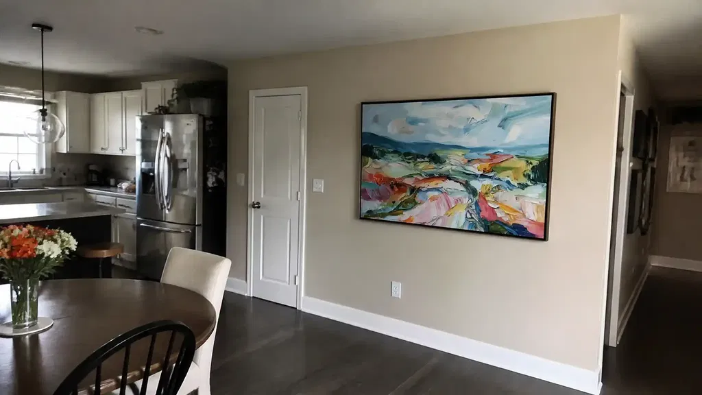
Entryway and Hallway Balance
Entryways and hallways are trickier because they usually have less width, faster traffic, and more lighting variation. A Wabi-Sabi work here should still feel textured, but it should not crowd the wall. One calm piece often does more than several smaller accents, especially if a mirror, bench, or console is already present.
If the area is narrow, choose a composition that reads quickly from a few feet away. If the wall is open and simple, a little more texture can help the piece register before the rest of the room does. That is why the right wall-scale fit matters so much in warmer interiors: the art should complete the space, not compress it.
Choosing Texture Depth Without Going Stark
- Subtle texture works best when the room already has a lot of material warmth. It adds softness without becoming the loudest thing on the wall.
- Medium texture is the safest middle ground for most buyers. It gives the piece enough movement to feel handcrafted without pushing the room toward visual noise.
- Bold texture makes sense when you want the artwork to act as a focal point and the rest of the room stays fairly simple.
A useful buyer check is whether the art still feels warm when you picture it under normal daylight and evening lamps. If the piece only looks good in one lighting condition, it may not be the right fit. Online photos can flatten texture, so side-angle texture proof is one of the most practical checks before you buy.
That also helps with authenticity judgment. Brush marks, uneven surface movement, and visible depth are better signs of an intentional textured piece than a perfectly uniform finish. Wabi-Sabi does not need to look polished, but it should still look deliberate.
For readers comparing surfaces, textured vs smooth canvas is often the real decision. Smooth pieces can work when a room already feels full and layered. Textured pieces usually fit better when the wall needs more presence and the room needs a little more tactile warmth.
Final Checks Before You Buy
- Check the palette against your wood tones, textiles, and wall color. If the art feels colder than the room, look for warmer neutrals or softer contrast.
- Measure the wall area, then compare it with the furniture beneath it. A piece that is too small can look accidental, while an oversized one can crowd a calm room.
- Review side-angle photos and close-ups so you can see whether the surface movement feels subtle, medium, or bold.
- Decide whether you want a softer neutral piece or a richer earthy statement before you add anything to cart.
- If the surface is heavier, plan on gentle dry dusting for textured canvas rather than flat-print treatment, because textured art needs a little more care over time.
If you are ready to shop for wabi sabi wall art, compare earthy Wabi-Sabi options, inspect the texture photos closely, and choose the piece that fits your room's warmth before you add it to cart. That last check usually saves the most regret.
FAQs
What Colors Work Best for Wabi-Sabi Wall Art?
The safest colors are earthy neutrals, muted clay, warm taupe, soft white, and gentle gray. Those tones usually feel calmer in warm interiors than sharp black-and-white contrast. If your room already has strong wood or linen textures, stay closer to the softer end so the wall art supports the room instead of competing with it.
How Do You Style Wabi-Sabi Wall Art in a Living Room?
Place it where it can anchor the seating area, such as above a sofa or console, and give it enough negative space to breathe. If the room already has natural textures, one larger calm piece usually looks more settled than several small pieces. The main check is whether the art helps the seating zone feel finished.
Can Textured Wabi-Sabi Art Work in a Bedroom?
Yes, especially when the piece has lower contrast and calmer surface movement. Bedrooms usually do better with quieter texture than bold focal energy. If you want the room to feel restful, choose a softer palette and place the art where it supports the room's calmest wall rather than its busiest corner.
How Do You Tell Wabi-Sabi From Simply Unfinished Decor?
Intentional Wabi-Sabi usually looks imperfect but balanced. The surface may be irregular, but the palette and composition still feel deliberate. If the piece looks sparse, accidental, or too flat to create visual depth, it may be closer to unfinished decor than to a warm Wabi-Sabi look.
What Size Wabi-Sabi Painting Fits a Warm Neutral Room?
Match the piece to the wall and the furniture beneath it. A small canvas can disappear on a wide wall, while a larger work can make a calm room feel more grounded. If you are between sizes, the better choice is often the one that still feels balanced from your normal viewing distance.