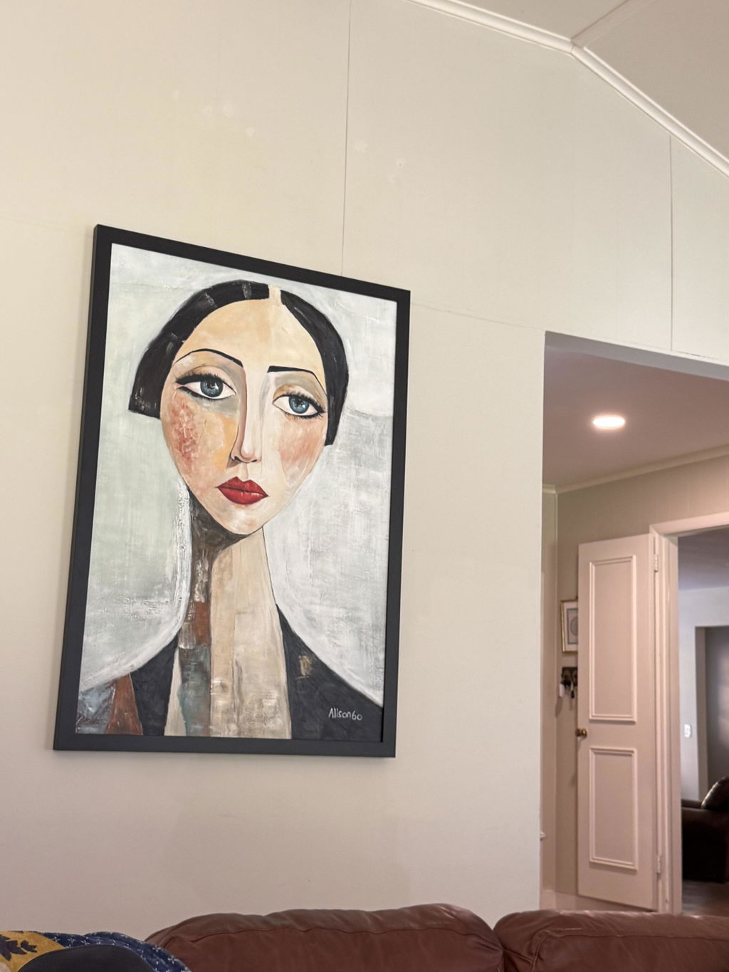
Wabi-sabi wall art works best when you treat it as a room-fit decision rather than just a style choice. The right piece should feel calm, grounded, and natural, but that effect changes depending on wall width, nearby furniture, and the light in the room. If any of those elements are off, the texture can end up looking either too flat or too busy.
What Makes Wabi-Sabi Texture Feel Right
Wabi-sabi texture feels right when it looks quiet rather than perfect. Think soft tonal shifts, visible surface movement, and an intentionally imperfect finish that still leaves the room feeling open. In practice, you are judging how the piece behaves in your space, not just whether the style label sounds right.
A front-on product photo can flatten texture, so look for clues such as side-angle shots, visible brush movement, and subtle changes in surface relief. Those details matter because nearby furniture and wall color can make the same piece feel sculptural in one room and subdued in another. For broader context, these selection rules for serene modern spaces can help you narrow your search before you buy.

A good first filter is simple: if the room already has a lot of visual texture, choose a quieter piece; if the room is very plain, a little more relief can help the art anchor the wall. That is the fundamental decision layer for wabi sabi wall art, and it is more useful than trying to define the style by color alone.
Best Rooms for Neutral Textured Art
Room function dictates how much texture feels appropriate. Living rooms can usually handle a bit more presence because people view the art from farther back and often need a focal point to ground the seating area. Bedrooms work better with softer relief and lower contrast, as the art should support the room's restfulness rather than compete with it.
Living Rooms With a Focal Wall
Living rooms are often the easiest place to use neutral textured art because the wall acts as an anchor for a sofa, console, or media zone. If your furniture is substantial, a slightly larger or more visible texture can feel balanced instead of heavy. A good rule of thumb is to let the art support the furniture's scale rather than floating aimlessly above it.
Bedrooms That Need Quiet Texture
Bedrooms reward restraint. If the piece sits above a headboard or across from the bed, choose texture that reads softly from a few steps away. The goal is calm, not drama. In smaller bedrooms, that often means avoiding high-contrast ridges and opting for a composition that leaves some visual breathing room.
Entryways and Hallways
Entryways and hallways are transitional spaces that ask for quick visual reading. Narrow walls, doors, mirrors, and trim can make a busy surface feel crowded fast. In these spots, slimmer proportions and lighter texture usually work better than a dense, highly sculptural finish.
Small Rooms That Need Breathing Room
Small rooms can absolutely work with neutral textured art, but the piece must remain restrained. If the wall is tight or the room already has patterned textiles, shelves, or lamps, heavy texture can make the space feel cluttered. Neutral wall art options are often the best starting point when you want the room to stay calm.
For shoppers comparing styles, abstract art styles can be a useful browse path, especially if you want a softer mix of shape and surface without leaning too decorative. In small rooms, the best fit is usually the piece that lets the wall breathe.

How Texture Reads at Different Distances
Distance changes whether texture feels subtle, balanced, or overpowering. Up close, you see more of the surface—relief, brush marks, and layered material become part of the experience. Farther back, that same texture needs cleaner proportions, or it can blur into visual noise.
Close-Range Texture
Close-range viewing works best when the texture is detailed but remains calm. That is why reading chairs, bedside walls, and intimate corners can handle a little more surface movement. The piece doesn't need to be loud, but it should reward a closer look.
Mid-Range Viewing
Most living rooms are experienced at mid-range, which is why balanced texture feels most versatile there. The piece can show enough relief to feel intentional without demanding attention from every corner of the room. If your main seating sits across from the wall, that is the viewing distance to optimize first.
Small Rooms Versus Open Rooms
Small rooms need restraint because there is less visual margin for error. Open rooms can handle stronger texture, but only if the composition remains proportionate to the wall. If the art is too small, it disappears; if it is too dense, it dominates. A helpful companion for this sizing judgment is matching detail to room size, especially when you are comparing how much surface detail makes sense from your usual viewing spot.
Light Changes the Texture Story
Lighting changes the story more than most shoppers expect. Side light and accent lighting emphasize peaks, ridges, and brushwork, while softer ambient light can flatten those details. The same neutral piece can feel serene in one room and dramatic in another simply because the light hits it differently. As accent lighting emphasizes texture, the placement of the lamp or window matters as much as the artwork itself.
- Side daylight makes relief feel more dimensional because it skims across the surface.
- Strong direct light creates sharper shadows, which may make the piece feel busier.
- Diffused overhead light tends to soften texture, which is helpful in a room that is already visually active.
- Closer light sources make the texture read more strongly; a lamp or sconce placed too near the art will increase contrast.
- If the room changes throughout the day, test the piece at the time you use the space most.
That last check is vital. A piece that looks serene in the morning may feel more graphic at night under a nearby lamp, especially if the relief is deep. If you want texture to stay quiet, keep the light soft and the beam indirect. If you want the texture to stand out, accent lighting helps, but be mindful of glare or harsh shadows in smaller rooms.
Match Scale and Proportion Before You Buy
Scale is where many well-intentioned art choices go wrong. A piece may be beautiful, but if it is too small for the furniture or too wide for the wall, it will feel off. For furniture-backed walls, start with width first, then consider texture depth.
| Room setup | Scale cue | Texture cue | Common mistake |
|---|---|---|---|
| Sofa wall | Aim for art that covers 2/3 to 3/4 of the sofa width | Medium texture usually reads well from the seating area | Choosing a piece that looks elegant online but feels too small above the sofa |
| Bed wall | Keep the composition broad enough to anchor the headboard | Softer relief works best | Hanging something dense enough to fight the room's restful tone |
| Entry console | Keep the piece visually lighter | Thin or moderate texture is usually enough | Using a heavy statement piece on a narrow wall |
| Narrow hallway | Favor slimmer proportions and simpler surface movement | Low-contrast texture is safer | Letting the art compete with trim, doors, or mirrors |
The 2/3 to 3/4 furniture-width rule is a practical starting point, not a universal law. It helps ensure the art feels anchored rather than lost. Just as important, leave 6 to 8 inches above furniture when hanging pieces over a sofa, bed, or console so the art connects to the furniture instead of hovering too high.
If the wall is narrow or the furniture is small, step down the texture intensity before you scale up in size. Oversized texture can crowd a wall, but undersized art disappears even faster.
Where to Place Wabi-Sabi Wall Art
The best placement is the spot that supports the room's main use without competing with other focal points. Start with the room's purpose, then verify wall width, light, and viewing distance. Ideally, the art should feel tied to an anchor—like a sofa, bed, or console—rather than standing alone in the middle of a busy wall.
- Pick the wall that serves as the room's natural focal area.
- Check if the wall has enough width for the art to breathe.
- Look at the light path at the time of day you use the room most.
- Confirm the piece sits close enough to furniture to feel anchored.
- Stop adjusting when the art feels connected and the surrounding wall still feels open.
When you are ready to browse, shop wall art only after you have checked scale, light, and placement. That order saves you from buying a piece that looks right as a style reference but wrong once it reaches your actual wall.
FAQs
Where Should Wabi-Sabi Art Go in a Room?
Start with the wall that naturally supports the room's main function, usually the wall behind a sofa, bed, or console. The best spot is one that has enough width for the piece to breathe and enough light for the texture to read clearly. If the wall already feels crowded, choose a simpler location instead of forcing a focal point.
Does Textured Art Work in Small Rooms?
Yes, but the texture should be restrained and the composition proportionate. In a small room, a lighter surface, softer relief, or a slimmer frame usually works better than a heavy, highly sculptural piece. If the art starts competing with nearby shelves, lamps, or patterns, it is likely too strong for the space.
What Rooms Suit Neutral Abstract Wall Art Best?
Living rooms, bedrooms, and entryways are the most natural fits because they support a calm, low-clutter look. However, the real test is not just the room name. Check the viewing distance and wall width first, then decide whether the texture should remain subtle or act as a statement.
How Do I Know If the Texture Is Too Strong for My Space?
If the wall feels crowded, the shadows look harsh, or the texture pulls attention away from the room's main use, it is likely too strong. A quick check: step back to your normal viewing spot and see if the piece still feels calm. If it only works up close, it may be too much for the room.
Can Neutral Textured Art Work in Bright Light?
Yes, but bright direct light can make the surface look busier by sharpening shadows and glare. If the room gets strong daylight, place the art where the light skims it gently rather than hitting it head-on. That keeps the texture visible without making the piece feel harsher than intended.