The Viewing Distance Guide: Matching Detail to Room Size
In our years of consulting with homeowners, we’ve noticed a curious shift in how people approach art. The era of the "vanity auction piece"—the $10 million canvas destined for a climate-controlled vault—is retreating. In fact, high-end auction sales plummeted 44% year-over-year in 2024, according to Marketplace. Instead, we are seeing a return to "real application value." People want art that lives with them, breathes with their architecture, and—crucially—photographs beautifully for the digital "galleries" of their social feeds.
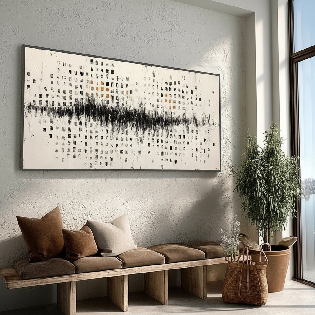
However, the most common frustration we hear isn't about the art itself; it’s about scale and detail. A piece that looked exquisite on a smartphone screen suddenly feels "noisy" and overwhelming in a small powder room, or "empty" and simplistic in a high-ceilinged foyer. This disconnect happens because most people choose art based on a static image rather than the dynamic way they actually move through a room.
To solve this, we use what we call the "Six-Foot Rule" and a rigorous mapping of sightlines. By understanding the relationship between brushstroke precision and physical distance, you can ensure your hand-painted mural or canvas feels intentional from across the room and rewarding from six inches away.
The Science of Sight: Why Detail Matters
When we talk about "detail," we aren't just being poetic; we’re talking about the limits of human biology. Your ability to resolve fine lines depends on your visual acuity and the density of photoreceptors in your eye.
Modeling Note: The Visual Acuity Variance While standard design rules assume a "universal" viewer, our scenario modeling acknowledges that individual vision varies wildly. Research on human photoreceptor topography shows that foveal cone density—the cells responsible for sharp central vision—ranges from 100,000 to 324,000 cones/mm².
Parameter Value/Range Unit Rationale Foveal Cone Density 100k - 324k cones/mm² Biological variance in detail resolution Optimal Viewing Distance 1.5 - 2.5 x Image Height Standard ergonomic heuristic Residential Lighting 300 - 500 Lux Typical ambient light for detail perception Detail Threshold 1/8 Inch Minimum brushstroke width for clarity at 8ft Perception Shift 25 - 30 % Detail loss in direct south-facing sunlight
This biological variance means that a "perfect" viewing distance is a myth. Instead, the goal is to provide enough "performative authenticity"—real, tactile brushstrokes—that the eye remains engaged regardless of where the viewer stands.
The 1/8-Inch Threshold
Based on our practical observations in residential installations, there is a specific threshold for brushwork. We’ve found that brushstrokes finer than 1/8 inch tend to "melt" into a flat color block when viewed from further than 8 feet in average home lighting. Conversely, strokes wider than 1/2 inch can appear crude or "unfinished" when you’re standing in an intimate space like a hallway.
For most living areas, we recommend a stroke range of 1/4 to 3/8 inches. This creates a "sweet spot" where the texture is visible enough to prove it's 100% human-made—avoiding the 62% value drop associated with AI-generated art—while maintaining compositional coherence from a distance.

Mapping Your Room’s Dynamic Sightlines
The biggest mistake we correct is clients measuring a wall and then buying a piece that fits the "hole." Art shouldn't just fit the wall; it should fit the path of the person in the room. We suggest mapping three key viewing points before committing to a specific level of detail.
- The Primary Entry/Transition Zone: This is the "first impression" spot—the doorway where you first see the wall. Here, the art needs a strong "macro" composition that reads clearly from 10–15 feet away.
- The Main Seating/Activity Area: This is where you spend 90% of your time. If your sofa is 6 feet from the wall, the art needs "micro" details—those subtle shifts in pigment and texture—that keep the eye busy during long periods of rest.
- Passing Circulation Paths: These are the spots where you glance at the art while moving (e.g., a hallway or the path to the kitchen). These require "rhythmic" detail that feels coherent even in a split-second peripheral view.
The Impact of Natural Light
The direction of your windows also dictates how much detail you can "afford." In our experience, north-facing rooms with diffuse, consistent light can support roughly 25–30% finer detail than south-facing rooms. In south-facing spaces, direct sunlight often "washes out" subtle gradients and creates harsh shadows on heavy impasto (textured) surfaces, making fine details harder to perceive.
Texture as the Soul of the Space
Why do we insist on hand-painted texture over high-definition prints? It comes down to what the University of Chicago calls "essential identity." Their research suggests that digital replicas lack the artist's "soul" or essence, which causes a collapse in perceived value.
From a technical standpoint, the microtopography of an oil or acrylic painting—the actual millimeter-scale peaks and valleys of the paint—interacts with your room's lighting in a way a flat print never can. According to optical theory, when pigment particles approach half the wavelength of visible light, the scattering and opacity reach their theoretical extremes. This is why a hand-painted "Titanium White" looks deeper and more vibrant than a CMYK printed white; the physical refractive index of the actual pigment creates a sense of life.
Furthermore, viewing high-quality art isn't just an aesthetic choice; it’s a neurological intervention. A systematic review published in PMC shows that passive art viewing consistently activates the medial prefrontal cortex (mPFC) and the amygdala, which helps regulate emotional circuits. In short: the right texture in the right room literally makes you feel better.

Managing the Risk: The Preview-and-Approve Process
We understand that "performative authenticity" comes with a side of anxiety. Unlike a mass-produced print, every hand-painted piece is unique. This is why we’ve moved away from the "buy and hope" model of traditional e-commerce.
By using a preview-and-approve workflow, you can see the actual brushwork of your specific piece before it ever leaves the studio. This allows you to verify that the detail level matches your room's dimensions. If the strokes look too "loose" for your intimate home office, or too "tight" for your grand double-height living room, adjustments can be made. This process bridges the gap between the unpredictability of fine art and the assurance of a premium consumer experience.
Health, Safety, and the "Invisible" Details
When you bring a large-scale hand-painted work into your home, you aren't just adding color; you're adding chemistry. We take a "hardcore" stance on material safety because indoor air pollution can be significantly higher than outdoor levels.
The Low-VOC Promise
Traditional oil paints often rely on mineral spirits and turpentine, which the CDC and NIOSH warn can lead to central nervous system issues over chronic exposure. We prioritize water-based acrylics and low-VOC (Volatile Organic Compound) sealants.
Logic Summary: Our commitment to air quality is aligned with EPA guidelines, which state that low-VOC materials are essential for healthcare facilities seeking LEED certification. We apply that same standard to your living room.
| Hazard Type | Material | Risk Level | Mitigation |
|---|---|---|---|
| VOC Emissions | Traditional Solvents | High | Use of water-based mediums |
| Heavy Metals | Cadmium/Lead Pigments | Severe | Strict use of non-toxic alternatives |
| Microplastics | Acrylic Runoff | Moderate | Eco-friendly studio filtration |
| Dust | Dry Pastels/Pigments | Moderate | Wet-medium application only |
We also strictly avoid "poison pigments." While the industry sometimes tries to "whitewash" the risks of heavy metals, Australian officials have proven that even "insoluble" pigments like Cadmium Yellow can release free ions in certain environments. Choosing art that uses modern, safe pigment chemistry ensures your "camera-ready" room is also a healthy one.
The ROI of Authenticity
Finally, let’s talk about the "social proof" and economic value of your walls. Beyond the immediate mood improvements—73% of people report significant mood boosts in art-filled environments—there is a direct link to property value.
A Royal Society analysis found that neighborhoods with high "art" geo-tags saw greater relative house price gains. While your living room mural isn't a public installation, the same principle of "creative placemaking" applies. A hand-painted piece signals a level of craftsmanship and investment that mass-market decor cannot replicate. It turns a "house" into a "curated residence."

Finding Your Perfect Match
Choosing the right art is a balance of biology, physics, and personal narrative. By following the "Six-Foot Rule" and considering your room's specific sightlines, you can move past the uncertainty of online shopping.
Remember:
- Small, intimate spaces (Powder rooms, hallways) require finer, more controlled brushwork (1/8" - 1/4").
- Large, open spaces (Great rooms, foyers) benefit from bold, expressive impasto (3/8" - 1/2"+).
- Dynamic paths require a composition that "reads" from multiple angles.
If you’re unsure, lean into the texture. The human eye is incredibly good at spotting the difference between a flat digital print and the "essential identity" of a hand-painted work. Trust the brushstrokes—they are the evidence of a human life spent creating something specifically for your space.
Disclaimer: This article is for informational purposes only. While we discuss indoor air quality and low-VOC paints, this does not constitute professional medical or environmental safety advice. Always ensure your space is properly ventilated during any home improvement project.


