The New Paradigm of Art Collecting: From Assets to Environments
The global art market is undergoing a fundamental structural shift. For decades, high-end collecting was often synonymous with "art as an asset"—a purely financial instrument traded in sterile auction houses. However, recent data suggests a retreat from these overpriced vanity pieces. According to Marketplace, high-end auction sales for works over $10 million plummeted 44% year-over-year in 2024. Buyers are returning to real application value, prioritizing emotional resonance and the tactile authenticity of artworks that enhance their immediate living environments.
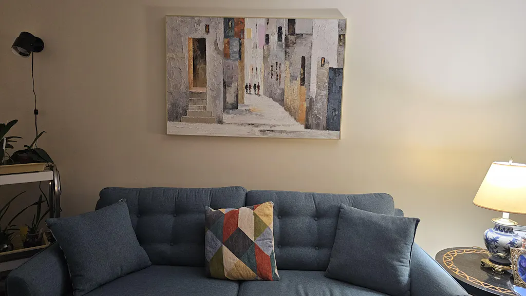
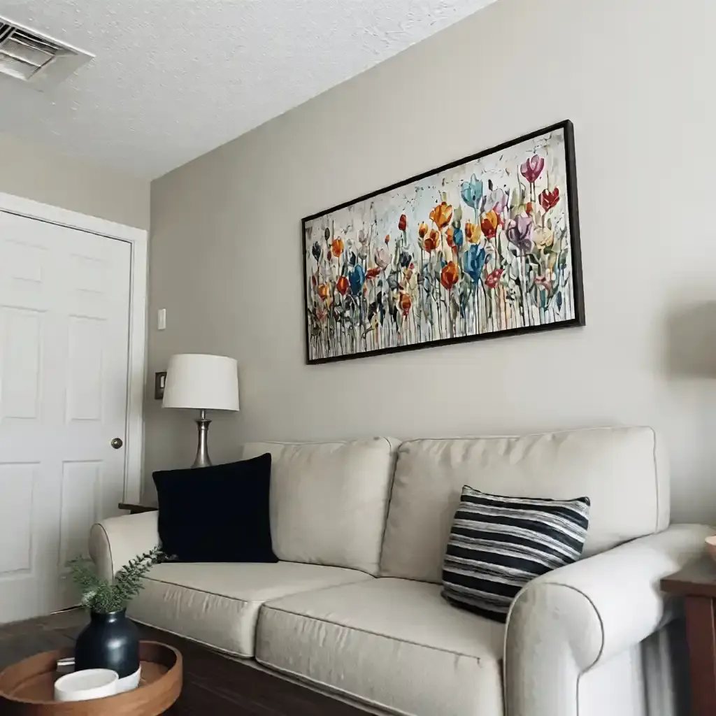
As homeowners and interior designers move away from the "speculative flip," the challenge shifts to curation. How do you build a cohesive residential gallery that feels intentional rather than accidental? The answer lies not in matching colors or subjects, but in Texture Continuity.
At MontCarta, we observe that the most successful high-end collections are linked by the physical behavior of the paint itself. By focusing on the "micro-topography" of the canvas—the ridges, valleys, and shadows created by the artist’s hand—you can bridge the gap between a minimalist abstract and a traditional landscape. This article explores the technical and psychological mechanisms of brushwork continuity and how it serves as the ultimate "decision safety" tool for modern curators.
The Neural Signature: Why Our Brains Seek the "Hand-Made"
The preference for hand-painted texture is not merely an aesthetic choice; it is hardwired into our neurobiology. A landmark consumer perception study by Columbia University confirmed that consumers value art labeled "AI-generated" 62% lower than authentic human-created art. This "value collapse" occurs because digital replicas lack what researchers at the University of Chicago call "essential identity"—the irreplicable soul and physical history of the artist’s labor.
From a neurological standpoint, viewing the physical relief of oil or acrylic paint activates specific emotional regulation circuits. A systematic review of 85 records published in PMC shows that passive art viewing consistently lights up the medial prefrontal cortex (mPFC) and the amygdala. The human brain recognizes the "neural illusion suppression" and the top-down visual selection required by a master painter to create 3D effects on a 2D surface. When we see a heavy impasto stroke, our brain subconsciously reconstructs the gesture that made it, creating a deeper empathetic connection than a flat print could ever evoke.
Logic Summary: Our emphasis on hand-painted texture is grounded in the "essential identity" theory. We assume that the tactile nature of paint serves as a proxy for human presence, which directly correlates to higher perceived value and emotional ROI.

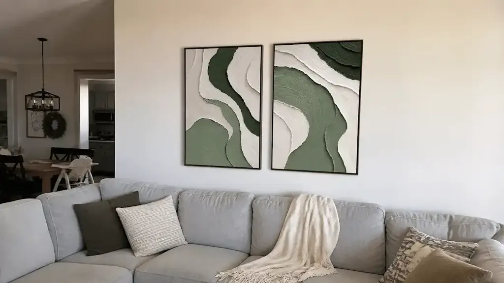
The 70% Texture Ratio: A Heuristic for Visual Cohesion
One of the most common frustrations for designers is the "style mismatch" that occurs when diverse artworks are placed in the same sightline. To solve this, we utilize a practical baseline we call the Texture Ratio.
Defining Stroke Speed and Build-Up
Texture continuity is maintained by ensuring at least 70% of a collection shares a similar "stroke speed" and "build-up."
- Stroke Speed: The rhythmic energy of the marks. Are they long, sweeping palette knife movements, or short, rhythmic dabs?
- Build-Up: The physical thickness of the pigment.
In our studio experience (based on patterns from thousands of custom commissions), we have found that mixing a heavy impasto piece with a flat, thin-wash painting often breaks the "authentic" narrative. The thinner piece can inadvertently look like a print by comparison. To maintain the illusion of a single, curated collection, the "handwriting" of the texture must remain consistent even if the subjects vary.
The Continuity Matrix (Heuristic Model)
| Aesthetic Goal | Shared Texture Parameter | Tolerance for Subject Variance | Rationale |
|---|---|---|---|
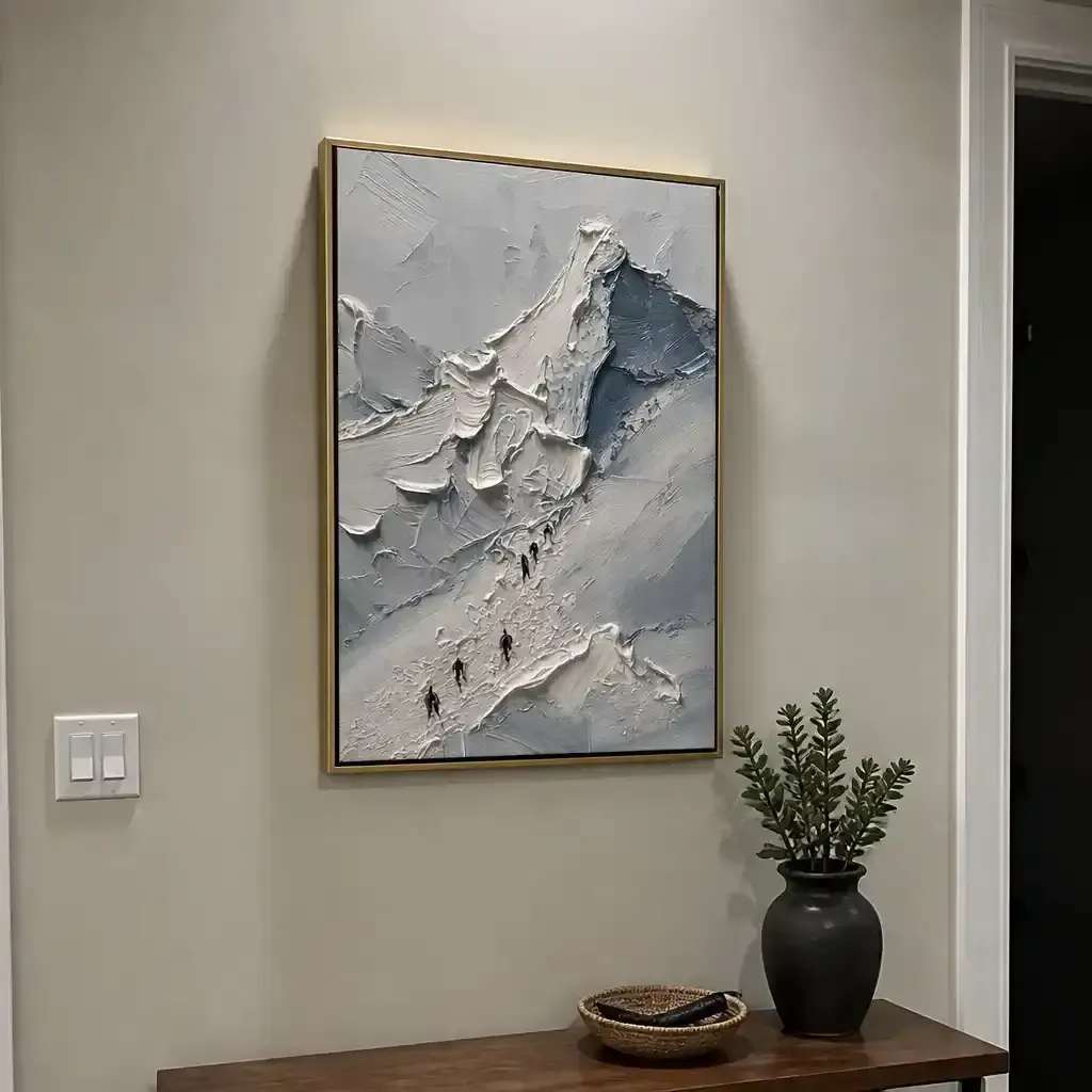
| High-End Gallery | Heavy Impasto (>2mm relief) | High (Abstract + Figurative) | Physical depth creates a unifying "3D" language. |
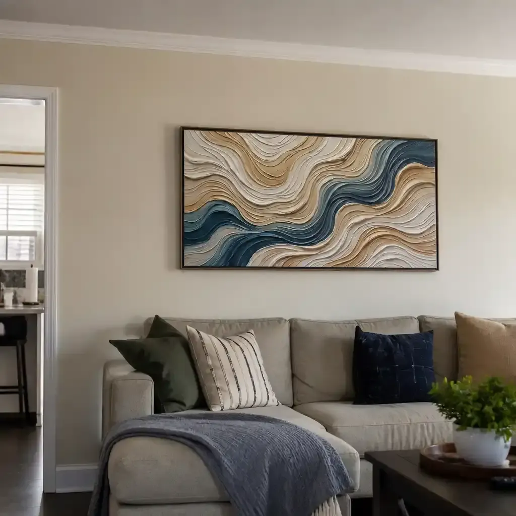
| Minimalist Calm | Rhythmic Dry-Brush | Low (Monochromatic) | Subtle texture prevents the space from feeling "cold." |
| Eclectic Designer | Consistent Stroke Speed | Very High (Mixed Media) | Gestural rhythm links disparate eras and styles. |
| Corporate/Wellness | Biophilic Landscapes | Medium (Nature Themes) | Texture mimics natural fractals, reducing stress. |
Note: This table represents a shop practical heuristic for quick selection, not a mandated museum standard.
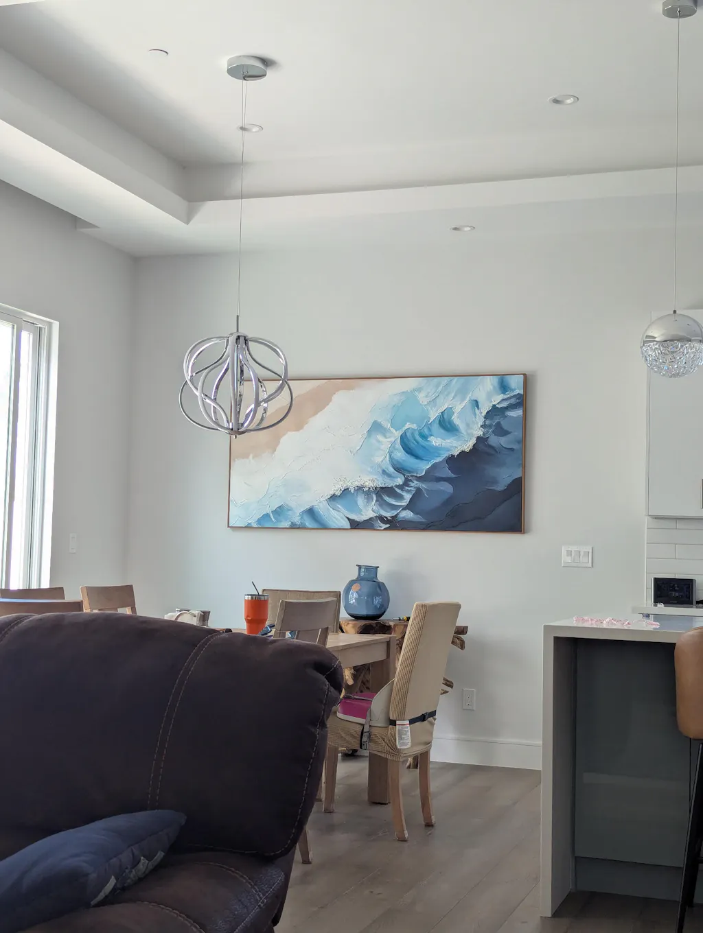
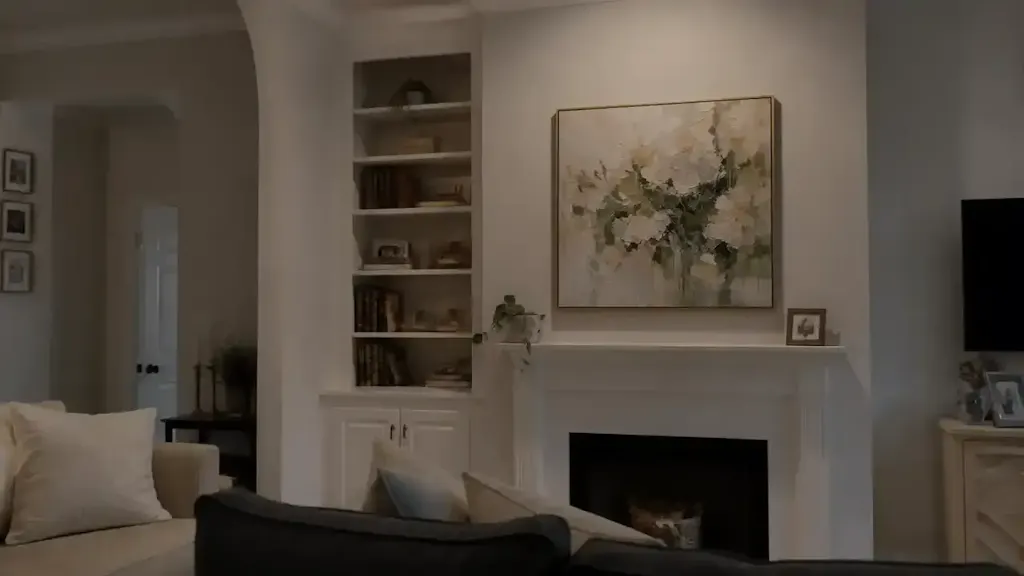
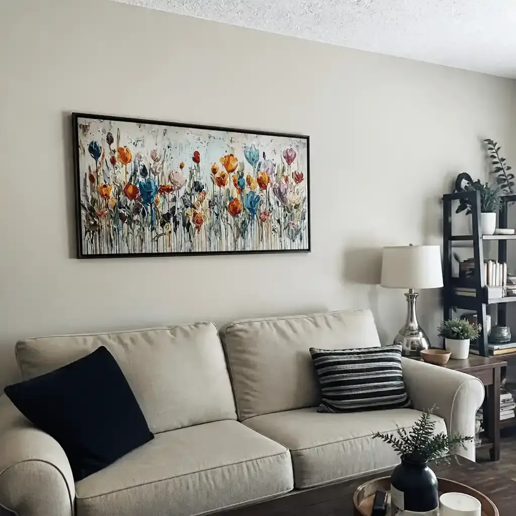
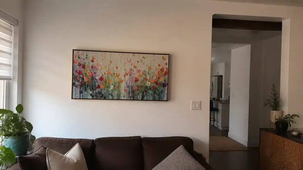
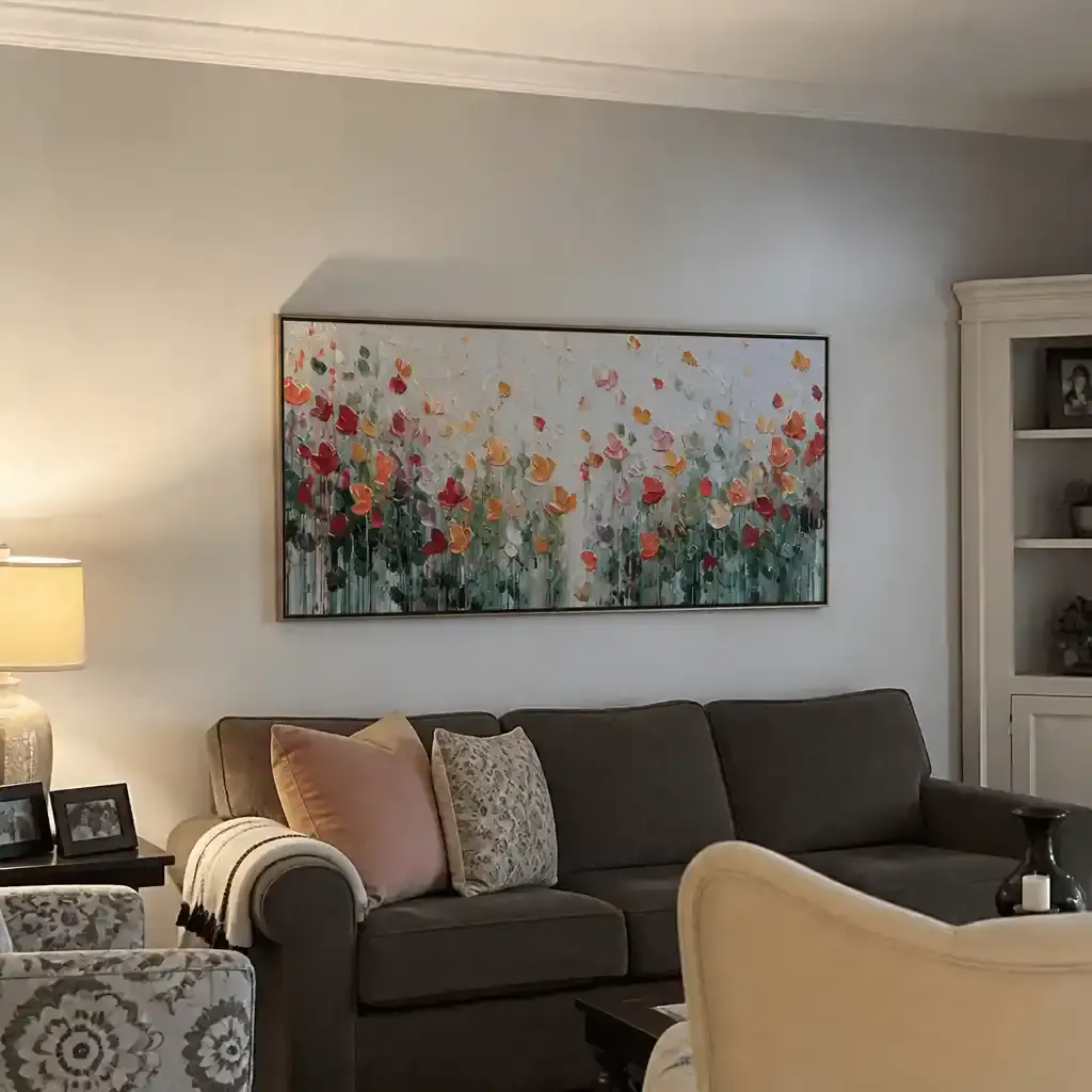
Bridging the Gap: Linking Abstracts and Landscapes
The most sophisticated home galleries often feature a mix of genres. Texture allows you to place a Dali-inspired surrealist piece next to a minimalist landscape without visual friction.
When we create made-to-order artworks, we often advise clients to balance heavily textured art with minimalist decor by matching the pigment thickness. If your focal abstract has 3mm high ridges, your secondary landscape should feature similar "impasto highlights" in the clouds or foliage. This creates a physical continuity that the human eye registers as a single collection before it even processes the subject matter.
This strategy is particularly effective in curating art for shared living and workspace areas, where the goal is to create a professional-grade environment that signals success and stability.

The Science of the Surface: Optical Scattering and 3D Relief
Why does hand-painted art "glow" in a way that prints do not? The answer lies in the physics of light. According to classical optical theory published in Optica, the scattering capability and opacity of a pigment reach their theoretical extremes when the particle diameter approaches half the wavelength of visible light.
Hand-painted pigments, especially those using high-quality titanium dioxide (which dominates 90% of the white pigment market due to its hiding power), interact with light in three dimensions. The "micro-physical texture" of the paint film creates "geometric metamerism"—the way a color appears to change as you move around it.
Furthermore, research from the MUNCH Museum confirms that interacting with art replicas featuring physical relief textures exponentially stimulates intrinsic motivation and satisfaction. By choosing made-to-order art with real depth, you are investing in a surface that is "alive" with light.
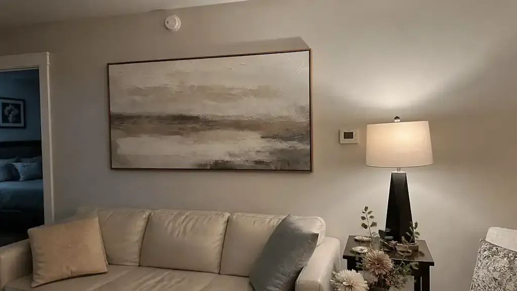
Professional Curation: The Raking Light Technique
To evaluate texture continuity, professional curators use a method called Raking Light. This involves placing a light source at an acute angle (15-20 degrees) to the canvas. This technique exaggerates the shadows cast by the impasto strokes, revealing the true "DNA" of the brushwork.
How to Use Raking Light at Home
- Angle: Position a floor lamp or spotlight so the light "skims" the surface of the painting.
- Shadow Analysis: Look for the length and direction of the shadows.
- Cross-Comparison: If the shadow patterns on two different paintings share a similar "frequency" or "rhythm," they will feel unified on the wall.
Proper lighting is essential for spotting embellished prints. A real oil painting will show complex, organic shadow structures, whereas a "gel-coated" print often reveals a repetitive, mechanical pattern that lacks the depth of genuine pigment build-up.
Health, Safety, and the "Clean" Canvas
As aesthetic-driven homeowners, the air quality of your home is as important as its visual beauty. Many commercial paints and low-quality art supplies contain high levels of Volatile Organic Compounds (VOCs). The EPA warns that indoor air pollution can be significantly higher than outdoor levels, making low-VOC paints a prerequisite for healthy living.
The Indoor Air Quality (IAQ) Promise
At MontCarta, we prioritize materials that align with modern health standards. Research from Aalto University proves that coatings on wood with 16% moisture emit significantly lower toxic VOCs during curing. We also steer clear of dangerous heavy metals. While cadmium pigments are classified as Group 1 carcinogens by the IARC, modern high-performance alternatives provide the same vibrancy without the neurological risk.
By using eco-friendly alternatives like walnut oil or water-based acrylics, we ensure that your new gallery wall contributes to a "healing environment." This is particularly relevant for biophilic design, where nature-themed murals have been shown by UPenn to reduce patient stress by 61%.
Methodology Note (IAQ Modeling): Our safety recommendations are based on EPA and Aalto University chamber experiments. We assume a standard residential room volume with average ventilation rates.
The Economic Impact: Art as Real Estate Leverage
Beyond personal enjoyment, texture continuity offers a significant emotional ROI in real estate staging. A study by the Royal Society using a CAR model found that neighborhoods with higher "art" geo-tags had greater relative house price ranking gains.
In the commercial sector, top developers are using unique public art installations as "marketing trump cards" to lease office space (Source: NAIOP). A single, well-placed hand-painted mural can turn a physical wall into a commercial landmark, driving foot traffic and social cohesion.
Ethical Sourcing and the Creative Economy
When you choose a made-to-order artwork from a studio that values its artists, you are supporting a sustainable creative economy. A Wharton School survey found that 87% of consumers agree artists should receive fair compensation.
The creative industry is a massive economic driver, with U.S. arts industries adding $1.2 trillion to the GDP in 2023 (Source: NEA). However, freelance artists remain vulnerable. By purchasing directly from studios that provide equal pay and fair profit shares—especially for women artists, who still face a significant gender pay gap—you ensure that your collection is built on ethical foundations.
Preserving the Narrative: Maintenance and Longevity
Hand-painted textured art is an investment in "cultural heritage." To ensure its longevity, it is vital to understand the chemistry of the paint film.
- Acrylic vs. Oil: Acrylic polymers form films through "coalescence," making them more resistant to embrittlement than oil films, which undergo oxidative cross-linking (Source: JustPaint).
- Cleaning: Research from Tate suggests that gently wiping acrylic surfaces with water-based cotton swabs can remove surfactants that cause "haziness," actually helping to preserve the paint film.
- Curing Timelines: For interior designers, planning for installation and curing timelines is crucial to prevent damage to heavy impasto layers during transport.
Creating Your Home Gallery
Building a cohesive art collection is a journey from buying isolated objects to creating a curated narrative. By using Texture Continuity as your guiding principle, you can move past the fear of "style mismatch" and embrace the tactile authenticity that defines high-end residential design.
Whether you are seeking the professional success signaling of a large-scale abstract or the healing calm of a biophilic landscape, remember that the brushstroke is the invisible thread that binds your home together.
Disclaimer: This article is for informational purposes only and does not constitute professional health, legal, or financial advice. Readers should consult with qualified professionals regarding indoor air quality, property investments, or the handling of potentially toxic materials.