Chromatic Narrative: Linking Artworks Through Color Theory
The global art market is undergoing a fundamental structural shift. While high-end auction sales for purely financial "vanity assets" plummeted 44% year-over-year in 2024, according to Marketplace, we are seeing a powerful return to real application value. Homeowners and designers are moving away from isolated, speculative purchases toward integrated, hand-painted collections that serve a narrative purpose.
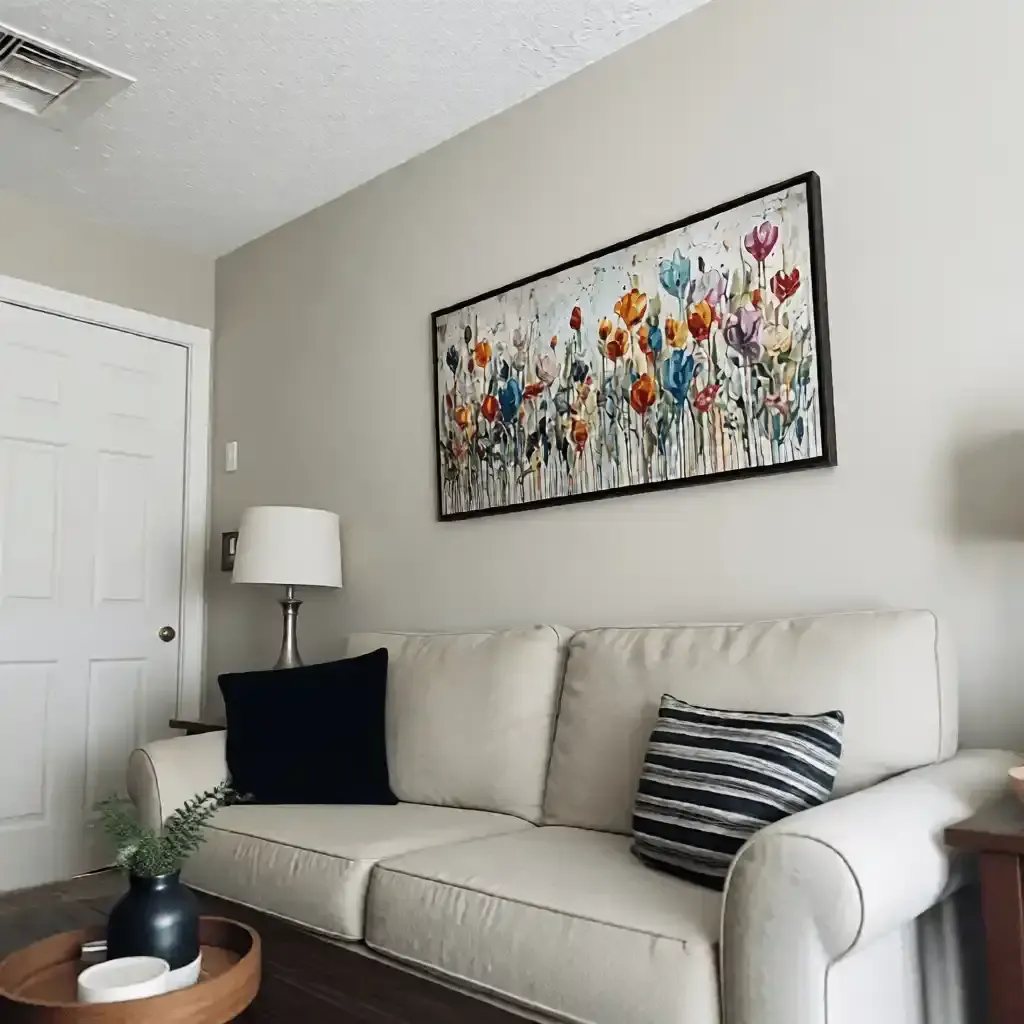
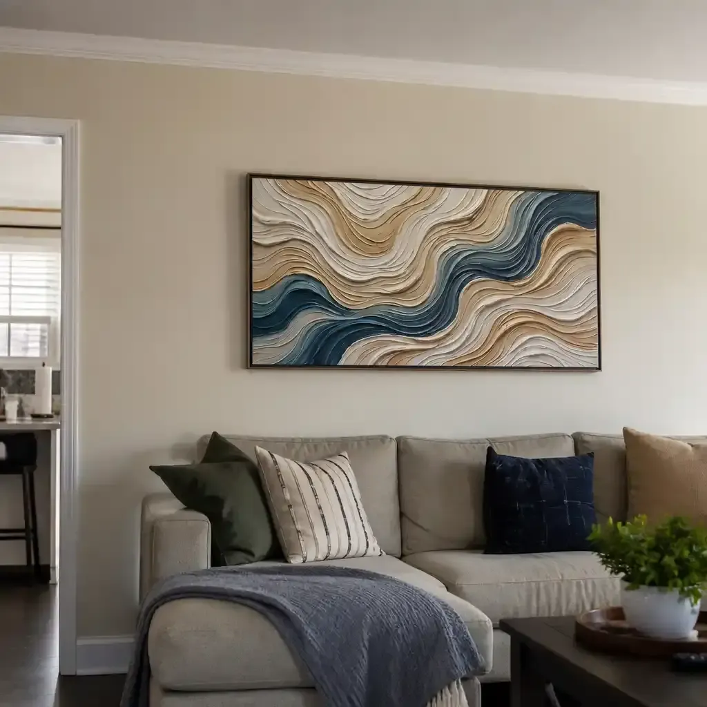
Building a "home gallery" is no longer about filling wall space; it is about creating a cohesive visual journey. The most effective tool for this transition is the chromatic narrative—the strategic use of color theory to link disparate artworks across a residence. This approach bridges the gap between fine art theory and practical styling, ensuring that your collection feels like a curated whole rather than a series of unrelated objects.
The Psychology of Essential Identity in Art
Why does a hand-painted mural or canvas feel fundamentally different from a high-definition print? The answer lies in what researchers at the University of Chicago call "essential identity." Their empirical research suggests that digital replicas and NFTs lack the artist’s "soul" in the eyes of consumers, leading to a collapse in perceived value.
Furthermore, a study from Columbia University confirms that consumers value art labeled as "human-created" 62% higher than AI-generated alternatives. This premium isn't just sentimental; it’s biological. Hand-painted works possess a micro-topography—minute variations in pigment thickness and brushstroke direction—that triggers specific neurological responses.
Logic Summary: We attribute the "depth" of hand-painted art to the Kubelka-Munk equation of light scattering. Unlike flat prints, physical pigments interact with light through absorption and scattering coefficients, creating a sense of "life" that flat digital reproductions cannot replicate.

The 70-20-10 Rule for Collection Continuity
To move from buying isolated objects to building a curated portfolio, professional curators often employ the 70-20-10 rule. We consider this a primary heuristic for residential art placement:
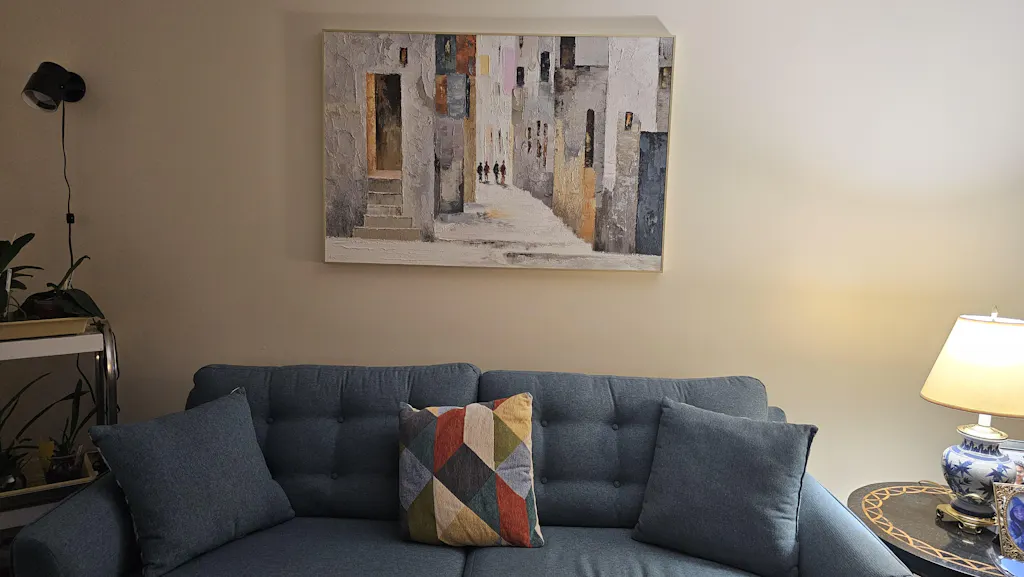
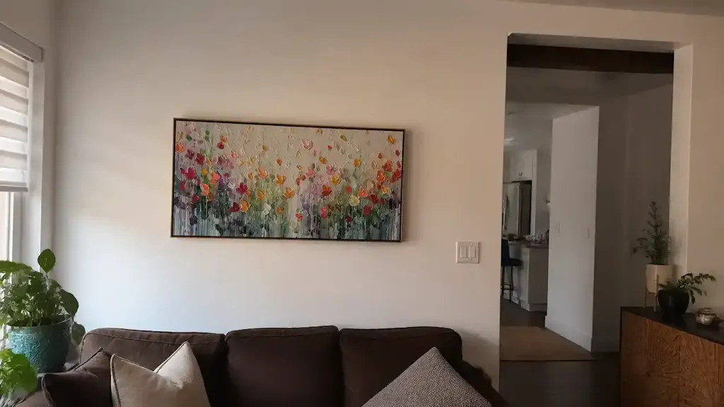
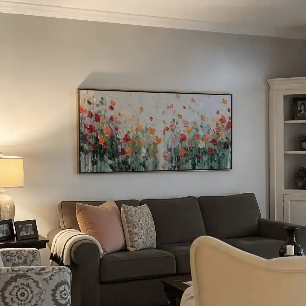
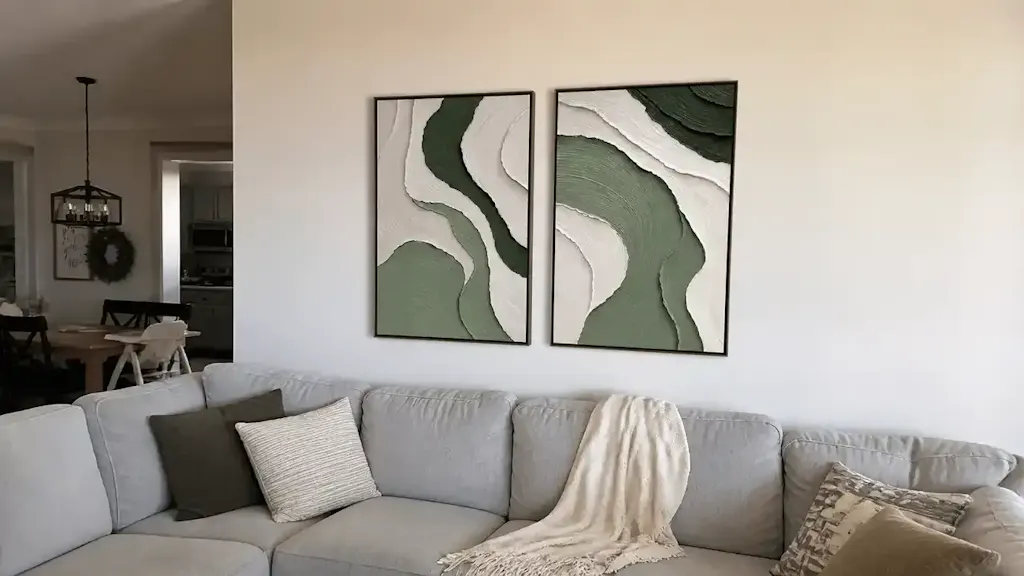
- 70% Dominant Tonal Family: These pieces share a primary "anchor" color or temperature (e.g., warm earth tones or cool blues). This creates the baseline for your home’s visual identity.
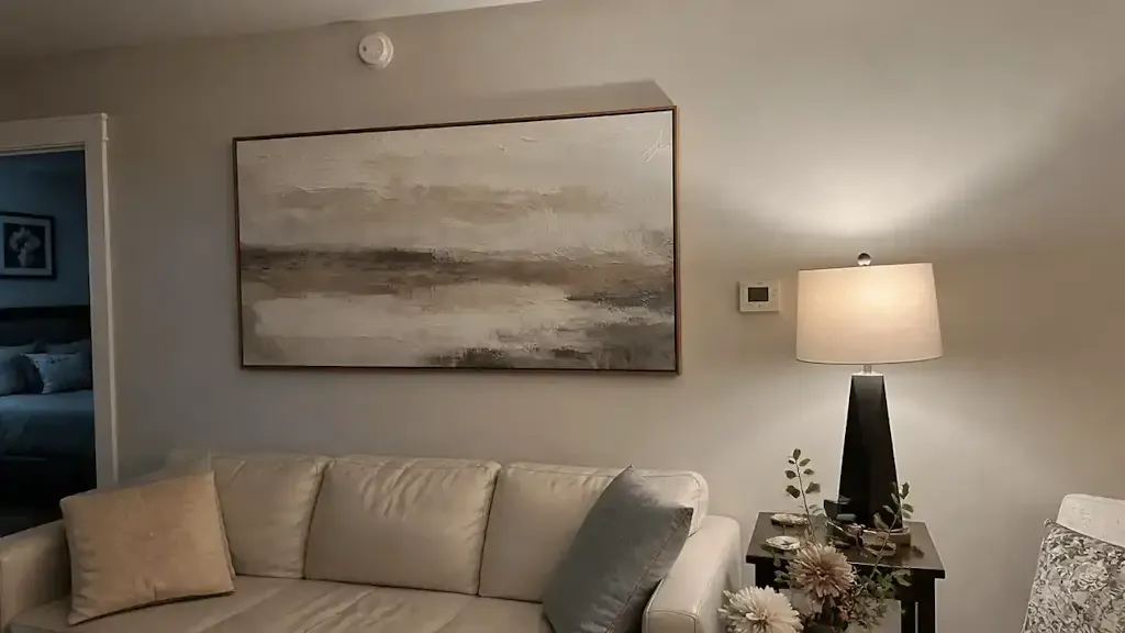
- 20% Transitional Bridge: These artworks include the dominant color but introduce a secondary hue. They act as "connective tissue" between different rooms or zones.
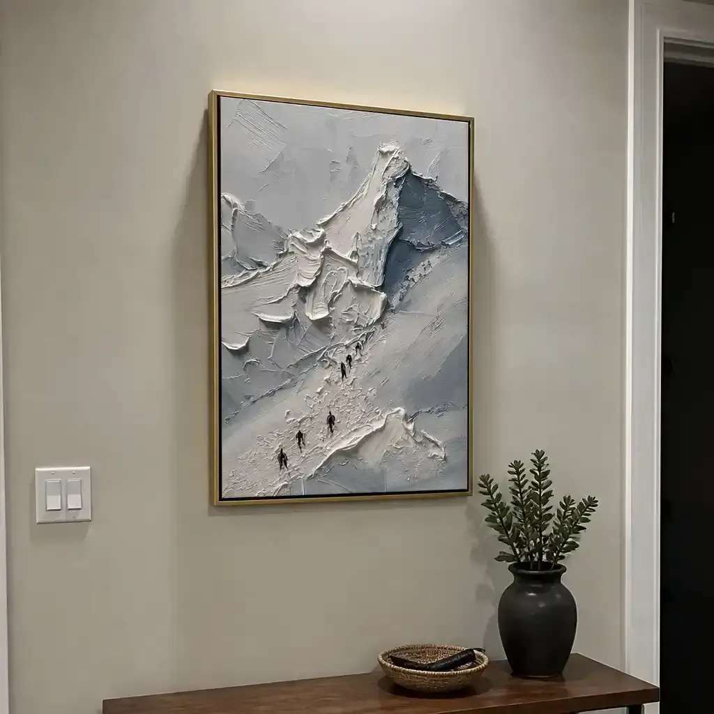
- 10% High-Contrast Focal Points: These are your "statement" pieces that break the rules, providing visual friction and preventing the space from feeling like a sterile showroom.
A common mistake we see in residential styling is "literal matching," where the art colors exactly mirror the upholstery. This often results in a "staged" feel that lacks authenticity. Instead, focus on matching the undertone—the subtle temperature of the paint—to create a subconscious sense of flow.
Heuristic Application: The 70-20-10 Framework
| Component | Function | Application Strategy |
|---|---|---|
| 70% (Anchor) | Establishes Atmosphere | Use for large-scale pieces in main living areas. |
| 20% (Bridge) | Facilitates Flow | Place in dining rooms or open-plan transitions. |
| 10% (Accent) | Creates Interest | Best for small alcoves, powder rooms, or end-of-hallway focal points. |
Note: This is a rule of thumb for quick selection. It may vary based on architectural lighting and room volume.
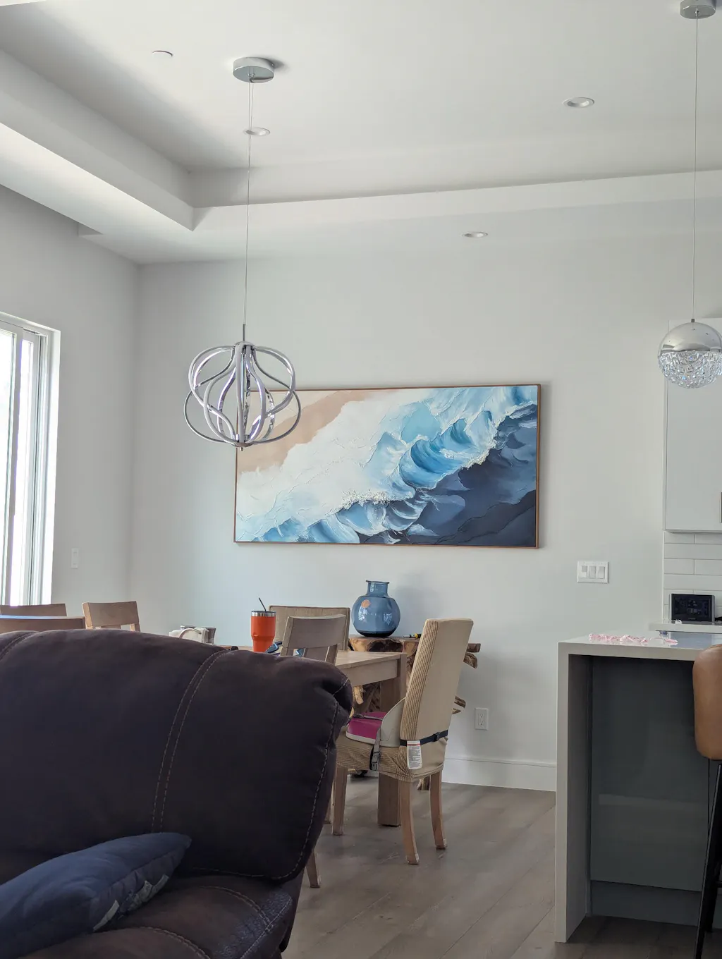
Spatial Navigation and the "Visual Echo"
In hallways and open-plan spaces, the goal is to guide the viewer’s eye naturally. We recommend the "Visual Echo" technique: identify a minor pigment in a large living room piece and make it the primary color of a smaller painting in the adjacent hallway.
According to a critical review in the Wiley Online Library, visitor movement in galleries is often dominated by spatial layout rather than color. However, in a home environment where movement is repetitive, these subtle chromatic links act as subconscious wayfinding markers. They reduce "visual noise" and create a calming environment.
This is particularly effective in high-density areas. Research on Tokyo office spaces indicates that nature-based biophilic design—such as murals featuring organic landscapes—effectively intervenes in employee burnout and cognitive fatigue. By echoing these natural hues through a hallway, you extend the "healing" effect of the art throughout the home.

Technical Precision: Pigments, Light, and Persistence
A chromatic narrative is only as strong as the materials used. Color is not static; it is a product of light and chemistry.
1. The Lightfastness Factor
When selecting pieces for a collection, we prioritize the ASTM D4303 Standard. This protocol measures how pigments resist fading under UV exposure. It is a common misconception that all "professional" paints are permanent. For instance, Prussian Blue may fade differently across various media, though a National Gallery experiment suggests the binder (oil vs. acrylic) has less impact on its "deathly fade" than the pigment's inherent chemistry.
2. Metamerism and Lighting
Lighting plays a critical role in how color links are perceived. A "Visual Echo" that works perfectly under 2700K (warm) light may vanish or turn muddy under 4000K (cool) light. This is due to metamerism—where two colors look identical under one light source but different under another.
Methodology Note (Modeling Assumptions): Our lighting recommendations assume a minimum Color Rendering Index (CRI) of 95+. We model the interaction between pigment refractive indices and light temperature based on the Kubelka-Munk theory.
3. Support-Induced Discoloration (SID)
Advanced collectors should be aware of SID. According to Golden Artist Colors, water-soluble impurities in cotton or linen canvases can be drawn into transparent acrylic layers, causing a yellow or brown tint. This can unintentionally break your color narrative over time if the substrate is not properly sealed.
The ROI of Hand-Painted Narratives
Investing in a cohesive art narrative isn't just an aesthetic choice; it’s a financial one. A Royal Society analysis found that neighborhoods with higher "art" geo-tags experienced greater relative house price ranking gains.
For commercial developers, the impact is even more pronounced. The Chicago Millennium Park public art projects drove an estimated $1.4 billion in real estate-related growth. By treating a residential interior as a curated gallery, you are essentially "future-proofing" the property’s value.
Estimated Economic Impact Model
| Metric | Estimated Impact | Source Basis |
|---|---|---|
| Property Value Gain | Significant relative ranking boost | Royal Society CAR Model |
| Commercial Foot Traffic | Directly correlated with murals | UCincinnati Regression Analysis |
| Public Art ROI | 7:1 return on investment | Americans for the Arts |
| Consumer Valuation | 62% higher for "human-made" | Columbia University Study |
Modeling Note: These figures represent scenario-based modeling of historical data and should be viewed as potential outcomes rather than guaranteed returns.
Health, Safety, and the Ethical Palette
A true chromatic narrative considers the health of the inhabitants. The EPA warns that indoor air pollution is often more concentrated than outdoor pollution. This makes the choice of low-VOC (Volatile Organic Compound) paints essential, especially for large-scale murals or "wrapped" rooms.
The Toxic Pigment Warning
While we value the historical depth of certain colors, many traditional pigments are hazardous. The International Agency for Research on Cancer (IARC) classifies cadmium compounds as Group 1 carcinogens. Furthermore, CDC NIOSH reports indicate that chronic inhalation of compounds in certain paints can lead to central nervous system neuropathy.
We advocate for the use of modern, non-toxic alternatives that maintain the "essential identity" of hand-painted art without the health risks. For example, titanium white has effectively replaced the highly toxic lead white, capturing 90% of the market share due to its superior hiding power and safety, as noted by the NCBI.
Supporting Local Artistry
Ethics also extend to the human element. A Wharton School survey found that 87% of consumers believe artists should receive fair compensation, especially in the age of AI. Supporting local artists who use eco-friendly materials—like hemp or flax canvases which consume half the water of cotton (Cincinnati Art Museum)—aligns your collection with modern ESG (Environmental, Social, and Governance) values.

Implementing Your Narrative: A Step-by-Step Guide
- Audit Your Undertones: Before buying new art, identify the "temperature" of your existing space. Is your flooring a warm oak or a cool gray? Your 70% "anchor" pieces should harmonize with this temperature.
- Identify the "Echo": Choose a secondary color from your most prominent piece. Look for a hue that appears in less than 5% of the canvas.
- Bridge the Zones: Select smaller works for hallways or dining areas that promote this "echo" color to a primary role.
- Synchronize Lighting: Ensure all linked pieces are lit with the same color temperature (we recommend 3000K for a balance of warmth and clarity) to maintain chromatic fidelity.
- Focus on Texture: Prioritize hand-painted works where the "micro-physical texture" is visible. This ensures the "essential identity" of the collection remains intact.
Moving Beyond Isolated Objects
The 2026 design trends, as tracked by Zillow, show a 21% rise in mentions of "artisan craftsmanship" and a 15% rise in "whimsy." This signals a clear departure from mass-produced, safe decor.
By utilizing color theory to link your artworks, you transform your home into a narrative space that supports mental health, increases property value, and honors the human tradition of mark-making. Whether it’s a panoramic hand-painted mural in a powder room (a dominant trend at NKBA 2025) or a series of "Visual Echoes" through a long corridor, the chromatic narrative is the ultimate tool for the sophisticated collector.
YMYL Disclaimer: This article is for informational purposes only and does not constitute professional medical, safety, legal, or financial advice. Chronic exposure to certain paint pigments and solvents can pose health risks; always consult a certified industrial hygienist or medical professional when handling art materials. Financial ROI estimates are based on historical market trends and are not guaranteed.
Sources
- Marketplace - The Expensive Art Market Struggles
- Columbia University - Human vs. AI Art Study
- Royal Society - Quantifying Art and Property Prices
- WHO - Arts and Health Scoping Review
- ASTM International - Lightfastness Standards
- Golden Artist Colors - Technical Support Bulletins
- EPA - Indoor Air Quality and Low-VOC Paints
- IARC - Cadmium and Cadmium Compounds