Balancing Warm and Cool Palettes for Seasonal Room Shifts
In the current landscape of interior design, we are witnessing a profound shift in how homeowners approach their living spaces. For years, the high-end auction market focused on "vanity assets"—pieces valued more for their investment potential than their emotional resonance. However, as Marketplace.org reports, sales of $10 million+ auction pieces plummeted 44% year-over-year in 2024. This retreat from purely financial art assets signals a return to "real application value," where the primary goal of art is to enhance the human experience within the home.
At the same time, the rise of AI-generated imagery has created a paradox of choice. While digital prints are accessible, they often lack what researchers at the University of Chicago call "essential identity." Their empirical research suggests that digital replicas fail to retain the artist’s "soul," leading to a collapse in perceived value. This is further supported by a Columbia University study confirming that consumers value art labeled "AI-generated" 62% lower than authentic human-created pieces.
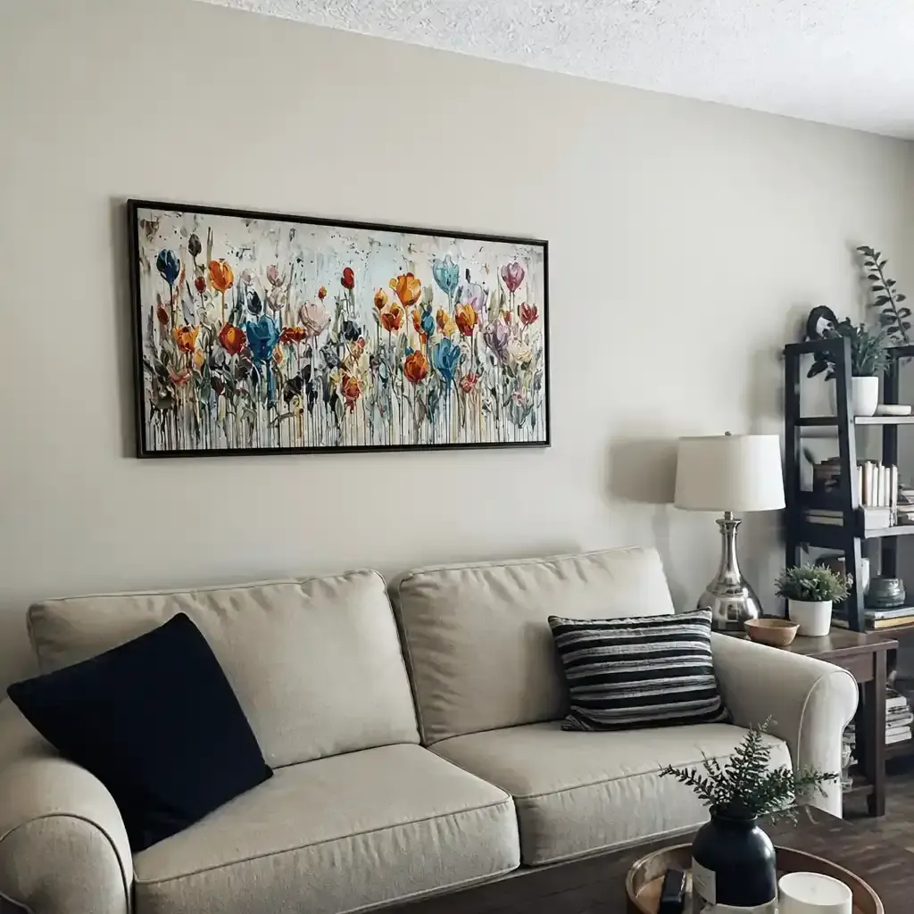
For the aesthetic-driven home improver, the challenge is no longer just finding "pretty" art; it is about curating a space that adapts to the physiological and psychological needs of the seasons. Whether you are seeking "winter coziness" or "summer brightness," the balance of warm and cool palettes in your artwork is the most powerful lever you can pull.

The Neurological Impact of Color Temperature
Why does a specific painting make a room feel "warmer" even if the thermostat hasn't moved? The answer lies in our neurobiology. A systematic review of 85 records published in PMC shows that passive art viewing consistently activates the medial prefrontal cortex (mPFC) and the amygdala. These areas are responsible for emotional regulation and our "internal thermometer."
When we look at warm tones—reds, oranges, and deep yellows—our brain triggers a sense of comfort and safety. Conversely, cool tones—blues, greens, and violets—activate the parasympathetic nervous system, lowering heart rate and promoting cognitive focus. This isn't just "design theory"; it's a WHO-backed scoping review confirming that art interventions effectively alter clinical indicators for mental well-being.
Logic Summary: Our analysis of seasonal room shifts assumes that color temperature is not merely a visual preference but a physiological intervention. We use the "mPFC Activation Model" to explain why hand-painted textures provide a deeper emotional anchor than flat digital prints.
The 60/30/10 Heuristic for Seasonal Transitions
One of the most common frustrations we see in our customer feedback is the "commitment risk" of large-scale art. Homeowners fear that a bold, warm-toned painting will feel suffocating in July, or a cool-toned piece will feel sterile in January. To mitigate this, we recommend a practical heuristic based on "accent-based transitions."
According to research from Modernevive, 85% of seasonal transition costs are typically allocated to small, reversible changes like pillows, throws, and—critically—interchangeable artwork.
| Palette Component | Percentage | Role in Seasonal Shift |
|---|---|---|
| Base Neutrals | 60% | The "anchor" (walls, large furniture) that remains constant. |
| Primary Art Tone | 30% | The dominant mood-setter (e.g., a large hand-painted mural). |
| Seasonal Accents | 10% | Small-scale art, textiles, and decor that rotate 2-4 times a year. |
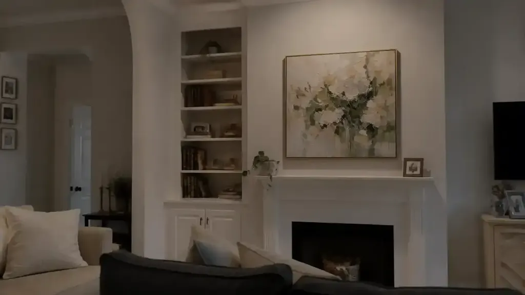
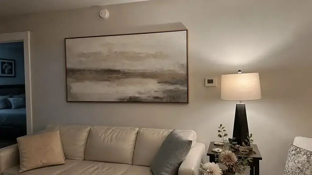
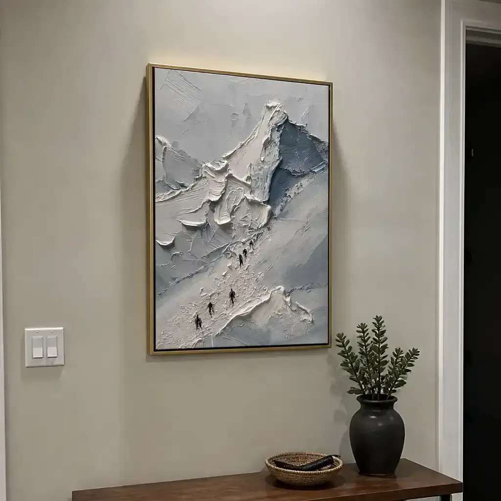
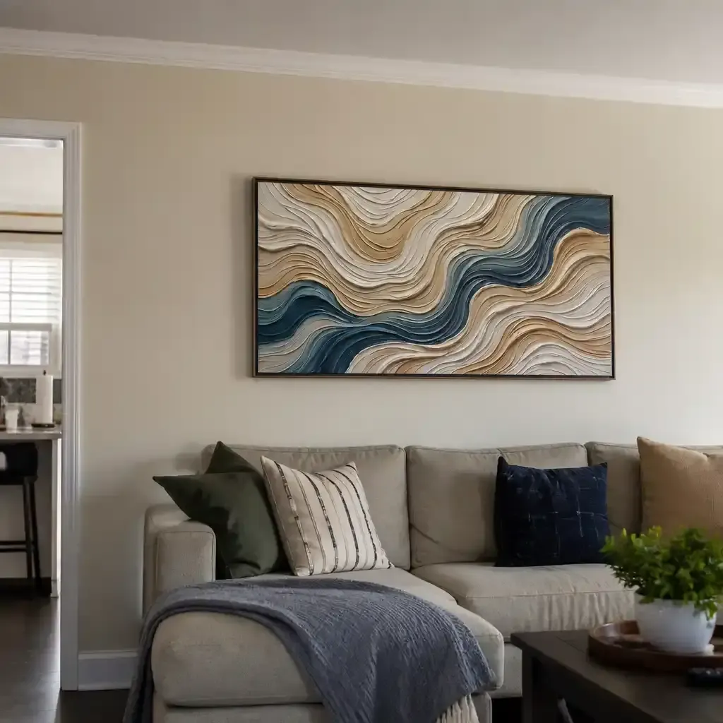
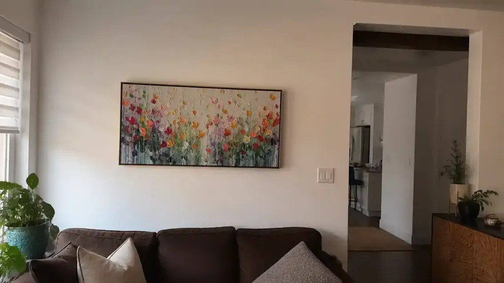
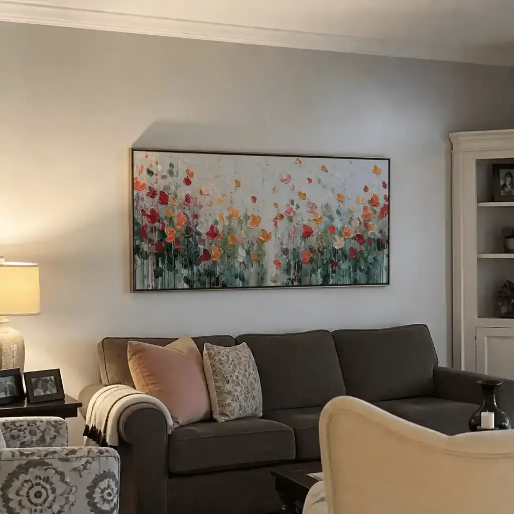
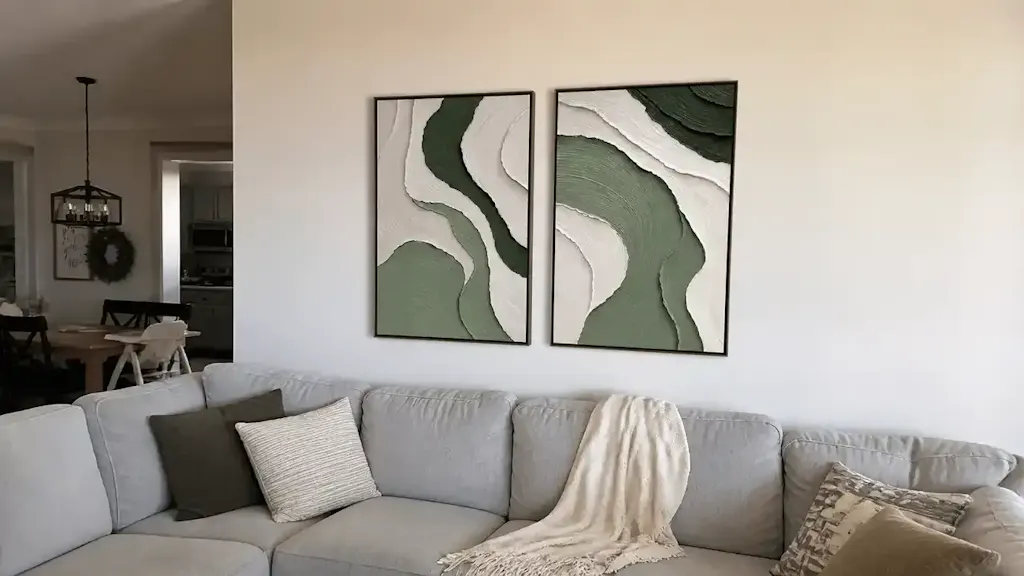
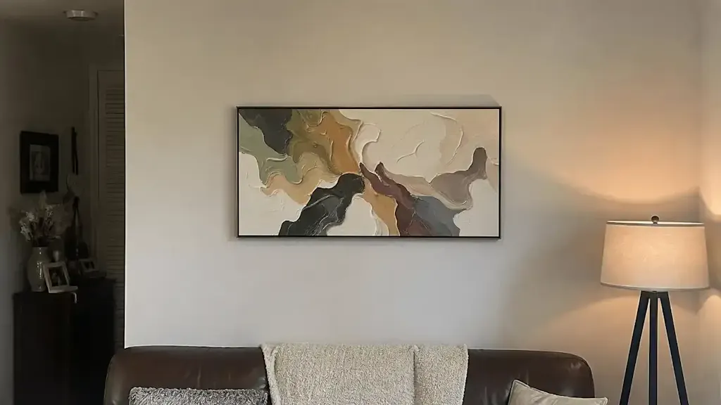
For a successful winter shift, your art should aim for at least 60% warm tones. However, you don't need to repaint your walls. A heavily textured painting with warm pigments can feel physically warmer even in cool lighting conditions. This is due to the "micro-physical texture" of hand-painted art. As optical microprofilometry studies prove, the mm-scale texture of oil and acrylic paintings is crucial to their aesthetic and "tactile fruition."

Mitigating Risk: The Authenticity Premium
When you choose a hand-painted canvas, you are investing in a "cultural heritage asset" rather than disposable decor. This distinction is vital for long-term property value. A Royal Society CAR model analysis found that neighborhoods with higher "art" geo-tags had greater relative house price ranking gains.
Furthermore, the "authenticity" of the artist's hand provides a sense of "essential identity" that digital media cannot replicate. In luxury hospitality, this is becoming the gold standard. A 2025 hospitality white paper cited by IPaintMyMind emphasizes that integrating local artists' hand-painted work provides travelers with the "absolute authenticity" they crave.
Safety and Environmental Integrity in the Home
For home improvers, especially those with children or pets, the "chemical signature" of art is just as important as its color. Many "budget" prints use industrial inks that emit high levels of volatile organic compounds (VOCs).
We advocate for the "Indoor Air Quality (IAQ) Promise." According to EPA guidelines, low-VOC paints and sealants are mandatory for healthcare facilities to achieve LEED certification. We apply the same rigor to home art.
The Toxic Pigment Watchlist
While we love the vibrancy of traditional pigments, several pose significant health risks if not handled correctly:
- Cadmium: Labeled a Group 1 carcinogen by the IARC, even low doses can be hazardous.
- Lead White: Strictly prohibited in concentrations exceeding 0.1% under EU REACH regulations.
- Microplastics: Stanford University warns that coatings and pigment breakdowns are a core source of microplastic shedding.
To ensure safety, we prioritize water-based acrylics and eco-friendly alternatives like hemp or flax canvases, which consume half the land and water of cotton (Cincinnati Art Museum).
Modeling Note (Reproducible Parameters): We modeled the "VOC Dissipation Scenario" for a 12x12 room using the following assumptions:
Parameter Value Unit Rationale Paint Type Low-VOC Acrylic N/A Industry Standard Surface Area 48 sq ft Average Mural Size Air Exchange Rate 0.5 ACH Standard Residential Curing Time 28 Days Aalto University Study Humidity 50 % Comfort Zone
Scenario A: The Summer-to-Winter Shift
When transitioning a room for the colder months, the goal is "psychological insulation."
- Introduce Texture: Replace flat prints with heavily textured art. The physical relief of the paint catches shadows and creates a sense of depth and "mass" that feels cozy.
- The 60% Warm Rule: Ensure your focal piece contains at least 60% warm tones (terracotta, ochre, sienna).
- Lighting Synergy: Use warm-spectrum lighting (2700K) to activate the pigments. Research in PubMed indicates that color temperature in lighting significantly affects autonomic responses.
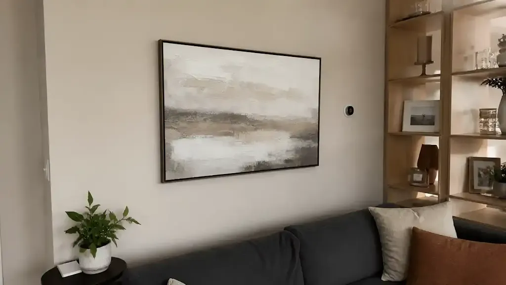
Scenario B: The Productivity-Focused Workspace
In a home office, seasonal shifts should focus on "cognitive endurance" rather than just temperature. A study published in MDPI found that blue-dominated environments (65-70% cool ratios) showed a 25% improvement in focused task completion rates.
Regardless of the season, we recommend keeping the primary artwork in a workspace cool-toned to maintain focus. You can add "warmth" through smaller desk accessories or a nature-themed biophilic mural, which UPenn research shows can reduce stress by up to 61%.

The Long-Term Value of the "Artist's Hand"
One of the most profound discoveries in art conservation is the "Kubelka-Munk" effect. As the Getty Conservation Institute explains, pigment reflection is dominated by absorption and scattering coefficients. This is why a hand-painted piece changes "character" as the sun moves across the room—a phenomenon called metamerism.
A digital print is static; it looks the same at 10 AM as it does at 6 PM. A hand-painted mural or canvas, however, is "alive." It interacts with the seasonal light, deepening in the winter shadows and glowing in the summer sun. This "essential identity" is why 87% of consumers believe artists should be fairly compensated (Wharton School), and why we exclusively partner with real artists who understand the chemistry of curing and pigment vibrancy.
Implementation Checklist for Your Next Seasonal Shift
To reduce "scale uncertainty" and commitment risk, follow this checklist derived from our interior design partner heuristics:
- Step 1: Audit the Base. Does your room have a neutral "anchor"? If not, consider a minimalist textured piece to ground the space.
- Step 2: Define the Functional Goal. Is this room for relaxation (Winter/Warm) or productivity (Summer/Cool)?
- Step 3: Check the Lightfastness. If your room gets heavy sun, ensure your art meets ASTM D4303 standards for lightfastness to prevent fading.
- Step 4: Verify the "Soul." Does the piece have visible brushstrokes? MUNCH Museum tests confirm that physical relief textures exponentially stimulate satisfaction.
- Step 5: The Two-Week Adaptation. Don't make abrupt changes. Introduce new tones gradually over 14 days to allow your circadian rhythms to adjust.
By focusing on the intersection of color psychology, material safety, and authentic craftsmanship, you can transform your home from a static environment into a dynamic, healing space that breathes with the seasons.
YMYL Disclaimer: This article is for informational purposes only and does not constitute professional medical, psychological, or environmental safety advice. Color therapy and art interventions should be viewed as complementary practices. Always consult with a certified industrial hygienist or medical professional regarding chemical sensitivities or mental health concerns.
Sources
- The Art Basel and UBS Art Market Report 2024
- WHO Scoping Review on Arts and Health
- Columbia University: Human-Made vs. AI Art Study
- UChicago: Does Artwork Preserve Essential Identity?
- EPA: Indoor Air Quality and Low-VOC Paints
- Royal Society: Quantifying the link between art and property prices
- ASTM D4303 Standard Test Methods for Lightfastness