The Strategic Role of Lighting in Art Curation
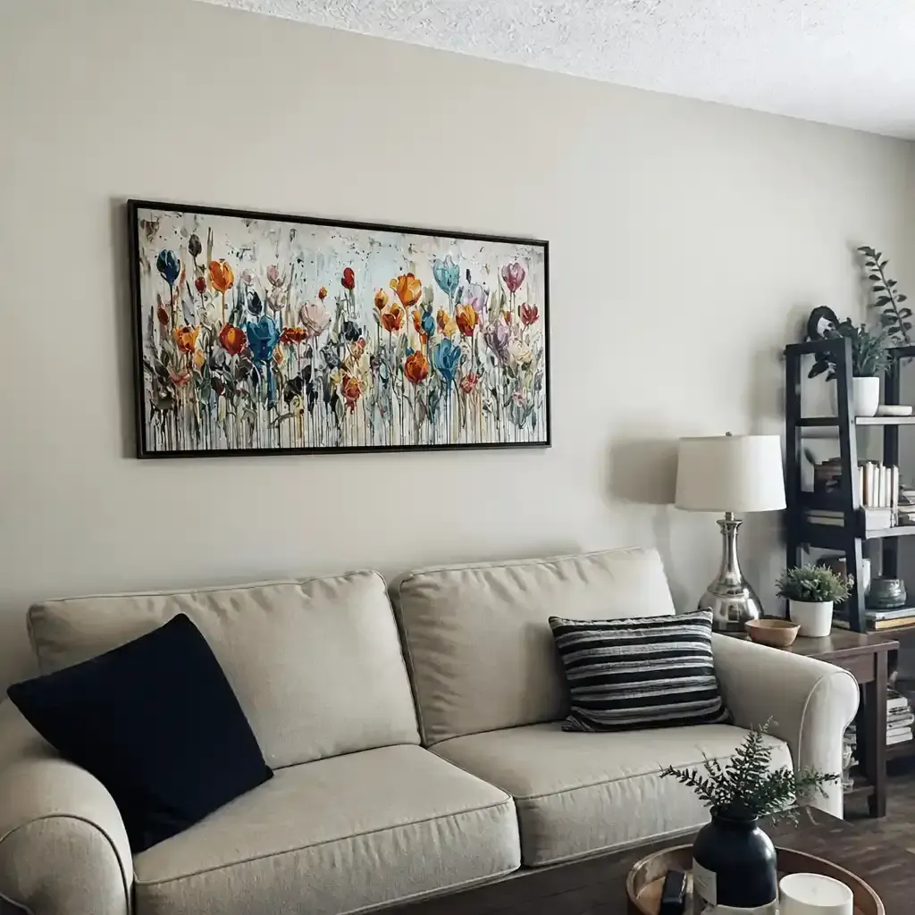
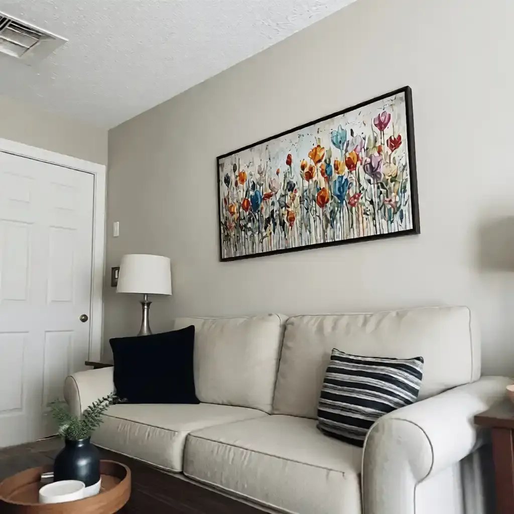
For the aesthetic-driven homeowner, art is never a static asset. It is a living dialogue between pigment, texture, and the environment. However, as the sun’s trajectory shifts from the low, amber arcs of winter to the high, piercing clarity of summer, the "essential identity" of a hand-painted mural can be compromised. Research from the University of Chicago suggests that consumers perceive art as retaining an irreplicable "soul" that digital replicas lack; yet, that soul is only visible when the lighting environment is precisely calibrated to the medium’s physical properties.
As the high-end art market experiences a retreat from purely financial auction assets—with sales of pieces over $10 million plummeting 44% in 2024 according to Marketplace—there is a clear pivot toward real application value. Modern collectors are prioritizing custom, hand-painted works that integrate deeply into their living spaces. This integration requires a technical understanding of how seasonal light affects color perception and how accent lighting must be adjusted to compensate.

The Physics of Seasonal Light and Pigment Interaction
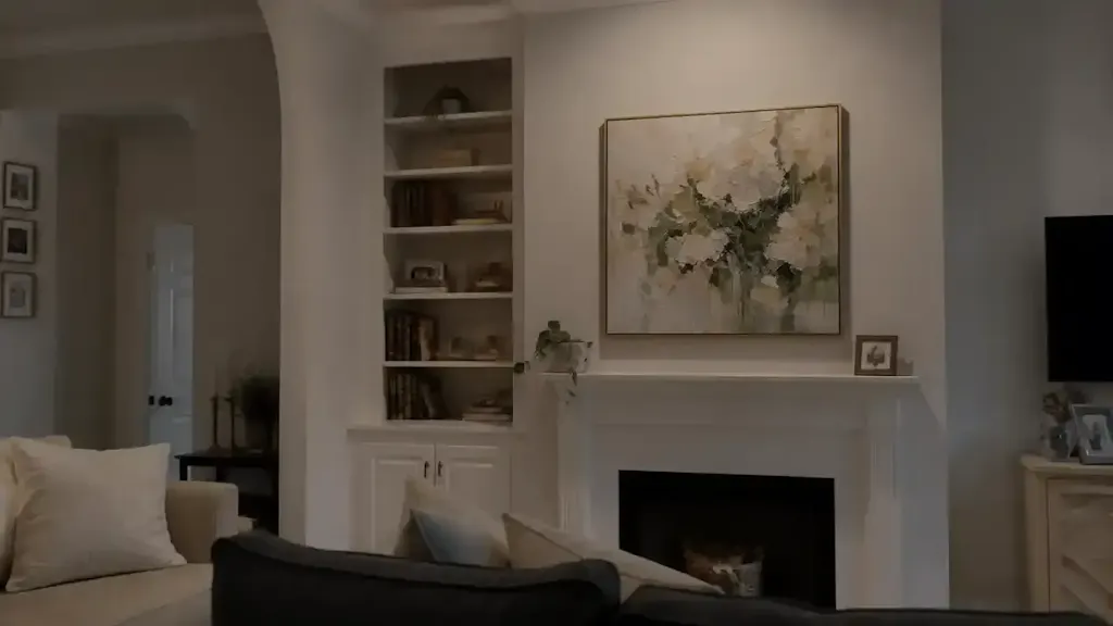
To effectively adjust accent lighting, we must first understand the variables at play: Kelvin (color temperature), Lumens (brightness), and Beam Angle (dispersion). In our experience managing high-end residential art installations, the most common mistake is treating lighting as a "set and forget" utility.
The Kelvin Shift: Winter vs. Summer
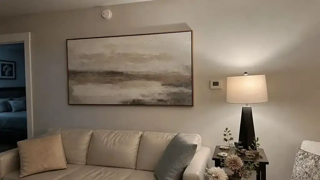
Natural light in winter is predominantly "cool" and low-intensity, often lacking the full spectral range needed to make warm-toned pigments (like ochres or cadmiums) pop. Conversely, summer light is "warm" and high-intensity, which can wash out subtle gradients.
- Winter Calibration (2700K - 3000K): During the darker months, we recommend shifting your accent bulbs to a warmer range. This maintains the vibrancy of warm tones and prevents the artwork from looking "flat" or clinical under the gray exterior light.
- Summer Calibration (3500K - 4000K): In summer, a slightly cooler accent light helps prevent glare on textured surfaces and balances the high-intensity natural light flooding the room.
The 2-3x Brightness Heuristic
A practical rule of thumb we use is that accent lighting should be 2 to 3 times brighter than the ambient lighting in the room. However, to avoid "washing out" pigment depth, we typically ensure no single fixture exceeds 500 lumens.
Modeling Note (Scenario Analysis): Our lighting recommendations are based on a deterministic model of residential "Gallery-Style" environments.
Parameter Value/Range Unit Rationale Target Illuminance 150 - 300 Lux Standard for home display without UV damage Contrast Ratio 3:1 Ratio Accent vs. Ambient to create focal depth Beam Angle 30 - 45 Degrees Optimized for impasto texture visibility CRI (Color Rendering Index) 95+ Ra Essential for accurate pigment representation Dimming Period 14 - 21 Days Physiological adaptation period for the human eye Boundary Conditions: This model assumes standard ceiling heights (8-10ft) and does not account for direct, unshielded southern exposure which may require automated solar shading.
Technical Deep Dive: Why Texture Demands Precision
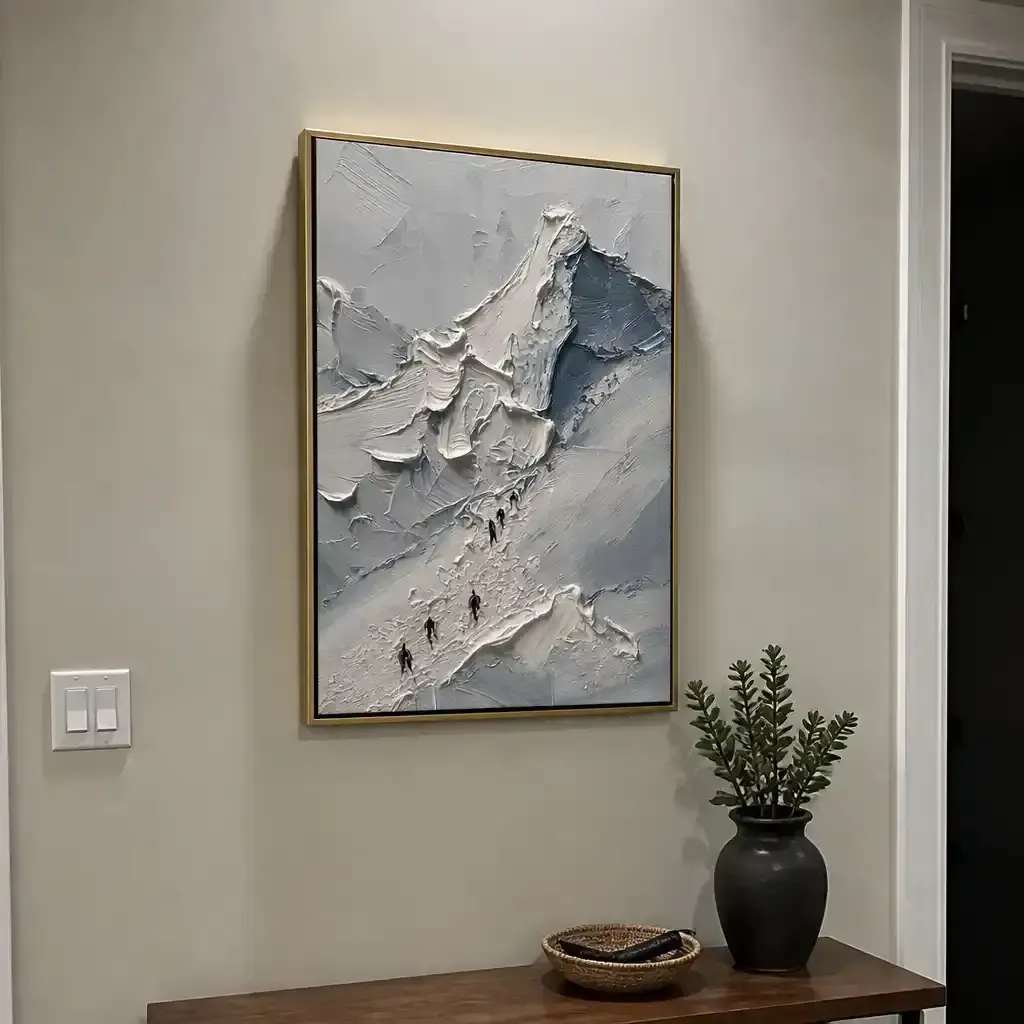
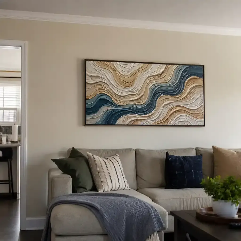
Hand-painted art, particularly those utilizing heavy impasto or palette knife techniques, relies on the "microtopography" of the paint film. Optical microprofilometry has proven that the mm-scale texture of oil paintings is crucial to their aesthetic value (MDPI Sensors).
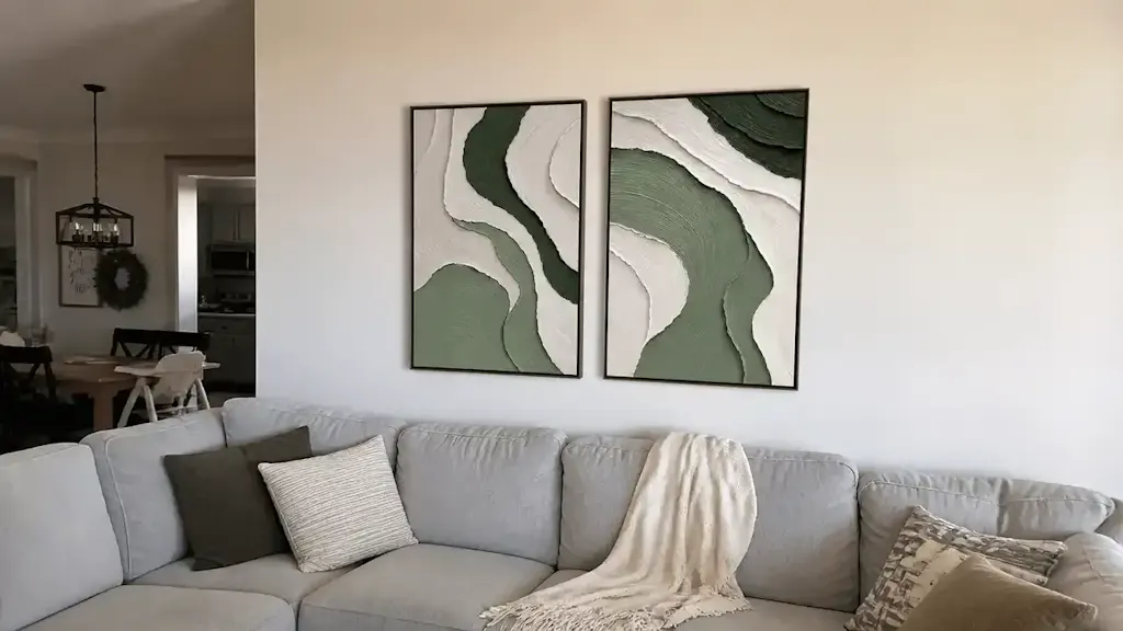
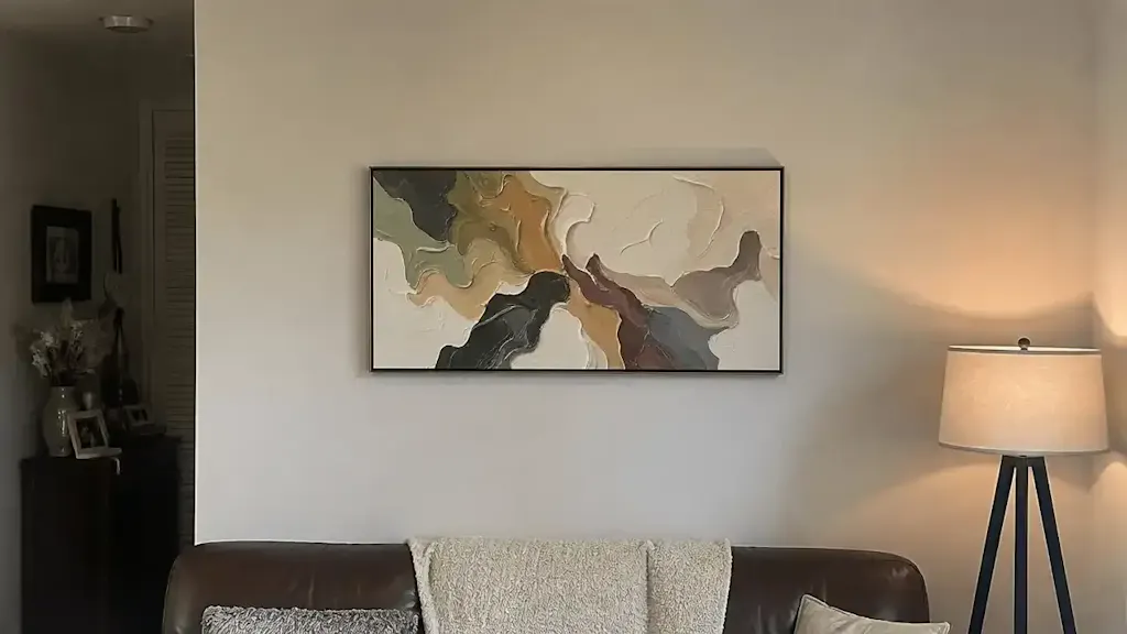
When light hits a textured surface, it creates highlights and shadows. If the beam angle is too direct (overhead), these shadows disappear, and the painting loses its three-dimensional quality. We have found that a 30-45 degree beam angle is the "sweet spot" for highlighting the physical relief of the paint. This is particularly effective for surrealist or Dali-inspired custom pieces, which are projected to be a major trend in 2026 as homeowners seek "understated elegance with texture as its soul" (Design State of Mind).

The "Nuclear Weapon" Against AI Art
The irreplaceability of this texture is confirmed by a Columbia University study, which found that consumers value art labeled "AI-generated" 62% lower than authentic human-created art. The physical presence of hand-applied pigments—their scattering and absorption coefficients—cannot be replicated by a flat printer. According to the Getty Conservation Institute, the Kubelka-Munk equation explains that pigment reflection is dominated by these coefficients, and the physical refractive index of the surface is what creates the "glow" we associate with high-quality original art.
Seasonal Transition: A Practical Implementation Guide
Adjusting your lighting shouldn't be an abrupt event. To prevent visual fatigue, we recommend a gradual transition over 2-3 weeks.
- Assess the Lumens: If your room feels "over-lit" in the summer, do not just turn off the accent lights. Instead, use a dimmer to reduce the intensity while maintaining the beam angle. This prevents the "harsh shadow" effect often seen when homeowners overcompensate with too-bright bulbs.
- Adjust the Beam Angle: As the sun’s angle in the sky changes, the way light enters your windows changes. You may need to slightly tilt your track lighting or recessed gimbals to ensure the focal point remains centered on the artwork.
- Monitor for SID (Support Induced Discoloration): In high-humidity summer months, be aware of SID. Research from Golden Artist Colors shows that water-soluble impurities in canvas can be drawn out when transparent mediums are applied thickly, causing yellowing. Proper climate control and "cool" LED lighting (which emits less heat) can mitigate this risk.
The Biophilic Connection
Integrating nature-themed murals can have profound health benefits. A University of Pennsylvania review noted that 73% of patients reported mood improvements when exposed to environmental artworks. By adjusting your lighting to match the natural "circadian" shift of the seasons, you enhance this biophilic effect, making your home a more restorative environment.
Advanced Color Science: The Fading Blue and Toxic Reds
Understanding the chemistry of your pigments is vital for long-term preservation. Not all colors react to light in the same way.
- The Prussian Blue Mystery: Many believe oil paintings hold color better than acrylics, but National Gallery experiments proved that the fading rate of Prussian Blue is identical across all media. The key to preservation is not the medium, but the UV filtration of your lighting.
- The Cadmium Risk: While vibrant, cadmium pigments are Group 1 carcinogens (IARC). For households with children, we often recommend high-quality acrylic alternatives that pass the BS EN 71-3 safety standards for heavy metal migration.
- Titanium White Dominance: Titanium dioxide now captures 90% of the white pigment market (NCBI) because of its inertness and hiding power. Under warm winter lighting, titanium white can sometimes look yellowed; using a higher-CRI bulb helps maintain its crisp, clean appearance.

Lighting as a Social and Economic Driver
Beyond individual aesthetics, the integration of hand-painted art has broader implications. In commercial settings, murals act as "permanent physical billboards," driving foot traffic and even increasing property values. The Royal Society found that neighborhoods with higher "art" geo-tags saw greater relative house price gains.
For the homeowner, this means that investing in high-quality murals and the lighting to support them is not just a decorative choice—it is a value-add for the property. By following ASTM D4303 standards for lightfastness and using conservation-grade LEDs, you ensure that this investment remains vibrant for decades.
Summary of Seasonal Lighting Strategies
To ensure your art remains the focal point of your home year-round, we suggest the following summarized approach based on our internal installation heuristics:
- Winter: Focus on warmth (2700K-3000K) to counteract external grayness. Increase contrast slightly to 3:1 to create a cozy, focused environment.
- Summer: Shift to cooler tones (3500K-4000K) to balance intense natural light. Use dimmers to manage glare while keeping the "texture-popping" beam angles (30-45°).
- Transition: Use a 14-21 day dimming adjustment period. This allows the mPFC and amygdala—the brain's emotional regulation centers activated by art viewing (NCBI)—to adapt without the jarring effect of sudden lighting changes.
By treating lighting as a dynamic tool rather than a static fixture, you protect the "essential identity" of your hand-painted art and ensure its emotional and financial value endures through every season.
Disclaimer: This article is for informational purposes only. When installing electrical fixtures or handling potentially toxic historical pigments, always consult with a licensed electrician or a professional art conservator. Indoor air quality should be monitored when using certain art finishes; refer to EPA guidelines for low-VOC standards in residential spaces.
Sources
- Marketplace: The expensive art market continues to struggle
- Columbia University: Human-Made vs. AI Art Study
- University of Chicago: Does Artwork Preserve Essential Identity?
- UPenn: Visual Art in the Built Environment
- Royal Society: Quantifying the link between art and property prices
- ASTM D4303: Standard Test Methods for Lightfastness
- Golden Artist Colors: Support Induced Discoloration (SID)
- IARC: Cadmium and Cadmium Compounds
- Getty Conservation Institute: Color Science and Pigment Mixture