Window Framing: Scaling Art for Narrow Walls Between Glass
The global art market is undergoing a fundamental correction. While high-end auction sales for purely financial art assets plummeted 44% year-over-year in 2024, according to Marketplace, there is a significant retreat back to "real application value." Homeowners and designers are no longer chasing vanity labels; they are seeking curated architectural elements that integrate seamlessly into high-visibility spaces.
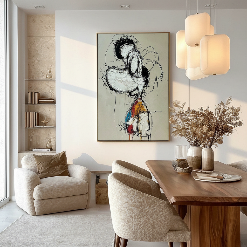
One of the most challenging architectural features to curate is the narrow wall segment between large windows—often found in formal dining rooms or sun-drenched living areas. These vertical strips are frequently treated as afterthoughts, yet they offer a unique opportunity to use light and shadow to elevate a room’s spatial narrative. To succeed, you must move beyond "eyeballing" the placement and adopt a technical approach that balances structural constraints, optical physics, and performative authenticity.
The Structural Reality of Window-Adjacent Walls
Before selecting a canvas, we must address the "invisible" architecture. In our experience with high-end residential installations, we often find that the wall segments between windows are structurally distinct from main partition walls.
According to structural research from Union FAS, plasterboard walls between window frames typically utilize 3/4-inch framing studs spaced 24 inches apart. This creates a "weight distribution danger zone." Standard wall anchors often fail at loads exceeding 25 pounds in these specific areas due to the lack of dense backing. If you are planning a large-scale hand-painted oil with heavy impasto, the weight of the stretcher bars and thick pigment can easily exceed these limits.
The 2-Inch Buffer Rule
To maintain "decision safety," we utilize the 2-inch Buffer Rule. Art should never come closer than 2 inches to the window casing. When art is "squeezed" against the trim, it creates a visual tension that makes the wall feel narrower than it is. By maintaining a 2-inch "negative border," the artwork feels like a natural extension of the window architecture rather than a forced addition.
Modeling Note (Structural Load & Spacing): Our installation model assumes standard residential drywall (1/2 inch) and non-reinforced window headers.
Parameter Value/Range Unit Rationale Min. Edge Buffer 2.0 inches Prevents visual "clutter" and casing overlap Max. Weight (Standard) <25 lbs Limit for standard toggle bolts in narrow gaps Stud Spacing 24 inches Typical for window-adjacent framing Thermal Expansion Gap 0.75 inches Accommodates seasonal vinyl frame movement Glare Threshold 150 - 200 lux Limit to prevent "washout" from side-lighting

Scaling and Alignment: Beyond Centering
When dealing with vertical strips, a common mistake is simply centering the piece vertically between the floor and ceiling. This ignores the horizontal sightlines established by the windows.
The Vertical "Rule of Thirds"
Instead of centering, we recommend a "Rule of Thirds" vertical alignment. The top edge of the art should align with the top third of the window frame rather than the top of the casing. This maintains a cohesive horizontal sightline across the room, preventing the "floating art" syndrome.
For users navigating these specific architectural boundaries, scaling art around windows requires a shift from standard gallery height (57 inches on center) to architectural alignment. If the wall is exceptionally narrow (less than 24 inches), we often suggest vertical stacking of smaller, slim panels to emphasize the height of the ceiling without overwhelming the horizontal space.
Frame Selection: The Slim Floater Standard
In narrow architectural gaps, frame width is a critical performance metric. A frame that is too wide "chokes" the wall. The industry standard for these spaces is the slim floater frame. It provides a 1/4-inch shadow gap that allows the hand-painted canvas to "breathe" while adding structural rigidity without the bulk of traditional ornate molding.
The Authenticity Premium: Texture vs. Print
In spaces with heavy side-lighting—the natural byproduct of being placed between windows—the difference between a flat print and a hand-painted oil becomes undeniable. This is where "performative authenticity" meets optical science.
The Physics of Metamerism and Texture
According to color science research from the Getty Conservation Institute, pigment reflection is dominated by the Kubelka-Munk equation, where absorption (K) and scattering (S) coefficients determine how we perceive color. In a flat print, the scattering is uniform. In a hand-painted oil with heavy impasto, the physical topography—the ridges and valleys of the brushstrokes—creates "geometric metamerism."
As the sun moves across the sky, the side-lighting from the windows catches the ridges of the paint, creating shifting highlights and shadows. This physical relief is what proves the work is not a digital replica. In fact, Columbia University experiments confirm that consumers value art labeled as "human-created" 62% higher than AI-generated prints. The "essential identity" of the artist is physically embedded in the pigment UChicago research.

The "Haze" Phenomenon in Modern Paints
Advanced collectors often ask why some acrylics turn "hazy" over time. Research from the Tate Modern Paints Project identifies that PEG-type surfactants in acrylic emulsions can migrate to the surface when environmental humidity rises (common near windows). This creates water-soluble microcrystals that cause a white, hazy appearance. To combat this, we recommend high-quality varnishing with UV stabilizers, which significantly slows photochemical aging in high-light environments PMC Polymer Research.
Environmental Health and Safety (EHS) in the Home
Placing art in high-visibility social spaces like dining rooms necessitates a strict focus on Indoor Air Quality (IAQ). Many mass-produced "oil paintings" from unregulated markets utilize lead-based pigments or high-VOC (Volatile Organic Compound) solvents to speed up drying times.
VOC Emissions and Respiratory Safety
The EPA warns that indoor air pollution is often more concentrated than outdoor pollution. For healthcare facilities and high-end residential projects seeking LEED certification, low-VOC paints are non-negotiable.
Furthermore, the CDC's NIOSH reports that chronic inhalation of volatile compounds in alkyd paints can lead to central nervous system neuropathy. We prioritize water-based acrylics or walnut-oil-based paints, which eliminate the need for toxic turpentine. Aalto University experiments have shown that coatings on wood with specific moisture levels emit significantly lower VOCs during the curing process, a critical factor for art mounted on wood-framed walls.
Pigment Toxicity Checklist
When selecting art for family spaces, verify that the artist avoids the "Toxic Trio":
- Lead White: Prohibited in mixtures exceeding 0.1% in the EU (REACH Annex XVII).
- Cadmium: A Group 1 carcinogen according to the IARC. While ECHA provides some exemptions for artist pigments, we recommend modern "hue" alternatives for homes with children.
- Arsenic-based pigments: Historically used in "Smalt" or "Orpiment," these are now replaced by safer synthetics V&A Museum.
The Economic and Psychological ROI
Investing in hand-painted art for these narrow architectural features isn't just an aesthetic choice; it’s a strategic one.
Property Valuation
A Royal Society CAR model analysis of a 10-year dataset found that neighborhoods with higher "art" geo-tags had greater relative house price ranking gains. In the commercial sector, the NCREALTORS reported that public art projects in Chicago drove $1.4 billion in real estate-related growth. For the homeowner, a custom mural or hand-painted piece acts as a "permanent physical billboard" of quality, differentiating the property in a competitive market.
Biophilic Healing and Mood
The placement of art between windows often creates a "Biophilic" effect—merging the view of the outdoors with the art indoors. A University of Pennsylvania review noted that 73% of patients reported significant mood improvements when exposed to environmental artworks. For high-stress environments, such as a home office or a formal dining room used for entertaining, nature-themed hand-painted works activate the medial prefrontal cortex (mPFC), optimizing emotional regulation NCBI Neurological Mechanisms.

Decision Framework: Choosing Your Narrow-Wall Art
To ensure "decision safety" and aesthetic success, use the following checklist derived from our architectural curation standards:
- Measure the "Net Wall Width": Subtract the window casing width from the total wall segment.
-
Apply the 2-Inch Buffer: Your maximum canvas width should be
Net Wall Width - 4 inches. - Check the Header Alignment: Will the top of the frame align with the top third of the window glass?
- Evaluate Side-Lighting: If the windows are south-facing, prioritize heavy impasto texture to maximize the "authenticity" of the hand-painted surface.
- Verify Material Safety: Ensure the work is labeled ASTM D-4236 compliant, though remember this only confirms the labeling is correct, not that the pigment is inherently non-toxic. Always ask for low-VOC certifications.
Summary of Best Practices
By treating the narrow walls between windows as architectural opportunities rather than obstacles, you can create a space that feels both grand and intimate. Whether you are scaling art for an open-plan living room or zoning a multi-use rental, the principles of structural integrity, optical texture, and human-centric safety remain the same.
Original, hand-painted art provides a 7:1 ROI in social value and community cohesion Americans for the Arts. By choosing authentic craftsmanship over mass-produced prints, you are not just decorating a wall—you are investing in a non-renewable cultural heritage asset for your home.
Disclaimer: This article is for informational purposes only and does not constitute professional architectural, structural engineering, or medical advice. Always consult with a qualified professional before performing structural installations or if you have concerns regarding chemical sensitivities.
Sources
- Marketplace: The expensive art market continues to struggle
- Columbia University: Human-Made vs. AI Art Study
- Royal Society: Quantifying the link between art and property prices
- WHO: Scoping Review on Arts and Health
- EPA: Indoor Air Quality and Low-VOC Paints
- Getty Conservation Institute: Color Science and Pigment Mixture
- Tate: The Tate AXA Art Modern Paints Project
- Union FAS: Structural Reinforcement for Wall-Hung Artworks


