Chair Rail Limits: Determining Vertical Art Scale and Placement
Traditional architectural features like chair rails and wainscoting provide a sense of historical permanence and "decision safety" for homeowners. However, they also create a horizontal bisection that fundamentally alters how we perceive wall space. In our experience working with high-end residential interiors, the most common mistake is treating a wall with a chair rail as a single vertical canvas.
The global art market is currently undergoing a structural shift. While high-end auction sales for purely financial art assets plummeted 44% YoY in 2024, according to Marketplace, there is a resurgence in "real application value." Homeowners are moving away from overpriced vanity pieces toward custom, hand-painted murals and canvases that harmonize with their specific architectural constraints.
This guide provides a technical framework for scaling and placing art within these complex boundaries, ensuring your investment in hand-painted art maintains its prestige without creating visual clutter.

The Psychology of the "Visual Field"
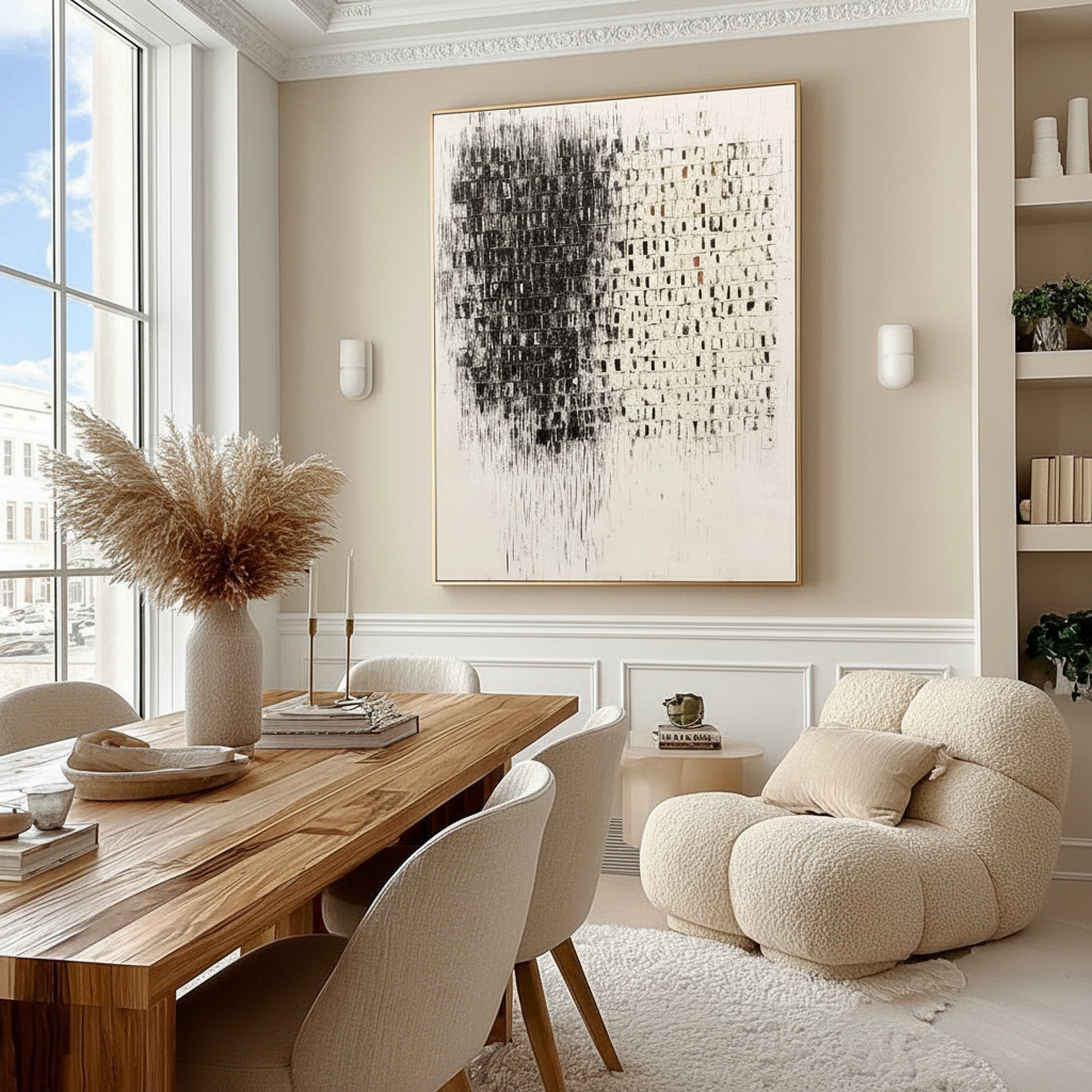
When a chair rail is present, the human eye does not calculate the center of the wall from the floor to the ceiling. Instead, it identifies a new "visual field" established between the top of the rail and the bottom of the crown molding. Centering artwork on the total wall height in a room with a 36-inch chair rail often results in the piece appearing "trapped" or "squashed" against the trim.
The importance of human-centric, hand-painted art in these spaces cannot be overstated. Research from Columbia University confirms that consumers value art labeled "human-created" 62% higher than AI-generated alternatives. This premium exists because the canvas retains what researchers at the University of Chicago call an "essential identity"—a soul that digital prints simply cannot replicate.
The 6-Inch Clearance Heuristic
Based on common patterns we observe in professional installations (not a controlled lab study), we recommend the 6-inch clearance rule.
- The Rule: Art should sit 6 to 9 inches above the chair rail.
- The Logic: This creates enough "breathing room" to avoid a "stacked" appearance where the art looks like an extension of the molding, while remaining low enough to stay within the primary line of sight.
- The Ceiling Buffer: The top of the frame should remain at least 10 inches below the ceiling or crown molding to prevent a cramped aesthetic.
Logic Summary: Our "Visual Field" framework assumes the chair rail acts as a secondary floor. By treating the space above the rail as the primary stage, we align the art with the viewer's natural ergonomic eye level (typically 61–67 inches from the floor).
Scaling for Proportions: Landscape vs. Portrait
The height of your chair rail dictates the ideal orientation of your artwork. Traditional wainscoting often sits at 30 to 32 inches, but contemporary interpretations or high-Victorian styles may reach 36 inches or higher.
| Chair Rail Height | Recommended Orientation | Rationale |
|---|---|---|
| 26–30 inches | Portrait / Vertical | Maximizes the generous vertical visual field. |
| 32–36 inches | Square / Landscape | Balances the reduced vertical space; prevents "ceiling crowding." |
| 36+ inches | Landscape / Horizontal | Essential to prevent the art from feeling "trapped" between the rail and ceiling. |
For rooms with paneled wainscoting, a secondary hierarchy must be maintained. We suggest a heuristic where the art width does not exceed 75% of the panel width it sits above. This preserves the architectural rhythm of the room, allowing the trim work to frame the art rather than compete with it.

The Material Science of Authenticity
Choosing hand-painted art isn't just about aesthetics; it's about the physical interaction of light and matter. Authentic oil and acrylic pigments possess a micro-topography that is crucial to their beauty. According to research published in Sensors, the mm-scale texture of oil paintings creates a "tactile fruition" that digital replicas lack.
The Risk of "Support Induced Discoloration" (SID)
When commissioning large-scale pieces for traditional rooms, material integrity is paramount. A common technical failure we see in the field (based on support and return handling patterns) is Support Induced Discoloration (SID).
As detailed by Golden Artist Colors, water-soluble impurities in cotton or linen canvases can be drawn into the paint film as it dries, particularly when using transparent acrylic mediums thicker than 1/16 inch. This results in an irreversible yellow or brown tint. To protect your investment, ensure your artist uses high-quality, pre-primed supports or applies a specialized stain-blocking primer.
Indoor Air Quality and Safety
For homeowners, particularly those with young children or respiratory sensitivities, the chemical composition of the art is a health consideration. The EPA warns that indoor air pollution is often significantly higher than outdoor levels.
We prioritize the use of low-VOC paints and non-toxic pigments. It is a common misconception that "odorless" solvents are safe; however, Princeton University EHS warns that chronic inhalation of even odorless mineral spirits can lead to neurological damage. Furthermore, certain historical pigments like Cadmium are classified as Group 1 carcinogens by the IARC. Selecting a studio that adheres to modern safety standards is essential for "decision safety."
Implementation: The "Mock-Up" Method
Before committing to a specific size, we recommend a physical simulation. This is a low-cost "flipping hack" often used by professional designers to ensure scale accuracy.
- Identify Boundaries: Mark the 6-inch buffer above the chair rail and the 10-inch buffer below the ceiling.
- Tape the Perimeter: Use low-tack painter's tape to create the "outer boundary" of the proposed frame.
- Evaluate the Hierarchy: Ensure the taped area does not exceed 75% of the width of any architectural panels.
- The "Walking Tour" Test: View the mock-up from the room's entrance and from a seated position (e.g., at the dining table).
Modeling Note (Reproducible Parameters): This heuristic model for vertical placement is designed for standard 8-to-10-foot ceilings.
Parameter Value/Range Unit Rationale Rail-to-Art Gap 6–9 Inches Prevents "stacked" visual weight
| Ceiling-to-Art Gap | 10+ | Inches | Ensures "breathing room" | | Art-to-Panel Ratio | < 75% | Percent | Maintains architectural hierarchy | | Viewing Height | 61–67 | Inches | Aligns with average adult eye level | | Tape Mock-up Duration | 24–48 | Hours | Allows for "light-cycle" evaluation |
The Value of the Hand-Painted Connection
Beyond the technicalities of height and width, the presence of hand-painted art has documented psychological benefits. A UPenn review found that 73% of patients in clinical environments reported significant mood improvements when exposed to environmental artworks. In a home setting, nature-themed or "biophilic" murals can activate the medial prefrontal cortex (mPFC), optimizing emotional regulation circuits (see NCBI).
When you choose an original piece, you are not just buying decor; you are investing in a cultural heritage asset. As noted by Artsy's 2024 Market Report, the habit of purchasing high-end original art online is now fully mature, providing homeowners with access to global talent while maintaining the "absolute authenticity" required for prestigious interiors.

Solving Common Placement Pitfalls
The "High-Rail" Trap In rooms with chair rails higher than 36 inches, the remaining wall space can feel like a narrow strip. In this scenario, we often see homeowners attempt to "squeeze" a portrait-oriented piece into the space. This is a mistake. Instead, use a landscape orientation or a series of smaller, horizontally aligned pieces. This stretches the visual field horizontally, making the room feel wider and the ceiling feel higher.
The "Gallery Wall" Conflict If you are planning a gallery wall above a chair rail, the "6-inch clearance" applies to the lowest row of art. The entire collection should be treated as a single visual unit. For further reading on managing complex wall features, see our guide on Navigating Obstacles: Sizing Art Around Windows and Wall Molding.
The "Wainscoting" Hierarchy For those with recessed or raised panel wainscoting, the art should never overlap the vertical "stiles" (the vertical pieces of the wood frame). Centering the art within a single panel—or perfectly spanning an odd number of panels—is the only way to maintain the architectural integrity of the room.
Designing for Longevity
The longevity of your art depends on both its placement and its chemical makeup. While acrylic polymers are known for their flexibility and resistance to embrittlement, they are sensitive to environmental shifts. Research from Tate shows that surfactants can migrate to the surface of acrylic films in high humidity, causing a "hazy" appearance.
To ensure your hand-painted mural or canvas remains a centerpiece for decades, we recommend:
- UV Protection: Use a high-quality varnish with UV stabilizers to prevent pigment fading (lightfastness).
- Climate Control: Maintain a stable relative humidity ($55% \pm 5%$) to prevent the swelling of pigments, which can increase mass by over 7% in extreme conditions (see ResearchGate).
By combining these technical placement rules with an appreciation for the "essential identity" of hand-painted work, you can transform a dining room with traditional trim into a sophisticated gallery that balances architectural heritage with modern artistic expression.
Disclaimer: This article is for informational purposes only and does not constitute professional architectural, safety, or medical advice. Always consult with a qualified interior designer or structural engineer for specific installation requirements, particularly regarding heavy framing or chemical sensitivities. For those with pre-existing respiratory conditions, ensure proper ventilation when installing freshly painted artworks.
Sources
- Marketplace: The Expensive Art Market Continues to Struggle
- Columbia Business School: Human-Made vs. AI Art Study
- EPA: Indoor Air Quality and Low-VOC Paints
- Golden Artist Colors: Support Induced Discoloration (SID)
- Princeton University EHS: Painting and Drawing Safety
- UPenn: Visual Art in the Built Environment
- Buildington: Traditional Dado Rails and Period Style Tips


