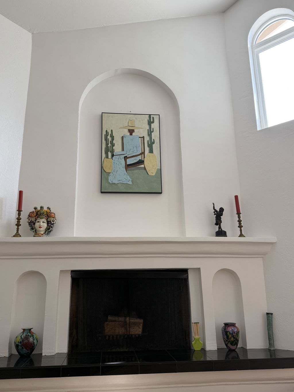
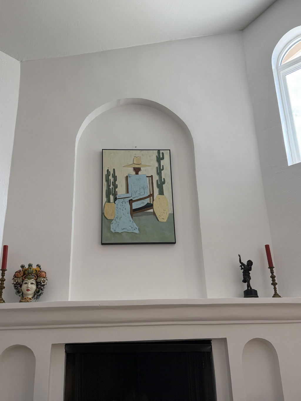
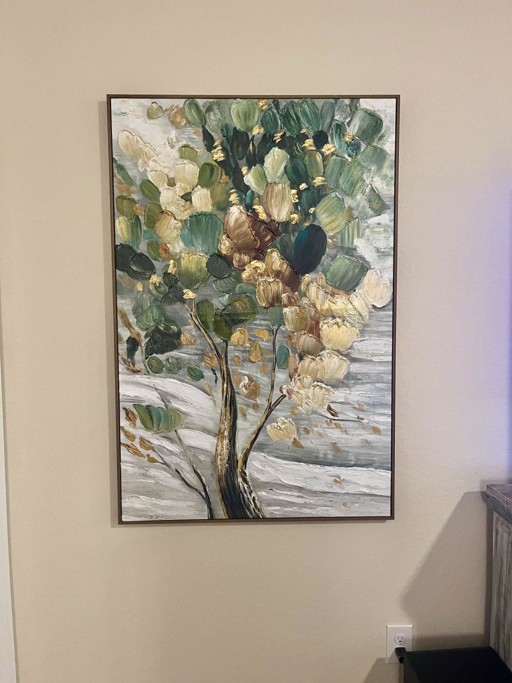
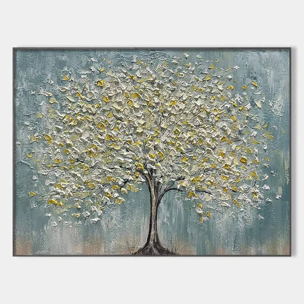
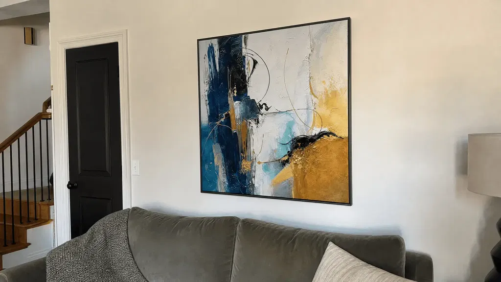
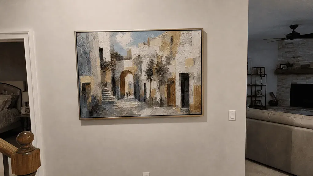
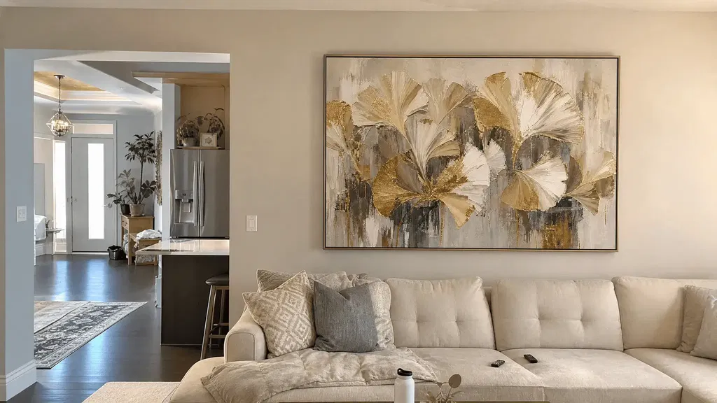
Wall art for low-light rooms works best when its main forms stand out clearly from the wall under the room’s least favorable normal lighting. Start with the wall, then compare the artwork’s tonal range, focal shapes, surface relief, and likely placement. A piece that looks crisp in a bright product photo may blend into a dark wall, lose fine detail from across the room, or feel heavier than expected once installed.
Choose Wall Art for Low-Light Rooms by Reading the Wall First
Judge the specific wall—not the room as a whole—at the times you normally use the space. The best choice remains readable from a normal viewing distance while balancing the wall color and surrounding furniture.
Match the Artwork to the Room’s Actual Light
A room with some indirect daylight can accommodate subtler artwork than one that relies almost entirely on lamps or overhead lighting. Check the intended wall in the morning, afternoon, and evening when those conditions differ meaningfully. If the wall stays shadowed after the lights are on, favor artwork with clear shapes and stronger separation over a composition built around delicate tonal transitions.
Lower contrast makes visual detail harder to distinguish, so view the artwork from the distance where you will actually see it instead of relying on a bright online image. Interior lighting guidance supports this general visibility principle, but it does not establish a universal brightness requirement for residential art.

Adjust the Contrast Test for Light and Dark Walls
Compare the artwork with the actual paint, wallpaper, paneling, or molding around the intended position. Lighting and surface color can change perceived brightness and color, so a palette that looks prominent on a screen may look different in your room.
| Wall Condition | Artwork Check |
|---|---|
| Light wall | Look for darker focal forms, a defined edge, or an accent that keeps pale areas from disappearing. |
| Dark wall | Look for meaningful light areas and a recognizable silhouette; avoid artwork whose darkest regions merge with the wall. |
| Mixed wall or molding | Compare the full framed outline and the artwork’s main forms with the dominant surface behind it. |
If the wall and artwork occupy nearly the same tonal range, keep comparing unless the piece will receive dependable, controlled lighting.
A collection such as abstract wall art can be a useful place to browse after you identify the contrast relationship you need—not proof that every abstract piece will suit a dim wall.
Use Color and Contrast to Keep the Art Readable
Choose color based on the separation it creates from the wall and the clarity of the artwork’s main forms, not on a supposedly universal low-light palette. A restrained or neutral composition can work when its shapes remain distinct; highly muted or very dark artwork needs stronger wall contrast or more favorable lighting.
Prefer Tonal Separation Over a Single Bright Color
One bright accent does not necessarily make an artwork readable if the main composition disappears into the background. Check these three features:
- Major value contrast: Can you distinguish the principal light and dark areas from a normal distance?
- Focal shape: Is the main subject or form recognizable without studying fine details?
- Visible accent: Is there a restrained color or light area that adds definition without becoming the only readable part?
A neutral piece may pass this test more easily than a brighter piece with muddy or closely matched values. Conversely, a colorful work can still feel heavy if most of its composition is deep, dense, or visually compressed against a dark wall.

Know When Muted or Very Dark Art Becomes Too Heavy
Be cautious when the artwork’s background, forms, and wall all sit in a similar tonal range. Deep charcoal, brown, navy, or heavily muted palettes are not automatic exclusions, but they are conditional choices in a dim room. They work more plausibly when the wall is lighter, the focal forms have clear edges, or the placement provides reliable illumination.
The useful question is not “Is this color bright enough?” but “Can I identify the artwork’s main structure without moving closer?” Lighting changes perceived color and brightness, so treat online color claims as provisional rather than final.
Treat Texture as a Visibility Variable, Not a Guarantee
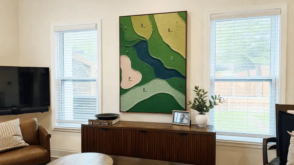
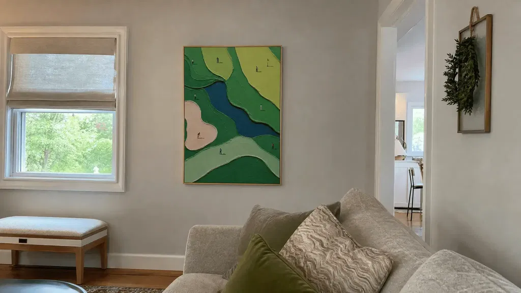
Textured art may add visible edges and natural shadow, but relief can also increase visual weight, hide subtle forms, or create distracting reflections. Judge the surface alongside the composition, sheen, light direction, and viewing distance; texture alone does not guarantee better low-light visibility.
Relief can make surface variation noticeable when useful light reaches the raised areas. The same relief can deepen shadows in an already dark composition or make fine detail look busier from across the room. Gloss and directional light add another variable: a surface may show definition from one angle but reflect a window or lamp from another.
When shopping online, inspect close-up and full-view images, and use side-angle images when available. Ask whether the piece depends on fine relief that may disappear at a normal distance or whether its larger shapes remain readable without the texture doing all the work. Internal guidance on lighting for oil texture may help you think through light direction, but it does not prove that a particular artwork will perform better in your room.
The available technical evidence on reflected glare concerns controlled painted surfaces rather than ordinary residential wall art. Treat the practical takeaway as a room-specific inspection rule: texture may add definition, shadow weight, or reflection depending on how your room is lit.
Place the Artwork Where Light Can Help It Read
Place the artwork where useful ambient or controlled light reaches its face without creating glare. Being close to a window or lamp is not enough; the surface must remain readable from the room’s normal viewing position and angle.
Use Windows and Lamps as Viewing Conditions
Light reaching the artwork matters more than simple proximity to a light source. Before choosing a piece that depends on fine texture or low contrast, consider the likely light path, your viewing position, and the surface finish.
| Placement | Helpful Condition | Watch For |
|---|---|---|
| Near indirect window light | Soft daylight reaches the face without a bright reflection in the viewer’s sightline. | Direct sun, reflected window brightness, and changing visibility throughout the day. |
| Beside a lamp or directional light | The lamp illuminates the artwork without shining into the viewer’s eyes or creating a hot reflection. | Gloss, glazing, deep side shadows, and a lamp that lights the wall unevenly. |
| Shadowed corner | Controlled wall or accent lighting reaches the piece without overwhelming the room. | Furniture, architecture, or a narrow light path hiding key forms. |
Avoid Glare, Deep Shadow, and Competing Focal Points
A nearby window or lamp can wash out detail when direct or reflected brightness covers part of the artwork. The glare guidance from the Florida Solar Energy Center explains why reflected brightness can reduce effective contrast, so inspect the piece from the main seating or standing position—not just straight on at close range.
If the wall remains dim, controlled wall or ceiling illumination may help the artwork read while keeping the brightest source out of the viewer’s direct sightline. Government lighting research supports indirect wall and ceiling illumination as a possible approach, not a guarantee or requirement.
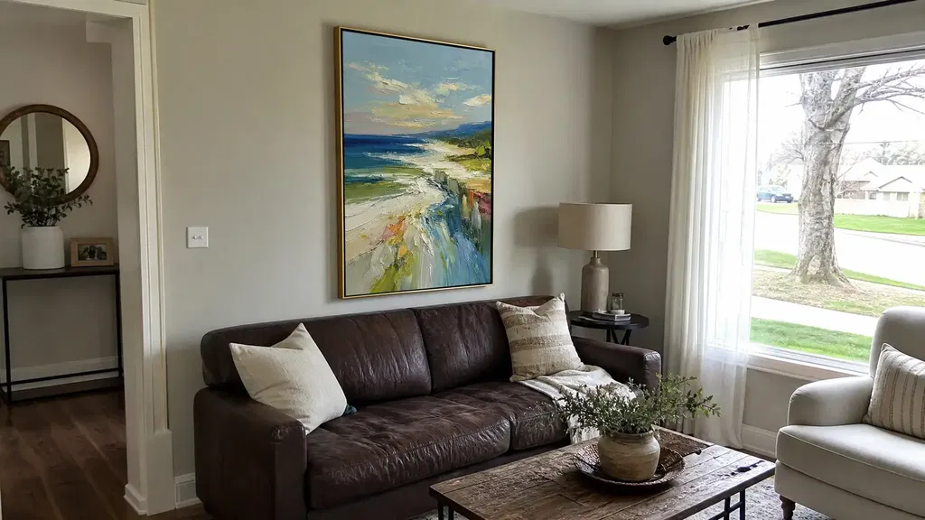
Also check whether furniture, a doorway, trim, or a competing bright surface pulls attention away from the artwork. On an unavoidably dim wall, prioritize a clear silhouette and stronger wall separation before adding a visually complex composition. A textured coastal painting can serve as an example to inspect for surface, color, and placement—but its product page cannot establish how it will read in your room.
Run the Five-Point Fit Check Before You Buy
Before placing the order, test the artwork against the intended wall under the dimmest normal condition and from the distance where you will usually view it. This is a practical likelihood test, not a guarantee of how the finished room will look.
- Wall contrast: Compare the artwork’s main light and dark areas with the actual wall, including any molding or dominant trim.
- Dimmest normal lighting: Use the evening, lamp-only, or shadowed condition that regularly occurs—not the brightest moment shown in a listing photo.
- Focal-form readability: Check whether the main subject, silhouette, or abstract structure is recognizable without moving closer.
- Texture effect: Decide whether relief adds useful definition or instead creates shadow weight, visual busyness, or a likely reflection.
- Viewing distance and overall weight: Step back to the normal seating or standing position and ask whether the piece feels balanced rather than merely visible.
If the artwork passes all five checks, it is a stronger candidate for the wall. If it fails only because of placement, repositioning or suitable controlled lighting may solve the issue. If it blends into the wall, loses its focal forms, or feels too heavy under normal lighting, keep shopping. You can compare options such as a neutral textured painting or browse impasto artwork as inspection paths, but judge each specific piece against your own wall and lighting.
Use this test to narrow your options for wall art for low-light rooms: compare the wall, the dimmest normal light, the viewing distance, and the artwork’s focal forms before you order.
FAQs
Use these questions to check common exceptions involving color, texture, frames, and window placement. The same room-specific test still applies.
What color wall art is best for a dark room if I do not want bright colors?
Neutral art can work when its values separate from the wall and its main forms have defined edges. If the tones closely match, try a different position or controlled lighting before ruling out the piece.
Can black-and-white wall art work on a dark wall?
Yes, if the white areas remain visible and carry the focal structure. Check the full composition from your normal viewing distance, since a small white accent may not provide enough separation.
How can I judge textured wall art online?
Use close-up, full-view, and side-angle images when available. Check whether fine relief disappears at a normal distance or reflects a window or lamp.
Should I choose a lighter frame for a low-light room?
Not automatically. Compare the full framed outline with the wall and surrounding trim instead of choosing a light frame by default.
Is wall art near a window always easier to see?
No. Indirect light may help, while direct or reflected brightness can create glare. Check the piece from your normal viewing angle.