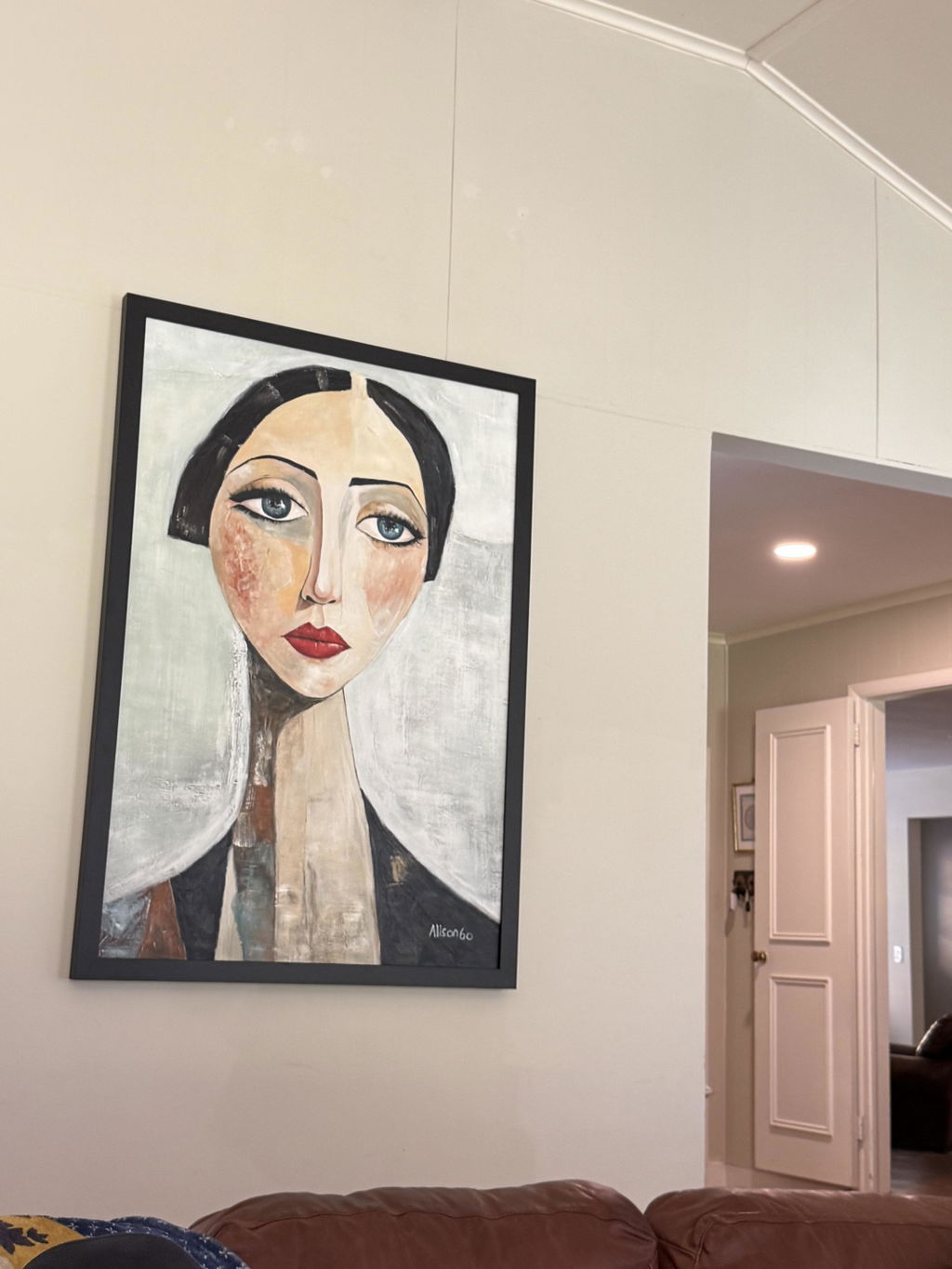
Yes—colorful abstract art can work in a beige, white, gray, or warm-neutral room, but the match depends on a few details. Start with the room’s undertone, then look for one color bridge, compare the artwork’s intensity and scale with the space, and test it on the actual wall in daylight and evening light. A vivid piece is usually easiest to integrate when it has one clear visual role instead of competing with several strong accents.
Read the Room’s Neutral Base and Undertone
This kind of artwork can suit many neutral interiors when its temperature, intensity, and visual weight work with the room’s existing finishes. Classify the space as mostly warm, mostly cool, or mixed before judging the artwork; a neutral wall is not automatically free of undertones.
Beige and Warm-Neutral Rooms
Beige, cream, tan, and warm-white rooms usually provide a good starting point for a warm or softened connection. Look for relationships with cream, honey, wood, tan, terracotta, dusty rose, or warm upholstery instead of relying on a label such as “blue” or “green.”
- Identify the room’s warmest visible neutral in the flooring, sofa, rug, wood, or upholstery.
- Compare the artwork with those fabrics and finishes in daylight and evening light.
- If a cool, highly saturated section feels abrupt against the room’s warmth, consider a more muted version, a warmer neighboring color, or a smaller focal area.
Judge color by hue, lightness, intensity, contrast, and lighting—not by the color name alone. The undertone test of comparing colors with existing finishes in changing light is useful here, even though the source discusses paint rather than artwork.

White and Cool-Gray Rooms
White and cool-gray rooms can support brighter wall art, but sparse surroundings may make the piece look more prominent. Compare it with metal, glass, upholstery, flooring, and cool-toned accents instead of treating white as a blank, undertone-free backdrop.
A bright artwork may become the room’s main focal point when there is little competing texture or color. That can work in a minimalist home if the wall and nearby furniture provide enough breathing room. If the artwork feels harsh against the room’s gray or blue cast, lower intensity or softer contrast may work better than adding accessories to force coordination.
Layered or Warm-Cool Mixed Rooms
Mixed-neutral rooms do not need artwork that matches every finish. Choose one existing element as the connection point and let the other colors remain supporting details.
| Room Condition | What to Look For in the Artwork |
|---|---|
| Mostly warm | A warm or softened color relationship with wood, upholstery, or flooring |
| Mostly cool | A clear focal color that can handle stronger contrast without crowding the room |
| Mixed finishes | One bridge to a rug, pillow, metal, wood tone, or nearby object—not a full match |
| Minimal, low-texture styling | Enough negative space to contain a vivid focal piece |
For a useful follow-up on connecting different room colors, see ways to unify mismatched room palettes. Use it as optional inspiration, not as proof that a particular artwork will fit.
Choose an Anchor Color for Colorful Abstract Art
A multicolor artwork looks more intentional when one visible room detail creates a recognizable connection. The bridge can be subtle or high-contrast, but the room does not need to repeat every shade in the artwork.
Find the Room’s Color Bridge
Select one reference detail—such as a rug, pillow, throw, wood tone, metal finish, or nearby object—and compare both its temperature and intensity with the candidate artwork.
- Choose the room detail you would still notice if the artwork were removed.
- Compare whether its color feels warm, cool, muted, or vivid next to the artwork.
- Decide whether the color should repeat quietly or become the artwork’s focal contrast.
A neighboring hue is generally a lower-contrast starting point, while an opposite hue can create a bolder focal effect. These are color-theory relationships, not guarantees: value, saturation, lighting, and surrounding materials can change the result. The general distinction between analogous and complementary color relationships supports the vocabulary, while the actual room remains the deciding test.

For example, a muted blue-gray rug might provide a calm bridge to blue and green passages in the artwork. A small rust-colored detail could instead create a more assertive contrast. Neither approach requires matching pillows or repeating every color.
Limit Competing Strong Colors
Identify the artwork’s strongest color and check whether another color in the composition has equal visual force. When several colors are equally vivid, nearby accessories should usually be quieter so the artwork can maintain a clear lead.
- Note which color you notice first from the room entrance.
- Check whether a second artwork, patterned rug, or bright accessory demands equal attention.
- Remove, relocate, or visually quiet nearby accents before deciding that the artwork itself is wrong.
This one-anchor approach is a flexible guideline for a neutral room, not a rule that every space must follow a fixed color formula. A multicolor piece can connect through one recognizable relationship while its other colors add controlled variety.
Control Intensity, Scale, and Negative Space
Brightness, saturation, physical size, surrounding contrast, and empty wall space work together to determine whether the piece feels balanced or visually heavy. Judge the candidate against the actual wall and furniture footprint, not an isolated product image or staged room.
| Check | Lower Visual Weight | Higher Visual Weight |
|---|---|---|
| Artwork size | Smaller footprint or more wall around it | Larger footprint with less breathing room |
| Color intensity | Muted passages and lower contrast | Vivid passages and sharp contrast |
| Surrounding detail | Simple furniture and restrained patterns | Busy patterns and several bright accents |
| Breathing room | Clear wall and one focal area | Crowded wall with competing objects |
Match Size to the Wall and Furniture
An undersized piece may feel disconnected from the furniture below it, while an oversized piece may dominate a sparse room. Before ordering, compare the listed artwork dimensions with the wall width, furniture width, doorways, nearby windows, and the space needed around the piece.
Large statement artwork can suit a neutral living room, bedroom, entryway, or office when the surrounding composition is restrained. A smaller accent may be easier to integrate when the wall is narrow, the room has several focal points, or the artwork contains many strong colors. There is no universal artwork-to-sofa ratio that guarantees a good result, so measure the actual installation area and consider the furniture’s visual mass.
Use Negative Space as a Buffer
An open wall and simple nearby furnishings can give a vivid piece room to lead. When the focal area is crowded, reduce competing decor before rejecting the artwork.
- Assess how much clear wall will remain around the artwork.
- Look for high-contrast objects, busy patterns, mirrors, shelving, or another bright focal point nearby.
- If the wall feels crowded, remove or relocate one competing element rather than adding another matching accent.
A vivid, high-contrast version of a hue will usually demand more attention than a muted or lower-contrast version. Color theory separates brightness or value from saturation or intensity, so compare both when deciding whether the candidate feels too loud. This overview of brightness and saturation in interior color supports that distinction without establishing a required percentage or size rule.
Know When Bright Art Fits—and When to Soften It
A colorful piece fits best when the room can give it one clear visual lead. Soften or replace the candidate when competing elements, limited breathing room, or a persistent undertone mismatch remain after practical adjustments.
Conditions That Support a Colorful Focal Piece
A brighter choice is more workable when the room has a controlled neutral base, one available focal wall, and moderate surrounding contrast. These conditions support using bright abstract art without treating vividness as an automatic fit.
- The wall has a clear focal role rather than competing with a television, gallery wall, shelving, or a busy window treatment.
- Nearby furniture and patterns are restrained enough for the artwork to lead.
- One anchor color connects the piece to the room without requiring an exact match.
- The artwork has usable negative space around it, or nearby decor can be simplified.
Signs the Palette Should Be Softer
Choose lower intensity, fewer competing colors, a smaller focal area, or a more neutral candidate when the room cannot provide visual breathing room. A softer choice is not automatically safer; it is simply better suited when the brighter candidate continues to compete or clash.
- Several strong accents or busy patterns already compete for attention.
- The intended wall is narrow or crowded, leaving little empty space.
- The artwork’s undertone still feels harsh beside the room’s fabrics, wood, flooring, or wall color after viewing it in different light.
- The candidate needs multiple new accessories to appear connected.
If those signals persist, replace the candidate rather than forcing a match. If the issue is limited to nearby clutter, adjust the room first and retest.
Run a Pre-Order Fit Test
Before checkout, preview the candidate at its intended location and approximate scale, then decide whether to keep, adjust, or replace it.
- Mark the wall with a taped or sketched rectangle that matches the listed dimensions.
- Compare the candidate with nearby furnishings in daytime and evening light.
- Identify its anchor and strongest competing color, then check the visual hierarchy.
- Verify dimensions, orientation, framing or mounting, shipping, returns, and warranty terms on the listing.
- Keep it if one clear lead remains; adjust nearby decor if that resolves the problem; replace it if undertone, scale, or visual weight still feels wrong.
If the candidate passes, shop canvas wall decor and apply the same checks to each listing. The collection does not establish a particular piece’s dimensions, color accuracy, or compatibility.
FAQs
What Colors Go With Colorful Abstract Art in a Neutral Room?
Use one recurring artwork color as an optional nearby accent only if the room does not already have enough color. A small pillow, throw, or object can create continuity, but skip the accent if it makes the room feel like it is developing a second competing palette.
Should Wall Art Match the Sofa or Rug Exactly?
No. Use the sofa or rug to compare temperature and intensity, not as an exact-match target. Exact matching can look forced with multicolor art; a related level of mutedness or a neighboring hue is often enough, provided the artwork still works with the room’s lighting and finishes.
How Can I Preview Colorful Abstract Art Before I Order?
Tape a rectangle to the intended wall or use a correctly scaled printout, then view it in both daytime and evening conditions. Include nearby furniture in the test and leave the rectangle in place long enough to notice whether the artwork feels too dominant from the room’s main sightlines.
Can Colorful Abstract Art Work in a Small Apartment or Rental?
Yes, when the piece has a contained focal area and the wall can support its footprint without crowding. In a rental, confirm the allowed hanging method before checkout and review the current return conditions; limited wall area makes scale and return flexibility especially important.