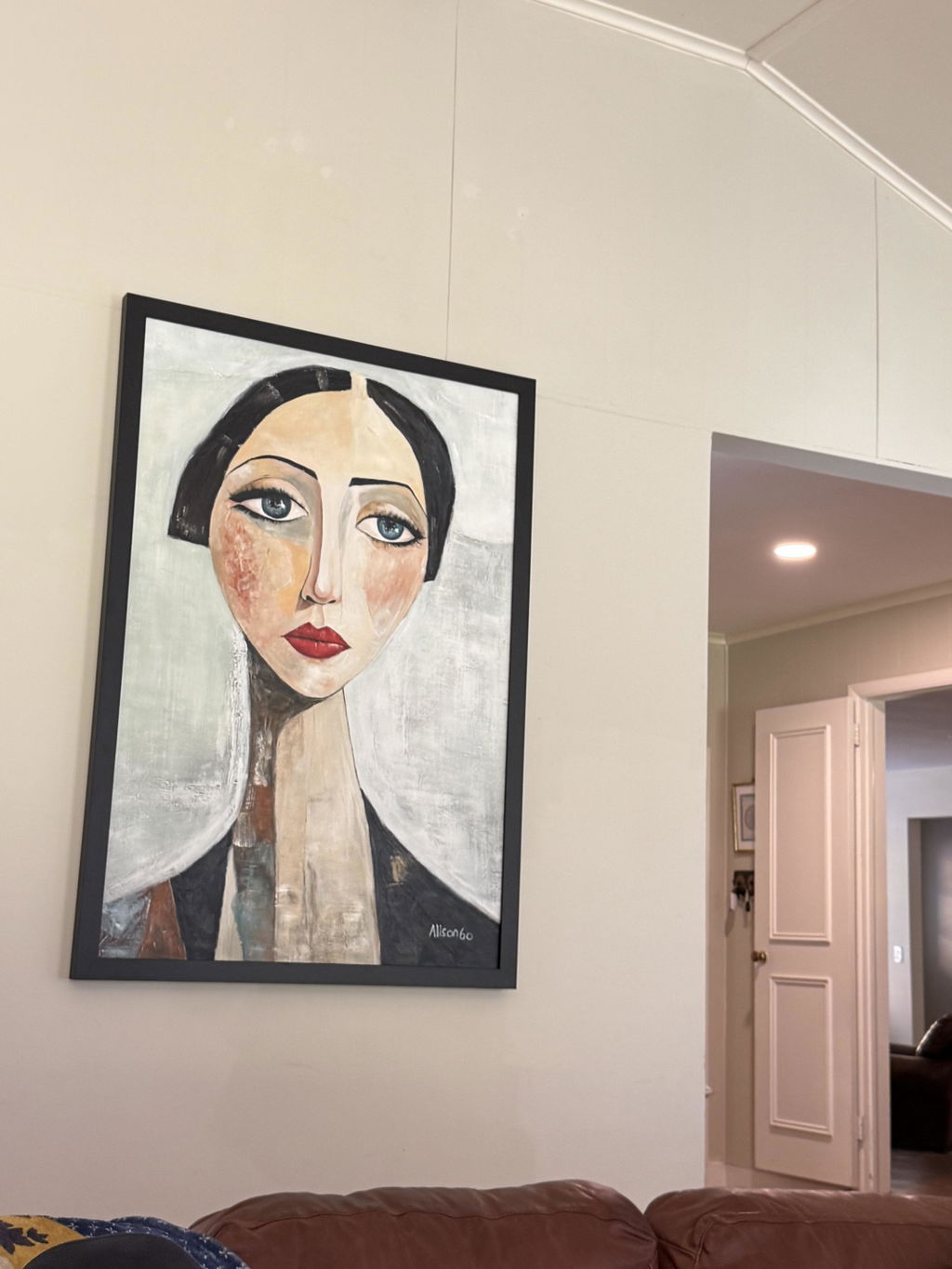
Open-concept wall art works best when you plan the visible sequence before choosing individual pieces. Walk through the home from the entry, seating area, dining area, kitchen, and hallway viewpoints; note which walls appear together, then give each wall a role. Repeat just one or two compatible cues—such as color, texture, frame finish, or subject rhythm—and let wall width, furniture, and traffic determine scale. A final viewpoint check helps you decide what to buy, revise, tone down, or leave open.
This approach answers how to choose art for an open-concept home without turning every connected room into a matching set. The goal is a coordinated visual plan, not identical artwork everywhere.
Map the Sightlines for Open-Concept Wall Art
Start with what you can see together, not with labels such as living room, dining room, or kitchen. A wall that belongs to a different room may still be part of the same visual sequence if it appears repeatedly from the sofa, dining table, or entry. This is a practical planning method, not a fixed design standard; sightline guidance for home design offers similar framing.
Mark Shared Views and Independent Zones
Before selecting pieces, walk through the home as if you were a guest arriving and moving from one area to the next. Record the main viewpoints, including seated and standing positions, and group walls that repeatedly appear together. Separate walls that disappear behind a corner, furniture arrangement, or change in direction.
- Stand at the entry and note the first wall or group of walls that draws your eye.
- Check the main seating position, dining position, kitchen work area, and hallway or pass-through.
- Mark walls visible from more than one of those positions as shared-view walls.
- Mark walls seen only briefly or from one direction as more independent zones.
- Revisit the map after the furniture and lighting are in place, since both can change the actual view.
An uninterrupted view across living and dining areas usually deserves more coordination than a wall hidden from the main seating area. A smaller or interrupted open layout gives you more freedom to vary the artwork between zones.

Separate the Main View From the Pass-Through View
Give the most frequently seen viewpoint more planning weight than a quick glimpse through the kitchen or hallway. If a kitchen-adjacent wall is visible from the sofa, it belongs to the living-area sequence; if it is seen only while walking past, it can use a quieter connection. Furniture and room elements can change the view, so recheck the sightlines after furnishing rather than relying only on an empty-room plan.
This distinction keeps a pass-through wall from becoming an accidental second focal point. Treat it as a bridge when it links two zones, but let it remain visually restrained when the main living or dining view already has enough activity. For a useful follow-up on choosing a lead piece, see visual anchor principles.
Give Each Visible Wall a Clear Job
Once you know which walls are seen together, assign roles instead of giving every surface equal visual intensity. One wall may lead, nearby walls may support, and a hallway may simply connect the sequence. This is a planning framework, not a requirement that every home have one dramatic anchor. Practical open-concept zoning guidance also treats artwork as one way to distinguish connected areas while keeping them visually related.
Choose the Anchor Wall
Choose the potential anchor by weighing three factors: recurring visibility, a clear relationship to the furniture, and enough usable wall area for the intended visual weight. The most visible wall is not automatically the best choice if a doorway interrupts it or it has no meaningful relationship to the seating or dining arrangement.
An anchor can use stronger contrast, greater presence, or a more noticeable subject when the layout supports it. In a quiet, neutral open plan, a low-contrast piece may be the better lead because it establishes direction without overwhelming the connected rooms. In a color-forward interior, the anchor may need a simpler relationship to surrounding finishes rather than another highly active color statement.
Build Supporting Walls Around It
Supporting and transition walls should relate to the anchor without copying it. Use the shared sightline to decide how quiet each wall needs to be:
- Living-area support: Let nearby artwork reinforce the seating area without competing with the wall carrying the greatest visual responsibility.
- Dining support: Give the dining wall its own identity while borrowing a limited cue from the living area, especially when the table and sofa are visible together.
- Kitchen-adjacent support: Use a restrained treatment when the wall sits within the main living sightline. It should connect the kitchen to the plan without becoming a separate centerpiece by default.
- Hallway or pass-through transition: Use the wall as a visual bridge when it links zones, but keep its scale or intensity quieter if viewing time is brief.
This role-based method is more useful than assigning art by room name alone. The same kitchen wall might be supporting in one layout and independent in another, depending on what the furniture leaves visible.
Coordinate Through Repeated Cues, Not Matching Sets
To coordinate wall art between rooms, repeat a limited relationship rather than the entire look. One or two compatible cues can connect the zones while subject, composition, format, and intensity change from wall to wall. That conditional approach is consistent with editorial guidance on mixing dining-room elements, but it is not a universal rule.
Select the Strongest Shared Cue
Compare these options separately instead of trying to repeat all of them:
- Color: Repeat a color that already appears in upholstery, rugs, cabinets, or nearby finishes, but vary its proportion or intensity.
- Texture: Use texture as the bridge when the home already has tactile surfaces and the subject matter needs more freedom.
- Frame finish: A related frame finish can connect pieces when color palettes differ, provided the frames do not make every display feel identical.
- Subject rhythm: Repeating lines, curves, movement, or organic forms can create a quieter relationship than repeating the same subject.
Choose the cue that fits the existing finishes and lighting. A color bridge may be natural in a neutral interior, while a color-forward room may benefit more from related framing or a simple recurring shape. The right cue is visible enough to connect the zones without becoming so dominant that it dictates every artwork choice.
Set a Coordination Limit
Repeating color, texture, frame, subject, composition, and scale at the same time can make an open plan feel staged. Start with one cue; add a second only if the spaces still feel disconnected when viewed together.
Neutral interiors often have room for a controlled color or texture bridge. Color-forward interiors may need simpler framing or subject rhythm so the artwork does not compete with the room's existing palette. Either way, preserve each zone's identity by changing at least one major characteristic, such as orientation, subject, composition, or visual intensity.
When you are ready to browse by concept rather than by room, color connections between artworks can serve as an editorial starting point. Treat any browsing path as a way to explore options, not proof that a particular style will fit your home.
Match Scale and Placement to the Room
The best format depends on the usable wall, relationship to furniture, ceiling height, viewing distance, and traffic around it. There is no universal hanging height, wall-percentage, or clearance formula for every open-plan setting, so judge the complete arrangement from the furnished viewpoints. For wall art for an open-concept home, the usable wall and the view from nearby furniture matter more than a preset size rule.
Size a Single Anchor to Its Setting
A single piece can work when its visual presence relates clearly to the wall and the furniture below or beside it. Consider the usable width rather than the total wall, and account for doors, windows, counters, shelving, and architectural breaks. A broad wall may call for more horizontal presence, while a tall or narrow wall may favor vertical orientation, but the surrounding sightline can change that choice.
Do not center art only on an empty rectangle. Center it in relation to the furniture, openings, and direction from which people actually see it. A piece that looks appropriately prominent from the entry may feel crowded from the sofa, so check both views before committing.
Use Groupings When the Wall Calls for Rhythm
A grouping can create the needed visual footprint when one piece would feel too isolated or when several furniture positions need a shared relationship. Judge the grouping as one composition, including its overall visual weight, rather than evaluating each piece separately.
| Wall or setting | More useful starting point | What to judge from the main view |
|---|---|---|
| Broad wall | Single horizontal piece or coordinated grouping | Whether the full width relates to the furniture and does not leave the wall visually disconnected |
| Tall or narrow wall | Single vertical piece or compact vertical grouping | Whether the height supports the wall without crowding openings or making the pass-through feel tight |
| Wall spanning multiple furniture positions | Grouping or carefully chosen broad piece | Whether the complete footprint links the positions without creating a competing focal treatment |
A grouping is not automatically better for a large wall, and a single piece is not automatically better for a narrow one. The surrounding furniture and repeated sightlines decide how much rhythm or visual quiet the wall needs.
Check Viewing Height and Clearance
Before buying or hanging, review the proposed placement from the ways the room is actually used:
- Compare seated and standing views from the living and dining areas.
- Check the relationship between the artwork, sofa, console, table, cabinets, or other nearby furniture.
- Make sure doors, walkways, counters, and pass-throughs do not feel crowded.
- Look for openings or sightline changes that make the artwork appear off-center from another zone.
- Judge the full arrangement at the distance from which it will usually be seen.
These checks are more reliable than applying a fixed placement rule to every wall. If a piece works from one position but feels intrusive or disconnected from another, revise the format, orientation, grouping, or wall assignment.
Run the Plan From Every Main Viewpoint
Before buying or hanging several pieces, test the complete plan in the furnished home. The purpose is to catch an unintended competing focal point, a weak connection between zones, a scale mismatch, or a traffic conflict while changes are still easy.
- View each major zone: Stand at the entry, main seating position, dining position, kitchen area, hallway, and any other recurring viewpoint. Note which walls appear together now, not just on the floor plan.
- Identify competing focal points: If two or more visible treatments demand equal first attention, quiet one by reducing intensity, changing the grouping, or leaving that wall open. This is a useful editing rule, not a universal design law.
- Verify the repeated cues: Confirm that the chosen color, texture, frame finish, or subject rhythm is visible enough to connect the zones without appearing copied.
- Compare scale with walls and furniture: Check the complete footprint from seated and standing positions. A piece that looked right in isolation may be underpowered beside a broad wall or crowded near an opening.
- Confirm traffic paths: Walk between the living, dining, kitchen, hallway, and entry areas. If the arrangement feels visually or physically intrusive, revise it before purchasing multiple pieces.
The result should point to a clear next action: buy the pieces that fit the map, revise the walls that compete, tone down the pass-through areas, or leave a wall open. If you need to browse by orientation after making those decisions, explore horizontal wall art or large vertical wall decor according to the wall context—not as a substitute for measuring and viewing the actual space.
FAQs
Use these questions to check matching, kitchen references, palette differences, and uneven wall sizes before you buy or hang open-concept wall art.
Should Wall Art Match Throughout an Open Floor Plan?
No. Repeat one or two underlying cues, then vary the artwork by function, visibility, and scale. If the palette already has several strong colors, a shared frame finish or subject rhythm may connect the rooms without adding another repeated color.
Should Kitchen Wall Art Follow the Living Room or Dining Area?
Use the area the kitchen wall is most often seen with as its primary reference. If it is equally visible from both, choose a restrained bridge cue instead of creating a competing anchor. Recheck the choice from the main seating position after cabinets, lighting, and counter activity are in place.
How Do You Coordinate Art in Adjoining Rooms With Different Color Palettes?
Choose a small detail that appears naturally in both spaces, such as a muted accent, recurring line quality, texture, or frame finish. If no cue fits both rooms, let scale or orientation provide the transition rather than forcing a color match.
How Do You Create Flow Between Rooms When Wall Sizes Differ?
Give the broad wall more visual authority and use quieter, smaller, or differently oriented pieces on adjoining walls. Repeat a cue rather than the same scale. If a narrow wall is visible only briefly, it may need a simple transition treatment—or no artwork—instead of a compressed version of the statement piece.