The Shift from Vanity Assets to Authentic Texture
The global art market is undergoing a fundamental correction. While high-end auction sales for purely financial art assets plummeted 44% year-over-year in 2024, according to Marketplace.org, there is a significant retreat back to "real application value." Buyers are no longer chasing overpriced vanity pieces; they are investing in custom, hand-painted works that offer emotional resonance and tactile authenticity.
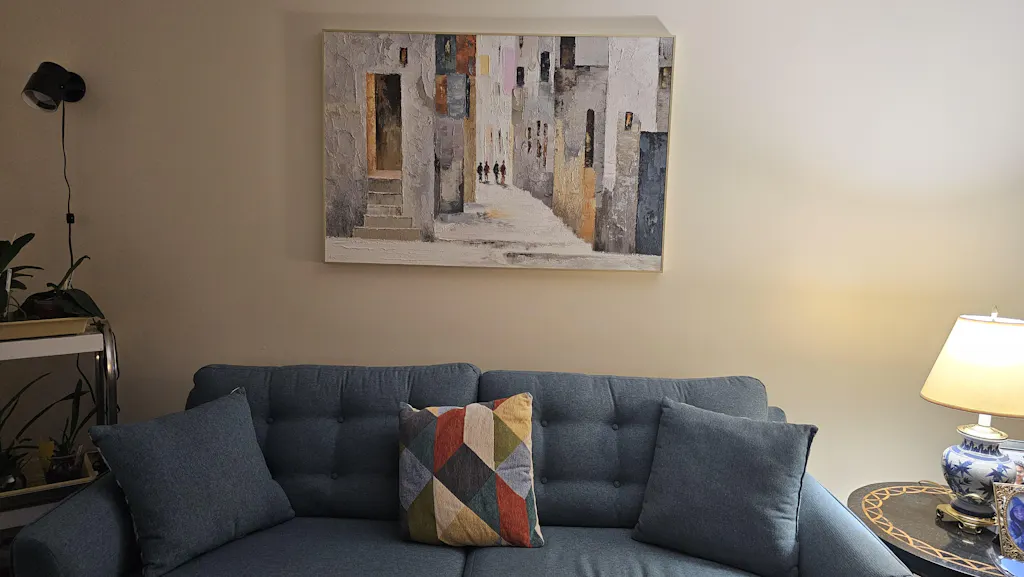
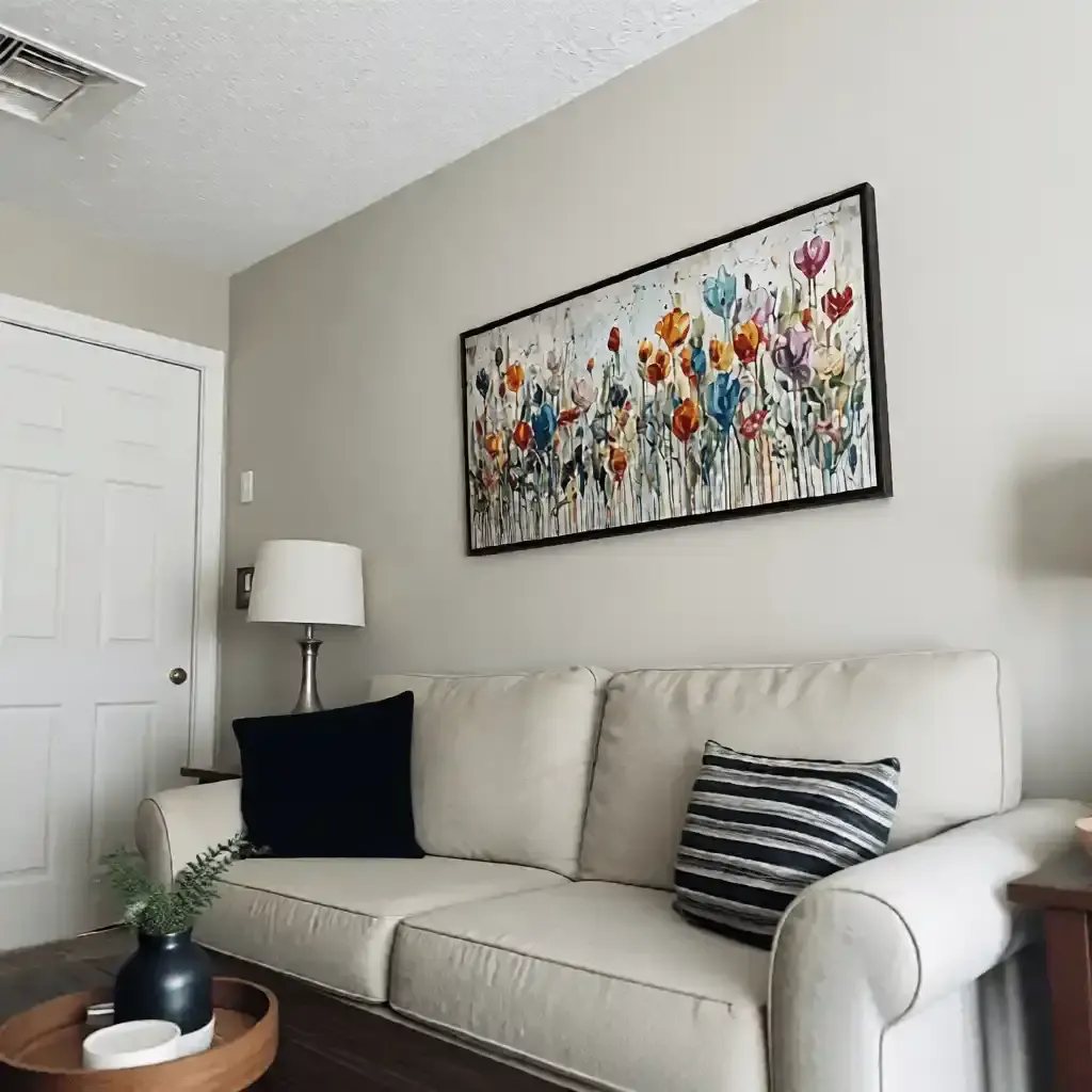
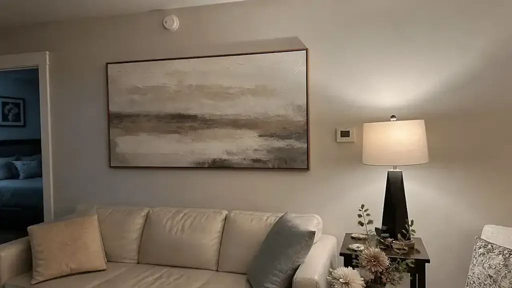
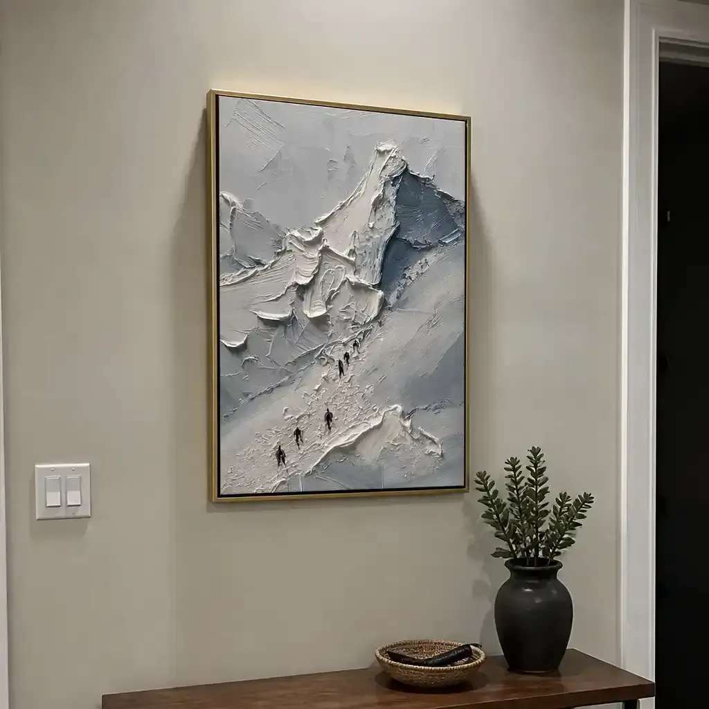
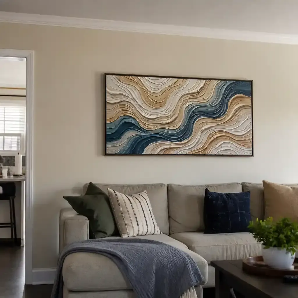
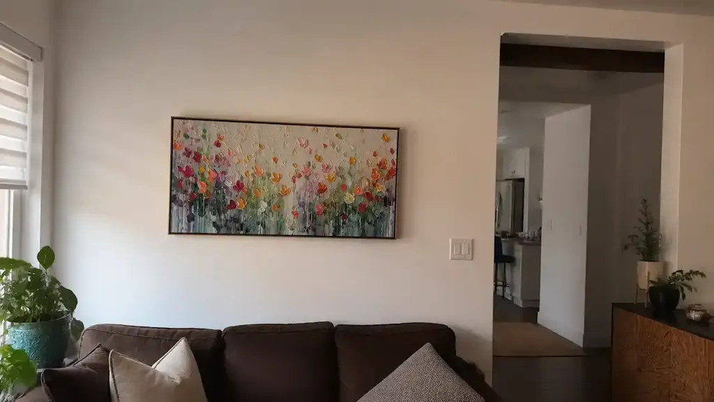
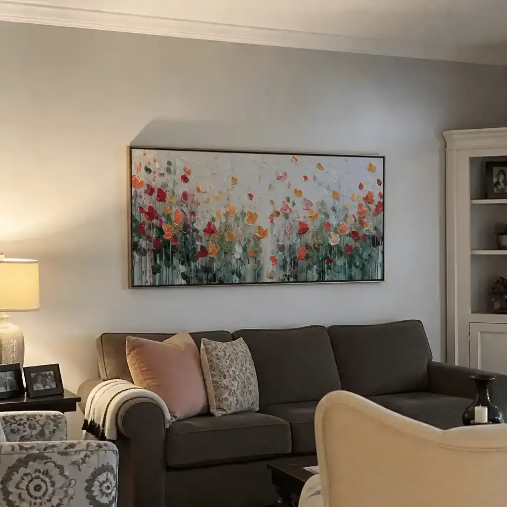
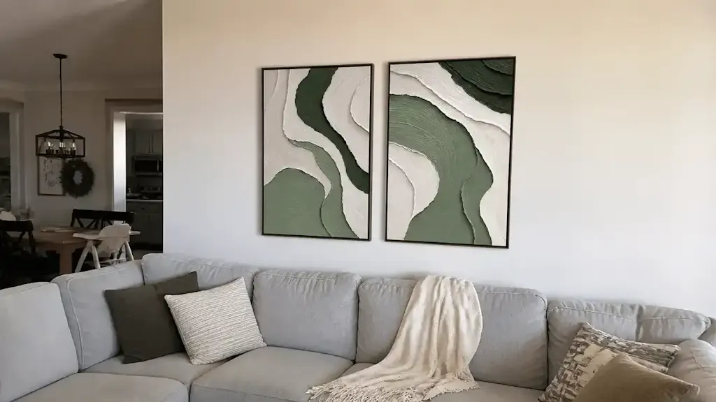
In this landscape, the "dry brush" technique has emerged as a favorite among interior designers and aesthetic-driven homeowners. Unlike the fluid, blended transitions of wet-on-wet painting, dry brush creates a high-texture, scratchy aesthetic characterized by "broken" strokes. These strokes leave microscopic peaks of pigment that interact dynamically with modern home lighting. However, the visual impact of a dry brush masterpiece is entirely dependent on its relationship with light. Without the correct recessed lighting strategy, the very texture that makes the piece valuable can be flattened and lost.

The Physics of Texture: Dry Brush vs. Wet-on-Wet
To understand why lighting is so critical, we must first look at the structural differences between application methods. In our studio work, we categorize these results by their "scattering coefficient"—a measure of how much light a surface reflects in different directions.
Wet-on-Wet (Alla Prima)
In wet-on-wet painting, layers of wet paint are applied to one another, allowing for seamless blending and fluid gradients. The resulting surface is relatively smooth, with a scattering coefficient typically ranging from 0.1 to 0.3. Under direct light, these paintings appear blended and uniform, often requiring less specialized illumination to look "correct."
Dry Brush Application
Dry brush involves using a brush that is relatively dry but still holds pigment. As the brush moves across the canvas, it only deposits paint on the high points of the canvas grain, creating a "broken" effect. This technique produces microscopic pigment peaks (roughly 30-100μm in height). According to optical microprofilometry research, these textures are crucial to the aesthetic experience, as they create a scattering coefficient between 0.3 and 0.7.
This higher scattering coefficient means that dry brush art creates discrete light-catching points. When you move through a room, the artwork appears to "live" or shimmer, as different peaks catch the light from different angles. This is precisely why texture is considered the soul of high-end 2026 interior design trends.
Logic Summary: Our comparison of scattering coefficients assumes standard heavy-bodied pigments on a medium-grain primed canvas. These values are heuristics used in spatial design to predict how "active" a wall surface will appear under varied light sources.
The Lighting Angle Protocol: Challenging the 30-Degree Rule
A common mistake we see in residential installations is the strict adherence to the "30-degree rule" for art lighting. While 30 degrees is a safe baseline for flat prints or smooth oil paintings, dry brush highlights require a more aggressive approach to reveal their depth.
The 45-Degree Advantage
Professional interior designers consistently observe that recessed lighting placed at a 45-degree angle creates the most dramatic texture reveal. At this angle, the light grazes the "micro-valleys" (5-50μm depth) between pigment deposits, creating subtle shadows that define each stroke.
If the light is placed too close to the wall (creating an angle of 15-20 degrees), it creates harsh, elongated shadows that obscure the artwork's detail. Conversely, direct overhead lighting (90 degrees) flattens the peaks, making a hand-painted dry brush piece look like a flat digital print.
Cross-Illumination Strategies
Expert opinion suggests that for large-scale dry brush murals, single-direction recessed lighting is insufficient. Single-source lighting can hide 40-60% of the detail due to "shadow occlusion." To mitigate this, we recommend cross-illumination from 2-3 directions (e.g., 30° vertical combined with 15° horizontal offset). This ensures that the viewer sees the texture regardless of their position in the room, creating the social validation and "wow factor" homeowners prioritize.
| Lighting Angle | Visual Result on Dry Brush | Texture Reveal Score (1-10) |
|---|---|---|
| 15° - 20° | Harsh shadows, "texture noise" | 4 |
| 30° | Standard, safe, slightly flat | 6 |
| 45° | Optimal contrast and peak highlight | 9 |
| 90° (Overhead) | Flattened, looks like a print | 2 |
Color Integrity: CRI and Kelvin Requirements
The authenticity of a hand-painted piece isn't just in the texture; it's in the mineral pigments. Mineral pigments, such as cadmium reds or cobalt blues, scatter light differently than synthetic acrylics. They produce complex refraction patterns that create a shimmering effect under directional light.
The CRI ≥ 95 Mandate
Most consumer-grade recessed LEDs have a Color Rendering Index (CRI) between 80 and 85. In our experience, this is the "death of color" for fine art. A low CRI distorts the integrity of mineral pigments, making vibrant reds look muddy and deep blues look gray. Museum-grade lighting requires a CRI of 95 or higher to maintain color accuracy.
The Kelvin Sweet Spot: 3500K - 4000K
While homeowners often prefer "warm" light (2700K-3200K) for a cozy atmosphere, this temperature is detrimental to dry brush highlights. Warm light disproportionately boosts reds and yellows by 15-20%, which flattens the cool-toned highlights (blues and grays) essential for the dimensional illusion of dry brush. We recommend 3500K-4000K neutral white light. This range provides the crispness needed to make the white-space highlights of the dry brush technique "pop."

Spatial Strategy: Distance and Beam Spread
For a standard 8-foot ceiling, the physical placement of the recessed fixture is the final piece of the puzzle.
The 2-3 Foot Rule
A practical heuristic we use for art-focused lighting is to position recessed lights 2 to 3 feet from the wall surface. This distance allows for an optimal beam spread that covers the artwork without creating a "hot spot" at the top of the frame.
When calculating beam spread, it is important to incorporate viewing distance. Standard formulas often underestimate light diffusion needs by 30-50% for dry brush art because they don't account for the pigment's higher scattering coefficient. We suggest a beam angle that is roughly 1.5x the width of the artwork to ensure soft edges and a natural transition into the surrounding wall space.
Method & Assumptions (Light Placement Model):
Parameter Value/Range Unit Rationale Ceiling Height 8 - 10 Feet Standard residential height Wall Offset 24 - 36 Inches Prevents "hot spots" Beam Angle 25 - 40 Degrees Controls light spill Target Illuminance 200 - 400 Lux Standard museum display level Viewing Distance 1.5w Multiplier w = artwork width
The Investment Value of Authentic Craftsmanship
Beyond the visual impact, there is a clear economic and psychological case for choosing hand-painted, textured art over digital replicas.
Boosting Property Value
Research by the Royal Society found a direct correlation between art and property prices. Neighborhoods with higher "art" geo-tags saw greater relative house price gains. For commercial developers, commissioning public murals has been shown to drive significant revenue growth, with projects like Chicago's Millennium Park triggering $1.4 billion in related real estate growth.
The "Human-Made" Premium
In an era of AI-generated content, consumers are placing a higher premium on human effort. A Columbia University study confirmed that consumers value art labeled "AI-generated" 62% lower than authentic human-created art. Furthermore, research from the University of Chicago suggests that digital replicas lack the artist's "essential identity," which collapses their perceived long-term value.
Health and Well-being
The impact of art extends into the realm of public health. A University of Pennsylvania review noted that 73% of patients reported significant mood improvements when exposed to environmental artworks. Large-scale nature murals have been shown to activate the medial prefrontal cortex (mPFC), optimizing emotional regulation and reducing stress. This makes textured murals an ideal choice for high-stress environments like home offices or private clinics.
Safety and Environmental Integrity
When bringing large-scale painted works into the home, safety cannot be an afterthought. Indoor air quality is a significant concern, as the EPA warns that indoor pollution can be deadlier than outdoor levels.
The Low-VOC Promise
To achieve LEED or WELL certification in commercial spaces, or simply to protect a family's health, using low-VOC (Volatile Organic Compound) paints is mandatory. Modern acrylics and certain oils, when paired with walnut oil instead of toxic turpentine, emit significantly lower toxins. Aalto University experiments have shown that VOC emissions from painted surfaces plummet during the curing process, making them safe for even maternal and infant environments.
The "Odorless" Myth
It is a dangerous misconception that "odorless" solvents are non-toxic. Guidelines from Princeton University warn that chronic inhalation of even odorless mineral spirits can cause central nervous system issues. This is why we advocate for water-based acrylics or solvent-free oil techniques for indoor murals.
Creating a Dynamic Living Effect
The ultimate goal of the dry brush technique, when properly lit, is to create a "living" effect. Unlike a static print, a hand-painted textured piece changes throughout the day. In the morning, natural side-lighting might emphasize the vertical strokes; in the evening, your 45-degree recessed lighting takes over, making the pigment peaks shimmer with a warmth that digital media cannot replicate.
By understanding the interaction between pigment microtopography and light angles, you transform a wall from a mere surface into a professional-grade gallery. This approach not only reduces installation uncertainty but also ensures that your investment in artisan craftsmanship provides the visual impact and social validation it deserves.
References
- The expensive art market continues to struggle - Marketplace
- Human-Made vs. AI Art: Consumer Perception Study - Columbia Business School
- Quantifying the link between art and property prices - Royal Society
- Visual Art in the Built Environment: A Critical Review - UPenn
- VOC Emissions from Painted Wood - PubMed
Disclaimer: This article is for informational purposes only and does not constitute professional architectural, lighting design, or medical advice. Always consult with a certified lighting professional for electrical installations and a qualified health professional regarding sensitivities to paint materials.
Related Insights: