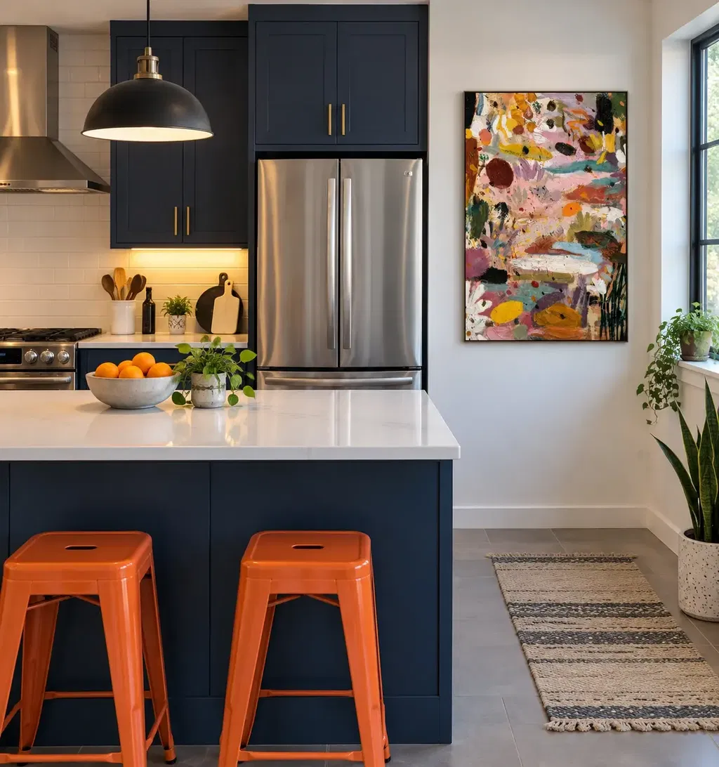
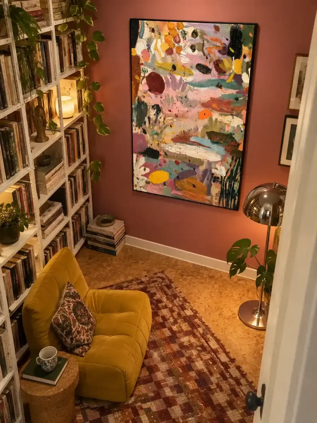
Start by reading your installed floor's actual undertone, not the stain's product name, then choose a canvas background hue that either coordinates with or intentionally contrasts that undertone. Warm-looking floors pair naturally with warm or gently related backgrounds, cool-looking floors pair with cool or softened neutral backgrounds, and neutral or mixed floors are worth testing both ways. Confirm any shortlisted pairing by comparing the actual painting and the actual floor under your room's daylight and evening light before you buy.
Key Takeaways
- Judge your floor's real, visible color and sheen, not the stain's product name, before shopping for art.
- Read an abstract painting in two parts: its dominant field color and its canvas background hue.
- Use the reference table below as a starting shortlist, not a fixed rule for every stain or room.
- Coordinate temperatures for a blended look, or contrast them on purpose for a stronger focal point.
- Compare the shortlisted painting and your installed floor under daylight and room light before buying.
Start with the Floor: Warm, Cool, Neutral, or Mixed?
Your floor's real color, not the name on a stain sample chip, tells you whether to start warm, cool, or neutral. Judge what you actually see in the room today, then pick a first route to test.
Look at the Installed Floor
Step back and look at the boards under normal room light. A warm-looking floor usually reads golden, honey, or reddish; a cool-looking floor reads gray, blue-gray, or ash; a neutral floor sits closer to balanced beige or taupe. Some rooms show a mixed cast where different boards or lighting angles pull in different directions, and that is a legitimate observation rather than a mistake. Stain and finish sheen change how wood looks, so judge the installed result instead of assuming a species or stain name guarantees one fixed undertone.

Choose a Starting Route
If the floor leans warm, start by testing art with warm or closely related backgrounds. If it leans cool, start with cool or softened neutral backgrounds. Color theory generally classifies warm and cool colors this way, though a borderline hue like purple can shift depending on what sits next to it. A neutral or mixed floor does not need a forced label: test a restrained version of both routes and let the room decide.
Read the Painting's Temperature and Background
Look past the single color that catches your eye first. A painting's overall temperature comes from the field that covers the most space, plus the hue sitting behind it.
Read the Dominant Field
Identify the color that occupies the largest portion of the canvas, not just the boldest brushstroke. Reds, oranges, and yellows generally read warm, while blues and greens generally read cool, though context can shift a borderline hue like purple or teal. Many abstract paintings combine both temperatures, so weigh which family actually dominates the composition before comparing it with your floor.
Check the Canvas Background
The base hue behind the strongest marks often matters more than one accent stroke. A warm gold accent sitting on a cool gray background reads differently beside your floor than the same accent on a cream background, so check both layers separately. Browsing a curated abstract paintings for sale collection can help you compare several background hues side by side, but the collection itself does not guarantee a match; your eye and your floor still make the final call.
Warm, Cool, and Neutral Pairings at a Glance
Once you know your floor's cast and the painting's dominant field and background, this table gives you a shortlist to test first. Treat every row as an editorial starting point, not a guaranteed match for every stain or room.
| Floor look | Background hues to test first | Contrast option to test |
|---|---|---|
| Warm-looking (golden, honey, reddish) | Cream, ochre, rust, muted coral | Softened blue-gray |
| Cool-looking (gray, blue-gray, ash) | Blue-gray, sage, taupe, soft white | Muted ochre or rust |
| Neutral (balanced beige or taupe) | Either restrained warm or cool route | Test both before deciding |
| Mixed or uncertain | Restrained warm and restrained cool samples | Choose based on room light and furnishings |
Use the middle column when you want the art to feel like part of the room, and the right column when you want it to stand out on purpose.
Choose Coordination or Deliberate Contrast
Same-temperature art creates a blended, quieter relationship with your floor, while opposite-temperature art creates a stronger, more deliberate contrast. Pick based on the visual effect you want, not a rule about matching.
When to Coordinate
Choose a background near your floor's temperature when you want the art to feel like part of the room rather than a standalone statement. Analogous colors sitting next to each other on the color wheel generally blend harmoniously, so a warm floor with a warm or gently related background tends to feel cohesive. Let the background hue carry more weight than a single small accent when judging how coordinated the piece will actually look.
When to Contrast
Choose an opposite-temperature background when you want the art to separate from the floor and pull focus. Warm colors tend to advance and cool colors tend to recede, so a cool floor with warm-dominant art can create a stronger focal point, though complex compositions and room light can soften that effect. If the contrast feels jarring rather than intentional, look for a piece with a more restrained background or a secondary neutral to bridge the two.
Check the Pairing in the Room's Actual Light
An online product photo rarely matches how a painting and your floor look together in person. Compare both under your room's real daylight and its evening lighting before you commit.
Compare Under Daylight
Hold the shortlisted painting, or a printed preview, against the wall where it will hang during daytime hours. Natural light strongly affects how colors are perceived and how they interact with each other, so both the floor and the canvas can look warmer, cooler, or more muted than they did in a listing photo. Look specifically at the painting's background and dominant field next to the actual floor, not just the wall color around it.
Compare Under Room Light
Repeat the same comparison after switching on the room's main lamps or overhead fixtures. Floor sheen reflects light differently than daylight does, sometimes making a gray floor look warmer or a golden floor look more muted once the lamps are on. Keep a deliberate contrast pairing only if it still looks intentional under this artificial light, not just under daylight.

Make the Pre-Purchase Call
Before you buy, run one last side-by-side check using the room itself as the judge.
- Place a photo or view of your installed floor next to the shortlisted painting's listing image, ideally taken from the actual room.
- Ask whether the dominant field and background either blend with the floor's cast or create a clearly intentional contrast, not an accidental clash.
- Buy only if the relationship still looks convincing under the room's relevant lighting; if it does not, test the alternate temperature route from the table above before buying.
FAQs
Can warm abstract art work with cool wood flooring?
Yes. Warm-dominant abstract art works well against a cool-looking floor as an intentional contrast, because opposite temperatures provide separation and highlight the canvas. Confirm the pairing by checking both the dominant field and the background against your installed boards in natural daylight and nighttime room lighting.
How do I pick abstract art for neutral or mixed wood floors?
Start by testing both a restrained warm piece and a subdued cool piece rather than forcing one label onto the room. Neutral floors allow either temperature to succeed, so let secondary elements such as wall color, major furniture fabrics, and overall natural light direct whether you coordinate or contrast.
Why does a floor's finish sheen affect color temperature matching?
Glossier finishes reflect more overhead and lamp light, which can wash out subtle undertones or reflect warm artificial bulbs across cooler wood planks. Matte and satin finishes reflect less light, letting the floor's true pigment show consistently when evaluated alongside canvas colors.