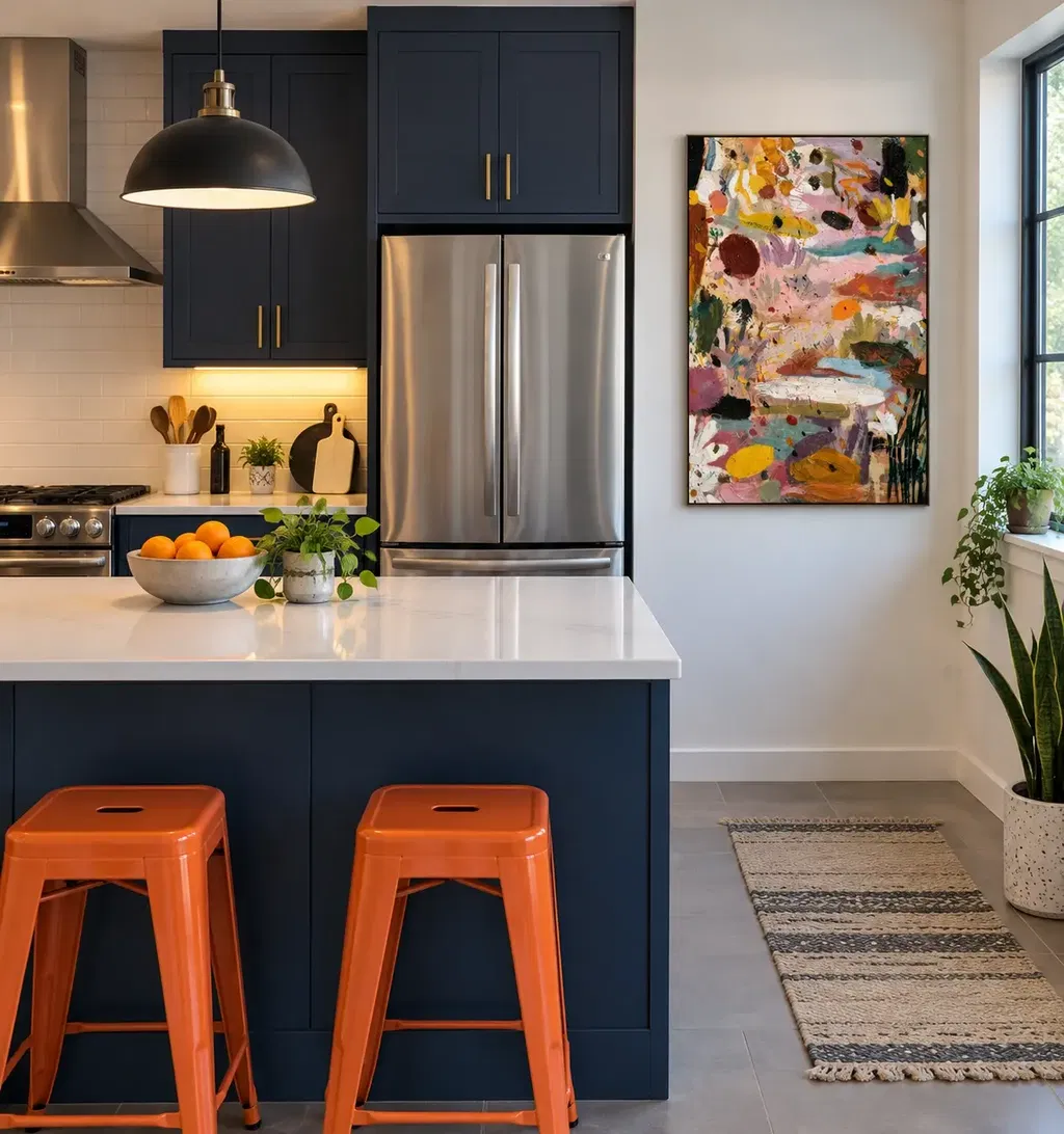
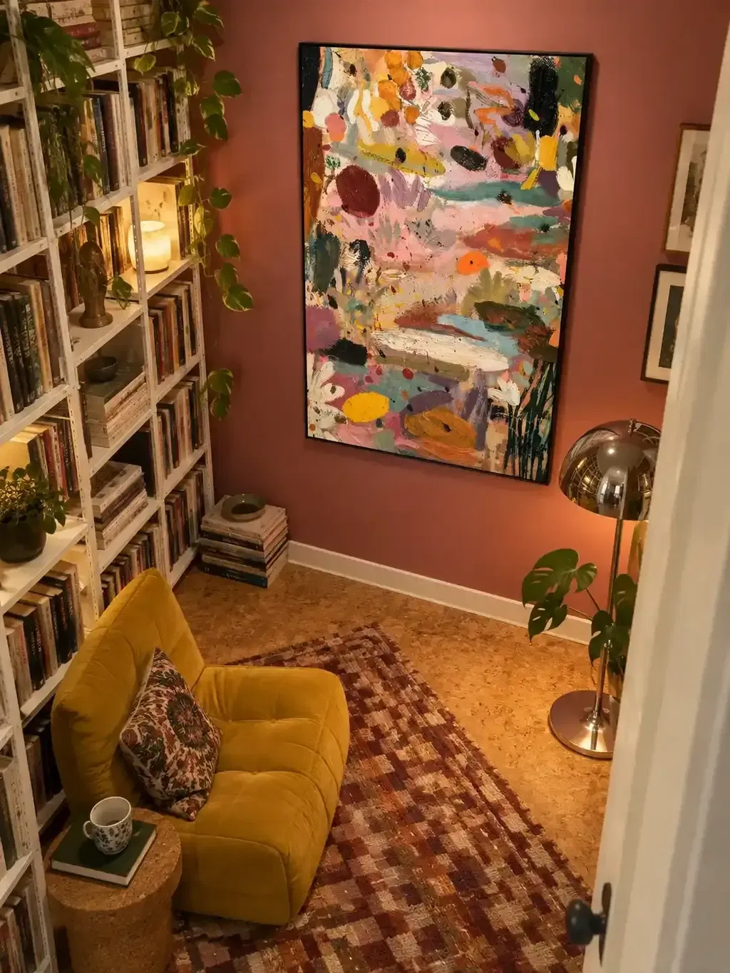
The best way to curate surrealist and figurative art in a sitting room is to give one piece a clear job, then connect it back to the room through color, scale, placement, or subject rather than matching every fabric and finish. A recognizable figure or familiar palette gives viewers an entry point, while a touch of dreamlike disruption gives the room something to talk about. From there, the room's existing character, traditional or eclectic, decides how much contrast the space can comfortably hold.
Key Takeaways
- Decide the art's role, focal point, counterpoint, or supporting layer, before you shop for a style label.
- Pair one recognizable entry point with one deliberate source of tension, and scale that tension to the room's complexity.
- Choose a single focal work when the room already has strong visual competition; save groupings for walls with enough visual quiet.
- Traditional rooms usually keep continuity through recognizable subject matter, while eclectic rooms can carry more contrast if one cue repeats elsewhere.
- Place the dominant piece on the main seating sightline, then run it through a simple pass-or-fail connection check.
Start With One Expressive Role for the Room
Before you shop, decide what job the artwork needs to do in your sitting room. That decision matters more than any style label, because a bold figurative piece can anchor a room or fight it depending on the role you give it.

- Name the room's current visual anchor, whether that is a fireplace, a piece of furniture, or an architectural feature.
- Note the room's dominant palette, furniture scale, and the main seating sightline.
- Assign the art a role: primary focal point, quiet counterpoint, or a supporting layer to an existing anchor.
- Set the desired tension level, then test whether the piece connects through color, scale, subject, or rhythm rather than a literal match.
If you are also trying to avoid a busy wall while doing this, our guide to picking statement wall art walks through the same focal-point logic in more detail.
Use Surrealist and Figurative Terms as Selection Tools
These labels describe three different things: how unconventional a piece feels, how recognizable its subject is, and how much visual tension it carries. Knowing the difference lets you shop by feel instead of by movement name.
Surrealist: unexpected, uncanny relationships
Tate defines Surrealism as a twentieth-century movement built on irrational, poetic, and revolutionary ideas, not simply an unusual look. A painting that seems odd or dream-like is not automatically Surrealist in that formal sense. For a sitting room, treat the label as a signal that the piece may lean on unexpected pairings rather than a guarantee of historical pedigree.
Figurative and semi-surrealist: recognizable entry points
For this guide, figurative means the viewer can recognize a person, body, or object at a glance, which is what makes the work approachable in a shared living space. Semi-surrealist is a practical shopping descriptor, not a settled movement: it points to recognizable imagery that has been altered by unexpected scale, setting, or combination. The more recognizable the subject stays, the easier the piece is to place near everyday conversation.
Choose Recognizable Entry Points or Dreamlike Tension
Set the expression level by pairing one accessible entry point with one deliberate source of tension, and let the room's existing complexity decide how far to push either side. Tate notes that Surrealist artists often find the unexpected and uncanny in ordinary subjects, which is the same instinct worth applying at home in a bounded, conditional way.
A recognizable figure lets a viewer enter the work before noticing its unusual setting or symbolism, which can help in a formal or already busy room. A stronger dreamlike disruption can spark more conversation, but it works best when the room has enough visual quiet to support it. A repeated color or related scale can tie either choice back to the room without asking every element to match.
Choose a Single Focal Work or a Grouped Arrangement
Choose one focal work when the room is already visually complex or needs a clear anchor, and reserve a grouping for walls that have enough visual quiet to support several related pieces. This is a direct choice, not a matter of taste alone: it depends on how much competition already exists on your walls and furniture.
Choose one focal work when clarity matters most
If your sitting room already has strong furniture silhouettes, patterned upholstery, or several decorative objects, one bounded piece usually reads more clearly than a cluster. A square modern figurative portrait, such as our Golden Muse portrait, is one example of this bounded format: it comes in a blue-and-gold palette, several square sizes from 20 by 20 inches up to 48 by 48 inches, and multiple frame options, which gives you room to match its scale to your wall without assuming it will suit every room.
Choose a grouping when the wall needs visual rhythm
A grouping earns its place when the surrounding wall and furniture can support several related decisions without any one piece dominating unfairly. Keep one work or silhouette as the clear lead, and let the others echo its color, shape, or mood rather than competing with it. We do not recommend a fixed number of pieces or a set spacing interval; if you are deciding between a coordinated set and a single statement painting, our comparison of one statement painting against symmetrical sets covers the wall-geometry side of that decision.
Adapt the Composition to a Traditional or Eclectic Sitting Room
A traditional sitting room generally holds together best when the art stays recognizable or restrained, while an eclectic room can carry more deliberate contrast if one visual cue repeats elsewhere. Neither style owns figurative or surrealist work outright; the difference is how much continuity the room needs to feel composed.
| Room character | Continuity to preserve | Where contrast can enter | Most useful focal behavior |
|---|---|---|---|
| Traditional | Recognizable subject, restrained frame or palette | One bolder color or subject accent | Single anchor near seating |
| Eclectic | One repeated color, shape, or texture across pieces | An unexpected pairing or dreamlike detail | Lead work with echoing supporting pieces |
In a traditional room, a figurative portrait in a frame that echoes existing wood tones keeps the space feeling settled even if the subject is unusual. In an eclectic room, a more dreamlike piece can become the intentional high point of the wall, as long as its color or texture also shows up somewhere else in the seating area.
Place the Art Around Seating and Conversation
Place the dominant work where it leads the main seated and standing sightlines, then protect negative space so secondary pieces support rather than compete with conversation. Check the piece's proportion against the nearby wall and furniture before committing, without forcing it into an exact ratio.
If you are building a grouping, make the lead work obvious first, then add supporting pieces that pick up its color or shape at a smaller scale. Keep enough open wall or floor space around the seating area so the arrangement reads as intentional rather than crowded. Readers who want a closer look at comfortable seated viewing height can check our seated viewing guide for that specific adjustment.
Apply a Pass/Fail Conversation Test Before You Commit
Keep the piece if it passes three checks: a viewer can find an entry point without explanation, at least one relationship connects it to the room, and one work clearly leads the eye. If any of those checks fail, the choice needs revision rather than rejection outright.

If there is no accessible entry point, look for a version with a more recognizable figure or familiar scale. If no relationship links the piece to the room, look again at palette, scale, placement, subject, or rhythm rather than adding a literal match. If several elements compete for attention, subordinate or remove one so a single work can lead the wall.
FAQs
Is "Semi-Surrealist" a Formal Art-Historical Category?
No. In this guide, semi-surrealist serves as a practical shopping descriptor for recognizable imagery altered by unexpected scale, setting, or combinations. It is not a formal art-historical movement, so evaluate candidate works by how easily guests recognize the subject before noticing unusual elements.
How Should I Evaluate a Piece in Daylight Versus Evening Light?
View the candidate piece in both daylight and artificial evening light before finalizing your selection. Keep it only if the primary figure remains legible and the chosen connection point, whether a shared gold tone or quiet negative space, stays balanced when ambient light softens.
What Should I Do if a Bold Figurative Work Feels Too Intense Over the Sofa?
Shift the piece to an adjacent conversation wall that can be viewed at a slight angle rather than directly facing the room's main entrance. Relocating the work lets it spark discussion naturally from the seating area without dominating the entire visual threshold of the room.