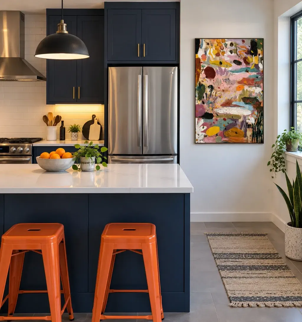
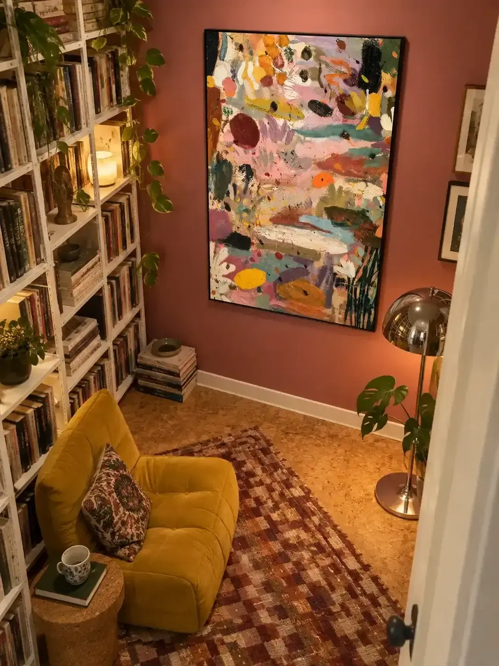
The fastest way to style a modern still life painting in a dining room is to treat the canvas as the source of one visual cue, then repeat that cue once or twice around the table. Pick a color, contour, or texture from the art and echo it in the centerpiece or ceramics, and remove any extra accent that pulls attention away from it. Once that lead element is set, placement, centerpiece, texture, and lighting decisions all get easier because they answer to the same rule.
Let the Painting Set One Visual Cue
Modern boho still life works in a dining room as a visual bridge, not a rulebook. The point isn't to recreate the objects in the canvas on your table; it's to borrow one thing from the painting and let it show up again nearby. A muted ochre wash, a curved vessel outline, or a rough brushstroke texture can all serve as that cue.
Pick just one. A dining room built around everyday rituals, morning coffee, Sunday dinners, quick weeknight meals, works best when the art feels expressive rather than staged. Choose a single lead color or shape, echo it once or twice in the table setting, and leave everything else in the room to provide contrast. If you find yourself repeating three or four elements from the painting, that's a sign to edit rather than add.
Place the Painting in Conversation With the Table
The painting should relate to the table's main axis, not sit as an isolated object on an empty wall. In a centered dining room, align the artwork's visual middle with the table's centerline so the two read as one composition when you sit down. In an open-plan space, check whether the table or a stronger architectural line, a wall return, a pass-through, a built-in cabinet, gives the room its real structure, and follow that line instead.
There's no fixed inch-based ratio that works in every room, so skip the search for a universal formula. Instead, tape a full-size paper outline to the wall at the height and width you're considering, then sit at the table and stand at the room's main entry point. If the outline feels stranded above the surface or crowds the sightline across the table, adjust the size or position before committing. Our dining room wall art guide covers additional sizing and placement checks if you want a second reference point.
If you're comparing artwork options at this stage, treat any listed canvas dimensions as one input among several, not proof that a size will fit. The wall-and-table relationship you just tested matters more than a size label.
Build a Centerpiece That Leaves the Painting Room
Let the painting's visual density set the centerpiece's density: a busy, color-rich canvas usually calls for a quieter table, while a simpler painting can support a slightly fuller one. On a compact or round table, one low bowl, vessel, or single sculptural object works better than several tall pieces that block the view across the table and interrupt conversation.

On a longer table, a loose grouping can tie the tabletop to the wall, but vary the height and shape of each piece instead of lining up identical objects. One design roundup of dining table styling in House Beautiful shows this in practice: a cluster of vases at different heights, or a mix of bowls and vessels, reads as collected rather than matched, while still coordinating with the room around it.
Keep the centerpiece as a supporting rhythm, not a rival focal point. Leave enough open surface for place settings and everyday use. If the arrangement blocks eye contact across the table or crowds the plates, remove a piece rather than rearranging around it.
Echo Its Colors and Shapes Through Ceramics and Texture
Ceramics and textiles should repeat one or two cues from the painting, not the whole palette. If the canvas has a warm terracotta note, a rounded ceramic vase in a related tone can connect the two without needing an exact color match. If the surface has visible brushstroke texture, a hand-thrown bowl with an uneven glaze can echo that same tactile quality from across the room.
Skip the matching set. Mixing a related shape at a different scale or finish keeps the table looking gathered over time instead of purchased all at once. In a neutral dining room, let earthy tones and tactile surfaces carry the warmth the walls and floor don't provide. In a more colorful room, pick one existing color, from the rug, upholstery, or an accent wall, and repeat only that one; keep the rest of the ceramics quieter so the painting still reads as the strongest color statement.
Texture here is a visual cue, not a durability claim: choose pieces for how they read from the table and doorway, not for how they'll hold up over years of use. Our textured wall art guide walks through how brushstroke and impasto texture catches light if you want to match that quality in ceramics or textiles.
Balance the Painting With an Architectural Pendant
Judge the pendant against the dining table, not against the room as a whole. A fixture that's centered over the table's centerline will feel intentional even if it's off-center relative to the walls around it. From there, decide which element should lead: a strong, expressive painting can sit comfortably near a large pendant when the fixture itself is visually simple, or when the two occupy clearly separate zones of the room.
When both the painting and the pendant are bold, something needs to quiet down. Lower the centerpiece height, simplify the ceramics, or choose a plainer frame for the artwork rather than adding a third focal point. House Beautiful chandelier recommendations suggest sizing a fixture to roughly half to two-thirds of the table's width and choosing a simpler design when the room already carries pattern or color, useful as a styling reference, not an installation or electrical standard.
Mounting height, wiring, and code requirements are a separate matter for a qualified electrician or installer; this section is about how the two objects look together, not how the fixture gets hung.
Choose the Right Path for Your Dining Room
Which path fits depends mostly on your table's shape and your room's existing color story.
If you have a compact or round table, pick one clear cue from the painting and pair it with a single low, restrained centerpiece so the sightline across the table stays open. A long table or an open-plan layout asks the opposite question: check the painting against the table's length and any nearby architecture, and give it more visual weight, a larger canvas or a supporting arrangement of objects, if the wall would otherwise look sparse next to a long horizontal table.
A neutral dining room benefits from letting earthy color and tactile texture do the work; repeat one warm tone or rough surface instead of adding more color. A room that's already colorful needs the opposite discipline: identify one shade the painting shares with your rug, chairs, or wall, and let the rest of the ceramics stay quiet so that shared color, not a new one, ties the room together. A pendant-led room needs the focal-point decision settled first, painting or fixture, before you add centerpiece or ceramic density on top.

If you're at the point of choosing a hand-painted, boho-style focal point, our COLLECTED STORIES painting is made to order on linen canvas and available in sizes from 20x28 inches up to 48x80 inches, plus rolled, frameless, or floating-frame presentation. Compare those formats against the wall outline you tested earlier rather than choosing by size label alone.
Use a Five-Step Styling Sequence
Work from what's fixed in the room to what's still flexible, and finish with an edit rather than another addition.
- Record the fixed elements. Note the table shape, the pendant if there is one, the wall you're considering, and the strongest existing color in the rug or upholstery.
- Test the painting's placement. Tape a full-size paper outline to the wall, using the cue you chose for the composition, and check it against the table's centerline and your main sightlines.
- Choose the centerpiece direction. Pick low and restrained, collected and varied, or a single sculptural object, based on how visually dense the painting already is.
- Add one or two echoes. Bring in a ceramic or textile piece that repeats a single color, contour, or texture from the painting, varying its scale or finish.
- Stand back and edit. View the room from the entrance and from a seated position, then remove or reposition whichever element competes hardest for attention.
FAQs
Do ceramics and centerpieces have to match the painting exactly?
No, exact matching often makes the dining table feel overly staged. Borrow just one visual cue from the painting, like a warm terracotta shade, a rounded silhouette, or a rough glaze, and vary the rest across your pieces. If the space starts feeling uniform, remove any duplicate accent that repeats that cue and re-evaluate the table from the room doorway.
How do I prevent a dining pendant light from causing harsh glare on textured canvas art?
Check sightlines from seated dining positions and ensure direct light sources do not cast harsh reflections across thick brushstrokes. If your pendant has exposed or downward-pointing bulbs, soften the glare by choosing diffused, shaded fixtures or shifting the artwork to an adjacent focal wall. Keeping the lighting focused gently downward over the tabletop lets tactile canvas art catch ambient glow naturally without washed-out highlights.
Should I choose a floating frame or frameless stretched canvas for a modern dining space?
Base the framing style on your room's existing architectural structure and dining furniture lines. A slim floating frame provides clean visual boundaries that work well against textured wallpaper, wood paneling, or busy dining layouts. A frameless stretched canvas offers a softer, modern boho appearance that blends effortlessly into minimalist or open-concept dining rooms.