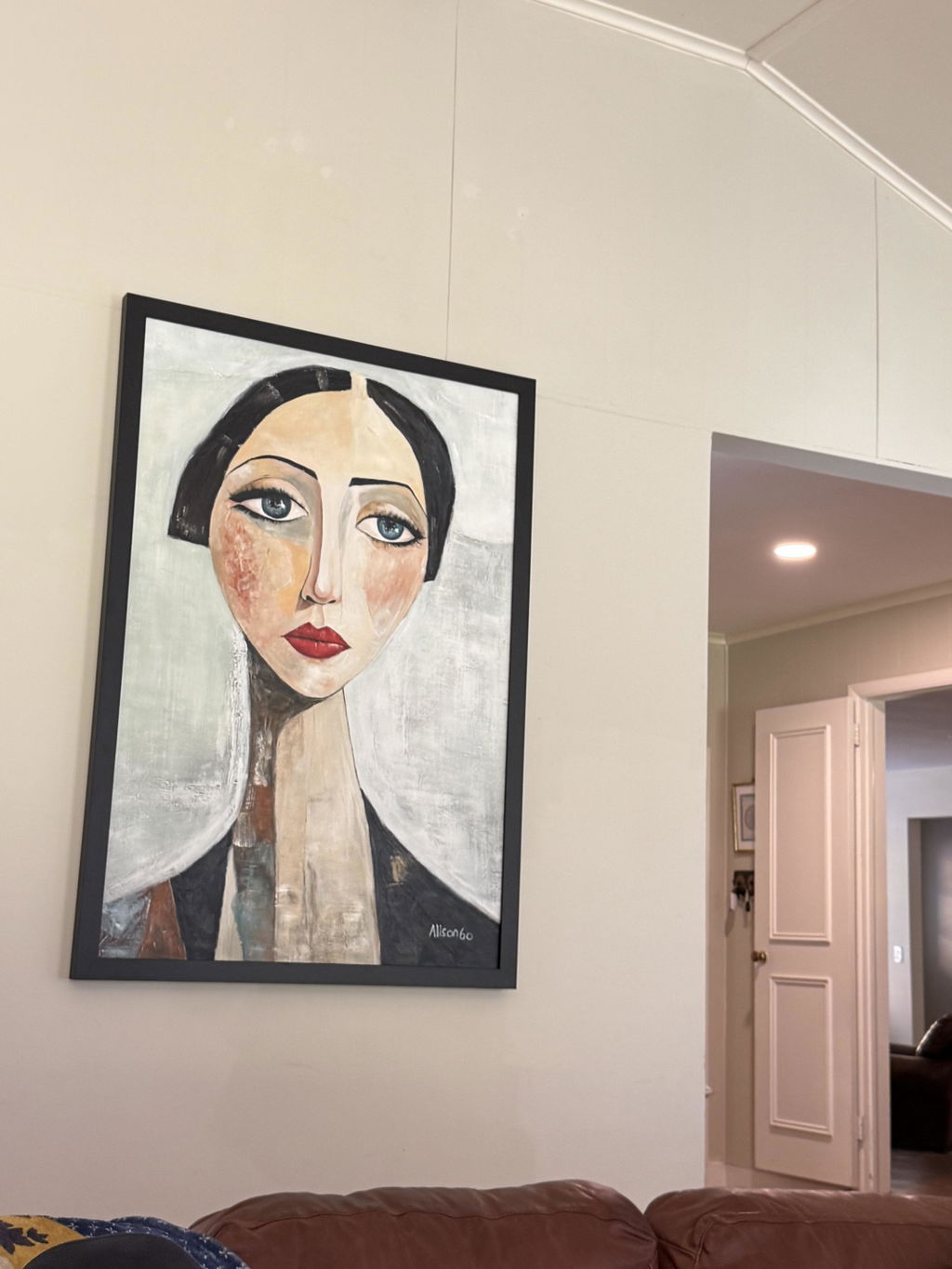
Abstract wall decor becomes a room's visual anchor when it establishes a clear visual hierarchy in relation to the wall, furniture, lighting, and nearby objects. Color can help, but scale, contrast, texture, directional marks, placement, and surrounding negative space may matter just as much. The goal is not to find a painting that looks dominant in isolation; it is to find an anchor candidate whose emphasis still reads from the room's important viewing positions.
Use the framework below to compare a piece with its actual setting, then classify it as a plausible anchor or a supporting accent before you order.
What Gives Abstract Wall Decor Focal Weight
Focal weight is conditional visual emphasis: the degree to which an artwork becomes a clear point of attention within a specific room. A painting may carry more weight when its scale, contrast, direction, placement, texture, or isolation differs meaningfully from surrounding elements, but no single cue guarantees that it will anchor every space. This is the practical meaning behind visual emphasis through scale, contrast, direction, and placement.
That distinction explains why bold color alone can disappoint. A saturated painting can fade if it is too small for the usable wall, hidden by furniture, or surrounded by stronger features such as a fireplace, television, window, or busy gallery wall. Conversely, a restrained painting may still command attention through proportion, defined edges, texture, directional movement, or generous space around it.

Think of an anchor as a role the artwork may earn in context, not a permanent label attached to the painting. If it looks compelling only in a close-up product image but disappears from the entry or seating area, it is more accurately treated as an accent. When considering modern abstract art, compare the candidate with the room's existing hierarchy rather than judging the image by itself.
Match Scale to the Wall and Furniture
Judge a painting against the usable wall area and the furniture or architectural feature beneath it. Listed dimensions tell you the object's footprint, but only a room comparison shows whether that footprint provides enough presence, breathing room, or alignment for the intended focal role.
Check the Wall's Proportion
Start by measuring the clear area the artwork can actually occupy. Subtract the visual effects of doors, windows, trim, shelves, lamps, and adjacent objects, then compare the candidate's width, height, and orientation with what remains. There is no universal art-to-sofa or art-to-wall ratio that replaces this check; the same dimensions can read differently in a narrow hallway, an open living-room wall, or a tall stairwell.
| Wall or furniture condition | Proportion cue to evaluate |
|---|---|
| Wide, open wall | A horizontal work or a wider grouped footprint may feel more connected to the wall's span; check whether the piece has enough presence without filling every inch. |
| Narrow wall or vertical zone | A portrait orientation may follow the available shape more naturally; confirm that nearby trim, openings, or furniture do not crowd it. |
| Art above furniture | Compare the artwork with the furniture's full visual width and the open area above it; look for alignment and enough separation from lamps, shelves, or the ceiling. |
| Open wall without furniture | Use the wall's height, width, and nearby architectural lines as the comparison points, then check how much negative space remains around the piece. |
The question is not simply whether the art is "large enough." Ask whether its footprint supports the intended emphasis while leaving the room's structure legible. For more format ideas, use this guide to giant wall art as a browsing path, not as proof that any particular size will fit your wall.

Choose One Large Work or a Grouped Arrangement
A single large work concentrates attention around one composition. A grouped arrangement distributes attention across multiple objects, so its full width, height, spacing, and internal rhythm must be judged as one visual footprint rather than as separate pieces.
Choose one concentrated work when the room needs a singular point of emphasis or when the wall's shape naturally supports one composition. Choose a group when the space, furniture alignment, or existing decor benefits from a wider rhythm. The decision also depends on whether you want the anchor to feel singular or assembled. Compare oversized art versus sets with your wall shape and sightlines, rather than treating either format as automatically stronger.
Build Emphasis with Contrast and Color Weight
Contrast can make an artwork easier to notice, but the right amount depends on the room's baseline palette, wall color, furnishings, and changing light. Compare the candidate with those real conditions: a screen may exaggerate or flatten contrast, so a bold online image is not proof of a bold room result.
Compare Value and Edge Contrast
Inspect value first: how the artwork's light and dark areas compare with the wall and nearby furniture. A dark field on a pale wall may separate quickly, while a light work can stand out against deeper paint or cabinetry. Then look at hue and saturation—whether the colors differ in family and intensity from the room's existing colors.
Edge contrast is another useful lens. Defined boundaries, strong shapes, or abrupt transitions may read from farther away than soft, low-contrast passages. Check the painting beside an actual wall-color sample, upholstery, rug, or cabinet finish if possible. If the room already has several high-contrast features, a quieter artwork may create a more controlled focal area than adding another visual interruption.
Formal analysis treats value, line, texture, space, and movement as composition cues. Use those terms as inspection lenses, not as promises about how every viewer will respond.
Balance Saturated and Quiet Color Areas
A concentrated color area may pull attention when the rest of the room is restrained, but stronger color is not automatically better. Evaluate the relationship instead:
- Match intensity to room restraint. In a neutral room, one saturated area may supply emphasis; in a colorful room, it may compete with upholstery, rugs, accessories, or a nearby view.
- Look for repeated accents without exact matching. A color that echoes a pillow, wood tone, metal finish, or rug can connect the artwork to the room without making it look overly coordinated.
- Check non-color sources of weight. A quiet palette may still work as a focal area when scale, texture, edge definition, mark direction, or surrounding space carries the emphasis.
If you are ready to compare palettes rather than make a product-specific judgment, browse modern abstracts by the room's existing colors and the kind of interruption you want.
Read Texture and Directional Movement
Texture and directional marks can add surface interest or movement, but their usefulness depends on viewing distance, lighting, architecture, and the room's existing visual activity. Treat a title or short product description as a starting point; verify the actual surface, orientation, and imagery before assuming how a piece will read.
Use Texture as a Layer of Visual Weight
Look at texture from both close and normal viewing distances. Raised or visibly worked surfaces may contribute visual weight when light catches them, while a smoother surface may preserve a quieter field. The same texture can feel intentional in a calm room and crowded in a space already filled with patterned upholstery, open shelving, plants, or layered accessories.
Online, seek detail images and side-angle views when surface depth matters. A close-up can make texture seem more dominant than it will from a sofa or entryway. If the listing does not make the surface clear, treat texture as unverified and avoid buying on close-up drama alone. You can use textured abstract art as a category-navigation path, but the available product record does not establish exact material, depth, dimensions, or room suitability.
Follow the Direction of the Marks
Read the dominant marks as lines of movement and compare them with the room's strongest lines. Horizontal strokes may visually relate to a long sofa, console, or low cabinet; vertical marks may echo a tall window, doorway, or stair run; diagonals and sweeping marks may introduce more directional energy. These are comparison cues, not fixed psychological rules.
Choose direction that supports rather than fights the architecture. A very active diagonal composition may compete with a prominent staircase, while a calm horizontal field may become too passive on a tall, empty wall. Stand back and ask whether the marks reinforce the room's rhythm or create a second, unrelated direction that divides attention.
Test the Room's Sightlines Before You Buy
Treat a painting as a plausible anchor only when it remains legible from the room's important viewing positions, fits the usable wall, and has enough separation from competing features. This room test matters more than a persuasive product-page image because scale, obstruction, light, and negative space change how the artwork reads in place.
Trace the Main Sightlines
Run this three-step test before deciding that a piece is a statement abstract painting for a room:
- Check viewing positions. Stand at the main entry, the primary seating area, and other places where people naturally pause. Notice whether the composition still reads at normal distance.
- Check obstructions and competition. Look for doors, lamps, plants, shelves, screens, windows, fireplaces, and other focal features that could block or outrank the artwork.
- Check changing light. View the wall in daylight and under typical evening lighting. Glare, shadows, and low light can change the apparent value, color, and surface activity.
If the piece works only from one close viewpoint, classify it as supporting decor unless that limited view is intentional. If it remains clear from the main approach and seating area while fitting the wall's hierarchy, it is a stronger anchor candidate—but still not a guaranteed fit.
Run a Pre-Purchase Anchor Check
Use these three checks to turn "how to make abstract art a focal point" into a room-specific decision:
- Record the room evidence. Measure the usable wall area and note furniture width, ceiling height, openings, obstacles, orientation, and the intended viewing distance.
- Name the emphasis cue. Decide whether scale, contrast, texture, mark direction, placement, or negative space is supposed to carry attention. One or two clear cues are easier to evaluate than a vague promise of impact.
- Preview the full context. Use a room mockup or in-room image when available, inspect listed dimensions and close/distant details, and seek side-angle views if texture matters. Check the seller's shipping and return information before ordering.
Negative space is the open area around the artwork; it can help separate the focal area from competing objects, while a crowded wall may reduce clarity. The role of negative space around the artwork is therefore part of the buying decision, not leftover wall area.
At the end, make a simple classification. If the work wins on at least one clear emphasis cue and does not fail the scale, sightline, or room-context checks, it is a plausible anchor. If it looks strongest in isolation, depends on close-up texture, or becomes crowded or easy to miss in place, treat it as an accent. Once you have measured the wall and identified the intended emphasis, we invite you to compare relevant abstract or textured collections as verification options—not as guaranteed room solutions.
FAQs
Use these practical checks to decide whether abstract wall decor is ready for an anchor role or still needs room-context verification.
When Should Abstract Wall Decor Remain Supporting Decor?
Keep it as supporting decor if it disappears from the main approach, is blocked by furnishings, or competes with a stronger focal feature. Recheck the usable wall, sightlines, and surrounding space before ordering.
How Large Should a Focal-Point Painting Be?
Use the usable wall area, furniture relationship, room scale, orientation, and full footprint of a grouped arrangement. There is no universal size threshold that replaces those measurements.
Can Quietly Colored Abstract Art Still Anchor a Room?
It can if another cue, such as scale, value contrast, texture, mark direction, or negative space, carries attention. Compare it with the wall and furnishings in daylight and evening light.
What Should You Check When Viewing Abstract Art Online?
Inspect dimensions, orientation, close and distant images, side angles, and room mockups when available. Compare them with your measured wall and confirm current shipping and return information before ordering.