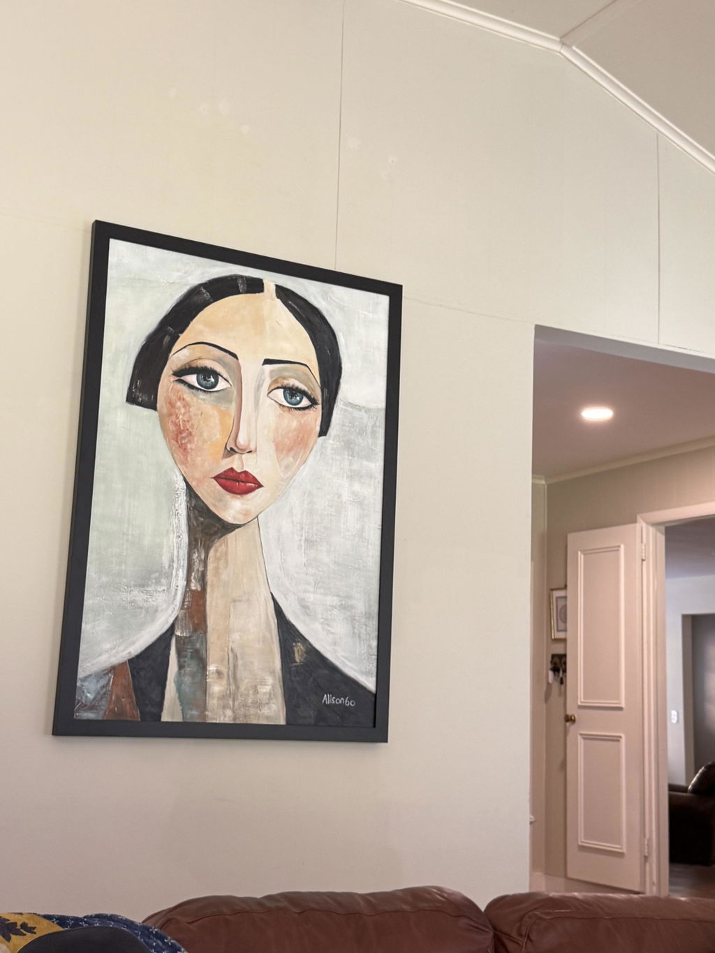
Texture can make landscape wall art feel calmer, richer, or more immersive because the surface itself changes how your eye perceives depth. A flat piece and a textured piece might share the same colors, but the one with raised paint, visible brushstrokes, or knife marks will catch the light differently, creating a sense of dimension that resonates across the room.
What Texture Changes in Landscape Wall Art
Texture changes how a landscape reads before you even focus on the subject matter. Raised paint, distinct brushwork, and layered marks create subtle shifts in light and shadow, which help elements like horizons, tree lines, water, and mountain ridges feel less static. In landscape painting, this effect is often called texture and depth, where the physical surface helps suggest distance and atmosphere.
For shoppers, the takeaway is simple: texture isn’t just for decoration. It changes the visual weight of the piece. A smooth, flat sky may recede, while a thicker foreground ridge or a rough patch of foliage can pull the eye forward. That is why textured landscape wall art often feels more "alive" from a normal viewing distance, especially when the room has enough open wall space for those surface details to register.

Texture also shapes the mood. Soft, layered marks can make a scene feel misty or serene, while more pronounced ridges can make that same scene feel active and tactile. If you are comparing textured wall art with flatter landscape pieces, the goal isn't just to find more detail, but to determine if that detail adds the specific type of depth you want in your space.
Why Impasto Feels More Immersive
Impasto changes the feel of a landscape because the paint sits above the surface rather than blending smoothly into it. This physical relief catches light, casts tiny shadows, and gives the eye more edges to track. Research on impasto and perceived depth shows how impasto catches light and enhances depth, strengthening the illusion of three-dimensional form when color and lighting align.
How Light and Shadow Build Depth
When light hits raised paint, the high points brighten while the low points fall into shadow. This unevenness is why a landscape can feel more dimensional than a flat print. Ridge lines, cloud edges, surf, and tree canopies pick up this variation particularly well. It’s a visual effect—not magic—but it is strong enough to change the feel of a room when the art is placed where light can graze the surface.
Brushwork vs. Palette-Knife Texture
Brushwork and palette-knife work don't read the same way. Softer brushwork tends to blend more gently, creating a quieter, more painterly feel. Palette-knife ridges are typically bolder, cleaner, and more architectural because the edges are sharper and the relief is easier to spot from a distance.
This difference matters if you are choosing between modern landscape art with depth and a more subdued surface. Knife texture usually makes a stronger focal statement. Brush texture is often the better fit when you want a sense of movement without a lot of visual punch. If your room already features strong patterns, bold furniture, or busy shelving, a calmer surface is often the safer choice.

Landscape Subjects That Benefit Most
Texture doesn’t help every landscape in the same way. A mountain scene may benefit from rocky relief, a forest from layered foliage, and a coastal scene from the suggestion of surf or shoreline movement. The key is matching the texture to the subject's natural motion.
| Landscape Subject | Texture Cue | Visual Mood | Best Room Fit |
|---|---|---|---|
| Mountains | Ridge-like strokes, rocky breaks, layered peaks | Solid, grounded, expansive | Living rooms, focal walls |
| Forests | Overlapping marks, clustered foliage | Dense, calm, immersive | Bedrooms, reading nooks |
| Coastlines | Swept marks, wave crests, shoreline texture | Open, breezy, rhythmic | Light-filled rooms, entryways |
| Mixed/Abstract | Broader texture range, less literal detail | Flexible, modern | Transitional/modern spaces |
The practical takeaway is that texture should support the subject, not fight it. Heavy, directional marks can make rock faces or tree trunks feel more convincing, while softer layering works better for scenes that are misty, distant, or quiet. It is worth checking texture cues by landscape subject before you buy, especially if you are browsing landscape oil paintings and want the surface treatment to match the scene.
How to Match Texture to Your Room
The right level of texture depends on where the art will live. Stronger texture usually works best when the room gives it room to breathe. In a large living room or a long hallway, the surface can read clearly from afar. In a smaller bedroom or reading nook, moderate texture often feels better because it adds depth without making the wall look cluttered. This is especially important for large landscape artwork used as a focal wall.
Room Size and Viewing Distance
If you can see the piece from across the room, bolder texture is easier to appreciate. If you mostly see it up close, finer brushwork or moderate relief is often more comfortable. The piece doesn't need a specific size threshold to work; it just needs enough space for the surface detail to read as depth rather than clutter.
Light Direction and Surface Readability
Texture reads best when light can skim across it. Using raking light can make ridges and raised areas stand out more clearly than flat, front-facing lighting. High-quality lighting also matters, as better color rendering keeps the landscape from looking dull. If the piece is in a darker corner, the texture effect will naturally be more subtle.
Style Fit
Modern rooms often pair well with clean compositions and controlled texture. Transitional spaces can handle a wider range of surface movement, especially in muted earth tones. Rustic or cabin-style rooms often embrace stronger texture, as the surface detail echoes natural materials like wood, stone, and textiles.
The best choice isn't always the boldest one. If your room already has a lot of visual activity, choose moderate texture. If the room is simple and the wall needs a clear focal point, bolder impasto works well. This is also where high-CRI lighting comes in, as it ensures the texture and color read clearly together.
A Simple Buyer Checklist for Texture
- Start with the scene: Decide if you want mountains, forests, coastlines, or a mixed landscape.
- Match texture to the subject: Rocky, layered scenes handle more surface variation than quiet, distant ones.
- Check the room scale: Bigger walls and longer viewing distances support bolder texture.
- Look at the light: Side lighting shows off texture better than a dark corner.
- Review product details: Ensure the piece fits your room's style, color palette, and desired level of visual energy.
If you are ready to shop, browse landscape wall art first, then narrow your search toward textured pieces once you know how much surface depth you want.
Final Takeaway
Texture transforms landscape wall art by shaping how light, depth, and movement are perceived. Bold impasto can make a focal wall feel immersive, while moderate texture often fits smaller or busier rooms better. When deciding between two pieces, compare the subject, room size, and lighting, then choose the surface that supports the mood you want to create.
FAQs
How does texture change the mood of a landscape painting?
Texture can make a landscape feel calmer, more energetic, or more tactile depending on how thickly the paint is applied. Softer texture usually feels quieter, while stronger relief feels more active. Ask yourself if you want the wall to recede into the background or serve as a bold focal point.
What landscapes look best with heavy impasto?
Mountain, coastal, and expressive sky scenes often work well with heavier impasto because those subjects naturally support ridges and movement. The exception is a small or busy room, where heavy texture can feel overwhelming. In that case, a lighter surface provides more breathing room.
Can textured landscape wall art work in a small room?
Yes, but moderate texture is usually the better fit. In a small room, art is often viewed up close, so heavy relief can dominate the space. If you want texture in a compact area, look for a piece with a calm composition and colors that don't compete with the rest of the room.
Why does palette-knife art feel more dynamic?
Palette-knife work creates sharper edges and thicker ridges, allowing the surface to catch light more dramatically. This makes the piece feel more active from across the room. For a softer, less dramatic effect, brush-based texture offers more control and less visual contrast.
How do I choose texture for a living room focal wall?
Start with the wall size and the available light. Larger walls with side lighting can handle bolder texture, while rooms with heavy furniture or patterns often do better with a moderate surface. If you are unsure, choose a piece that adds depth without competing with your existing decor.