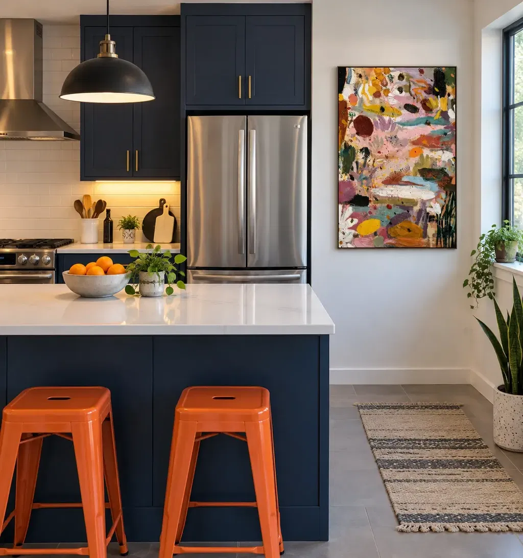
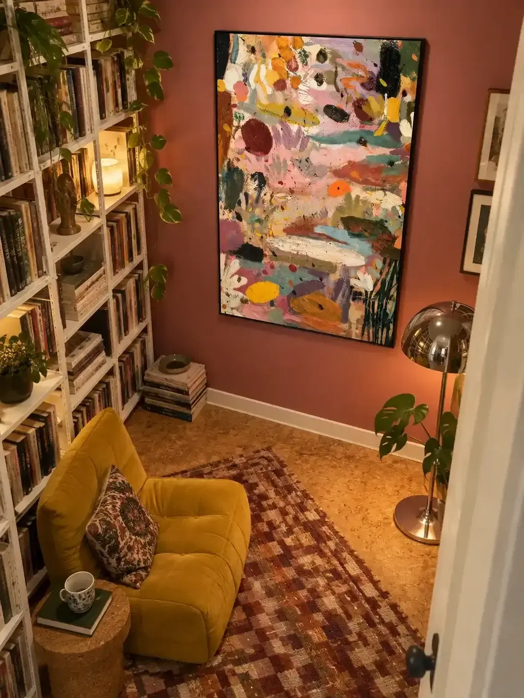
Two abstract paintings don't need matching colors, sizes, or frames to look intentional side-by-side. They need one shared visual anchor, a layout that has been tested before you drill, and an installation that keeps both pieces level and balanced. Start by picking that anchor, then work through scale, layout, and mounting in order.
Key Takeaways
- Two non-matching abstract paintings work as a pair when they share one clear anchor, such as mood, color family, line, or texture, not every feature.
- Compare visual weight, not just outer dimensions; a smaller, darker, or denser painting can still dominate the pair.
- Choose matched alignment for similar-weight works and a deliberate offset when one piece needs to visually lead.
- Test the full arrangement with paper templates or a floor mockup before making any wall holes.
- Measure from each painting's actual hanging point, level the finished pair, and keep the display away from direct sunlight and heat.
Start With One Shared Visual Anchor
Two different abstract paintings can work together the moment they share one clear connection, seen from across the room. That connection doesn't have to be color. It can be mood, a repeated line direction, a similar texture, or a comparable degree of abstraction.
Pick the single strongest anchor instead of trying to force every feature into agreement. A quiet, moody piece and an energetic one can still pair well if both use the same restrained palette or similar brushwork density. What matters is that one anchor survives when you step back and look at both paintings together.
If the two paintings compete at a normal viewing distance and you can't name a shared anchor, that's the signal to stop. Changing the spacing or the frame later won't fix a pairing that has no real connection. Choose a different second painting, or look for a subtler link, such as matching mark density or a shared warm-versus-cool temperature, before moving on to layout decisions.
Test Color and Visual Weight Before You Commit
Two paintings can complement each other without sharing a palette, as long as one clearly leads and the other supports it. The test is whether the pair settles into a hierarchy or whether both pieces keep pulling your eye back and forth.

Color contrast isn't the same as visual competition. A saturated, dark-value, or heavily textured painting often carries more visual weight than its size suggests, even next to a larger but lighter piece. Viewing both works in grayscale, or from across the room, exposes this kind of imbalance faster than staring at swatches up close.
From there, make one of three calls. Keep the pairing if one painting reads as the lead and the other as support, with a shared mood or color family tying them together. Adjust it if the relationship is close: try reordering which piece sits left or right, or add breathing room around the busier work. Separate the pieces if neither settles into a hierarchy and the two paintings still fight for attention after adjustment. This same keep-adjust-separate approach applies whether you're combining two solo pieces or building on an existing set; our guide to cohesive art sets covers the related case of grouping two or three works you already like.
Set Scale, Orientation, and Frames as a Deliberate Contrast
Two non-matching paintings don't need identical size, orientation, or frames. What they need is a scale and frame relationship that reads as a choice, not an accident.
Matched top, bottom, or center alignment calms a pair that already has similar visual weight, especially above furniture where a level horizontal line matters. Unequal size or orientation can still work when the larger, darker, or busier piece clearly leads and the smaller piece supports it, keeping the group bounded rather than scattered. Frame differences follow the same logic: keep them if one frame stays quiet and doesn't outshine the art, or simplify to matching frames or a frameless look if the mismatch feels distracting rather than deliberate.
| Pairing choice | When it helps | What to check |
|---|---|---|
| Similar scale, matched alignment | Both works have comparable visual weight | Top, bottom, or center lines match |
| Unequal scale | One work has a clear supporting role | Combined group still reads as one bounded set |
| Mixed orientation | Portrait and landscape share the anchor | Neither piece looks stranded on its own |
| Different frames | One finish stays visually quiet | No frame competes with the art itself |
Use the table to narrow your options, then judge the final combination against the anchor you already chose. A darker, unequally sized painting with a quiet black frame next to a lighter, evenly matched piece can still look curated if the anchor holds.
Mock Up the Side-by-Side Arrangement
The combined footprint of both paintings matters more than either piece on its own, so test it before you touch a wall. A temporary layout lets you judge the gap, the alignment, and the relationship to nearby furniture while changes are still free.
- Cut full-size paper templates, or lay both paintings on the floor in the intended arrangement.
- Mark the pair's combined center. Above furniture, compare it to the console, sofa, or bed's own center and usable width; on an open wall, judge the pair's centerline on its own.
- Test one consistent gap first, then try a deliberate offset if the heavier piece feels disconnected at even spacing.
- Step back and view the mockup from where you'd actually sit or stand, and from the room's main entry point.
This approach follows the same logic professional galleries use for grouped displays: treat the works as one unit, keep spacing consistent, and test the layout before drilling any holes. If you're pairing two panels that read as a single diptych rather than two separate paintings, our diptych alignment guide covers that closer-set case in more detail.
Hang and Inspect the Finished Pair
Once the mockup looks right, the installation itself is a short, practical sequence. Follow it in order and finish with one harmony check.

- Confirm the approved mockup positions, including the gap and any offset, one more time before marking the wall.
- Measure from each painting's actual hanging point and wire drop, not just its outer edges, when you transfer the layout to the wall.
- Choose sturdy hardware and a wall anchor suited to each painting's weight and the wall structure, and handle each canvas from the sides, using two people for a large piece.
- Mount both paintings, then check each one with a level rather than trusting the eye alone.
- Step back and view the pair from the room's normal seating or walking positions, and keep the display away from direct sunlight and heat where the wall allows it.
- Run one final harmony check: the shared anchor is still visible, the visual weight feels balanced, the gap looks intentional, and the pair sits correctly against its furniture or open-wall context.
For more on where that centerline should sit relative to eye level and nearby furniture, our art hanging height guide walks through the measurement in more detail.
FAQs
How should I handle two abstract paintings with different frame styles?
You do not need to replace either frame if one profile remains visually subordinate and the pair shares a distinct anchor like palette, line, or mood. When both moldings compete for attention or pull the eye away from the art, unify the presentation by reframing one piece to match, putting both in slim matching profiles, or displaying them frameless. Check this contrast in your full-size paper mockup first, because frame profiles carry much more visual impact on a vertical wall than flat on a table.
What is the ideal spacing between two paintings hung side-by-side?
There's no single measurement that works for every pair, wall, and frame combination. Instead, choose the smallest gap that keeps the two paintings looking like separate works rather than one connected piece, then keep that gap consistent across the arrangement. Judge the spacing during your mockup, from the room's normal viewing distance, since a gap that looks generous on paper can feel cramped or disconnected once the paintings are on the wall.
How do I align two paintings that have different heights?
Aligning two unequal paintings along their horizontal centerlines creates the most stable composition on an open wall. When placing them over an anchoring piece of furniture, such as a credenza or headboard, aligning their bottom edges often yields a cleaner, grounded sightline. Test both centerline and baseline alignments in your mockup to verify which relationship balances visual weight without making the smaller canvas look adrift.