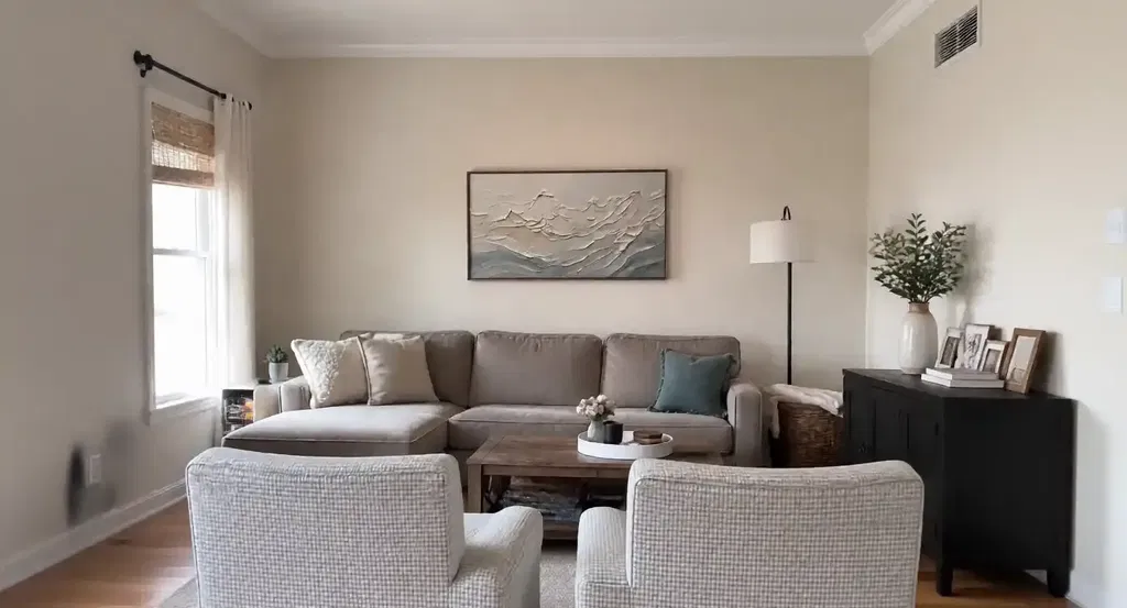
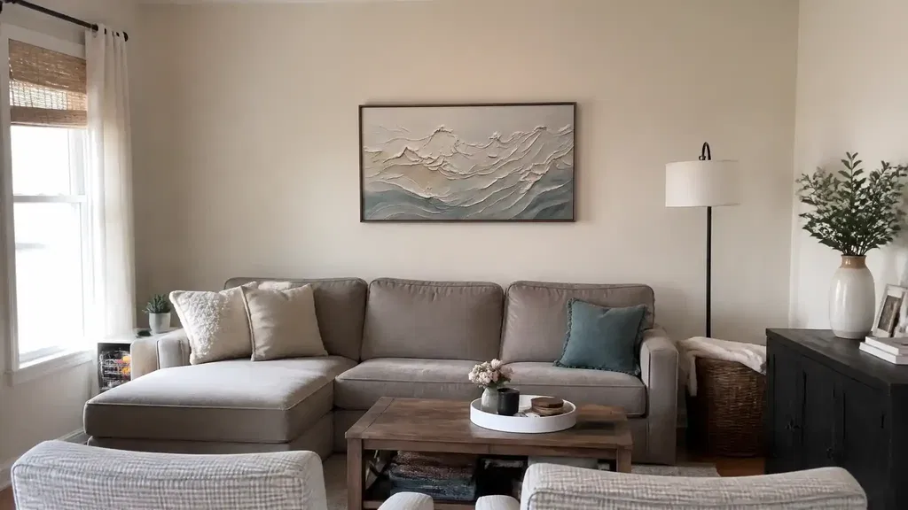
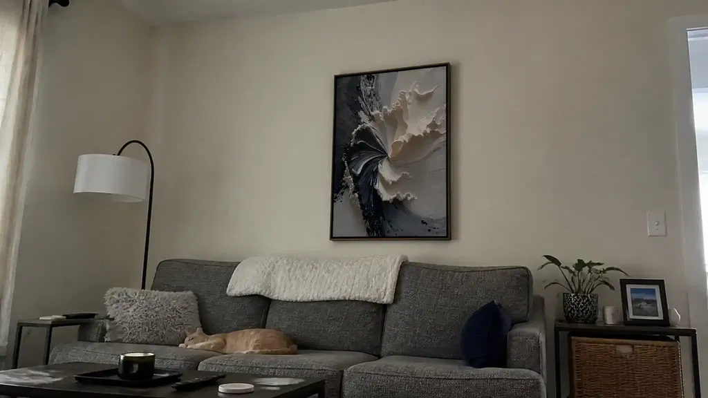
Large abstract wall art above sofa should be judged by proportion first, then by wall shape and color temperature. If the piece spans the sofa well, respects the wall's open space, and fits the room's dominant finishes, it usually feels intentional instead of oversized. Start with the sofa width, then check whether the wall can support the visual weight.
Start With Sofa and Wall Proportion
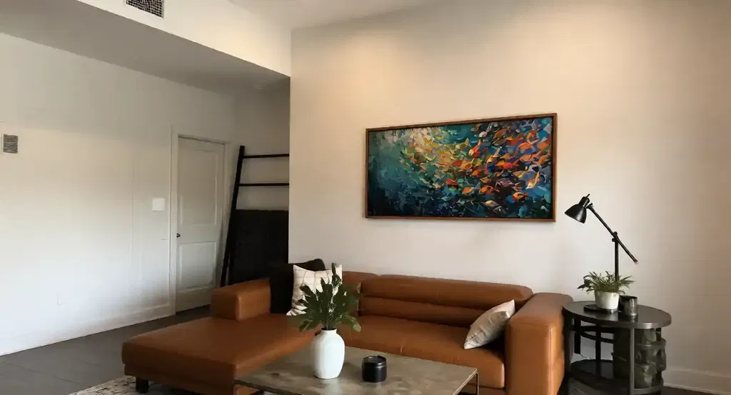
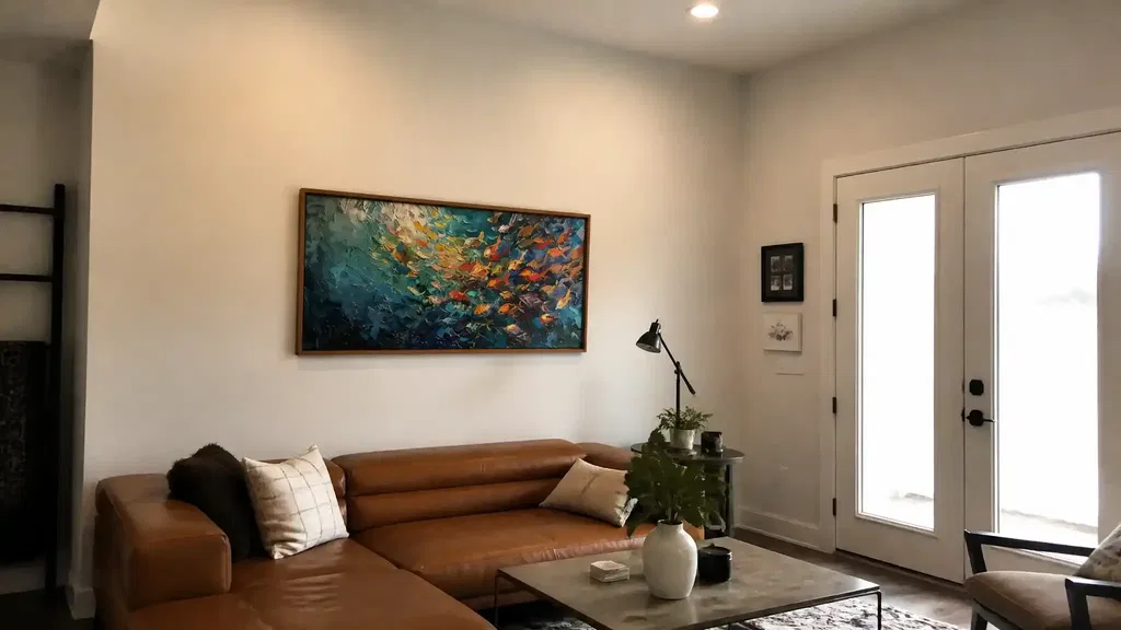
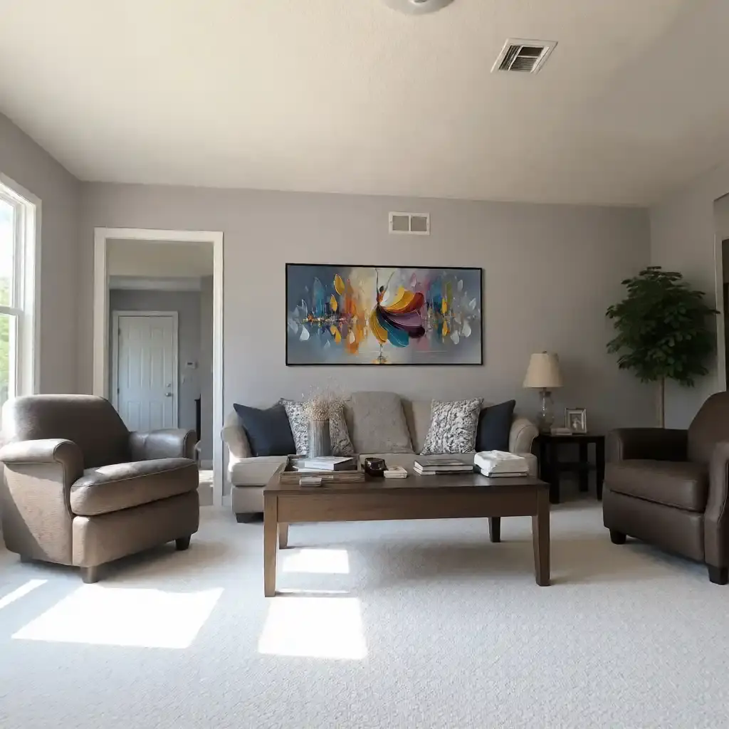
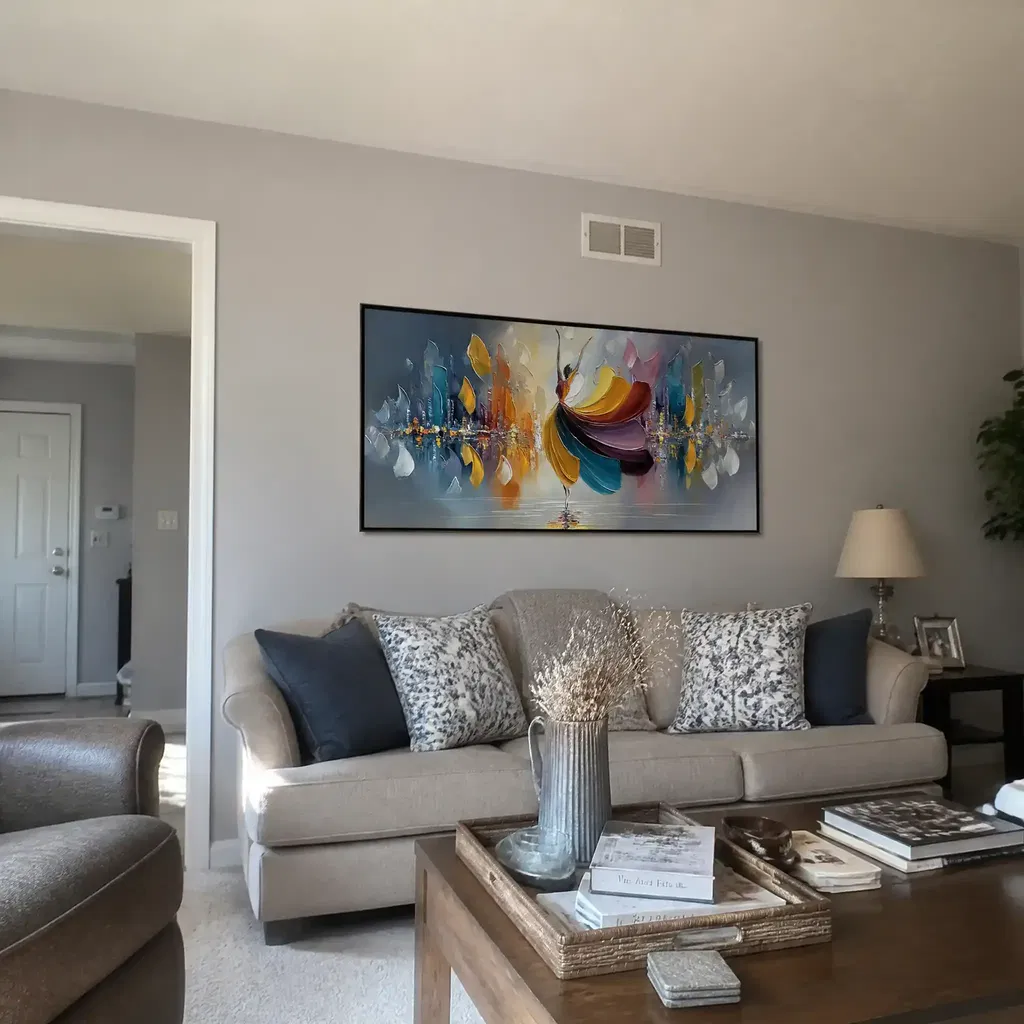
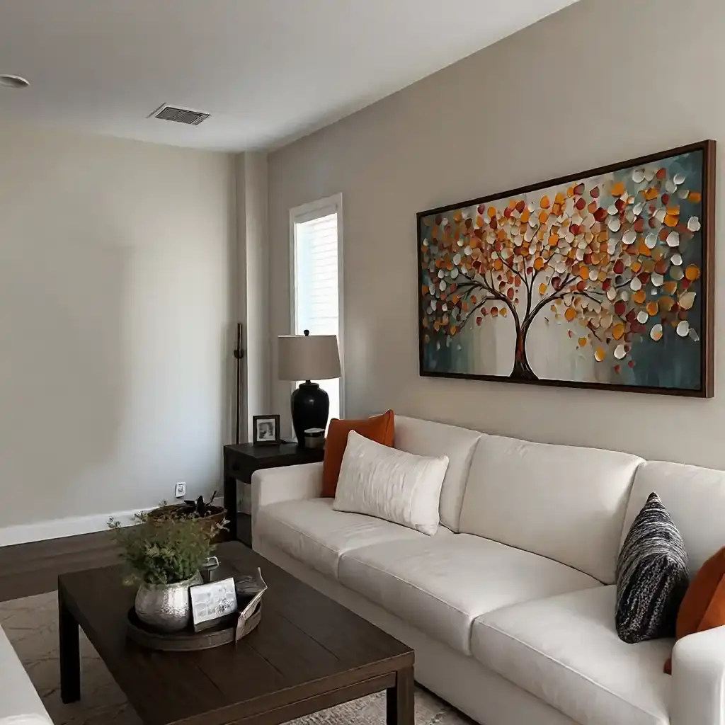
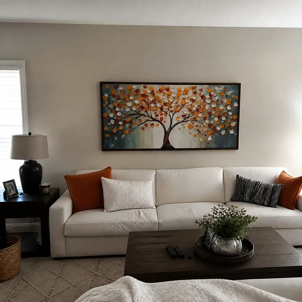
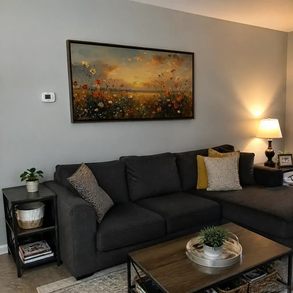
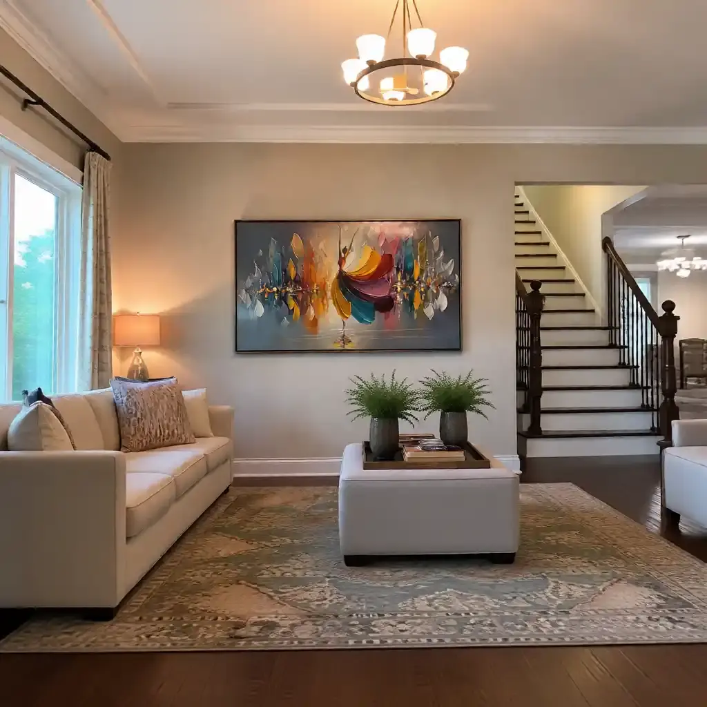
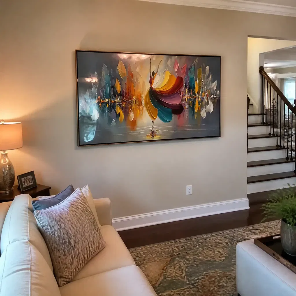
For most living rooms, the sofa is the best anchor point for abstract wall art decisions. A common rule of thumb is that art should cover about two-thirds to three-quarters of the furniture width below it, which keeps the piece grounded without swallowing the seating area. That is a heuristic, not a universal law, but it is a strong first filter when you are comparing sizes.
Use the Sofa as Your Anchor
If you are choosing abstract wall art for living room seating, measure the sofa first and let that width set the starting range. A 72-inch sofa, for example, usually calls for a wider piece than a 60-inch sofa, even if both rooms are otherwise similar. Sectionals often need a broader or more panoramic composition, while low-profile sofas can handle art that feels slightly taller without looking top-heavy.
The biggest mistake is picking the largest canvas available instead of the one that relates best to the furniture. A piece can be physically large and still feel weak if it is too narrow for the sofa. On the other hand, a slightly smaller work can still read as strong if the composition has enough visual weight.

Check Wall Width and Negative Space
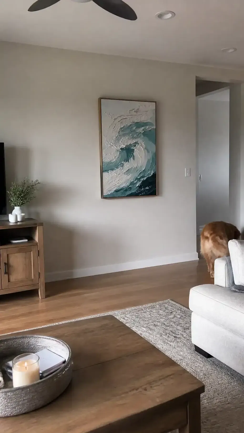
Blank wall span matters as much as sofa width. A wide, uninterrupted wall can support a broader canvas or a grouped composition, while a wall with corners, trim, or nearby furniture usually needs more restraint. The goal is to leave enough breathing room so the art feels connected to the room instead of pressed into every available inch.
If you are comparing what size abstract art for living room walls makes sense, ask one simple question: does the wall still have enough open area around the piece for it to breathe? If the answer is no, the artwork may feel crowded even when the dimensions look right on paper.
Match Visual Weight to the Room
Size alone does not decide how large a piece feels. Darker abstracts, dense brushwork, and heavy texture can read larger than their measurements suggest, while light, open compositions can recede even when the canvas is oversized. That is why statement abstract art sizing is really a mix of width, color mass, and texture.
In a room with thin-legged furniture, bright upholstery, and lots of open floor space, a more substantial abstract often helps anchor the layout. In a room that already has a chunky sectional, dark wood, and layered decor, the same amount of visual force may feel too heavy. For room balance, the question is not just how big the piece is, but how much attention it pulls.
Choose a Scale That Supports the Focal Point
A strong focal wall should look deliberate from the main seating view. If the abstract art is supposed to lead the room, it needs enough scale to compete with nearby lamps, shelving, or windows. If the room already has a fireplace or another dominant feature, the art should support that hierarchy rather than fight it.
That is where the room-feel scale guide helps, and the broader oversized wall fit cues are useful when you are deciding whether the wall truly needs one large piece or a quieter setup. The right abstract painting should feel like it belongs to the architecture, not like it was dropped in at random.
Let the Architecture Set the Limits
Ceiling height, wall width, and architectural breaks can change the same artwork from "perfectly scaled" to "too small." Taller walls and open spans usually allow more confident scale, while low ceilings, windows, built-ins, and fireplaces reduce the safe width range. In other words, the room volume tells you how much visual mass the wall can carry.
| Living Room Condition | What It Usually Does To Art Scale | Main Risk To Avoid | Safer Abstract Art Approach |
|---|---|---|---|
| Low ceiling | Makes tall pieces feel closer and heavier | The room can feel compressed | Favor wider compositions with moderate height |
| Tall ceiling | Gives the wall more room to absorb scale | Art can look timid if it is too small | Use a larger canvas or a more confident span |
| Wide blank wall | Supports broader art or grouped work | A small piece looks lost | Choose a wider abstract or a stronger composition |
| Fireplace, built-ins, or windows | Break up usable wall space | The art can compete with the architecture | Measure the open span, not the entire wall |
| Busy wall with several focal points | Raises visual competition | The room feels cluttered | Pick a calmer piece or reduce size and intensity |
If the room has a large uninterrupted wall, large abstract wall art can usually go bigger without feeling out of place. If the wall is segmented, the art often needs to be more restrained so it does not fight the room's built-in structure. The safest check is to measure only the open rectangle where the artwork can actually live.

That is the point of blank wall sizing cues: the artwork should match the usable wall, not the total wall. In rooms with high ceilings or broad spans, the larger end of the common proportion range usually feels more natural, while smaller rooms tend to benefit from a more careful fit.
Pair Color Temperature With Furniture Finishes
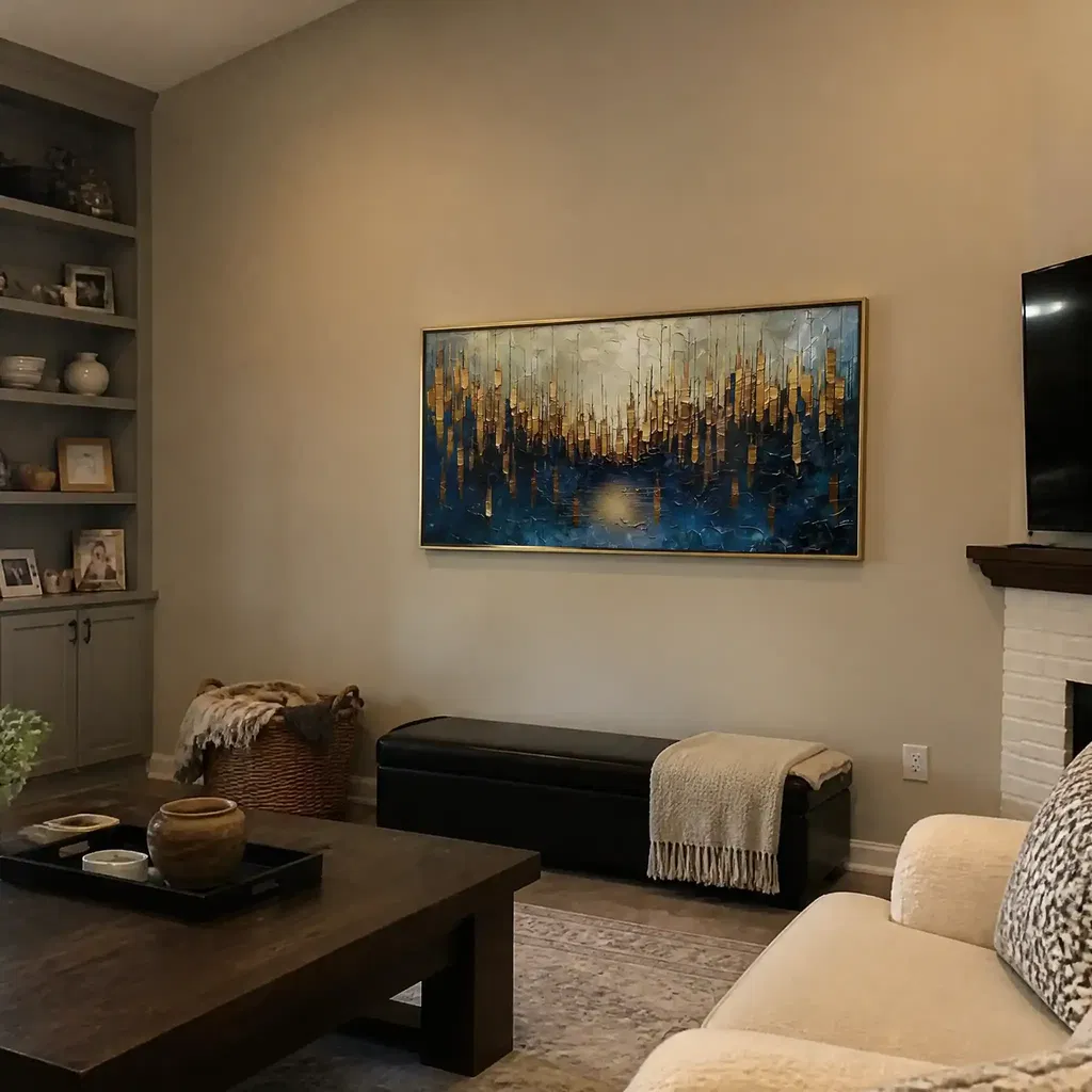
Neutral abstract painting living room choices are often the easiest place to start when the room already has strong finishes. Warm tones usually feel more natural with wood, brass, leather, and beige upholstery, while cooler tones tend to steady black, chrome, stone, and gray. That is not a hard rule, but it is a practical way to keep the artwork from fighting the furniture.
Warm and Cool Tones in the Same Room
If the room mixes warm oak, a gray sofa, and black metal accents, choose one temperature to dominate instead of trying to match every finish. A piece with warm undertones can soften a cooler room, while a cooler abstract can calm a room that feels too wood-heavy or yellow. The more mixed the room already is, the more useful a single dominant temperature becomes.
Neutral Abstracts for Busy Interiors
A neutral abstract painting living room setup works well when the room already has patterned rugs, textured upholstery, or several material changes. Neutral does not have to mean flat. Texture, value contrast, and layering can give a beige or gray abstract enough depth to feel finished without adding more color noise.
That is why the abstract color and texture conversation matters so much in a real living room. If the room already feels busy, a quieter painting can help it settle down instead of adding another loud element.
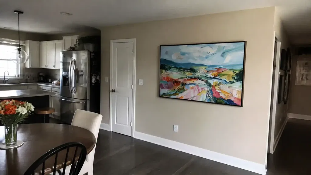
Statement Color When the Room Needs Energy
A bolder piece makes more sense when the room is clean, neutral, or visually underpowered. In that setting, statement abstract art sizing is not only about width. The color intensity also changes how much energy the piece brings to the room.
A strong color story can work beautifully over a simple sofa, especially when the furniture and wall color are restrained. But in a small room that already has a lot of pattern, a vivid canvas can make the seating area feel crowded. If the room is busy, let the art calm it. If the room is sparse, let the art lead.
Texture as a Bridge Between Finishes
Texture is especially useful when you want the art to feel rich without relying on bright color. A layered surface can connect to wood grain, woven fabrics, or stone finishes, which helps the piece feel tied to the rest of the room. That is one reason neutral abstract paintings can still feel substantial when they have enough surface depth.
A neutral wall-art texture guide is helpful here because it shows why beige or ivory art does not have to disappear. Texture gives the eye something to hold onto, which matters a lot in large-format pieces.
Choose the Right Placement Above the Sofa
For above-sofa placement, relate the art to the sofa first and the wall second. A practical hanging gap is a short one, not a floating one. Keep the artwork close enough to the furniture that the two read as one zone, and adjust for lamps, shelves, and nearby windows if they crowd the wall.
- Measure the sofa width and the open wall span above it.
- Compare the art width to the sofa width and stay near the common two-thirds to three-quarters range when the wall allows it.
- Leave a short gap above the sofa, usually around 4 to 12 inches, so the piece feels attached rather than suspended.
- Check the view from the main seating spot, not just while standing.
- Make sure lamps, shelves, or window trim do not pinch the artwork into the wrong position.
Art hung over furniture should be judged relative to the furniture, not only by general eye-level rules. That is the main takeaway from standard hanging guidance: the sofa sets the relationship, and the wall sets the limits. If you want a wider comparison of when a wall needs more scale, the blank wall fit cues are a good check before you buy. For a quick comparison, how high to hang art above furniture is useful when you need a bounded placement range.
Use a Final Fit Checklist Before You Buy
Before you add a piece to cart, check the five signals that usually decide whether it will work: sofa width, open wall span, ceiling height, dominant room tones, and the number of competing focal points. If two or more of those signals push in different directions, slow down and keep shopping.
- The sofa width and art width should feel related, not random.
- The open wall should still have breathing room after the piece is centered.
- The room's ceiling height should support the artwork's visual weight.
- The palette should either echo the room or intentionally contrast it.
- Heavy texture should be a choice, not an accidental maintenance trade-off.
If the room has several architectural breaks or another strong focal point, a calmer abstract or a slightly smaller size is usually safer. When you are ready to shop, browse abstract paintings for sale or compare extra large living room art to find a piece that fits the wall instead of forcing the wall to fit the piece.
FAQs
What Size Art Should Go Above a Sofa?
A good starting point is a piece that spans about two-thirds to three-quarters of the sofa width. If the wall is segmented or the room is small, stay closer to the lower end. If the wall is wide and open, the upper end usually looks more grounded.
How Do I Know If a Large Abstract Painting Will Overwhelm My Living Room?
It usually feels too strong when the ceiling is low, the wall is already broken up, or the room has several competing focal points. If the art also has heavy color or dense texture, step down one size or choose a calmer composition so the room keeps breathing room.
Should I Choose a Neutral Abstract Painting for a Busy Living Room?
Usually yes, if the room already has pattern, mixed finishes, or strong furniture color. Neutral works best when texture and value contrast keep it from feeling flat. If the room is already quiet, a more colorful canvas can give it the energy it is missing.
How Does Ceiling Height Affect Large Abstract Wall Art Placement?
Higher ceilings usually support larger or more confident pieces because the wall can absorb more visual mass. Lower ceilings usually need a wider, less towering composition and a careful hanging gap so the art stays tied to the sofa instead of drifting upward.
Can a Panoramic Abstract Painting Work in a Small Living Room?
Yes, if the wall is wide enough and the composition stays visually light. Panoramic art often works better than a tall canvas in small rooms with low ceilings. The key is to measure the usable span first so the piece does not crowd lamps, trim, or nearby furniture.