Beige has a reputation problem. It's been called by some the "sad beige": flat, lifeless, short on personality. But that reputation belongs to a specific kind. The printed, smooth, one-dimensional kind. Neutral wall art with real painted texture catches light in a way that's hard to stop looking at. Here's how to find one, and how to make it work in your room.
Why Neutral Rooms Feel Flat and How to Fix It
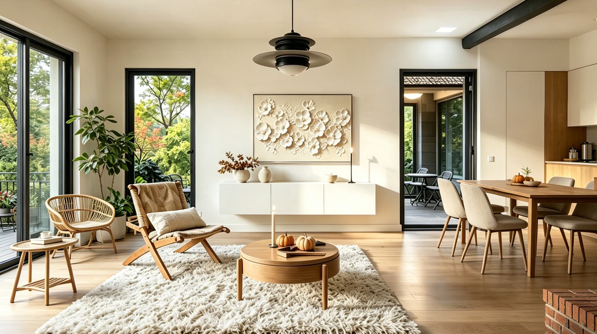
The "Sad Beige" Pattern
"Sad beige" describes a room where every element, including walls, sofa, floors, and art, sits in the same tonal range, with the same smooth surface finish and the same brightness level.
No contrast means no visual interest.
Why Texture Is the Fix
The fix isn't always adding color. Contrast can come from texture, specifically the difference between a rough, built-up paint surface and a smooth linen sofa fabric. A hand-painted neutral abstract with real physical texture introduces that contrast at eye level, where it does the most work. A flat, printed beige panel adds another smooth surface and makes the problem worse.

What Makes Beige Texture Art Different from a Print
How Light Behaves on a Textured Surface
When a painting has real physical surface variation, including ridges from palette knife work, plaster buildup, or raised impasto strokes, light stops moving uniformly across it. It hits raised edges and skips over low points, creating small zones of brightness and shadow that shift as the day progresses.
A printed beige artwork looks essentially the same at 9 a.m. and 9 p.m. A hand-painted piece looks different in every lighting condition.
What to Check Before You Buy
Texture is hard to judge from a standard product photo. Look for these signals:
- The product description mentions palette knife, impasto, plaster, or 3D texture. These are specific techniques that produce real surface relief.
- Photos include a side-angle or raking light shot showing visible shadows on the surface.
- The piece is hand-painted rather than a reproduction. Original work almost always has more surface depth, even when texture isn't the main selling point.
If none of these are clear in the listing, contact the seller directly and ask whether the paint surface is actually raised and textured, or flat like a print.
Warm Beige vs Cool Beige and How to Match Your Room
Not all beige reads the same. The undertone of a neutral painting interacts with the materials in your room, and when they pull in opposite directions, the result is a subtle "something's off" feeling that's hard to name but persistent.
Warm vs Cool at a Glance
| Undertone | What It Looks Like | Works Best With |
|---|---|---|
| Warm beige | Yellow, camel, ochre base | Oak floors, brass fixtures, warm-white walls |
| Cool beige | Gray, taupe, blue-white base | Marble, polished concrete, bright white walls |
| Warm cream | Pink or yellow undertone | Warm wood tones, terracotta accents, soft ambient light |
| Cool cream | Gray or blue undertone | White tile, steel fixtures, chrome hardware |
How to Read Your Room
Start by identifying the largest fixed element in your room, such as the floor, dominant wall color, or main sofa fabric, and decide whether it reads warm or cool. Choose a painting that stays in the same direction.
When Slight Contrast Works
A slight tension between warm and cool neutrals can add subtle interest. A direct clash between opposite ends of the spectrum creates visual noise that's hard to resolve.
Neutral Art Can Balance a Colorful Room Too
The Visual Pause Effect
Neutral wall art doesn't belong only in calm, minimal spaces. Picture a living room with a deep navy sofa, a terracotta rug, and matte black shelving. Every surface competes for attention. A large beige or cream textured neutral abstract on the wall gives the eye somewhere to land and recover. It becomes a visual pause between strong colors.
Same Art, Two Different Jobs
- In a neutral room, neutral abstract wall art earns its place through texture and the surface depth it creates.
- In a colorful room, neutral wall art earns its place through restraint. It creates breathing room and keeps strong colors from becoming overwhelming.
Knowing which role you need before you shop changes what size and surface quality to prioritize.

How to Keep Beige Wall Art from Disappearing
The most common mistake with beige wall art: hanging it against a light or white wall without any supporting elements. The painting and wall merge, and the art becomes invisible.
Hang It at the Right Height
Before size, frame, or lighting, get the height right. The center of the painting should sit at roughly 57 to 60 inches from the floor, which puts it at eye level for most people standing in the room. If you're hanging it above a sofa or console, leave 6 to 12 inches of space between the top of the furniture and the bottom of the frame. A painting hung too high on a light wall is one of the most common reasons neutral art disappears. The eye never naturally travels up to find it.
Go Big on Size
A large canvas creates presence through surface area alone. Even when the color is close to the wall, a wide piece with visible texture registers clearly. A practical starting point: if you're hanging the piece above a sofa or bed, aim for a width that's about two-thirds the width of the furniture beneath it. For a standard 84-inch sofa, that puts you around 56 inches wide. Going smaller than half the furniture width is where pieces start to look lost, especially in neutral tones.
Add a Dark Frame
A dark frame (black, deep walnut, or charcoal) draws a clear visual edge between the painting and the wall. It lifts the piece off the surface and gives it definition. A thin metal frame in brass or bronze adds warmth without adding visual weight.
Use Directional Lighting
A picture light mounted above the painting, or a spotlight aimed from the side, sends light skimming across the textured surface instead of hitting it straight on. Every raised brushstroke catches the light and casts a small shadow behind it. A painting that looked flat in ambient daylight suddenly reads as three-dimensional. This is the most effective single change you can make for a textured neutral piece.
If you can only choose one, start with lighting.
Montcarta's Timeless Beige Wall Art shows what that looks like in practice. The SERENE PATHWAYS impasto painting is a good example of how a side-lit textured surface reads in a finished room.

Choose Neutral Art That Actually Shows Up in a Room
Neutral tones don't bore a space. The wrong type of neutral art does. A flat print in beige adds nothing. A hand-painted piece with real texture catches light and shifts through the day. Match the color temperature, give it the right size or frame, and it holds attention whether your room is calm or full of color. Montcarta's Beige collection offers hand-painted textured originals across multiple styles and sizes. Explore the beautiful beige art for your home!
FAQs
Q1: Does neutral wall art work as a statement piece?
Yes, but two things need to be true at once. The piece needs to be large (36 inches wide or more) so its scale registers in the room, and it needs real physical texture. That's what makes a beige painting hold attention the same way a bold-colored piece would.
Q2: What is the difference between warm beige and cool beige in wall art?
Warm beige has yellow or orange undertones and pairs naturally with wood, brass, and warm-white lighting. Cool beige pulls toward gray or blue and works better with marble, steel, and bright white environments. To tell them apart, look at the piece in natural daylight. If it shifts yellow, it's warm; if it stays gray, it's cool.
Q3: How many pieces of neutral wall art can I use in one room?
For most rooms, one or two pieces is enough. In a neutral space, one large textured piece usually has more impact than several smaller ones competing for the same visual territory. In a colorful room, a set of two or three neutral pieces can work well if they're grouped together. They create a larger area of visual calm rather than scattered interruptions.
Q4: Is hand-painted neutral art worth the higher price over a print?
For neutral tones specifically, yes. Color is not doing the visual work in a beige abstract painting. Texture is. A print is flat by definition, so it removes the only element that makes neutral art interesting. If you're going to hang beige, the texture has to be real or it has nothing to offer once the novelty wears off.
Q5: Does neutral wall art go out of style?
Neutral tones don't, but specific visual styles do. Heavily rendered realistic beige paintings from earlier decades feel tied to that era's aesthetic. Contemporary neutral abstract wall art, especially palette knife or impasto work, aligns with current design directions like quiet luxury and organic minimalism. The color stays relevant; the style of mark-making is what dates a piece.


