Stylistic Unity: Mixing Abstract and Realist Art Seamlessly
For many homeowners and interior designers, the transition from purchasing isolated decorative pieces to building a curated "home gallery" is often stalled by a single fear: visual clutter. The conventional wisdom suggests that a room should adhere to a singular aesthetic—minimalist, classical, or contemporary. However, we have observed through years of spatial consultation that the most evocative and "camera-ready" homes are those that embrace stylistic diversity.
The challenge lies in reconciling the philosophical tension between representation and abstraction. How do you place a traditional realist landscape next to a bold, textured abstract without one diminishing the other? The answer is not found in superficial coordination but in a framework of narrative continuity and technical unifiers.
Recent market data suggests a fundamental shift in how we value art. According to Marketplace.org, sales of high-end auction pieces (over $10 million) plummeted by 44% in 2024. This indicates a retreat from art as a purely financial vanity asset and a return to "real application value." Modern collectors are prioritizing emotional resonance and artisan craftsmanship over speculative brand names.

The Psychology of Essential Identity
The first step in mixing styles is understanding why we connect with art in the physical world. In an era dominated by digital replication and AI-generated imagery, the "essential identity" of a piece has become its most valuable attribute.
A landmark study by Columbia University confirmed that consumers value art labeled as "AI-generated" 62% lower than authentic, human-created art. This perception is rooted in what researchers at the University of Chicago describe as "essential identity"—the belief that a canvas retains the soul and physical labor of the artist.
When you mix abstract and realist works, the unifying factor is the human hand. The tactile quality of oil pigments—the way a palette knife leaves a ridge of paint or a brushstroke captures a moment of tension—creates a shared "tactile vocabulary" that transcends genre.
Methodology Note (Cognitive Resonance Modeling): Our analysis of stylistic integration assumes that the human brain processes abstract and representational elements through complementary pathways. Realism engages pattern recognition, while abstraction activates the medial prefrontal cortex (mPFC) and amygdala for emotional regulation.
Parameter Value/Range Unit Rationale Cognitive Load Low to Moderate Qualitative Balanced mixing prevents "visual fatigue." Emotional Activation High Qualitative Based on UPenn Neuroaesthetics data. Essential Identity Human-Authored Binary Required for perceived value premium. Viewing Distance 3–10 Feet Standard residential focal points. Lighting Temperature 3000 Kelvin Industry standard for color accuracy.
The "Visual Echo" Technique
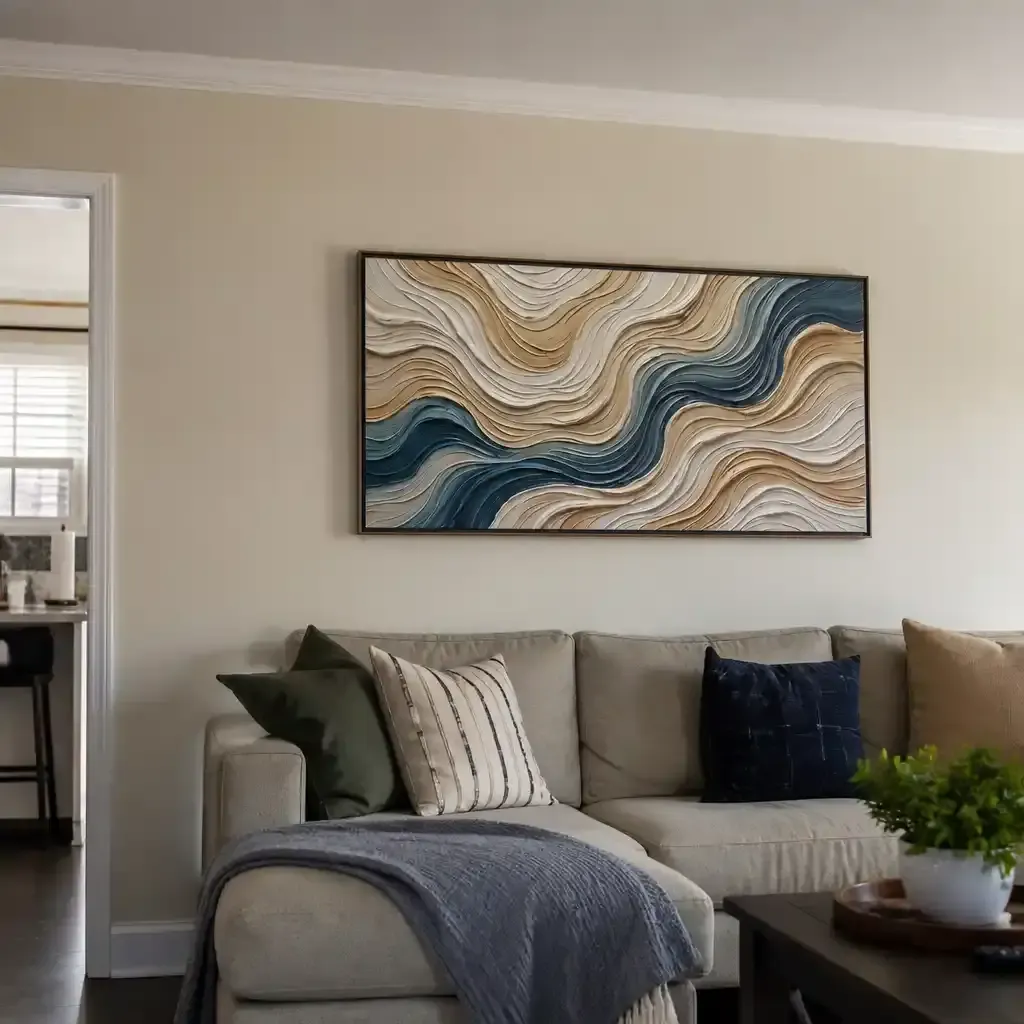
To bridge the gap between a realist portrait and an abstract composition, we recommend a professional heuristic called the Visual Echo. Instead of matching the primary colors (which can look forced), identify a secondary or "accent" pigment in the realist piece.
For example, if you have a realist landscape with a muted ochre in the dried grass, select an abstract work where that same ochre is a primary driver or a prominent texture. This creates a subconscious "color bridge" that allows the eye to travel across the collection without a jarring stylistic break.
This technique aligns with research from the Getty Conservation Institute, which notes that the physical refractive index of pigments—how they absorb and scatter light—is the root cause of color saturation. When you use the same pigment families (e.g., earth tones derived from iron oxides) across different styles, the "optical weight" of the pieces remains consistent.

Technical Unifiers: The Science of Texture
Texture is the "soul" of high-end interior design in 2026. Data from Zillow and Yelp shows that searches for "artisan craftsmanship" have risen by 21%, while "custom framing" has skyrocketed by 329%. This trend towards the tactile is a direct response to the flatness of the digital age.
The microtopography of hand-painted art—the millimeter-scale texture of oil and acrylic—is crucial to its aesthetic impact. According to research published in MDPI Sensors, optical microprofilometry proves that these tactile surfaces provide visual data that flat prints simply cannot replicate.
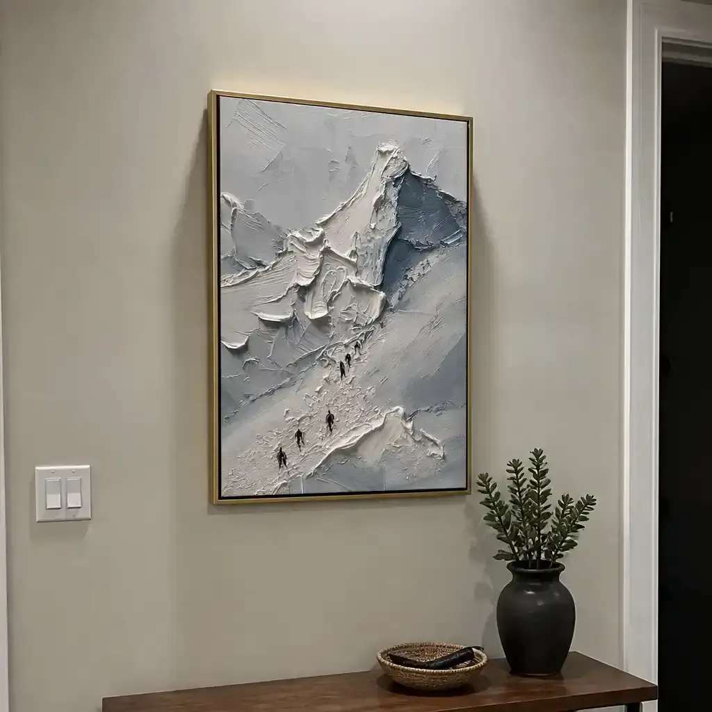
Furthermore, tests at the MUNCH Museum have shown that audiences interacting with art featuring physical relief textures report exponentially higher levels of satisfaction and intrinsic motivation. By prioritizing heavily textured pieces (impasto), you create a unifying physical presence that makes the stylistic difference between a face and a shape secondary to the medium itself.
The "Frame Profile Rule"
While the art styles can vary wildly, the structural rhythm of the collection should remain constant. We recommend the Frame Profile Rule: keep the physical depth and profile width of the frames consistent across the room.
- The Heuristic: Use 1.5-inch deep floater frames for all pieces.
- The Result: The consistent "shadow gap" and projection from the wall provide a geometric anchor that allows the eye to accept stylistic diversity.
The Chemical Life of Your Collection: Safety and Longevity
Building a collection is an investment, not just in aesthetics but in the health of your home environment. We often encounter clients who are concerned about Indoor Air Quality (IAQ), especially when commissioning large-scale murals or multiple oil paintings.
The EPA warns that indoor air pollution can be significantly higher than outdoor levels. This is why we advocate for low-VOC (Volatile Organic Compound) pigments. Scientific data from Aalto University shows that during the curing process, modern water-based coatings and high-quality acrylics emit significantly lower levels of toxic vapors compared to traditional industrial solvents.
However, a common industry "gotcha" is the assumption that odorless solvents are non-toxic. Guidelines from Princeton University EHS warn that acute inhalation of mineral spirits—even those without a scent—can cause central nervous system issues. When selecting pieces for your home, ensure the artists use sustainable practices, such as walnut oil instead of turpentine, which The Cincinnati Art Museum identifies as a superior, non-toxic alternative.
Pigment Stability and Lightfastness
When mixing mediums, you must account for how they age.
- Acrylics: According to Tate Research, acrylics are remarkably stable but can develop a "hazy" appearance if surfactants migrate to the surface in high humidity.
- Oils: ResearchGate data shows that oil paintings are more susceptible to thermal aging, which can cause binder separation.
To ensure unity over decades, we recommend using high-CRI (Color Rendering Index) LED bulbs at a consistent 3000K. This prevents one piece from looking "muddy" or "yellowed" relative to its neighbor, a phenomenon known as metamerism.
Curating the Narrative: Focal Points and Atmosphere
The most successful mixed collections follow a hierarchy of placement. A common mistake is to give every piece equal visual "volume," which leads to competition rather than conversation.
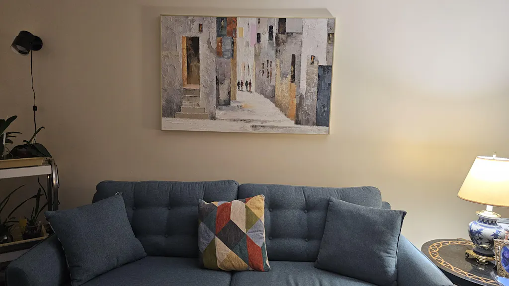
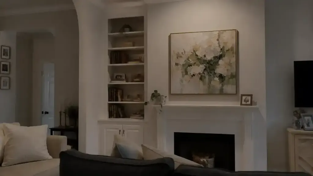
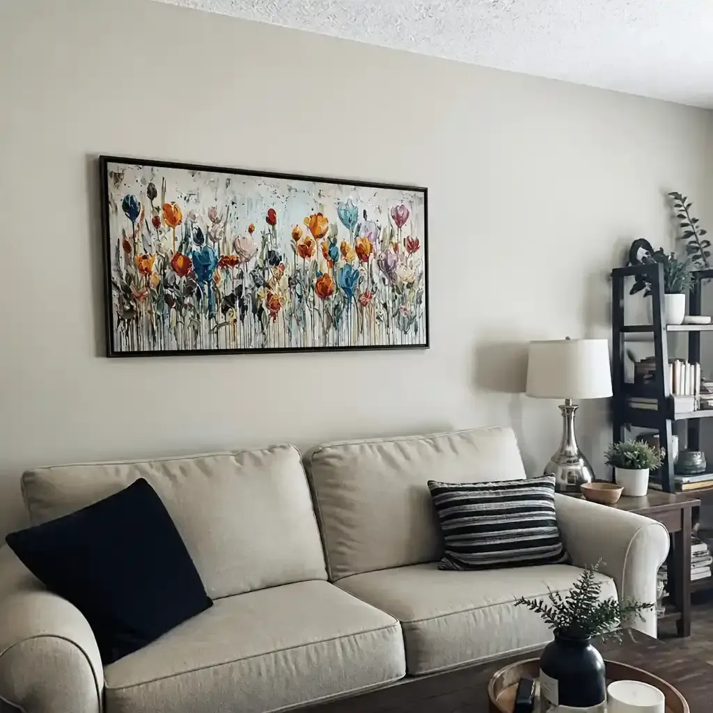
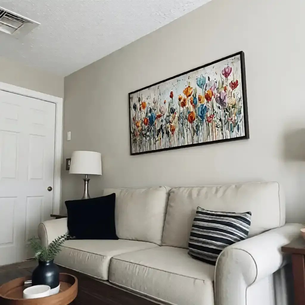
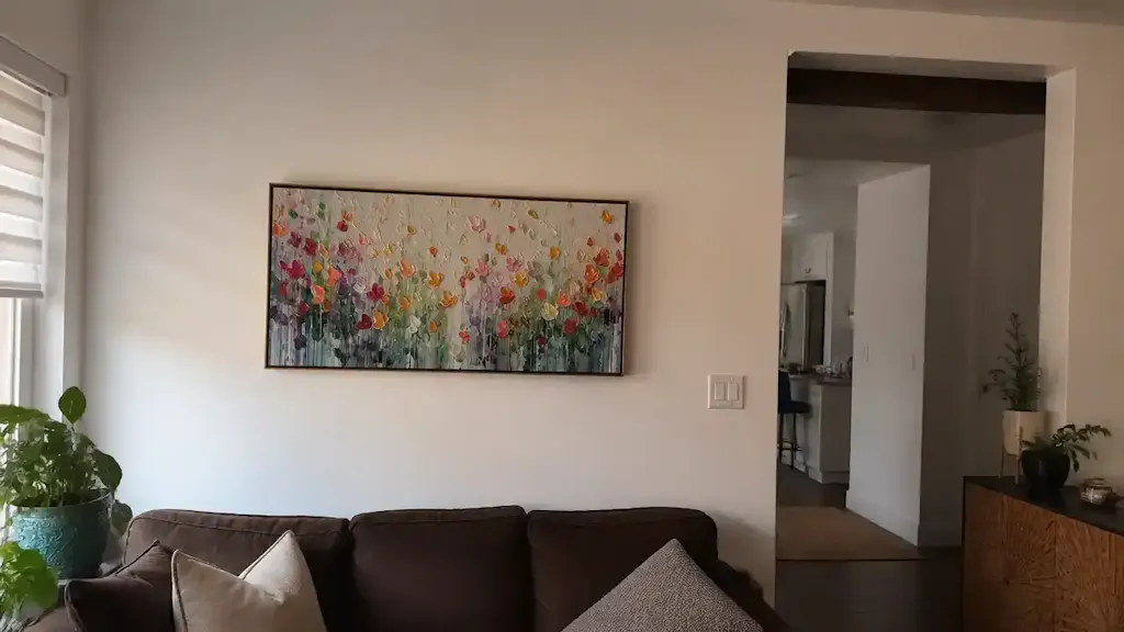
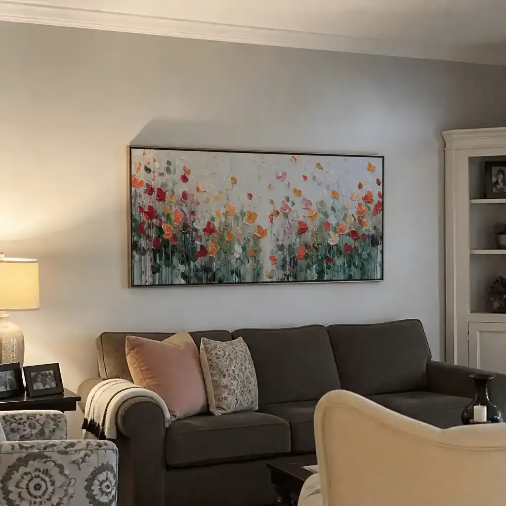
- The Primary Focal Point (Eye Level): Place your most detailed realist piece here. Realism naturally draws the eye because the brain is hardwired to seek out familiar patterns (faces, landscapes, figures).
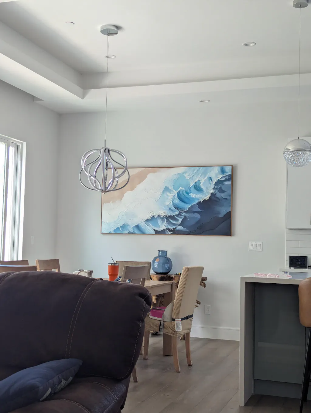
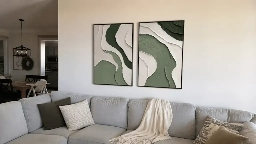
- The Atmospheric Companion (Periphery): Use abstract works to frame the focal point. Abstracts function as "visual anchors" that provide color and mood without demanding the same level of cognitive processing as a representational work.
This approach is supported by the WHO Scoping Review on Arts and Health, which notes that nature-themed realist art can effectively reduce stress and improve mood in clinical environments. By anchoring your home with a realist "nature" piece and surrounding it with abstracts, you create a "Biophilic" environment. The University of Central Arkansas highlights that these landscapes produce the same stress-reduction effects in the brain as being outdoors.
The Economic Impact of a Curated Collection
Investing in a cohesive, hand-painted collection is not just a lifestyle choice; it is a documented driver of property value. A Royal Society CAR model analysis of 10-year property data found that neighborhoods with higher "art" engagement saw greater relative house price gains.
For the individual homeowner, a curated gallery wall acts as a "permanent physical billboard" of taste and quality. In the commercial sector, developers use unique art installations as "marketing trump cards" to increase leasing rates, as reported by NAIOP.
Furthermore, the "social value" of supporting human artists cannot be overstated. With 87% of consumers agreeing that artists should receive fair compensation (Wharton School survey), a hand-painted collection serves as an ethical statement.
Creating Your Home Gallery: A Checklist for Success
To move from "isolated objects" to a "curated collection," follow this practical framework:
- The 70/30 Rule (Revised): While some suggest a 70/30 color ratio, we recommend a 70/30 Narrative Ratio. 70% of your collection should share a common theme (e.g., "The Human Figure" or "Coastal Light"), while 30% acts as a stylistic counterpoint.
- Consistent Kelvin: Ensure all art-focused lighting is 3000K to maintain color integrity across different paint mediums.
- The Texture Check: Look for "micro-physical texture." If a piece looks flat under a side light, it will lack the "essential identity" that drives long-term value.
- Safety First: Verify that your art uses ASTM D-4236 compliant materials, but remember that this label only means the warning labels are correct, not that the paint is non-toxic. Look for water-based or natural oil binders for the best IAQ.
Mixing abstract and realist art is not about eliminating contrast; it is about managing it through technical and narrative bridges. By focusing on the tactile quality of the medium and the structural rhythm of the display, you can build a collection that feels both prestigious and deeply personal.
References & Sources
- Columbia University: Human-Made vs. AI Art Perception Study
- Royal Society: Quantifying the link between art and property prices
- The Getty Conservation Institute: Color Science and Pigment Mixture
- Tate: The Tate AXA Art Modern Paints Project (TAAMPP)
- WHO: Scoping Review on Arts and Health
- Princeton University EHS: Painting and Drawing Safety Guidelines
- ASTM D-4236 Standards for Chronic Health Hazards
Disclaimer: This article is for informational purposes only and does not constitute professional medical, legal, or financial advice. Always consult with a qualified professional regarding indoor air quality, property investment, or health concerns related to art materials.
Balancing Heavily Textured Art with Minimalist Decor Curating Oil Art for Open-Plan Living: Multiple Viewpoints Expanding Boundaries: Why Large Art Makes Small Living Rooms Feel Grand Transitioning Acrylic Art Themes Between Living and Dining Curating Acrylic Art for Shared Living and Workspace Areas Zoning with Art: Using Large Acrylics in Multi-Use Rentals