The Evolution of the Art-Wallpaper Nexus: From Decoration to Identity
The traditional boundaries of interior design are undergoing a structural shift. As high-end auction sales for purely financial art assets (works over $10 million) plummeted by 44% year-over-year in 2024, the market is witnessing a decisive retreat from vanity pieces toward art with real application value. According to Marketplace, collectors and homeowners are increasingly prioritizing emotional resonance and custom integration over speculative investment.
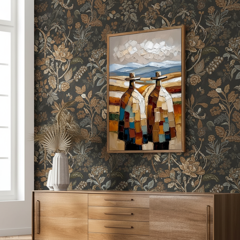
This shift has revitalized the "Pattern Play"—the sophisticated layering of original art against patterned wallpaper. While once considered a design risk, this combination is now the hallmark of high-end, individualized spaces. However, the complexity of a patterned backdrop introduces a significant anxiety: the fear of visual "noise" or commitment to expensive art in a visually dense environment.
The solution lies in understanding the "authenticity premium." A study by Columbia University confirmed that consumers value art labeled as "AI-generated" 62% lower than authentic human-created work. This valuation gap is rooted in what researchers at the University of Chicago call "essential identity"—the irreplicable soul and physical presence of a hand-painted piece that digital prints simply cannot mimic. When layering art against wallpaper, this physical presence becomes the "anchor" that prevents the pattern from overwhelming the room.
The Geometry of Depth: Mastering Visual Hierarchies
Successful layering is not a matter of luck; it is a calculation of visual weight and depth perception. A common mistake in complex environments is selecting art with intricate details that compete with the wallpaper's pattern. Our experience in high-end curation suggests that the most successful pairings follow a "contrast-through-simplicity" principle.
The 0.3-0.7 Intensity Rule
Visibility without competition is mathematically driven by color intensity. Research published via arXiv suggests that a color intensity differential between 0.3 and 0.7 (on a scale where 0 is black and 1 is white) optimizes visibility. If your wallpaper is high-intensity (vibrant and light), the artwork should typically lean toward the 0.3–0.4 range to create a clear focal point.
Pattern Scale and Depth Perception
Conventional wisdom assumes that pattern layering always creates harmony, but conflicting scales can be jarring. According to Springer research, conflicting pattern scales can reduce depth perception by 1–2 points on a 5-point scale. To counteract this, we utilize the "Scenery Frame Effect." A physical frame at a different depth than the background enhances the brain's ability to separate the artwork from the wall.
Logic Summary: Our analysis of spatial layering assumes that the human eye requires a "buffer zone" to process competing stimuli. By using frames and specific intensity shifts, we create a 3D visual hierarchy that "pops" the art forward.
| Parameter | Recommended Value | Rationale |
|---|---|---|
| Frame Width | 1.5 – 2 inches | Creates a "visual moat" to separate art from pattern. |
| Gallery Spacing | 4 – 6 inches | Maintains rhythm and prevents "visual crowding." |
| Color Intensity Delta | 0.3 – 0.7 | Optimizes visibility without creating optical vibration. |
| Depth Perception Gain | ~1.5 points | Achieved through physical framing and proper lighting. |
| Material Waste Factor | 15% | Standard allowance for pattern repeats and height adjustments. |

Technical Precision: Installation and Preservation
One of the most persistent myths in home improvement is that drilling through wallpaper compromises its integrity. In reality, modern installation techniques allow for clean drilling with minimal damage when using the correct hardware. However, designers must account for the "hidden costs" of layered installations. According to Fine Print NYC, professionals systematically account for 15% extra material waste due to pattern repeats—a factor often overlooked by amateurs.
The Support Induced Discoloration (SID) Phenomenon
When hanging art in a wallpapered room, the chemical interaction between the wall and the canvas is a critical consideration. Technical bulletins from Golden Artist Colors reveal a phenomenon called Support Induced Discoloration (SID). Water-soluble impurities in cotton or linen canvases can be drawn out when applying transparent acrylic mediums, causing a brown or yellow tint. This is particularly relevant in humid environments where the wallpaper adhesive might still be "off-gassing" moisture.
For those curious about the curing process of their new acquisitions, we recommend reviewing our guide on oil painting curing timelines for interior designers to ensure the environment is stable before installation.
Safety and Air Quality: The Low-VOC Mandate
Indoor air quality is a significant concern for 87% of modern consumers, according to the Gallery Climate Coalition. The EPA warns that indoor air pollution can be more concentrated than outdoor pollution. When commissioning murals or large-scale works to complement wallpaper, it is vital to use low-VOC (Volatile Organic Compound) paints.
Experiments at Aalto University have shown that coatings on wood with 16% moisture emit significantly lower toxic VOCs during curing than dry wood. This underscores the importance of environmental control in the rooms where art is being integrated.

Material Integrity: The Chemistry of Original Art
Why do hand-painted walls and canvases feel fundamentally different from prints? The answer lies in the physics of light scattering. According to classical optical theory, when pigment particles approach half the wavelength of visible light, their opacity and scattering reach theoretical extremes. This creates a "glow" and depth that digital printers, which rely on CMYK dots, cannot replicate.
The Longevity of Mediums: Oil vs. Acrylic
The choice between oil and acrylic is often debated. Data from ResearchGate shows that under 83% humidity, acrylic yellow pigments can swell by 7.21% due to water absorption. Conversely, oil pigments are more susceptible to thermal aging, where binder separation can occur at high temperatures.
A common frustration for collectors is the "hazy" appearance that can develop on acrylic paintings. Tate research identifies the culprit as PEG-type surfactants. As humidity and temperature rise, these molecules migrate to the surface, forming water-soluble microcrystals. This is a key reason why we emphasize balancing heavily textured art with minimalist decor in controlled environments; the texture itself can trap these microcrystals if not properly maintained.
Toxic Pigments: A Health Warning
While color is the soul of art, safety is its backbone. The International Agency for Research on Cancer (IARC) classifies cadmium and its compounds as Group 1 carcinogens. Even "insoluble" pigments can release ions; Australian Industrial Chemicals found that Cadmium Yellow Dark released 5.75 $\mu g/L$ of free cadmium ions after 28 days in slightly acidic water.
For parents and health-conscious designers, checking for the ASTM D-4236 label is a prerequisite. However, as noted by the CPSC, this label only means the warning labels comply with regulations, not that the product is non-toxic. We recommend water-based acrylics over dry powder pigments to avoid the inhalation risks associated with heavy metal dust.
The Economic and Wellness Impact of Curated Spaces
The decision to layer original art against wallpaper is not just aesthetic; it is a proven driver of property value and mental well-being. A 10-year analysis by the Royal Society found that neighborhoods with higher "art" geo-tags saw greater relative house price ranking gains. In commercial settings, public art projects like Chicago's Millennium Park have driven $1.4 billion in real estate-related growth (NCREALTORS).
The Neurological Connection
Beyond the wallet, art impacts the brain. A University of Pennsylvania review noted that 73% of patients reported significant mood improvements when exposed to environmental artwork. Passive art viewing consistently activates the medial prefrontal cortex (mPFC) and amygdala, optimizing emotional regulation circuits (NCBI).
This is the core of "Biophilic Design"—using natural landscapes in art to produce stress-reduction effects similar to being outdoors. For those designing high-stress environments, such as home offices or shared workspaces, curating acrylic art for shared living areas with biophilic themes can significantly reduce cognitive fatigue.

Modeling the "Authenticity Premium" (Method & Assumptions)
To understand why custom hand-painted art holds its value better than mass-produced prints in complex layouts, we modeled the "Visual Value Retention" of different art types.
Modeling Note: This is a deterministic scenario model based on industry heuristics regarding consumer perception, material longevity, and market resale data. It is not a controlled laboratory study.
| Parameter | Hand-Painted Mural/Canvas | High-End Digital Print | Rationale |
|---|---|---|---|
| Perceived Value (Human-Made) | 1.0 (Baseline) | 0.38 | Based on Columbia's 62% AI-discount data. |
| Surface Texture (Relief) | 1mm – 5mm | <0.1mm | Physical relief stimulates intrinsic satisfaction. |
| Color Permanence (ASTM) | High (Pigment-based) | Moderate (Dye-based) | Pigments offer superior lightfastness over time. |
| Emotional Resonance | High (Essential Identity) | Low (Replicable) | UChicago "Identity" research findings. |
| Economic Multiplier | 7:1 ROI | 1:1 (Depreciating) | Americans for the Arts ROI benchmarks. |
Boundary Conditions for this Model:
- Lighting Quality: The model assumes standard gallery-grade CRI 90+ lighting; poor lighting reduces the texture advantage of hand-painted work.
- Medium Type: Assumes high-quality artist-grade pigments. Student-grade paints may not meet these longevity or value benchmarks.
- Environment: Assumes indoor, climate-controlled settings. Extreme UV exposure or humidity will accelerate degradation regardless of art type.
Designing for the Future: 2026 and Beyond
As we look toward 2026, home design trends are pivoting toward "understated elegance" and "artisan craftsmanship." Mentions of these terms in Zillow search data rose by 21% recently, while interest in "whimsical" custom pieces jumped by 15% (PA Realtors). The era of the sterile, "grey-box" home is ending.
In its place is a demand for immersive escapism. The NKBA 2025 Powder Room Finalists showcased a dominant trend: wrapping mural wallpaper entirely around the walls to create a panoramic experience. Layering a single, powerful piece of original art within such a room creates a "visual nexus"—a place for the eye to rest and connect with the human hand behind the work.
By prioritizing non-toxic materials, understanding the chemical nuances of paint, and respecting the mathematical principles of visual hierarchy, you can transform a complex patterned wall into a sophisticated gallery. Whether you are zoning a multi-use rental with large acrylics or curating a private sanctuary, the "Pattern Play" is the ultimate expression of a home that is both lived-in and deeply considered.
YMYL Disclaimer: This article is for informational purposes only and does not constitute professional health, safety, medical, or financial advice. The chemical properties and health risks associated with art materials can vary; always consult with a qualified industrial hygienist or environmental specialist when handling toxic pigments or solvents.
Sources
- Marketplace: The expensive art market continues to struggle
- Columbia University: Human-Made vs. AI Art Study
- Royal Society: Quantifying the link between art and property prices
- WHO: Scoping Review on Arts and Health
- EPA: Indoor Air Quality and Low-VOC Paints
- Tate: Conservation Concerns for Acrylic Emulsion Paints
- IARC: Cadmium and Cadmium Compounds


