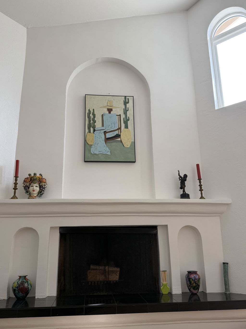
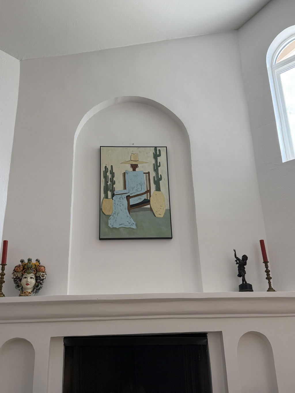
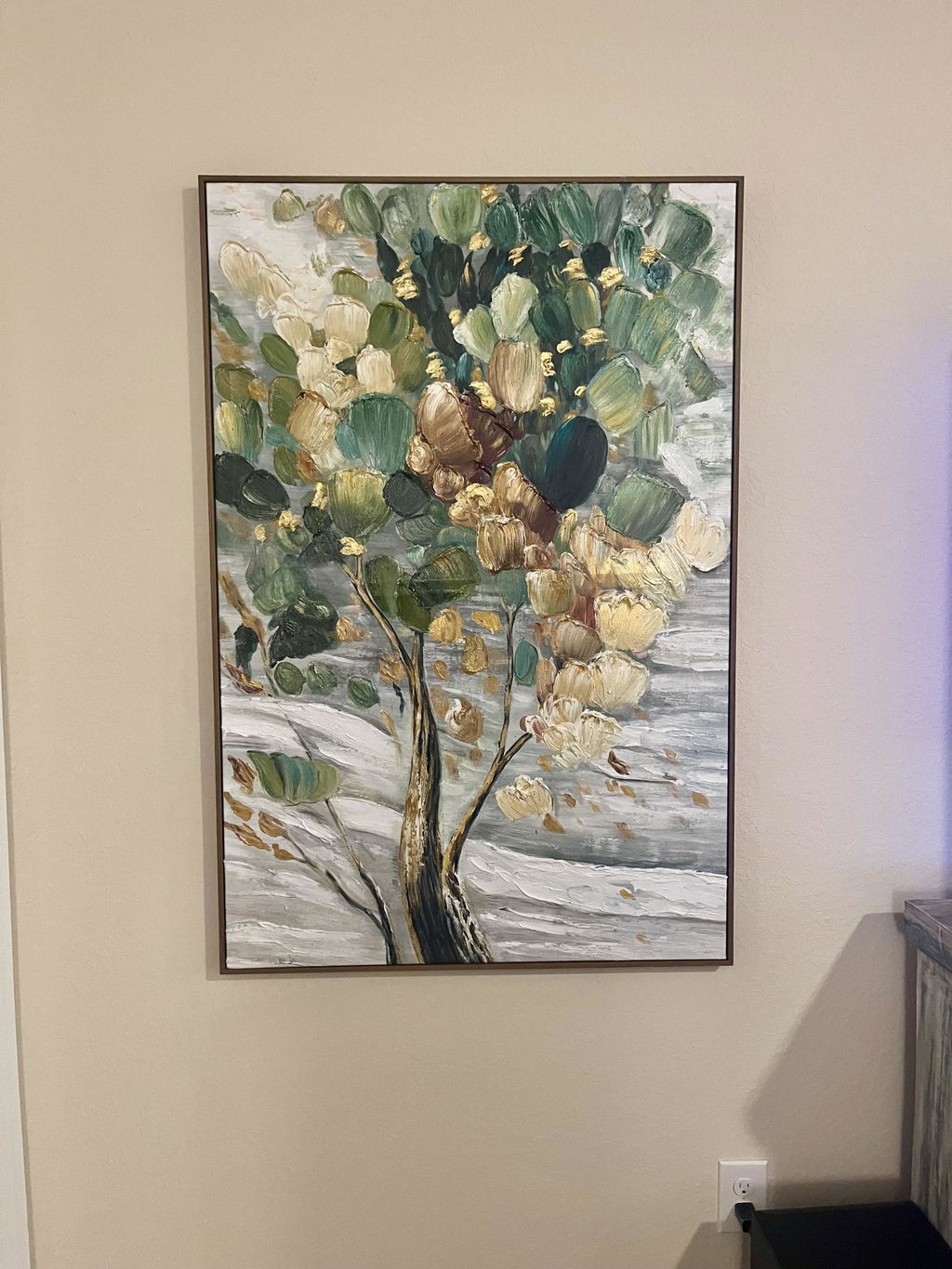
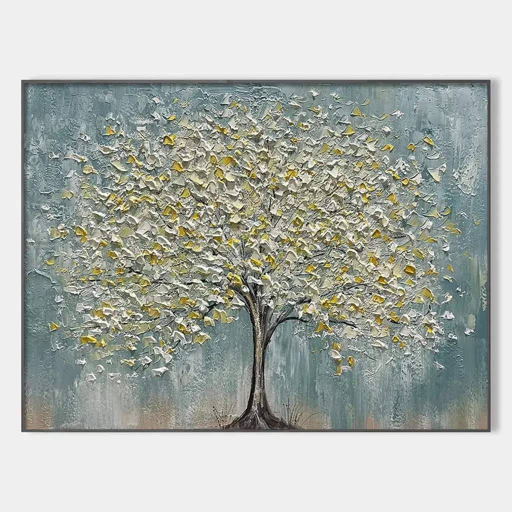
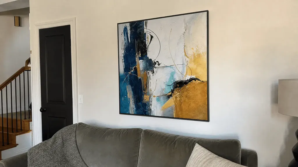
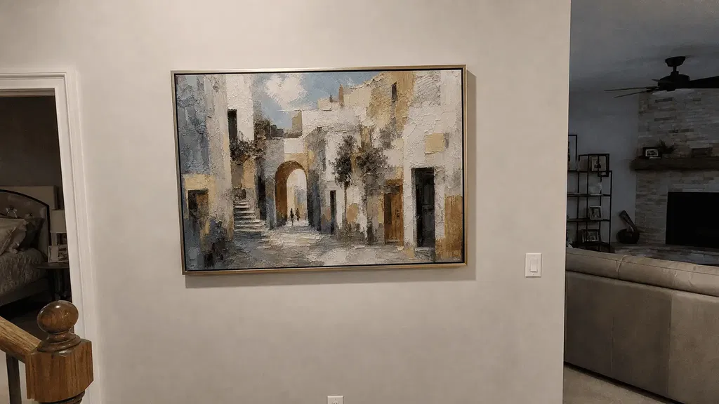
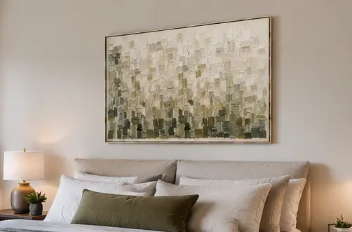
The best large-format paintings for a high-ceiling wall are sized to the usable wall and the room's furniture—not to ceiling height alone. Start by measuring the uninterrupted area, then identify the main sightline and visual center. From there, compare a single vertical statement, stacked pieces, and a horizontal counterweight against the wall's direction, furniture width, negative space, and installation limits.
This approach replaces guesswork with a practical sequence: measure, anchor, compare, and complete a room-view and product-page check before adding art to your cart.
Measure the Usable Wall Before Choosing Art
Measure the portion of the wall that can actually hold art, then compare that area with the furniture and viewing conditions below it. Total ceiling height is useful context, but it does not tell you how much uninterrupted space is available for a composition.
-
Map the unobstructed wall. Record the usable height and width, excluding windows, doors, molding, railings, sconces, outlets, stair angles, and other interruptions. A two-story wall may be tall, but a window or balcony can divide it into smaller visual zones. Treat each zone separately unless the architecture clearly supports one composition.
-
Mark the room's fixed relationships. Note the width of the sofa, console, bed, or other furniture that anchors the wall. Also record the ceiling height, the main viewing distance, and the path people use to enter the space. These details help you judge whether a proposed piece will connect to the room or appear to float above it.
-
Save a dimensioned photo or sketch. Photograph the wall straight on and add the usable height, usable width, furniture edges, and obstacles. A simple paper outline or digital overlay lets you compare portrait, stacked, and landscape boundaries before you browse. Use the sketch to define a realistic comparison area, then confirm the final artwork dimensions on the individual product page.
Once those measurements are recorded, you can browse oversized wall art as a category rather than assuming every large piece will suit the wall. The useful question is not "What is the biggest painting available?" but "Which complete composition fits this uninterrupted area and the furniture below it?"

Set the Visual Center Around Furniture and Sightlines
The visual center should follow the room's primary sightline and its lower furnishings, with ceiling height treated as context rather than the placement target. A tall wall does not automatically require artwork to move close to the ceiling; the composition should still feel connected when viewed from the room's main positions.
Begin with the way the room is used. In a living room, the main seating position may control the first impression. In a foyer, the entry approach may matter more. In an open-concept space, you may need to consider both the seating area and the transition into the next zone. Stand or sit in those positions and ask whether the artwork relates to the furniture, rather than appearing stranded in the upper half of the wall.

Furniture height changes the answer. A low sofa, long console, or open floor area may support a taller composition, but the lower part of that composition still needs a visual relationship with the room. Conversely, a tall cabinet, fireplace, railing, or architectural feature may already establish the center, making a higher or more fragmented arrangement feel crowded.
Preview the proposed boundary from seated, standing, and approach views before committing. Painter's tape, removable paper, or a marked photo can show whether the artwork feels connected from real viewing positions. Use eye level as a starting check, then adapt the center to furniture height, the primary sightline, and the wall's architecture rather than applying a fixed hanging-height rule. For walls interrupted by windows or molding, review the related guidance on art around windows and molding.
Match Large-Format Paintings to the Wall's Proportions
Choose the composition whose visual direction and combined scale connect the usable wall to the furniture and architecture. A single vertical piece, stacked grouping, or horizontal counterweight can work, but each solves a different proportion problem and can fail when obstacles or sightlines contradict it. High-ceiling design guidance supports treating this as a proportion check, not a universal size formula.
One Vertical Statement for a Strong Upward Line
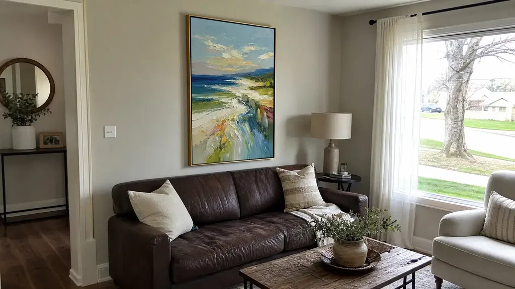
A single vertical statement suits a genuinely portrait-oriented usable wall when one uninterrupted focal point can connect the lower room to the height above it. It emphasizes the wall's upward direction without requiring separate pieces to align, so it can feel calm and decisive in a foyer, living room, or open-concept feature zone.
The not-fit condition is a wall where the lower placement would sit far above the furniture or where windows, sconces, stairs, or molding interrupt the intended boundary. In that case, a tall shape may emphasize disconnection instead of solving it. After confirming that portrait orientation is appropriate, use tall vertical wall art as a browsing route; verify each item's dimensions and product details individually.
Stacked Pieces for Height With Flexible Rhythm
Stacked pieces can fill vertical space while creating a more flexible rhythm than one large work. Judge the grouping by its combined outer boundary, shared center, and relationship to the furniture—not by the size of each individual piece. A coherent stack can make a tall wall feel intentionally built in sections, but it needs enough uninterrupted height for the units and their spacing to read as one composition.
- Check the combined outer boundary against the usable wall and the furniture below it.
- Preview the spacing and shared center with paper templates or a marked photograph.
- Reconsider the arrangement if stairs, sconces, molding, railings, or outlets break the alignment.
A stacked grouping may also involve more decisions during installation than one work. If you are weighing one oversized piece against a modular arrangement, compare the single canvas or triptych as a planning question, not as a promise that either format will fit your wall.
A Horizontal Counterweight for Wide or Open Rooms
A horizontal composition can balance a wide room or long furniture even when the wall itself is tall. Judge it against the wall's usable width and the furniture's lateral direction, not against ceiling height alone. It is often a better counterweight when a vertical piece would exaggerate height or leave the room's broad layout visually unaddressed.
| Option | Best fit to test | Furniture relationship | Visual movement | Installation complexity |
|---|---|---|---|---|
| Single horizontal work | A wide, uninterrupted wall zone | Echoes a long sofa, console, or open sightline | Calm and lateral | One composition to position, but product dimensions still require verification |
| Compact horizontal grouping | A broad wall that benefits from rhythm without a tall stack | Can align with several furniture sections or a long architectural feature | Layered and directional | More alignment and spacing decisions than one work |
| Vertical alternative | A wall zone that is clearly taller than wide or needs upward emphasis | Connects best when lower placement relates to furniture and the primary sightline | Strong upward movement | Usually simpler as one piece, but it can feel disconnected if the center is too high |
Treat extra-long horizontal art as a browsing direction only after testing the full boundary in the room. The most expansive option is not automatically the most balanced one; a horizontal work can still feel undersized if the wall is wide, while a vertical work can feel excessive if the room already has strong upward lines.
Check Negative Space and Nearby Obstacles Before Buying
There is no universal amount of empty space that looks intentional on every high wall. Negative space works when the artwork has a clear relationship to the furniture, sightlines, and architecture; the final decision should come from a room-view test and an individual product check rather than a straight-on elevation alone.
- Test the visual connection. View the planned boundary from the entrance, main seating position, and key transition areas. If the artwork only makes sense when you stand directly in front of the wall, the composition may be too detached from the room's everyday experience.
- Review real-room sightlines. Check seated and standing views, especially in a double-height living room or open-concept space. Look for a top-heavy effect, a floating lower edge, or a stack that disappears from one important approach.
- Map architectural interruptions. Recheck windows, molding, stairs, railings, sconces, lighting, outlets, vents, and doors. These can reduce the usable area or change the center even when the overall wall looks large. For texture and format tradeoffs, see large textured wall art, but evaluate the actual piece rather than relying on a category label.
- Verify the individual product. Before purchase, confirm the listed dimensions and review any available information about framing, materials, handling, returns, delivery, and installation. Collection names do not establish finished size, weight, or suitability for a stairwell or double-height wall. If your plan calls for very enormous wall art, check access from the shipping route to the final wall as well as the wall itself.
After this check, use the completed measurements and chosen format to browse a relevant collection. Treat the product page as the final authority for the specific dimensions and available purchase details, then confirm that the piece can reach and be installed in the intended location.
FAQs
Use the checks below to compare common wall layouts, room viewpoints, and installation conditions before you choose a piece.
Should art go all the way up a high wall?
No. Leave space above the artwork when it still connects to the furniture and room sightlines. Extend it higher only when the uninterrupted wall and architecture support that choice.
What size painting works best with high ceilings?
Compare the full artwork boundary with the usable wall, furniture, viewing distance, and obstacles. Confirm exact dimensions on the product page before choosing among large-format paintings.
How do you avoid a top-heavy two-story wall?
Anchor the composition to the main sightline and lower furnishings. Test a vertical, stacked, or horizontal boundary from the room's real approach and seating positions, then choose the format that keeps the lower edge visually connected.
What should I check above a staircase?
Map the stair angle, railings, molding, and route-based sightlines. Also confirm that delivery and installation access are realistic before choosing the format.
Are huge wall paintings always better for double-height rooms?
Not necessarily. Compare their visual weight and direction with the furniture and architecture, then use the individual product dimensions rather than the category name to judge fit.