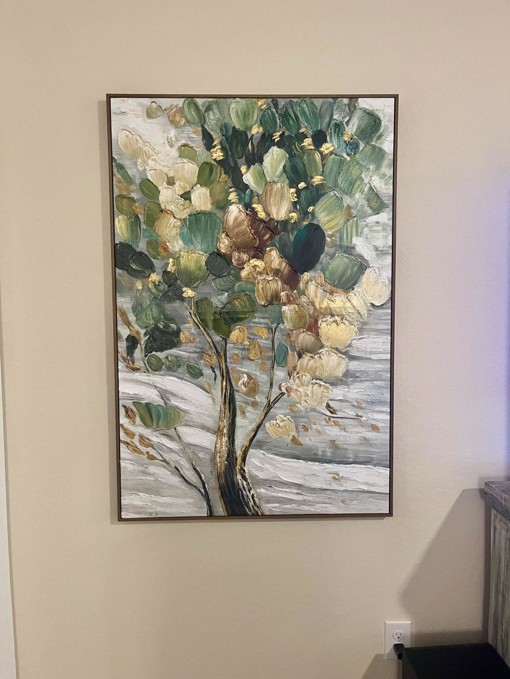
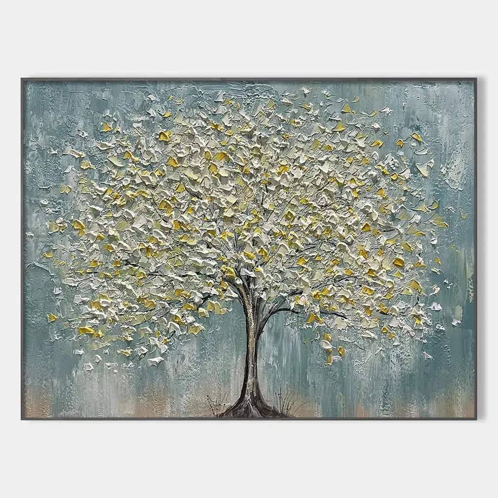
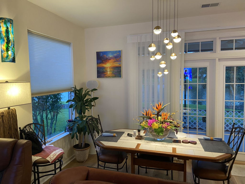
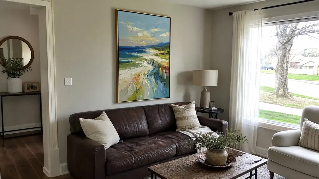
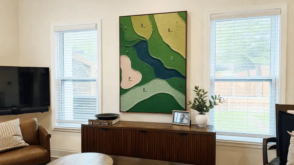
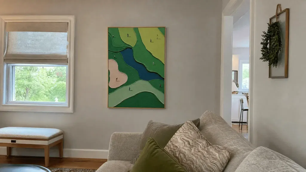
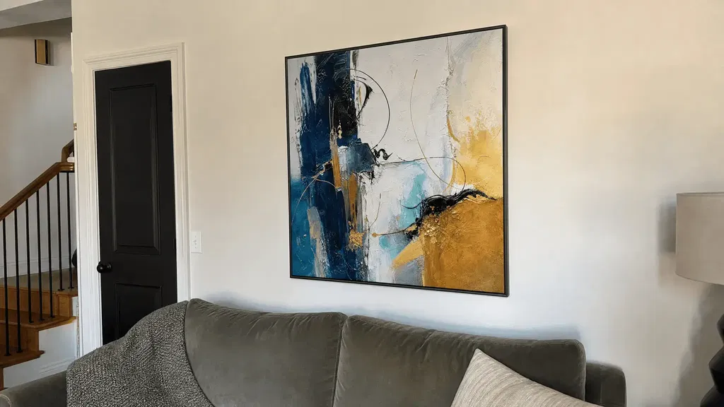
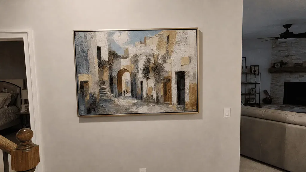
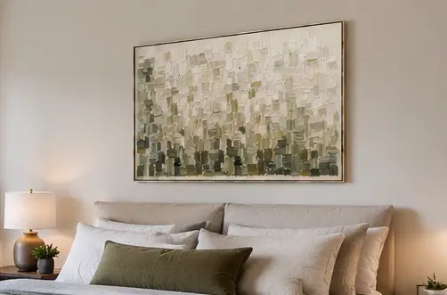
Texture wall art can feel more personal than a flat print because it gives your eye more than color and shape to follow. Raised marks, directional strokes, and shifting surface details can create a sense of depth, movement, and discovery. The effect is not universal, though: light, viewing distance, artwork scale, and your own response determine whether texture becomes a defining feature or a subtle supporting detail.
Why Textured Wall Art Feels Different in a Room
A uniformly flat image mainly communicates through composition, color, and contrast. A raised or varied surface adds another layer of visual information, allowing the eye to register changes in direction, shadow, and apparent depth. Texture can make an artwork feel more dimensional without proving anything about how it was made; course material on cues to shape and depth explains this kind of visual information.
That extra information can create visual rhythm. A ridge may lead attention across an abstract field, a recessed-looking passage may slow the eye, and a change in surface direction may give one area more emphasis than another. The palette does not have to become busier for the artwork to feel more layered.

This is the key difference between a flat print and physical or visibly varied texture: the viewer may have more surface cues to notice over time. Even without touching the work, texture can be read visually through marks, shading, and surface changes. A textured-looking photograph, however, does not establish that the artwork itself has raised relief, so online shoppers should distinguish the visual impression from the product's stated construction.
The personal feeling comes from the combination of surface, composition, room, light, and memory. One person may find irregular movement warm and expressive; another may prefer the clean consistency of a flat image. Neither response is objectively correct.
How Changing Light Reveals the Surface
The same piece of texture wall art can look more pronounced at one time of day and more restrained at another. Light direction changes the highlights and small shadows that help the eye read surface relief. As a review of cast-shadow perception illustrates, angled light may reveal details that diffuse or front-facing light leaves quieter.
Morning light through a side window may skim across ridges and make directional marks easier to notice. Overhead light can emphasize some upper edges while leaving other passages less distinct. An evening lamp placed to one side may create a warmer, more localized pattern of highlights and shadow. By contrast, evenly spread light tends to reduce strong modeling, making the surface feel subtler from the main viewing position.

These are tendencies, not guarantees. The wall's orientation, window placement, lamp position, artwork surface, and surrounding colors all affect the result. A piece that looks strongly dimensional in a close-up photograph may appear calmer on a wall with soft, even light.
Before buying, stand where the artwork will hang and notice whether light arrives from the side, above, or directly in front. If the room changes significantly between daylight and evening, look for close-up imagery taken under more than one lighting condition when available. You can also use this texture depth guide while comparing how much surface presence you want; it should not replace the specific product description or images.
When Texture Holds Up From Across the Room
Texture is usually easiest to appreciate up close or when light strikes the surface at an angle. From across the room, the overall composition, color relationship, and artwork scale generally lead, while surface detail may become a quieter secondary feature.
| Viewing situation | What may lead visually | How noticeable texture may be | Placement question to ask |
|---|---|---|---|
| Close view near a sofa, bed, or entry pause point | Surface marks, edges, direction, and small changes | More available to notice, especially with angled light | Will people have time and opportunity to look closely? |
| Normal room view from a sofa, bed, or chair | Composition, color balance, and scale, with texture supporting them | Present but dependent on relief, light, and image scale | Does the piece still work when surface detail is not the first thing you see? |
| Passing view from a doorway or hallway | Silhouette, contrast, broad color fields, and overall arrangement | Often subtler while moving past | Is the long-range composition strong enough on its own? |
Artwork size and placement matter as much as the surface itself. A larger piece may make broad directional movement easier to read, while a small work viewed from several feet away may present mainly as color and shape. A dim corner may also hide details that a side-lit wall reveals.
When shopping online, compare the front image with any close-up, edge, and room-context images. Product descriptions can help clarify whether the surface is physically varied, but visual texture and physical relief are not interchangeable. If the listing does not make construction clear, treat prominent texture as something to verify rather than a guaranteed in-room effect.
Why Surface Variation Can Feel More Personal
Surface variation can feel personal when it gives the artwork movement and small details to revisit. That impression belongs to the viewing experience: it may suggest warmth or expressiveness for one person without serving as evidence of originality, authenticity, or handmade history.
Marks That Guide the Eye
Directional strokes and raised passages can create a route through an abstract composition. The eye may move along a ridge, pause at a change in edge, and then return to a contrasting area. This can add rhythm without automatically making the palette or composition visually crowded.
Texture works with color, light, and shadow to affect emphasis and mood, much as other visual-art elements do. An educational guide to analyzing visual art describes how these elements contribute to visual interpretation. A restrained palette with varied marks may feel active without being loud; a bold palette with a highly varied surface may feel more energetic. The response depends on how those elements interact rather than on texture alone.
Details That Reward Repeat Viewing
Small changes in edges, grooves, or raised passages may not register all at once. After living with the piece, you may notice a new transition when daylight shifts or when you approach from a different angle. That repeat discovery can make the artwork feel more connected to your routine because it offers something beyond a single, fixed first impression.
This does not mean every textured work will become more meaningful over time. Personal association, subject matter, color, and placement may matter more for some rooms and viewers. A surface that invites your attention is a possible benefit, not a measured emotional outcome or proof of provenance.
Readers drawn to this combination of surface and composition can browse modern abstract art for style ideas. Use the collection as a starting point, then check each listing for the actual construction, imagery, size, and placement details.
When Texture Is Worth Prioritizing for Your Space
Prioritize texture when close viewing, directional light, or layered visual depth is central to how you want to experience the room. A flatter print may be a better fit when distant clarity, consistent graphic color, or an especially even visual surface matters more.
| Room condition or priority | Why texture may help | When a flatter print may fit better | Check before buying |
|---|---|---|---|
| Seating, bedside, or entry area where viewers pause nearby | Close viewing gives surface variation more opportunity to contribute | Rarely viewed up close, or the composition must read instantly from farther away | Review close-up and room-context images, then compare the piece at the intended wall scale |
| Side window or lamp creates changing, directional light | Highlights and shadows may add movement through the day | The room needs stable, predictable color with minimal shift in emphasis | Note where light comes from at morning and evening; do not assume a photographed effect will match your wall |
| Minimal room that needs another layer of depth | Texture may add interest without requiring more colors or objects | The space already has strong patterns, busy surfaces, or a deliberately crisp look | Compare the surface with nearby upholstery, rugs, and furniture before choosing the visual intensity |
| Hallway, doorway, or large room with mostly pass-through viewing | Texture can remain a subtle supporting detail | Long-range contrast, scale, and color are the main styling goals | Judge the composition from the doorway and across the room, not only from a close-up |
| Shopping online where the image suggests heavy texture | A genuinely varied surface may deliver the tactile-looking presence you want | The listing does not clearly establish whether the texture is physical or only visual | Check product wording plus front, edge, close-up, and room images; ask for clarification if construction is unclear |
The practical comparison is not "textured is better" versus "flat is better." It is whether the room rewards surface discovery or needs reliable graphic communication from a distance. A flat-looking print may deliver the cleaner, more consistent appearance you want, while texture-led wall art may add another layer for close or changing-light viewing.
For style-led browsing, explore Wabi Sabi art when organic irregularity appeals to you, or compare abstract wall art paintings when composition and color need to lead. These links are starting points, not evidence that every piece in a collection has the same materials, relief, or room performance.
Before adding a piece to your cart, make four checks: identify whether the listing describes physical relief or only a textured appearance; compare the artwork's scale with the wall and furniture; inspect the room's actual light direction; and decide whether you will mostly view it close up, from a seat, or in passing. If those checks favor surface discovery, texture deserves priority. If they favor long-range clarity and visual consistency, a flatter print may be the more comfortable choice.
FAQs
Does Textured Wall Art Look Different in Changing Light?
It can. Side or angled daylight may make ridges and small shadows easier to see, while diffuse or front-facing light may make the surface read more quietly. Check the wall at the times you normally use the room, especially if a lamp or window changes direction across the day.
Why Does Handmade-Looking Texture Feel More Personal?
Irregular-looking marks may invite closer viewing, suggest movement, or reveal small changes over time, which can make the piece feel more present to you. That response is subjective: a handmade-looking surface does not prove originality, provenance, or how the artwork was produced. Before buying, decide whether you like the marks themselves rather than relying on the impression they create.
Is Textured Art Better Than a Flat Print?
Neither format is universally better. Texture may suit a room with close seating, changing side light, or a desire for layered visual interest; a flat print may suit distant viewing, consistent color, or a cleaner graphic effect. Compare both formats from the room's main viewing position before making the choice.
Will Texture Still Matter If Most Guests View the Art From Across the Room?
It may matter less than composition, scale, and color when guests mainly see the work from a doorway or across a large room. Give texture more weight only if the artwork will also be viewed close up or under light that can reveal surface detail. Otherwise, choose the piece whose broad shapes and color relationships work best at the distance that matters most.