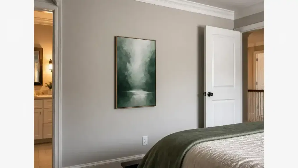
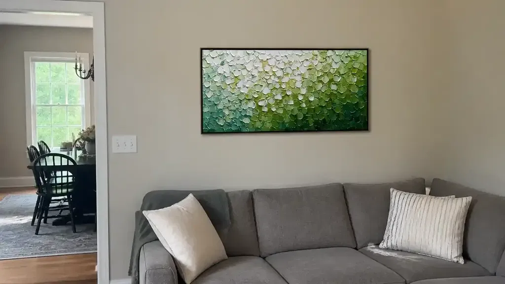
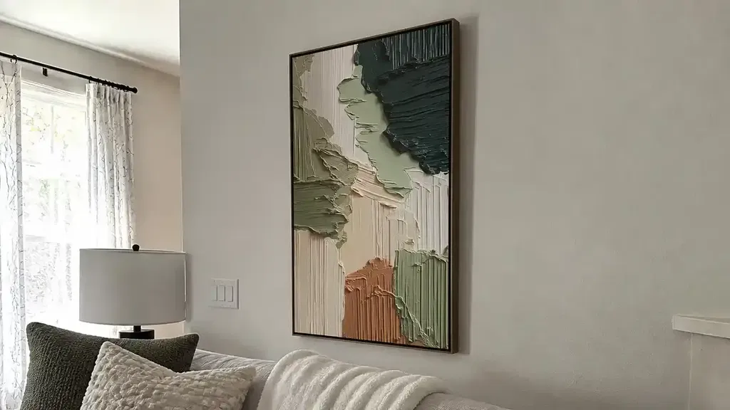
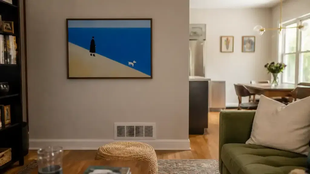
Contemporary art generally means art of the present and recent past, made across many media, subjects, techniques, and visual approaches. It is not one decorating style: a contemporary work may be abstract, representational, tactile, conceptual, or digitally based. For a home collection, start with the individual artwork and your reason for living with it—not the label alone. MoMA describes contemporary art as art of the present and recent past, while institutional boundaries can vary.
Contemporary Art in Plain English
When you are choosing contemporary art for your home, think of it as current or recent creative practice rather than a fixed look. The category can include paintings, sculpture, photography, installation, video, and mixed-media work, so the useful question is whether a particular piece fits your eye, space, and way of living.
What Makes a Painting Contemporary
A painting does not become contemporary because it uses a certain palette, avoids recognizable subjects, or follows a minimalist trend. Its date, the artist's perspective, the ideas it engages with, and the way it uses materials or process may all matter. Contemporary practice can respond to current culture, experiment with media, or question familiar boundaries, but no single trait is required for every work.
The Walker Art Center's overview of contemporary art notes that the field can span disciplines, mediums, and cultures. That makes the artist's stated approach and the specific work more useful than assuming a style label tells you everything. A landscape, figurative painting, abstract composition, or textured surface can all belong to contemporary practice when the broader context supports that description.

If you are browsing original artwork, read the listing for the artist, medium, date or period when supplied, and description of the work's approach. Those details help you understand what you are considering without treating a category name as proof of quality, authenticity, or value.
Original Art Versus Mass-Produced Wall Decor
The distinction between original art and mass-produced wall decor is mainly about production and ownership, not an automatic ranking of quality:
- Individual artist-created work: A specific work is made as an individual piece or within a limited, clearly described process. Choose this route when the artist's hand, the particular surface, or the experience of owning one distinct work matters to you.
- Repeatable decorative wall decor: A design is produced for reproduction across multiple copies or formats. Choose it when predictable appearance, easy replacement, or a decorative image matters more than owning one individual work.
A reproduction can be a thoughtful choice, and an original is not automatically the right choice for every room or budget. Check how the item was produced, what the listing says you will receive, and whether the viewing experience you want depends on a specific surface or one-of-a-kind object.
Modern Art, Contemporary Art, and Decorative Prints
Modern and contemporary are broad art-history terms, while a decorative print describes a production format and intended wall-decor use. In everyday retail language, the labels may overlap, so verify the artist, period, production method, and listing details before drawing conclusions. The Amon Carter Museum's overview of modern and contemporary art presents the period distinction as approximate rather than a universal cutoff.
| Category | Time reference | What the label describes | What to verify in a listing | Possible home-collection role |
|---|---|---|---|---|
| Modern art | Generally an earlier art-historical period, often associated broadly with the late 19th through the mid-20th century | A historical period and its varied movements, not one look | Artist, date or period, medium, and whether the item is an original or reproduction | A way to bring a historical style or period interest into a home; modern art for your home may be a useful follow-up search |
| Contemporary art | Current or recent practice; institutions may draw the boundary differently | Recent art-making across varied media, subjects, ideas, and approaches | Artist, stated approach, medium, date when supplied, and production method | A personal response to work being made now or recently, whether that response is to an abstract, figurative, tactile, or other approach |
| Mass-produced decorative prints | No required art-historical period | A repeatable wall-decor production method | Whether it is a paper print, canvas reproduction, or another repeatable format; edition or customization details if offered | An accessible way to add an image, color, or theme without buying an individual artwork |
Use these categories to clarify what you are shopping for, not to predict quality or value. A period label does not prove authenticity, and “contemporary” does not guarantee that a piece will suit your room. If the listing is vague about production method or what is included, pause before treating the label as enough information.

Evaluate a Piece Before It Enters Your Collection
Evaluate the whole piece—not just its category—by looking at medium, surface, subject, color, scale, visual weight, and your response to living with it. Practical compatibility should come first; personal connection can then break a tie between options that meet the basic requirements.
Medium, Texture, and Surface
- Medium: Check whether the listing clearly identifies oil, acrylic, watercolor, mixed media, photography, or another medium. If the medium affects how you expect the work to look or be cared for, do not fill in missing details yourself.
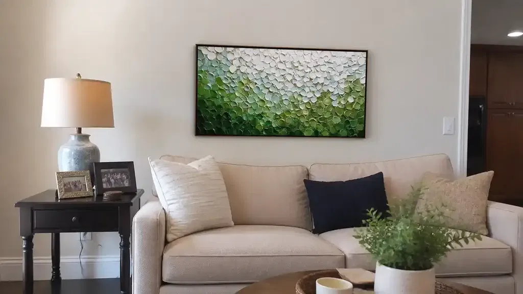
- Surface and texture: Look for close-up and, when available, side-angle images that show dimensional details. Texture can be a reason to choose a piece, but it is not proof of originality or quality. If the listing does not let you assess the feature that attracted you, delay the decision or ask for clarification.
You can explore textured wall art as a category, but keep the same verification standard for every listing. A heavily textured surface may also be a weak fit if you want especially low-fuss upkeep; that is a personal maintenance boundary, not a rule about all original art.
Subject, Color, and Emotional Pull
Ask what you want to see repeatedly: a recognizable subject, an unusual shape, a quiet neutral field, a strong color relationship, or a mood that changes how the room feels. Exact color matching is unnecessary. One or two visual relationships—such as a repeated warm tone, a shared line quality, or a deliberate contrast—can be enough for the work to feel connected.
Your emotional response matters, but use it as a tie-breaker after checking the listing and room conditions. “I love it” is a good reason to keep a piece on the shortlist; it is not a substitute for knowing its dimensions, medium, orientation, or installation requirements.
Scale and Visual Weight
Compare the work's dimensions with the actual wall, nearby furniture, viewing distance, and visual density of the image. A small, high-contrast work may carry more visual weight than a larger, quiet composition, so size alone does not determine how it will read.
| Situation | Measure or observe | Decision question |
|---|---|---|
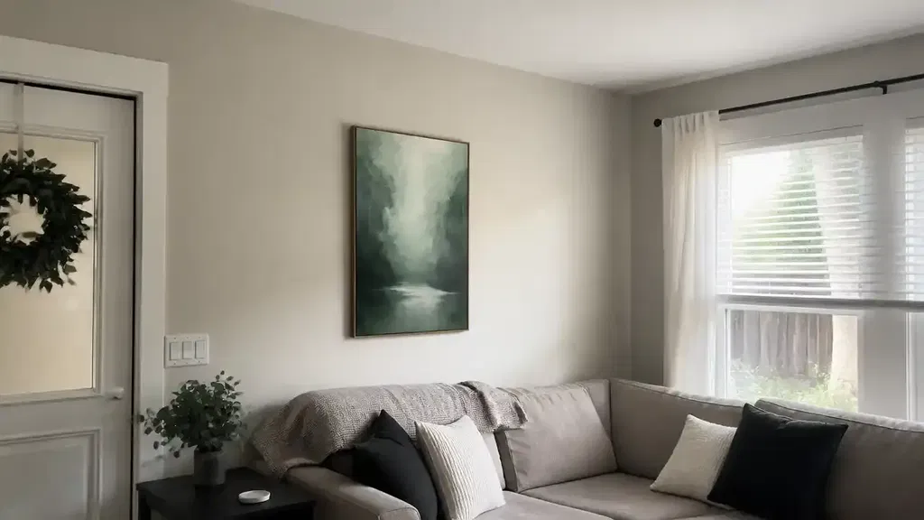
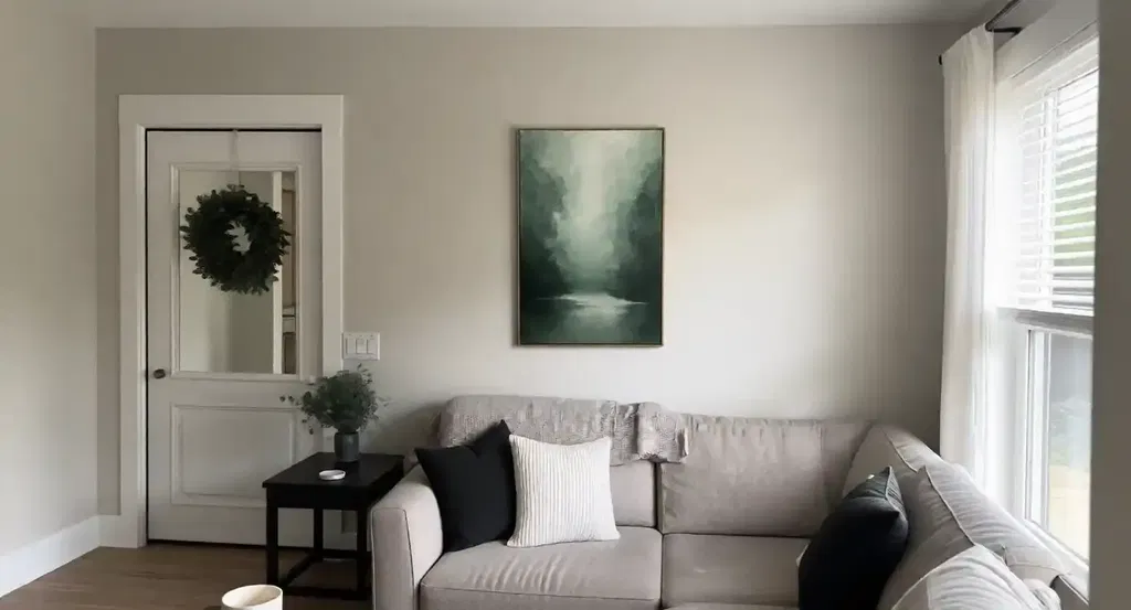
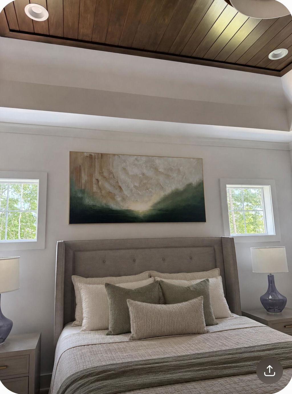
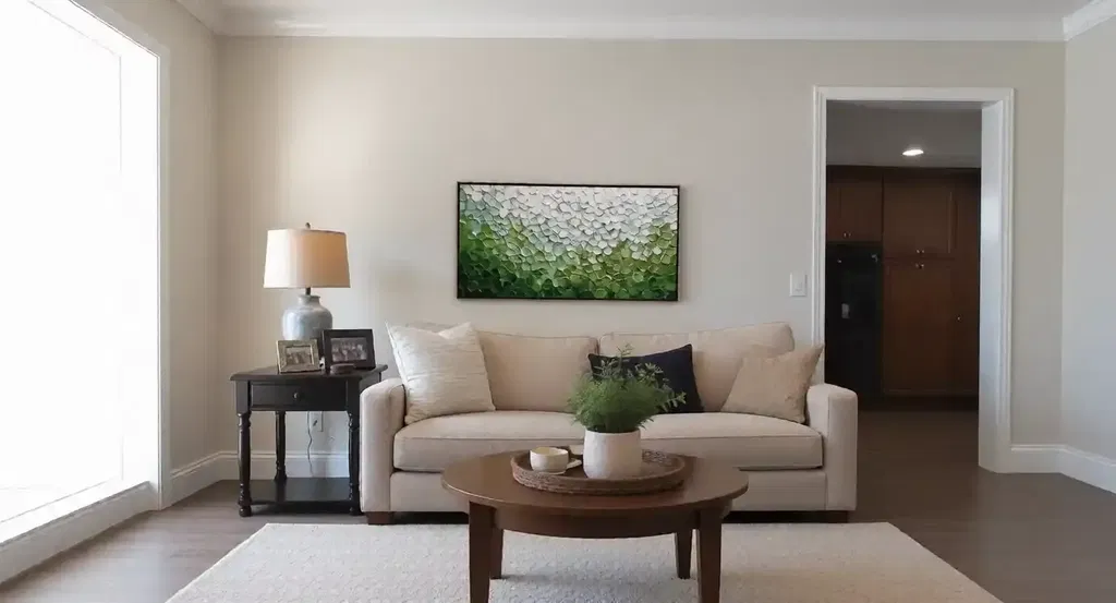
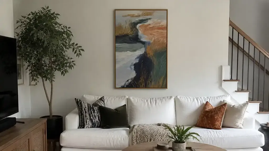
| Above a sofa or bed | Usable wall width, furniture width, ceiling height, and the main viewing position | Does the work feel intentionally related to the furniture without crowding it or disappearing above it? |
| Over a console | Console width, objects already on it, sightline, and clearance for installation | Will the artwork remain the focal point, or will nearby objects compete with it? |
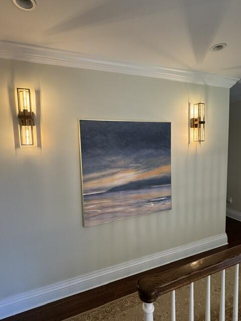
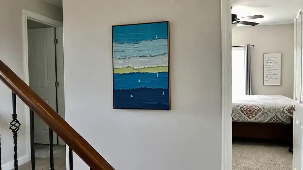
| Hallway or entry | Narrow wall width, walking path, viewing distance, and available light | Can the work be read while moving through the space, and is its surface protected from likely contact? |
| Bedroom | Bed or dresser placement, nighttime lighting, and the atmosphere you want | Does the scale and visual energy support the room's purpose rather than overwhelm it? |
There is no single ratio that works in every room. Stand where you will normally see the piece, consider the furniture around it, and compare the artwork under the room's actual lighting before deciding.
Match Artwork to the Room Without Losing Your Taste
Room fit is a practical judgment, not a universal color-matching or placement formula. Check wall space, furniture scale, viewing distance, lighting, and the atmosphere you want, then decide whether the artwork should settle the room, create contrast, or act as a focal point.
| Room or scenario | Wall context | Furniture and viewing check | Lighting check | Desired visual role |
|---|---|---|---|---|
| Living room | Identify the usable wall behind or beside the main seating area | View the work from the sofa and compare its visual weight with the largest nearby furniture | Check daylight, lamps, and glare at the times you use the room | Focal point, conversation starter, or a calmer counterpoint to busy furnishings |
| Bedroom | Consider the wall's relationship to the bed, dresser, and walking paths | Review the piece from the bed and avoid choosing scale by wall height alone | Look at both daytime light and evening illumination | Quiet atmosphere, personal reminder, or a controlled accent |
| Hallway or entry | Measure the narrowest usable span and note doors or traffic | Check how close viewers will be and whether the frame or surface could be bumped | Assess shadows and low-light readability | A welcoming first impression or a short visual pause |
| Small apartment | Use the wall you can legally and practically install on, not merely the largest blank area | Favor a piece whose dimensions and portability suit possible moves or room changes | Test how the work looks in compact, changing light | One intentional anchor, or a flexible work that can move with you |
Before buying, run this five-point check: measure the wall, compare furniture scale, view the work from the main position, inspect it in actual light, and name the atmosphere you want. If texture is central but online images do not show close-up or side-angle detail, treat that uncertainty as a reason to wait. Likewise, if you want the lowest-maintenance display possible, a highly dimensional surface may not be the best fit for this particular room.
For another practical perspective, these artwork sizing tips can help you organize the measurements, but use your room's dimensions and viewing conditions rather than applying a fixed formula.
Build a Personal Collection One Piece at a Time
A sensible collection starts with one personally meaningful, practically verified piece. Later works can relate through mood, medium, subject, scale, or contrast; they do not need to match as if they were a single decor set, and no purchase should be treated as a guaranteed financial investment.
- Define the first piece's role. Decide whether it should anchor a living room, mark an entry, create a quieter bedroom mood, or simply be a work you want to see every day.
- Measure and photograph the wall. Record usable width and height, nearby furniture, outlets, doors, and the main viewing position. A quick photo helps you judge the work in context while browsing.
- Write a short visual and practical brief. Note preferred subject or abstraction, color relationships, medium, texture tolerance, orientation, approximate size, installation limits, and the atmosphere you want.
- Compare a small shortlist. Look at several works side by side and ask which one still interests you after removing room-matching pressure. Abstract wall art can be one path if you respond to shape, color, or texture more than recognizable subject matter.
- Verify the listing before ordering. Confirm dimensions, medium, orientation, surface description, installation needs, image angles, shipping condition, and return terms. If a detail could change your decision and it is missing, ask before purchasing.
- Live with the decision before adding another work. Notice what you actually enjoy about the first piece—its mood, surface, subject, scale, or contrast. Use that observation to guide the next addition instead of forcing a theme too early.
This process keeps a personal home collection flexible and deliberate. Browse original art or related abstract categories after completing the checklist, and let the individual work—not a style label or promise of future value—make the case for itself.
FAQs
These questions cover the main checks that remain after you understand the category, compare labels, and assess a specific work.
Is Contemporary Art Always Abstract?
No. It can be abstract, representational, figurative, landscape-based, conceptual, or media-based. If you are unsure, look at the artist's stated approach and the work itself; you do not need to prefer abstract art for a piece to fit the category.
Should My Artwork Match My Furniture Exactly?
No. Coordinate one or two relationships—perhaps a repeated color temperature, similar visual weight, or intentional contrast—rather than matching every finish. Review the work from the room's main viewing position in both natural and artificial light.
Can Renters Start a Personal Art Collection?
Yes. Start with a portable work suited to your wall size and a lease-approved hanging method, then check whether the installation can be removed without damage. If you may move soon, consider orientation, transport practicality, and whether the piece can work in more than one room.
What Should I Check Before Buying Art Online?
Check the stated dimensions, medium, orientation, surface or texture description, installation needs, useful image angles, shipping condition, packaging information, and return terms. Request clarification before ordering if any missing detail could change your decision.