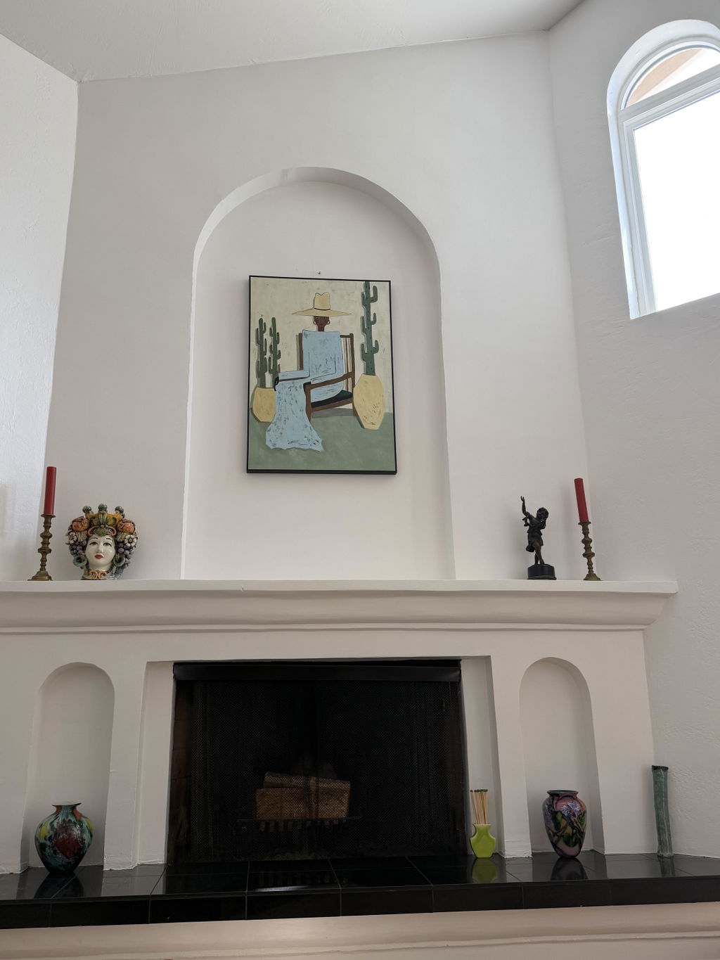
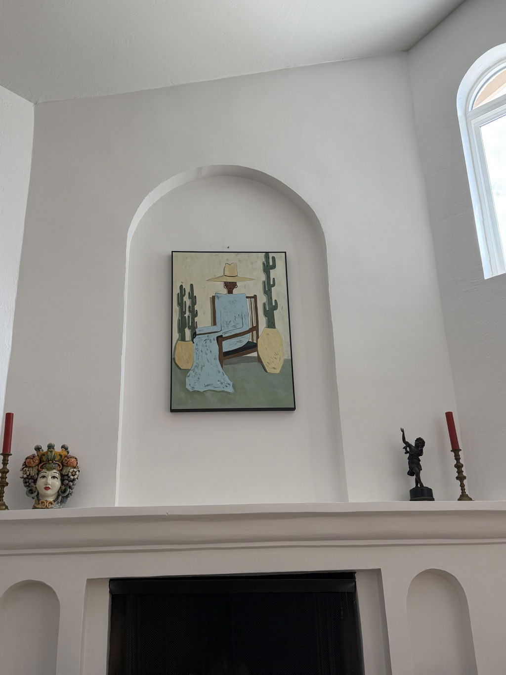
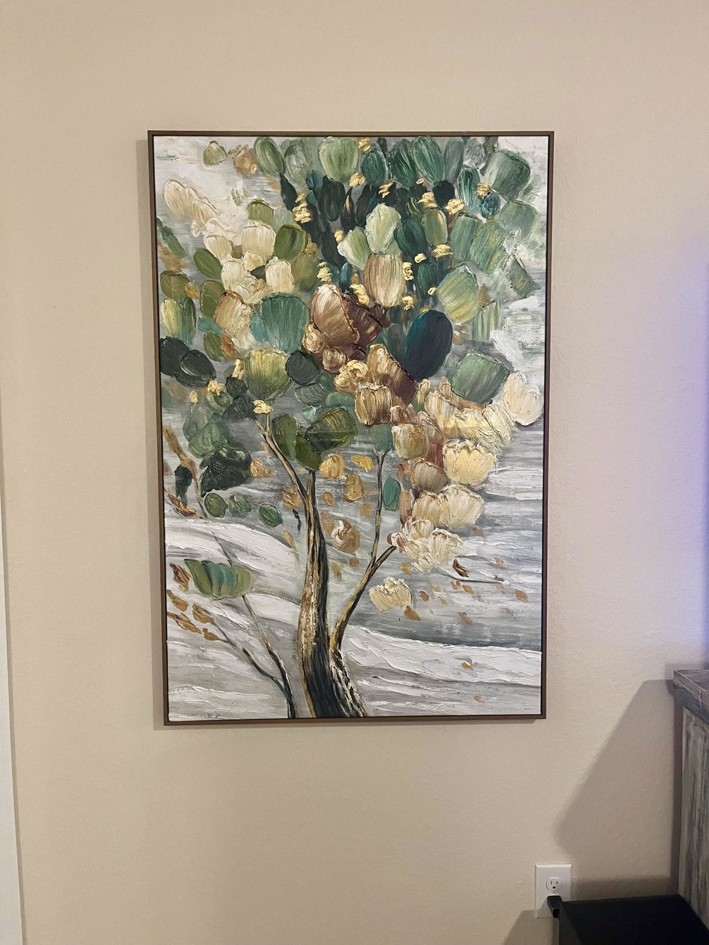
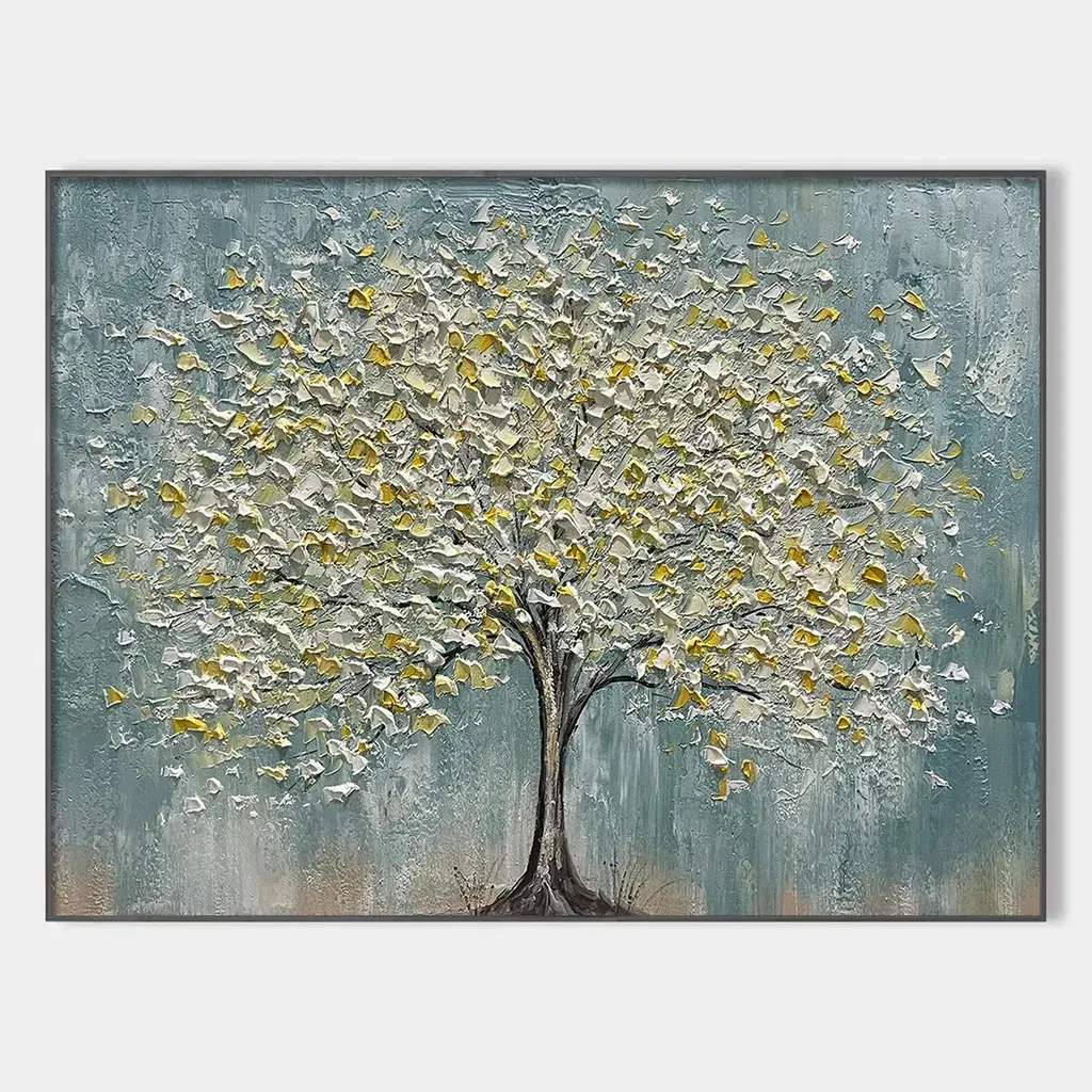
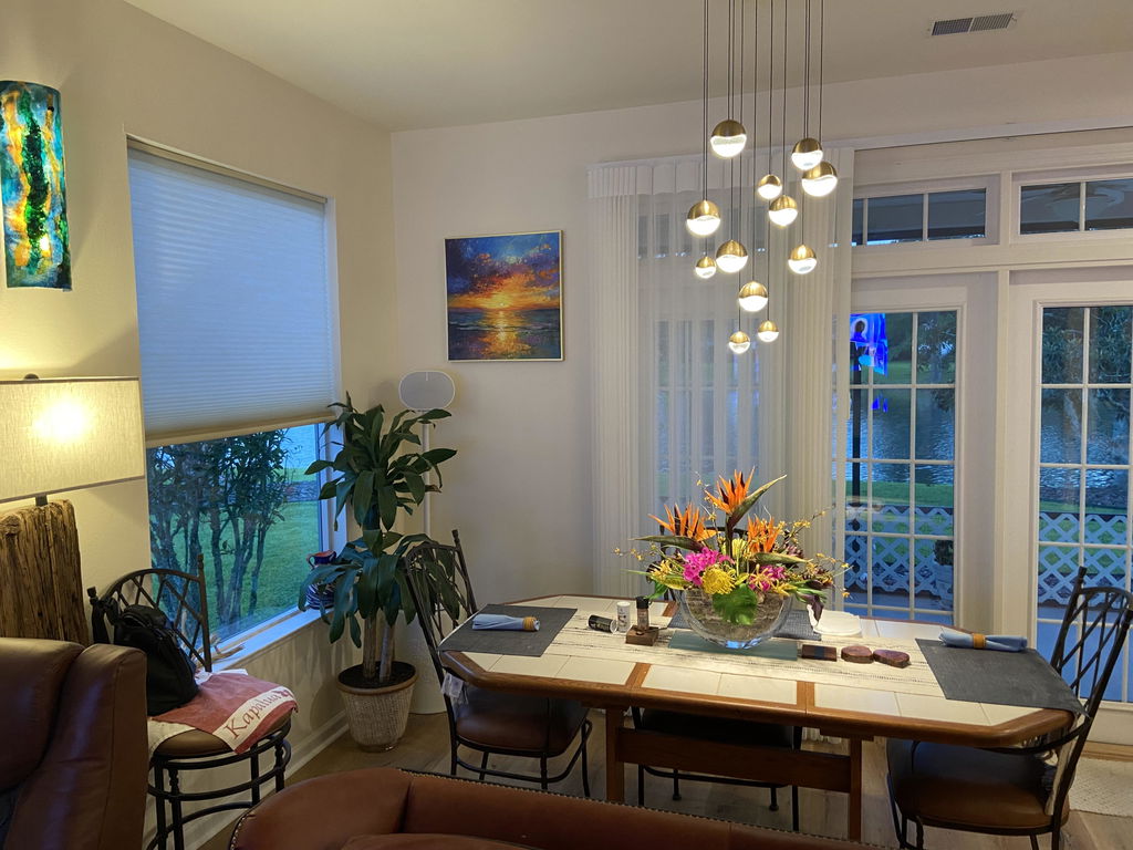
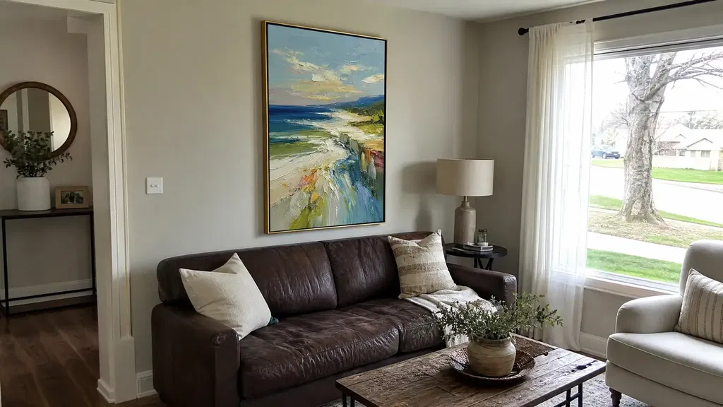
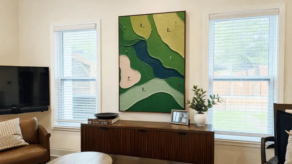
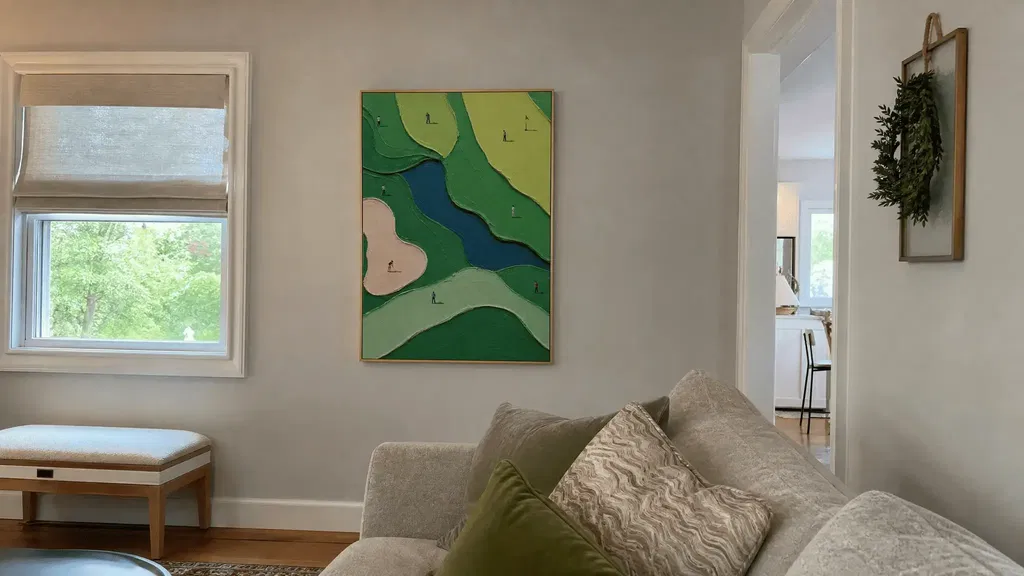
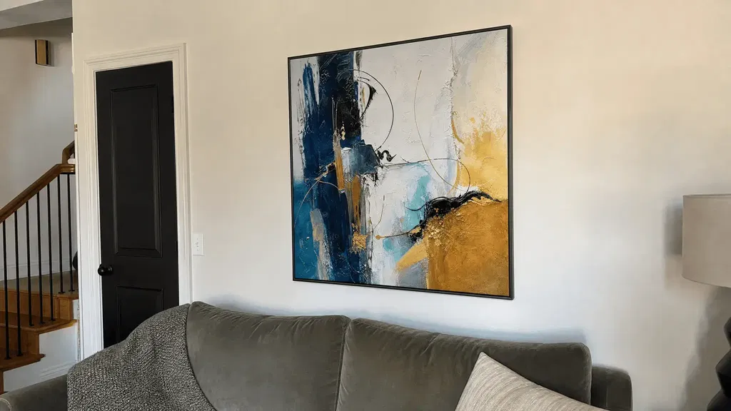
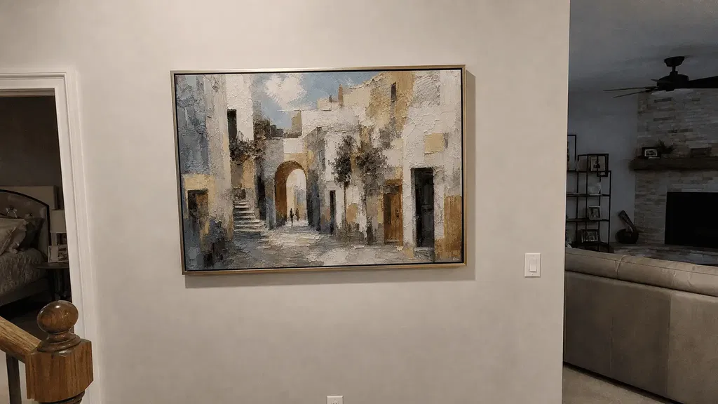
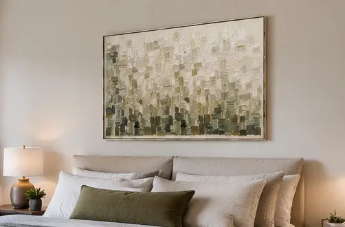
Winter scene wall art can stay stylish after the holidays when it emphasizes nature, weather, light, and atmosphere instead of Christmas symbols. Snowy landscapes, bare trees, mist, and mountains create a seasonal feeling, while restrained framing and everyday accessories keep the room from looking like a temporary holiday display.
The best choice comes down to four practical checks: separate winter imagery from festive cues, compare the artwork's undertones with your room, match the scene's visual energy to the space, and confirm the wall proportions before adding it to your cart.
How Can You Keep Winter Art Up After the Holidays?
Keep winter art up by making the landscape—not the holiday season—the main visual message. A nature-focused scene can feel appropriate through late winter and beyond when the surrounding display avoids overt Christmas symbols, festive wording, and a strong red-and-green theme. This is a styling choice that depends on the room; winter decor guidance likewise presents nature-led imagery as more flexible when overt holiday cues are absent.
Look for imagery built around snow, mist, forests, bare branches, mountain forms, winter light, or open sky. These cues describe weather and place rather than a specific celebration. Ornaments, wrapped gifts, Santa imagery, stockings, holiday typography, and explicitly festive framing, on the other hand, make the display more likely to read as Christmas decor.

The surrounding room matters as much as the artwork. Simple wood, stone, linen, or metal accents can support a quiet, nature-inspired look without turning the wall into a seasonal vignette. If a neutral winter image still feels too festive, remove holiday-coded accessories first and reassess it before replacing the art. The display may be carrying the seasonal message—not the landscape itself.
Choose Colors That Keep Snowy Landscapes Warm Enough
Start with the room's undertones rather than assuming every snowy image belongs with cool gray. Cool-neutral, warm-neutral, and muted-earth palettes can all work with winter landscape wall art, but the result depends on the wall, flooring, furniture, textiles, and natural and artificial light. Use the table below as a set of starting points, not fixed matching rules.
| Palette direction | Possible room pairings | Conditional visual effect | Holiday cues to limit |
|---|---|---|---|
| Cool-neutral | Blue-gray, soft gray, white, charcoal, or cool-toned textiles | Can reinforce crisp snow, mist, and winter light. Check whether the room already has enough warmth and texture to avoid a stark result. | Bright red, saturated green, and shiny metallic accents that become the display's main contrast. |
| Warm-neutral | Beige, taupe, cream, warm white, camel, and natural wood | May soften a cool snowy scene and help it sit more comfortably beside warm furniture. Compare the artwork in both daylight and evening light. | Red-and-green pairings or multiple glittering accents that shift the palette toward Christmas styling. |
| Muted-earth | Soft brown, muted olive, clay, stone, tan, and subdued upholstery | Can bridge winter imagery with an organic, lived-in room when the artwork includes restrained contrast. Keep darker tones from overwhelming a small wall. | Strong seasonal color blocking, especially when accessories repeat the same festive colors. |
Cool neutrals often lean blue or green, while warm neutrals may lean beige, taupe, yellow, or pink. That description helps with comparison, but it is not a precise color test: nearby colors and changing light can alter how a neutral appears. Interior color guidance offers useful context, but hold the artwork image or sample near the actual wall and compare it with the flooring, sofa, bedding, and window light.

Warm wood, beige, taupe, and muted brown can act as bridge tones when snowy art looks too cold beside your furnishings. They do not guarantee a match, so check whether the artwork shares at least one subdued undertone with the room. For more ideas on balancing depth, contrast, and warm neutrals, see this guide to neutral textured art.
Match the Scene to the Room's Existing Rhythm
Let scale, furniture, visual activity, and sightlines determine how quiet, defined, wide, or vertical the artwork should be. A winter subject does not automatically fit every room; compare the composition with the elements already doing the visual work.
Living Room
In a living room, relate the artwork's width and contrast to the sofa, rug, console, and other large anchors without trying to match every color. A broad wall may suit a wider composition or a coordinated grouping, while a smaller wall may need one clearly framed focal image. Keep nearby accessories restrained if the art already features strong mountains, dark trees, or a dramatic horizon.
Measure the available wall and the furniture below it before browsing. A piece can be attractive yet feel undersized, crowded, or disconnected when its orientation does not relate to the furniture. This room-size art placement guide can help when you are comparing wall and furniture proportions. As a separate editorial reference, art placement guidance also recommends comparing the wall and furniture instead of relying on the subject alone.
Bedroom
A bedroom usually benefits from a quieter composition, softer contrast, and fewer competing details. Open snow, distant trees, pale sky, or restrained texture may provide a calmer backdrop than a dense forest or sharply defined mountain peak.
Use bedding or upholstery as a reference for one subdued tone rather than repeating several winter accents. If cool whites look stark at night, compare the piece under the bedroom's evening lighting before deciding that the palette works. The goal is a winter atmosphere that supports the room's existing rhythm, not a seasonal display centered on the bed.
Hallway or Entryway
In a hallway or entryway, judge the art by circulation and sightlines first. A more immediate focal image can work when it is visible from nearby rooms, but a high-contrast scene may dominate a narrow passage or compete with the first view into the home.
When there is little furniture or textile color to reference, use the wall, trim, flooring, and adjacent-room palette instead. Orientation matters, too: a vertical composition may follow a narrow wall more naturally, while a horizontal scene needs enough uninterrupted width to remain legible as you walk past it.
Choose a Winter Scene by the Feeling You Want
Choose among open landscapes, snowy trees, and mountain scenes based on visual energy and composition—not on the assumption that one subject is universally more stylish. The useful comparison is how much negative space, density, depth, and focal structure the room can absorb.
Open Winter Landscapes
Open winter landscapes usually offer more breathing room through a visible horizon, broad sky, snowfield, water, or mist. They can work as a calm backdrop when the room already contains substantial furniture, patterned textiles, or several decorative objects.
Before buying, check the horizon and empty areas against the wall color. Too little contrast may make the scene disappear, while a strong horizon or dark foreground may become the room's main anchor. An open composition does not always mean low visual impact; the tonal range still controls how prominent it feels.
Snowy Trees
Snowy trees create a more enclosed, textural impression and often add vertical movement. They may suit a wall that needs more intimacy or a stronger sense of foreground, but tree density determines whether the result feels restful or busy.
Compare the number and contrast of trunks, branches, and shadow areas with the room's existing patterns. A dense tree line beside a patterned rug or heavily styled console may call for quieter accessories. A more open stand of trees can provide the winter cue without filling every part of the wall with detail.
Snowy Mountain Scenes
Snowy mountain scenes add depth and a stronger focal structure through peaks, ridges, distance, and dark foregrounds. They can give a large or visually quiet wall more definition, but dramatic peaks may compete with furniture, lighting, or architectural features.
Balance a structured mountain scene with quieter decor around it. Check whether the strongest contrast falls where you want the eye to land and whether the composition feels proportionate from the room's main seating or walking path. The mood is subjective, so let the room determine how much drama is useful.
Build a Winter Scene Wall Art Shortlist Before You Shop
Once you have defined the winter look, use broad art categories as browsing paths, not proof that a listing is the right fit. Start with landscape paintings for mountains, trees, snow, or open scenery, and compare textured wall art for surface, neutral color, or abstract movement without literal snow.
Keep four filters beside you while browsing: subject, palette, scale, and texture. A listing title or product image does not establish exact dimensions, materials, finish, durability, price, availability, shipping, returns, or winter-specific subject matter. Verify those details on the current product page before treating them as buying facts.
The collection is a place to compare directions; your room measurements and the live listing details make the final decision.
Make the Final Wall Art Fit Check
Before adding a piece to the cart, compare its tones, contrast, orientation, and scale with the actual wall and nearby furniture. Check it in daytime and evening light, then remove holiday-coded accessories and ask whether the display still feels natural for everyday decor. Measurements are a starting point, not a guarantee; art-sizing guidance is best treated as an optional rule of thumb, not a standard.
- Check the dominant tones and contrast. Compare the artwork with the wall, flooring, sofa, bedding, and nearby objects.
- Check proportion and orientation. Measure the usable wall and furniture, then review the artwork's width, height, and any grouping.
- Check the real setting. Compare nearby textiles and materials in daytime and evening light.
- Remove competing holiday cues. If the art works better without them, edit the accessories before rejecting the piece.
If the scene, palette, and proportions still work after those checks, verify the live listing details and then decide whether to add it to your cart.
FAQs
How Long Can Winter Scene Wall Art Stay Up After the Holidays?
There is no required removal date for nature-focused winter art. Keep it through late winter or longer if it still works with everyday accessories; rotate it when the room's palette, light, or spring refresh makes the scene feel too specific. A useful test is to remove holiday decorations and view the wall again without them.
How Do You Pair Snowy Art With Warm Wood Furniture?
Compare the art with the wood, flooring, beige upholstery, and taupe textiles in both daylight and evening light. Warm materials may bridge cool snowy imagery, but check for at least one shared subdued undertone. If the artwork remains stark, try a warmer frame or simpler surrounding accessories before committing.
What Size Winter Art Works Best Above a Sofa?
Measure the sofa width, usable wall area, and space needed for neighboring objects or a grouping. Then compare the artwork's orientation and total visual width with those measurements. The often-repeated two-thirds-to-three-quarters guideline can serve as a loose starting point, but the wall, sofa, grouping, and room sightline should make the final call.
Can Winter Wall Art Transition Into Early Spring Decor?
Yes, if the image uses broad nature imagery rather than holiday symbols. Remove winter-specific accessories first, then introduce lighter or fresher textiles while keeping the artwork. Rotate the piece only if its snow, dark contrast, or narrow seasonal palette no longer works with the room's early-spring changes.