Floral wall art has a reputation problem. Many people hesitate before hanging a flower painting, worried it will make the room feel stuck in the past. But the subject itself is not the issue. What dates a space is the execution: the rendering style and the color palette. Get those two things right, and flower paintings feel as current as any other art form.
Why Some Flower Paintings Look Dated and Others Do Not
| Factor | Reads as Dated | Reads as Current |
|---|---|---|
| Rendering style | Dense, hyper-realistic bouquets with no negative space | Visible brushstrokes, open compositions, room to breathe |
| Color palette | Dusty pink, sage green, muted purple together | Monochromatic, grayscale, or bold single-color compositions |
| Frame | Ornate gold or heavy dark wood | Thin metal, simple natural wood, or unframed canvas |
Flowers themselves carry no period association. A peony painted with open space and loose brushwork looks as current as any abstract piece. The same flower rendered in a tight, realistic style with an ornate frame immediately reads as traditional.
Rendering Style
Heavy, cluttered compositions leave no room for the eye to rest. Modern floral wall art does the opposite: it uses negative space and lets the brushwork show. The painting breathes.
Color Palette
Certain combinations carry strong decade associations. Shifting to a monochromatic scheme or a clean high-saturation palette strips that association out entirely.
Frame Choice
An ornate gold frame overrides everything else. An unframed canvas with painted edges is a reliable modern default when you are unsure.

Floral Painting or Botanical Art: Which Do You Actually Need?
What Floral Painting Gives You
Visible brushstrokes, layered paint, and emotional warmth. You see the artist's hand. This style suits living rooms, cozy spaces, and walls that need energy and weight.
What Botanical Art Gives You
Precise lines, scientific restraint, and calm. Often crisp on a white background with no heavy color charge. This works in minimalist spaces, Nordic-inspired interiors, and home offices.
How to Choose Between Them
| Floral Painting | Botanical Art | |
|---|---|---|
| Visual style | Expressive, layered brushstrokes | Precise lines, illustration-like |
| Mood | Warm, vibrant, energetic | Calm, structured, restrained |
| Background | Rich color or textured layers | White or simple monotone |
| Best rooms | Living rooms, cozy spaces | Minimalist interiors, home offices |
| Color range | Full spectrum | Monochrome or muted tones |
One test: how do you want the art to make you feel? Warm and alive points to a floral painting. Clean and orderly points to botanical art.
How Size Changes the Way You Read a Flower Painting
Small Floral Art (Under 24 Inches Wide)
Invites close inspection. You study petal shapes, color layers, and brushstroke direction. Avoid placing small pieces high above a sofa or on a large dining room wall as you cannot get close enough for them to work.
Medium Floral Art (24 to 35 Inches Wide)
Works as a secondary piece in a gallery wall arrangement, or as a standalone in smaller rooms like a bedroom nook or entryway. Flexible and easy to place.
Large Floral Art (Over 35 Inches Wide)
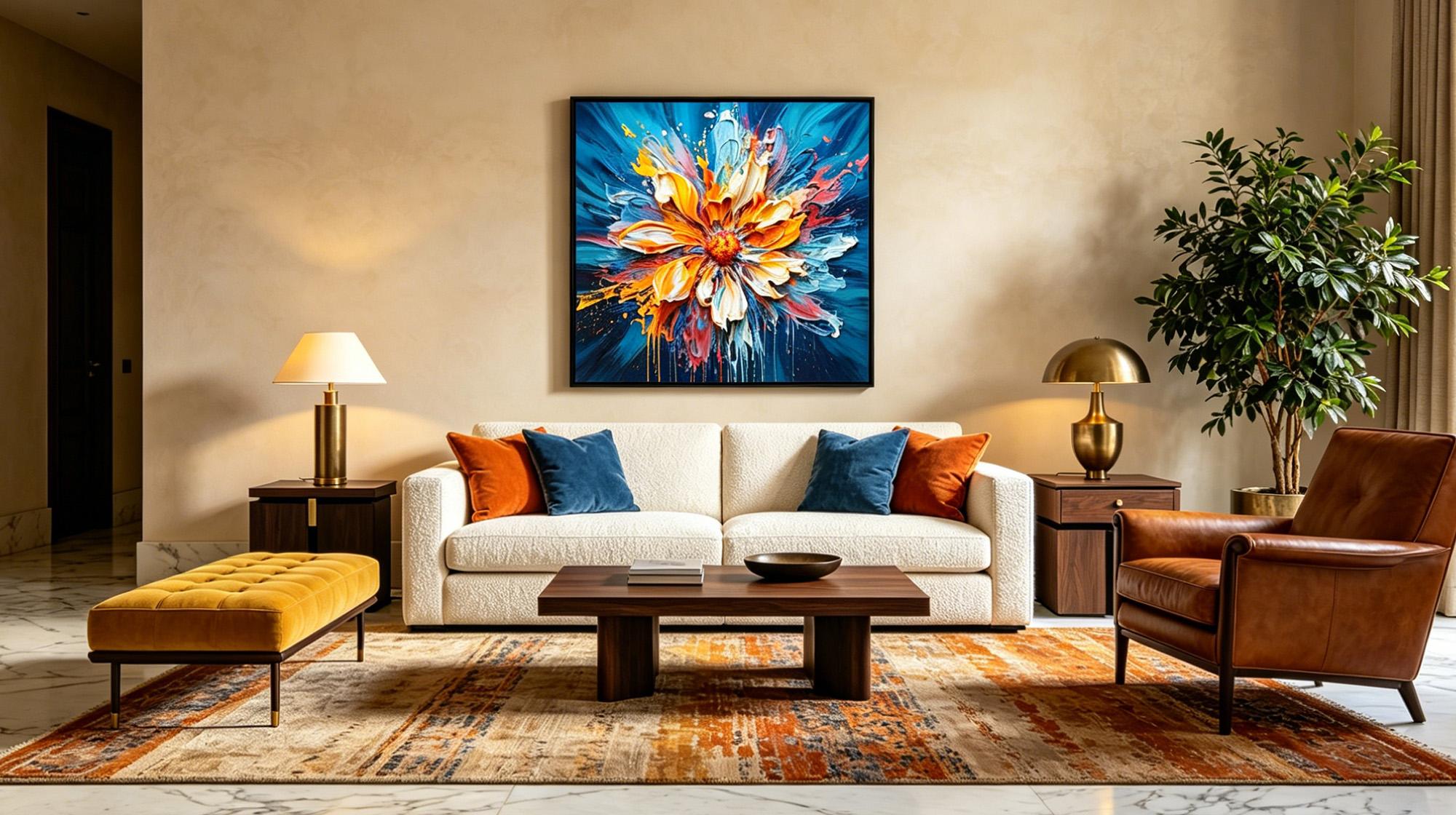
Shifts the experience from detail to atmosphere. The flowers become a carrier for mood rather than an image you study closely. Hand-painted originals in oil or acrylic, like those in Montcarta's Flowers collection, carry enough surface texture to read well from across a room. If you want the piece to anchor a full wall, aim for a width that spans at least 60 percent of the furniture beneath it.

Which Room Works Best for Flower Paintings
Living Room
The most flexible space. A large abstract floral painting anchors the main wall; a grouping of small botanical prints works well as a gallery arrangement. Connect the palette to your sofa or rug by pulling one color from the painting into your textiles. An exact match is not necessary.
Bedroom
Lower the saturation here. Highly saturated reds or bright oranges can be visually stimulating before sleep. Soft pinks, gray tones, or monochromatic flower paintings are a more restful choice. Large floral wall art with generous negative space works well above a bed.
Entryway and Hallway
These narrow spaces do not need large furniture to anchor a piece, which gives you more freedom. A single vertical flower painting makes a strong first impression near the entrance. Vertical compositions suit narrow walls better than horizontal pieces.
Can You Mix Flower Paintings with Other Art
Yes, of course. Flower art pairs well with other elements:
With Abstract Art
Neither style tells a literal story, so they do not compete. Find a color bridge: if both pieces share a dominant tone, they create a visual conversation rather than a conflict.
With Minimalist Line Art
The floral painting brings color and warmth; the line art provides structure and restraint. The contrast between them is what makes the pairing work.
What to Avoid Pairing With
Highly narrative art creates too much competition for the eye. These types consistently clash with floral paintings:
- Detailed landscape paintings pull the eye into depth and perspective, competing directly with the floral piece for visual dominance.
- Portraits carry strong human presence that overwhelms the quieter emotional tone of most flower paintings.
- Cityscapes and architectural prints are structured and geometric, which creates a jarring contrast with organic floral forms.
- Heavily narrative illustrations give the eye too many places to land at once.
If you include a floral painting in a gallery wall, treat it as the color anchor and let the surrounding pieces draw from it.
Conclusion: Let the Flowers In
Floral wall art is not trapped in the past, nor is it a relic of a bygone era. When you choose the right style, select the proper size, and place it thoughtfully, a flower painting brings a breathing vitality to your room that no other subject can replicate. Ready to invite nature indoors? Explore Montcarta's Flowers collection for stunning hand-painted originals. Pieces like our Colorful Floral Wall Art deliver the perfect balance of texture and modern style. Let the flowers in today.

FAQ
Q1: Are flower paintings too traditional for a modern home?
Not if you choose the right style. Modern floral wall art works through abstraction, monochromatic palettes, or expressive brushwork with open negative space. Thickly painted, realistic bouquets in ornate frames read as traditional. Flower paintings are not the issue.
Q2: What flowers are most commonly painted in art?
Roses, peonies, poppies, sunflowers, and lotuses appear most frequently. Roses and peonies offer rich layering suited to oil and acrylic. Sunflowers are widely recognized partly through artists like Van Gogh, while lotuses carry deep symbolic meaning in East Asian art traditions.
Q3: Should floral art have a frame?
It depends on the medium. Original hand-painted oil or acrylic canvases often look strong unframed, with the painted edges adding character. For paper prints, frames protect the work and elevate the presentation. Natural wood frames suit warm floral paintings; black frames work well with high-contrast pieces.
Q4: Can I put floral art in a bathroom?
Yes, but the materials matter. High humidity can damage paper over time, so canvas originals with a protective coating or prints framed under glass are the better option. Botanical wall art with clean black-and-white line work tends to look particularly well suited to bathroom spaces.
Q5: Do I need real flowers in the room if I have floral art?
No, but combining them can work well. If you place real flowers near the painting, aim for contrast rather than repetition. Matching the exact flower type in the vase to the painting tends to feel redundant. Complementary colors usually balance the artwork better.