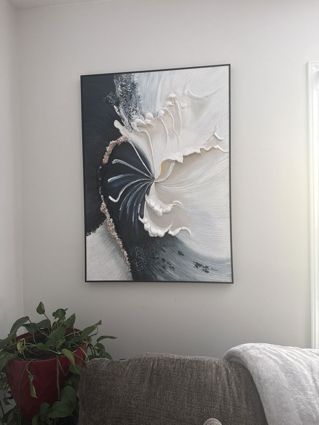
Black textured wall art can give a room definition, depth, and a clear focal point. It can feel more architectural than colorful artwork because the viewer notices the surface, shadows, and shapes before responding to a broad color palette.
The concern is understandable: will a large black painting make the room look smaller, darker, or visually heavy?
The answer depends less on black itself than on how much black the artwork contains, how its texture responds to light, how large the painting is, and what surrounds it.
Used thoughtfully, black textured wall art can anchor light furniture, add contrast to a neutral wall, and make a simple interior feel more intentional.
Why Black Textured Wall Art Feels More Dimensional
A completely flat black surface is usually perceived as one dark shape. A textured black surface changes as light reaches its raised and recessed areas.
Brush marks, palette-knife planes, layered paint, and sculptural ridges can produce small highlights and shadows. Viewed directly from the front, the painting may appear calm and monochromatic. Viewed from the side, more of its surface structure becomes visible.
Because the palette is limited, the viewer becomes more aware of:
- the direction of the marks;
- transitions between smooth and raised areas;
- differences in sheen;
- shadows created by the surface;
- movement within the composition.
This is what gives black textured canvas wall art its physical presence. The artwork does not depend only on color or a printed image; the surface itself becomes part of the composition.
When paint is applied thickly enough to retain raised tool marks, the technique may be described as impasto. MontCarta’s guide to impasto painting and visible brushwork explains how this type of texture is created.

Will Black Wall Art Make a Room Feel Too Dark?
Black artwork can feel heavy when it becomes one large, uninterrupted dark block without enough contrast around it.
The risk increases when:
- the wall is already very dark;
- the room receives limited light;
- most of the furniture is also black;
- the painting is oversized for the available wall;
- the frame is thick and visually dominant;
- the composition contains little variation.
Black wall art can feel much more balanced against a light wall and alongside materials that soften its visual weight.
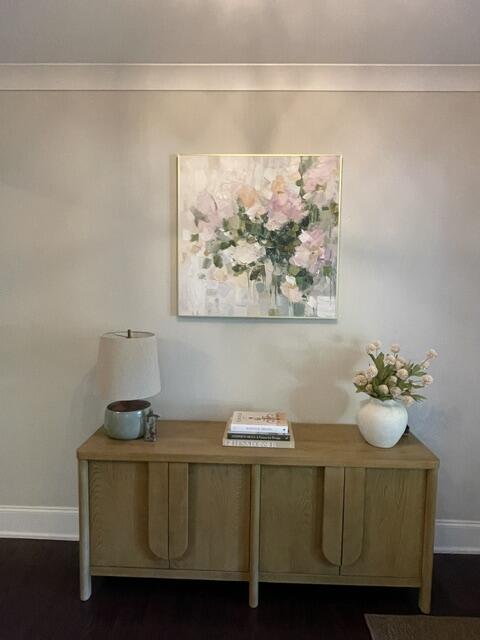
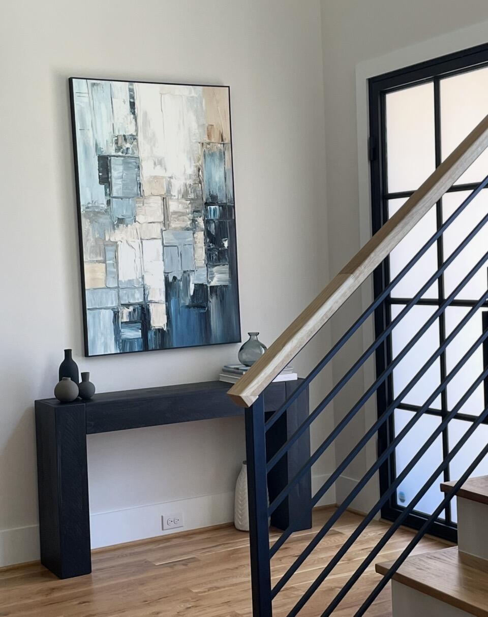
A cream wall, pale sofa, warm wooden table, light rug, or natural linen creates separation around the painting. Small black details—such as a lamp base, chair leg, thin frame, or cabinet handle—can then repeat the artwork’s darkest color elsewhere in the room.
The painting no longer looks like an isolated black object. It becomes part of the room’s broader visual structure.
Choose the Right Black Palette for Your Space
Not every black painting contains the same amount of visual darkness. The palette should reflect how strongly you want the artwork to lead the room.
Pure Black Textured Art
Predominantly black artwork creates the strongest statement. It works best when the room is light, relatively restrained, and able to support a clear focal point.
Texture is especially important in a pure black composition. Without changes in relief, edge, or sheen, the artwork may appear flat from across the room.
MontCarta’s BLACK TEXTURE is an example of a predominantly black minimalist textured composition.
Black and White Textured Art
Black and white textured wall art is generally easier to integrate because its lighter passages introduce internal contrast.
It can connect dark furniture with pale walls and often feels less visually dense than a pure black composition. The white areas also make changes in texture and brushwork easier to recognize from a distance.
A work such as CONVERGENCE uses black, white, and raised abstract marks to make contrast part of the composition.
Black with a Warm or Metallic Accent
Black artwork containing beige, brown, ochre, gold, or another restrained accent can connect naturally with wood, brass, warm lighting, or neutral upholstery.
The accent does not need to be repeated throughout the entire room. A relationship with one or two existing elements is usually enough.
Before deciding, view the room from its main entrance. Ask whether the painting will be the only dark object in sight or one part of a balanced distribution of color and visual weight.

Balance Black Art with Scale, Materials, and Lighting
Dark artwork may appear visually stronger than a light painting of the same dimensions, making scale especially important.
Above a sofa, bed, sideboard, or console, the painting should relate to the furniture without making the top half of the composition feel overly heavy. MontCarta’s painting size guide for the wall above a sofa provides a practical starting point based on furniture width.
Before ordering, mark the proposed dimensions on the wall with painter’s tape. Check the outline from the doorway and normal seating position—not only while standing directly in front of it.
Materials can also soften the visual effect of black. Useful combinations include:
- warm oak or walnut;
- cream, beige, or oatmeal upholstery;
- linen, wool, or woven textiles;
- restrained brass or gold details;
- plants and natural greenery;
- light stone or softly patterned rugs.
Lighting determines how much of the texture remains visible. Diffused ambient light can make the surface feel calm, while directional light from the side may reveal more relief and shadow.
Avoid placing a strong light directly in front of a reflective passage. The objective is to reveal the texture without creating glare that obscures the painting.

Where Black Textured Wall Art Works Best
| Room | Useful direction | What to avoid |
|---|---|---|
| Living room | Use one substantial piece above a light sofa or console | Too many competing dark objects around the painting |
| Dining room | Pair black texture with warm wood and soft evening lighting | A painting that disappears under dim, flat light |
| Bedroom | Consider black and white or black with softer neutral areas | An oversized uninterrupted black composition above the bed |
| Entryway | Use a vertical painting to give a narrow wall more presence | Heavy surrounding décor that crowds the texture |
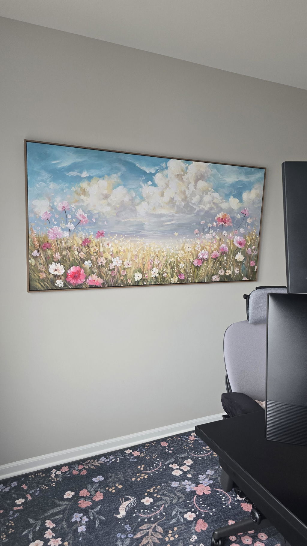
| Home office | Combine black abstract art with clean furniture lines | Multiple strong focal points on adjacent walls |
These are starting points rather than fixed rules. Wall color, furniture scale, natural light, viewing distance, and the amount of surrounding décor can change how the same painting feels.
A small room does not automatically require a small painting. One appropriately scaled statement piece may look calmer than several small dark objects spread across the wall.

What to Check Before Buying Black Textured Art Online
Black surfaces can appear lighter, darker, smoother, or more reflective depending on photography and screen brightness. When comparing black textured wall art online, look at the full composition as well as close-up and angled images of the surface.
Pay particular attention to whether the painting is pure black or contains charcoal, gray, white, or warm undertones. These differences may be subtle on screen but can significantly affect how heavy or soft the artwork feels in a room.
Before making a decision, compare the artwork under your room’s likely wall color and lighting conditions rather than judging it against a white product-page background alone.
Use Black as an Anchor, Not as Visual Weight
Black textured wall art works best when black has a clear role.
It can anchor pale furniture, define a focal point, repeat architectural details, or introduce depth without adding numerous colors. Texture prevents the painting from relying only on darkness by allowing light, shadow, and physical marks to become part of the experience.
The safest approach is to balance three things:
- the amount of black in the composition;
- the size and orientation of the canvas;
- the warmth and brightness of the surrounding room.
When these elements work together, black art does not have to make a room feel heavy. It can make the interior feel clearer, more grounded, and more intentional.
Explore MontCarta’s black wall art collection to compare predominantly black, black-and-white, minimalist, abstract, and textured compositions.

Frequently Asked Questions About Black Textured Wall Art
Is Black Textured Wall Art Suitable for a Small Room?
Yes. Choose a scale that relates to the wall and furniture, and maintain enough contrast around the painting. Black-and-white artwork or black art with lighter areas may feel less visually dense in a compact room.
What Wall Color Works With Black Wall Art?
White, cream, beige, light gray, and other pale neutral walls provide clear contrast. Black artwork can also work on a dark wall, but the frame, texture, and lighting need enough separation to prevent it from disappearing.
How Should You Light a Black Textured Painting?
Use ambient light or controlled directional light that reveals the raised surface without producing strong glare. Check the painting from the doorway and normal seating position to ensure the texture remains visible.