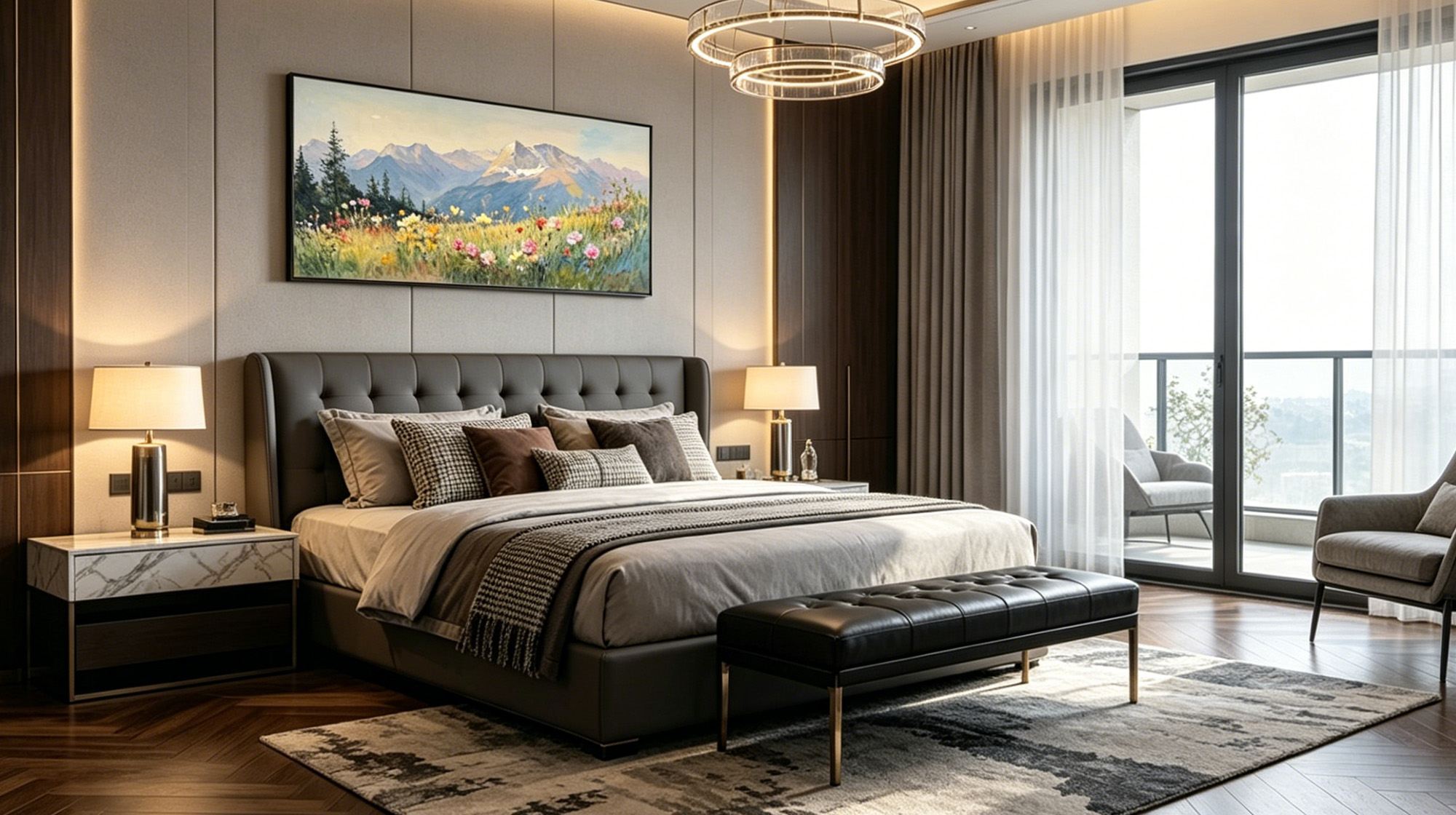
Living room art is meant to impress your guests, but bedroom art needs to do the exact opposite. It should help you unwind before sleep and wake up feeling completely calm. This difference matters a lot. It changes what subjects you pick, the colors you choose, and even how many pieces you hang. Let's explore how to choose the perfect bedroom wall art.
Bedroom Art vs. Living Room Art: Key Differences
In the living room or dining room, your line of sight stays mostly horizontal. In the bedroom, you view art at two specific moments: waking up and falling asleep. Both times, you are lying flat with your eyes angled slightly upward. This changes how you interact with the art entirely.
Hang bedroom wall art too high and you strain your neck to see it. The ideal placement keeps the bottom edge of the frame 6 to 10 inches (15 to 25 cm) above the headboard, so your eyes land on it naturally without effort.
As you drift off, your brain reduces its ability to process visual input. A dense, detailed composition that works beautifully in a living room becomes visual noise at bedtime. Bedroom art should feel quiet.
| Living Room | Bedroom | |
|---|---|---|
| Viewing posture | Standing or sitting | Lying flat, eyes angled up |
| Hanging height | Eye level | 6 to 10 in above headboard |
| Ideal composition | Rich detail works well | Simple, low density |
| Main function | Decoration and display | Calm atmosphere, aid sleep |
Choose Cool Tones or Soft Neutral Colors
Color is one of the first things your brain processes when it looks at a painting, before subject matter, before composition. That makes it the single most important factor for bedroom wall art.
Cool Tones
- Soft blue, sky blue, powder blue
- Muted blue-green, sage, eucalyptus
- Pale gray-green, celadon, seafoam
- Dusty lavender, soft lilac, muted violet
- Slate gray, cool silver
These tones lower visual energy naturally. Your eye reads them as calm and they don't demand anything from you.
Soft Neutral Tones
- Warm white, ivory, cream
- Soft sand, linen, wheat
- Taupe, greige, mushroom
- Pale blush, dusty rose, soft terracotta (low saturation only)
- Light gray, warm gray, dove
These work well as long as saturation stays low. A warm beige at low saturation feels cozy and quiet. Push the same hue to high saturation and it turns energetic. The color itself is not the problem, the intensity is.
Colors to Avoid
- Bright red, vivid orange, electric yellow, hot pink, lime green. Saturated warm colors trigger alertness.
- Bold black-and-white graphic art. High contrast keeps your visual system in tracking mode and your eyes keep scanning.

Choose Gentle Brushstrokes and Plenty of Negative Space
Your brain keeps processing visual information even as you wind down. It reads detail, fills in patterns, and works to make sense of complex imagery. The more visual data a painting contains, the more cognitive effort it takes to process. Loose brushwork and open space directly reduce that load.
Brushwork
The level of detail in a painting determines how hard your eyes have to work.
- Highly realistic or photo-detailed painting asks your brain to keep reading the scene. It holds attention rather than releasing it.
- Loose, painterly brushwork lets your eyes slide over the surface instead of stopping to examine it.
- Impressionist styles and impasto techniques (thick, textural paint application) are particularly well suited to bedroom art. They feel alive without being demanding.
Negative Space
Negative space is the open, unoccupied area of a canvas: sky, water, mist, empty ground. It gives your eyes a place to land and stop moving.
- When every inch of a canvas is filled, your eyes keep scanning for somewhere to rest. They never find it.
- When open space is present, your gaze settles. Visual processing slows down.
For bedroom wall art, the empty areas of a painting should feel just as intentional as the subject itself.
Prioritize Calm Natural Landscape Paintings
Subject matter shapes the emotional tone of a painting before you consciously register it. Certain subjects carry built-in low energy. Others carry urgency, tension, or narrative weight. For bedroom wall art, you want the former.
Why Natural Landscapes Work
These subjects share a common visual structure: large areas of gradual color shift, minimal detail, a single quiet focal point, and no story that demands resolution. Your brain does not need to figure anything out. You simply look, and your body settles.
What to Look For in a Landscape
- Scale and openness. A wide sky or a long horizon gives your eyes room to rest without anchoring on any one point.
- Stillness over movement. A calm lake reads differently than crashing waves. A misty meadow reads differently than a stormy cliff. Choose scenes where nothing is happening urgently.
- Soft light. Early morning and overcast light flatten contrast naturally. Dramatic sunset light can feel energizing rather than calming.
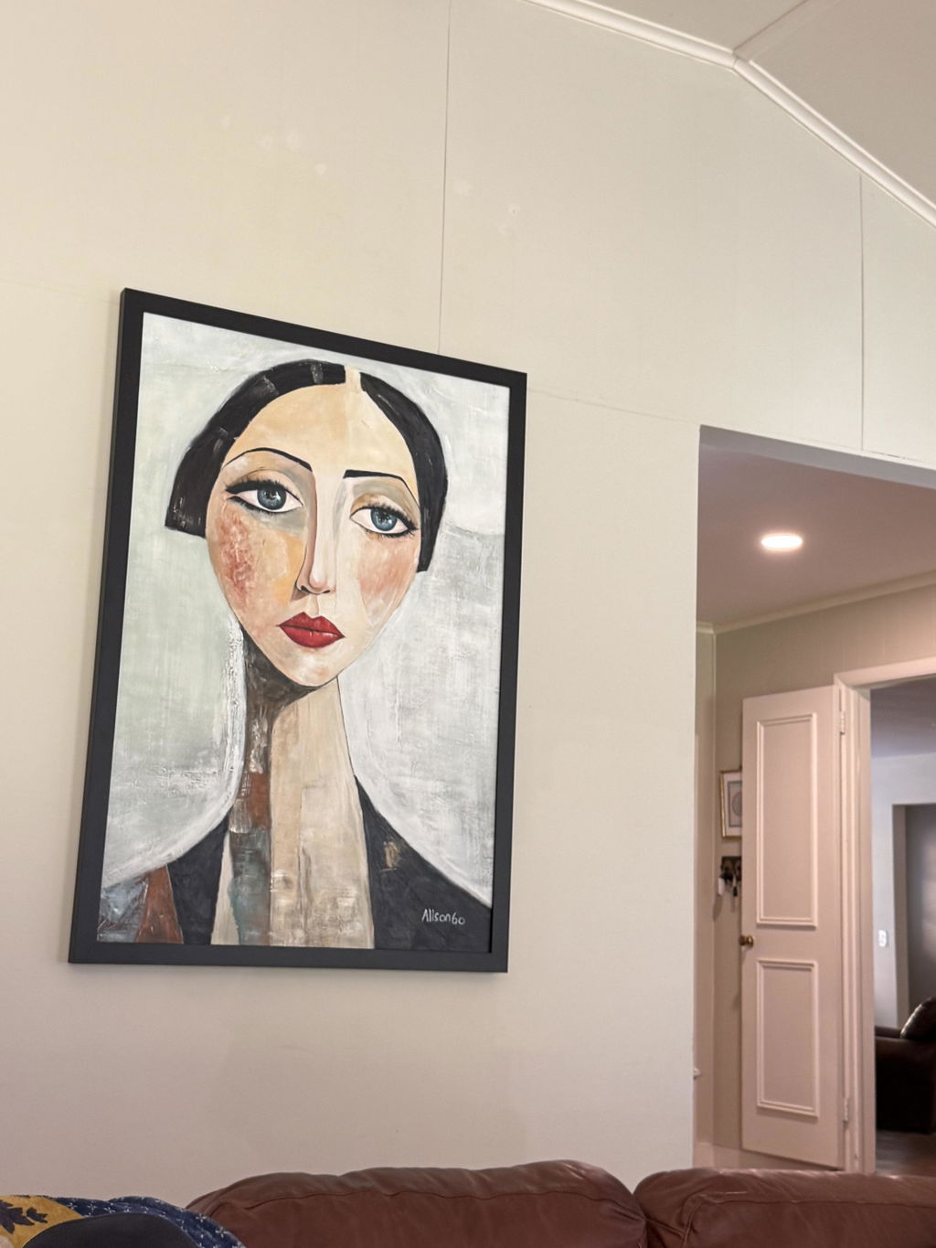
- Minimal human figures or narrative. When a painting includes people, your brain tends to shift into interpreting faces, expressions, relationships, and context. For most people, that works against winding down.
Recommended Subjects
- Misty coastlines and soft shorelines
- Early morning lake or river scenes
- Wide-sky plains and open meadows
- Rain-softened forest edges
- Overcast rolling hills
- Sparse winter trees against pale sky
- Fog over still water
Abstract Art Can Work Too
Abstract bedroom wall art is possible, but the same principles apply. Ask one question: does this feel calm after ten seconds of looking at it?
- Works well: gradient-based abstracts, single soft focal point, organic shapes, muted palette
- Avoid: high-contrast geometric patterns, sharp angles, competing shapes, bold color blocking

Pick the Right Size and Hanging Position
Even the perfect painting can feel wrong if it is the wrong size or hung in the wrong spot.
Sizing Above the Bed
A good rule of thumb is that the painting should be 50 to 70 percent as wide as your bed. Any narrower and it looks like an afterthought. Any wider and it overwhelms the headboard. The bottom edge should hang about 6 to 10 inches (15 to 25 cm) above the top of the headboard, close enough to feel connected to the bed, with enough breathing room to read as intentional wall art.
| Bed Size | Bed Width | Recommended Painting Width |
|---|---|---|
| Twin | 39 in (99 cm) | 20 to 27 in (51 to 69 cm) |
| Full | 54 in (137 cm) | 27 to 37 in (69 to 94 cm) |
| Queen | 60 in (152 cm) | 30 to 42 in (76 to 107 cm) |
| King | 76 in (193 cm) | 38 to 53 in (97 to 135 cm) |
One Piece vs. Multiple Pieces
A single painting gives your eye a clear place to land and stop. Multiple pieces create a visual sequence your eye follows from one to the next. For a bedroom, a single piece usually works better. If you do go with a multi-panel or diptych arrangement, keep the visual style consistent across all pieces so the eye does not have to work to connect them.
High Ceilings
If your ceilings are above 9 feet (2.7 m), one painting above the bed can look small and disconnected from the wall. Consider stacking two horizontal paintings vertically instead. It fills the wall height more naturally than one oversized piece and keeps the visual weight balanced.
Quick Hanging Checklist
- Bottom edge sits 6 to 10 inches (15 to 25 cm) above the headboard
- Painting width is 50 to 70 percent of the bed width
- Lying down, you can see the full painting without tilting your head
- The piece feels balanced, not floating near the ceiling, not crowding the pillows
What to Avoid in Bedroom Wall Art
Knowing what not to choose is just as useful as knowing what to look for.
- High contrast (black and white). Your visual system responds to contrast regardless of subject matter. A serene black-and-white coastal photo can be more visually active than a soft, colorful landscape. Subject does not always win. Contrast does. Opt for slow gradients and muted tones instead.
- Multiple focal points. When a painting has several competing areas of interest, your eyes move from one to the next without resolution. A single, soft focal point gives them somewhere to settle.
- Saturated warm colors. Bright red, vivid orange, electric yellow. These tones signal alertness. Cool or low-saturation neutral tones do the opposite.
- Dense geometric patterns. Your brain attempts to resolve repetition and structure. Organic, irregular shapes make no such demand.
- Highly detailed scenes. Detail reads as information. The more of it a painting contains, the more work your brain does passively in the background. Loose, suggestive brushwork carries far less cognitive load.
Final Thought: How You Feel Is Everything
These guidelines point you in a direction, but the real answer comes from the painting itself. Look at it, lie down, and pay attention to what happens. Bedroom wall art that works will help you settle. A piece that keeps your eyes moving or brings a faint sense of alertness is better suited somewhere else in the home.
If you are looking for a starting point, Montcarta's hand-painted landscape, seascape, and minimalist collections are worth exploring. Every piece is 100% hand-painted in oil or acrylic. Browse by style and size at Montcarta.

FAQ
Q1: Can I put a dark or bold painting in a bedroom?
Yes, but placement matters most here. Keep dark or visually heavy paintings away from the space directly above your bed, as that is where your eyes rest before sleep. Hang them on a side wall or opposite the entrance.
Q2: Should bedroom wall art match the bedding or the wall color?
It can do either, but a better approach is to let the art lead. Pull one specific color from the painting and use it as an accent in your bedding or rug to make the art the room's focal point.
Q3: Is abstract art good for a bedroom?
It depends on the style. Abstract art with gentle gradients, a single focal point, and plenty of negative space works wonderfully. Avoid high-contrast abstracts or busy geometric patterns, as they keep your visual system too active.
Q4: How do I light bedroom wall art?
Stick to warm lighting (under 3000K, which is the range that produces a soft, amber-toned glow) for your bedroom. Avoid shining a harsh spotlight directly on the canvas. Instead, use a warm wall sconce or an angled light from above to highlight texture without creating glare.
Q5: What art is not suitable for a bedroom?
Avoid high-contrast black-and-white patterns, art with multiple competing focal points, and highly saturated warm colors like neon orange. You should also skip complex figurative pieces that require a lot of visual attention before sleep.