The hardest part of creating a gallery wall is deciding what to include, in what order, at what spacing, and where to start. Every question opens three more. The good news is these decisions have a sequence. Work through them in order and each step becomes much clearer. Here's the full process, from choosing your first piece to knowing when the wall is finished.
Start with One Unifying Thread, Not a Theme
A strict theme can turn a gallery wall into a display case. All beach photographs. All botanical prints. All monochrome. It looks coordinated, but it doesn't look collected. A unifying thread works differently: it holds everything together visually while letting individual pieces stay varied.
Three sources of unity work well. Pick one:
- Color. Every piece shares a tone range, not necessarily the same color. Warm earthy tones throughout. A recurring presence of gray-blue. The eye notices the relationship without being directed toward it.
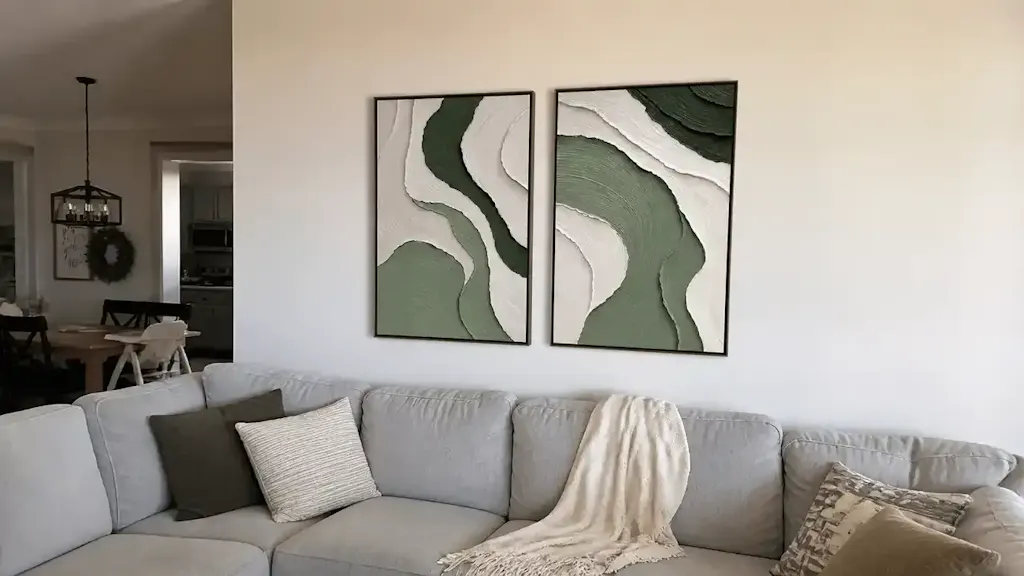
- Frame finish. All frames in the same color: all black, all raw wood, all white. When frames match, the content inside can vary as widely as you want. The frame becomes the container that holds everything together.
- Visual weight. All pieces carry a similar density of mark to open space. A heavily textured abstract next to a nearly empty minimalist piece creates tension rather than cohesion.
You don't need all three. One is enough. The others can mix freely.

How to Choose Your Anchor Piece
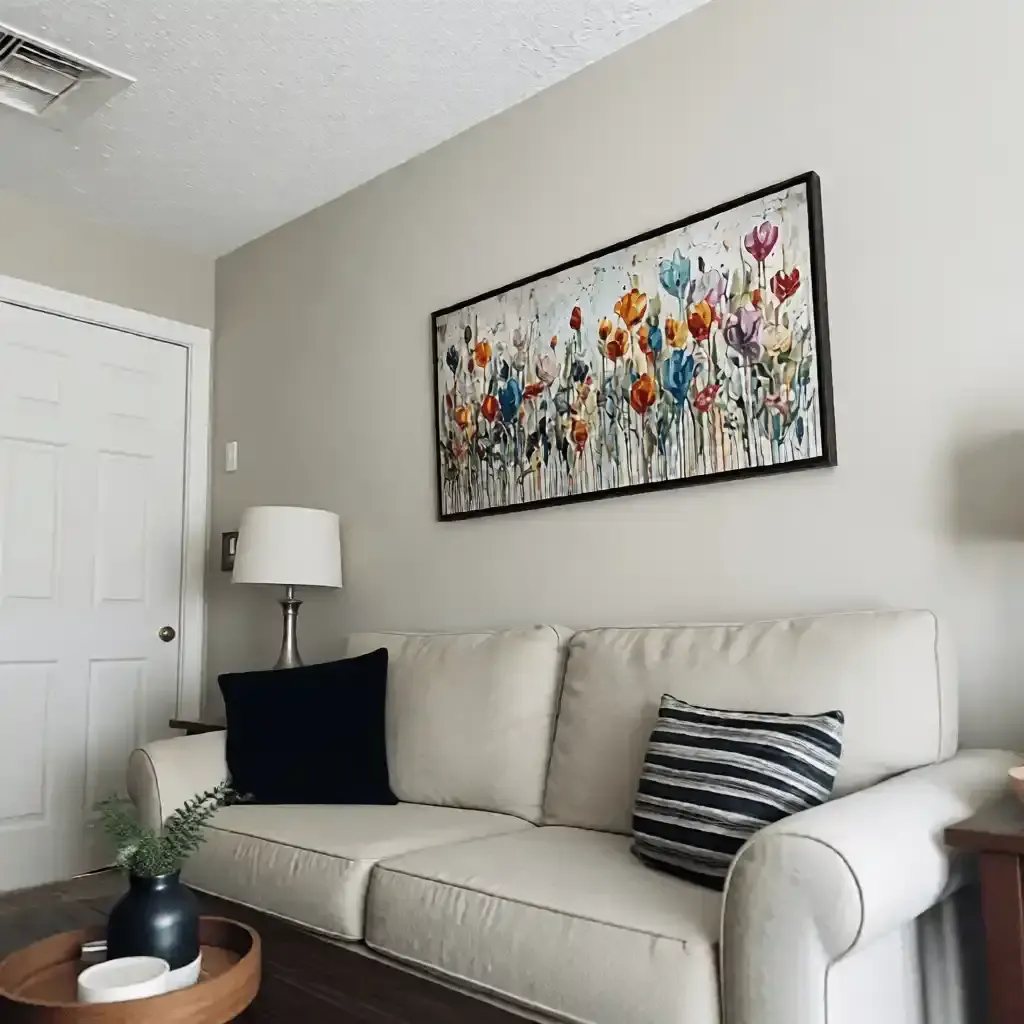
The anchor isn't necessarily the largest piece on the wall. It's the piece your eye finds first, the one that sets the emotional register for everything around it.
What makes a piece work as an anchor:
- It has a clear visual center of gravity: a composition that pulls the eye to one point.
- It holds the wall on its own. If it looks lost by itself, it won't anchor anything else.
- Its color or texture generates enough presence that nearby pieces feel like they belong in its orbit rather than competing with it.
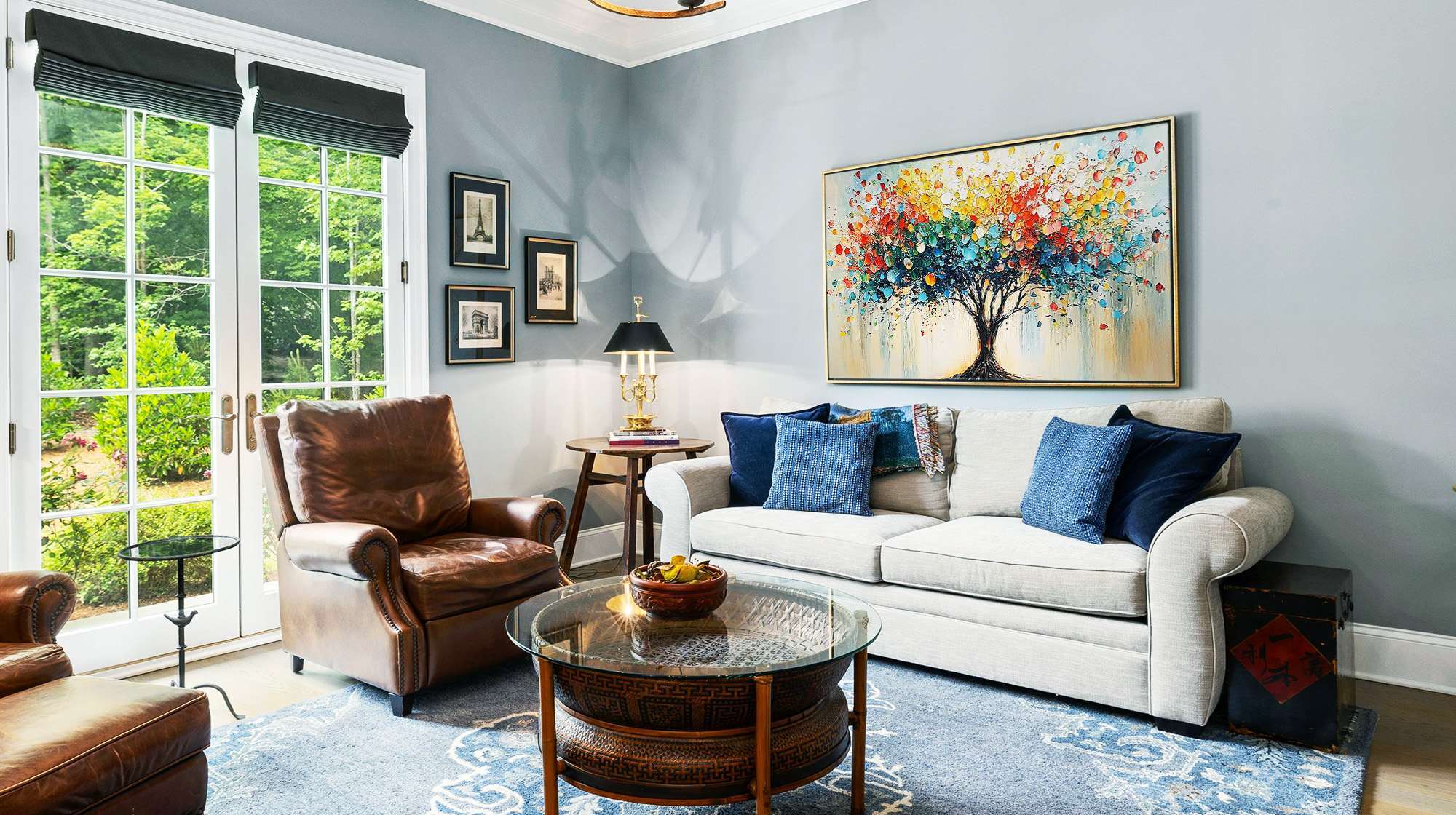
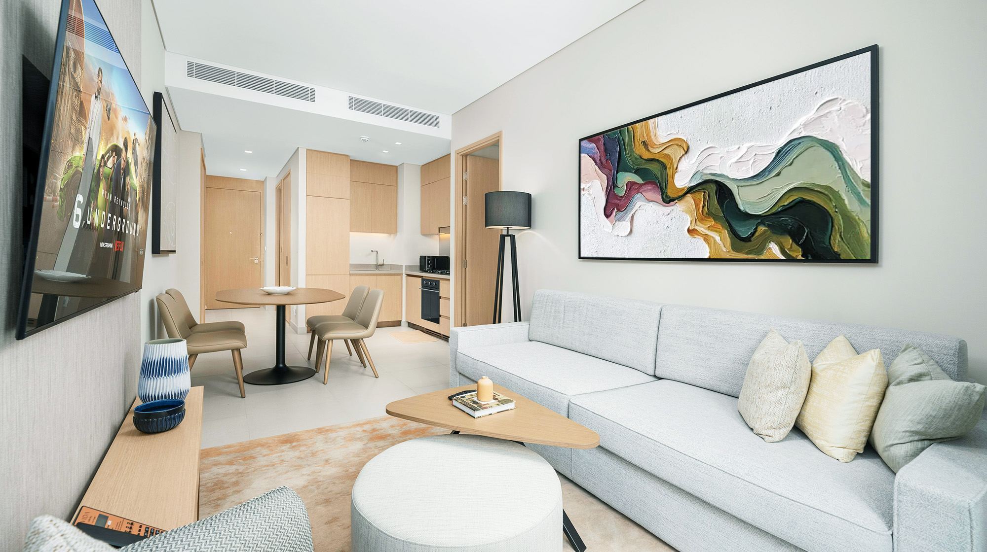
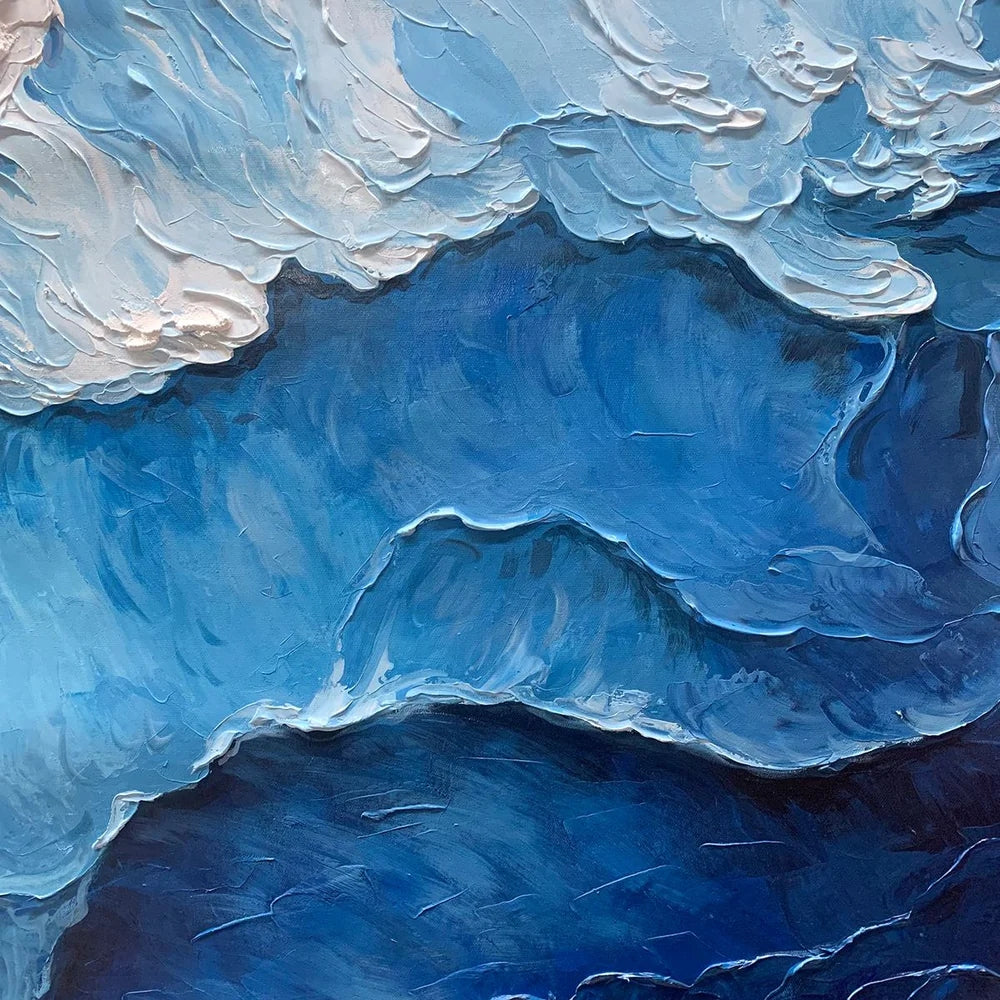
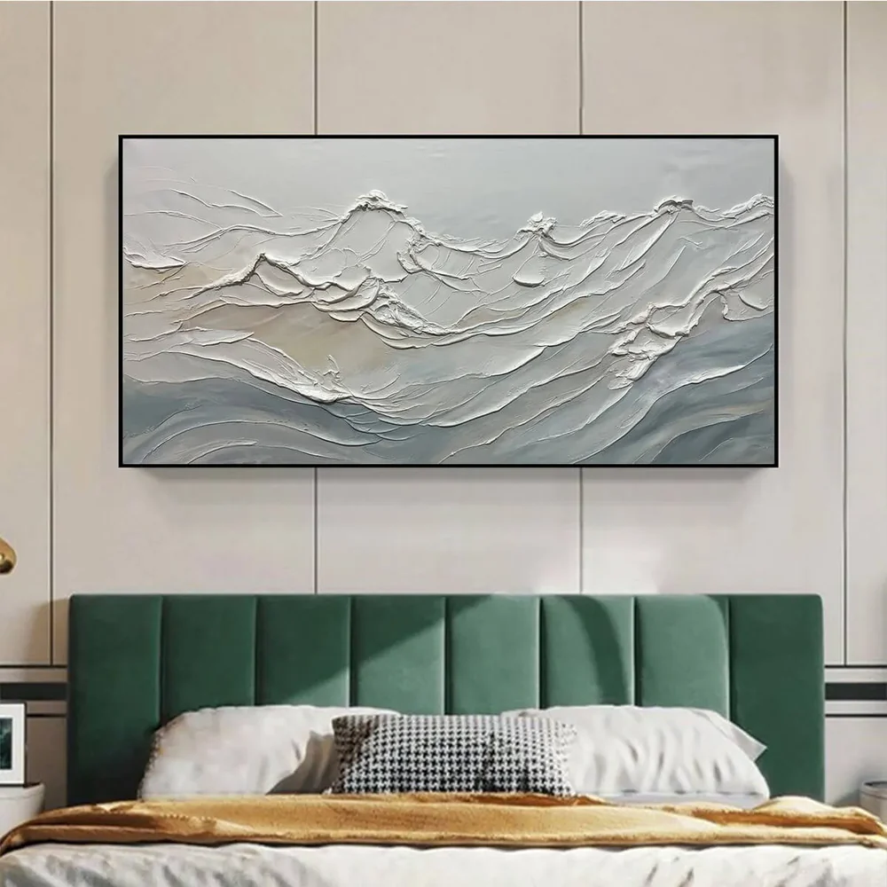
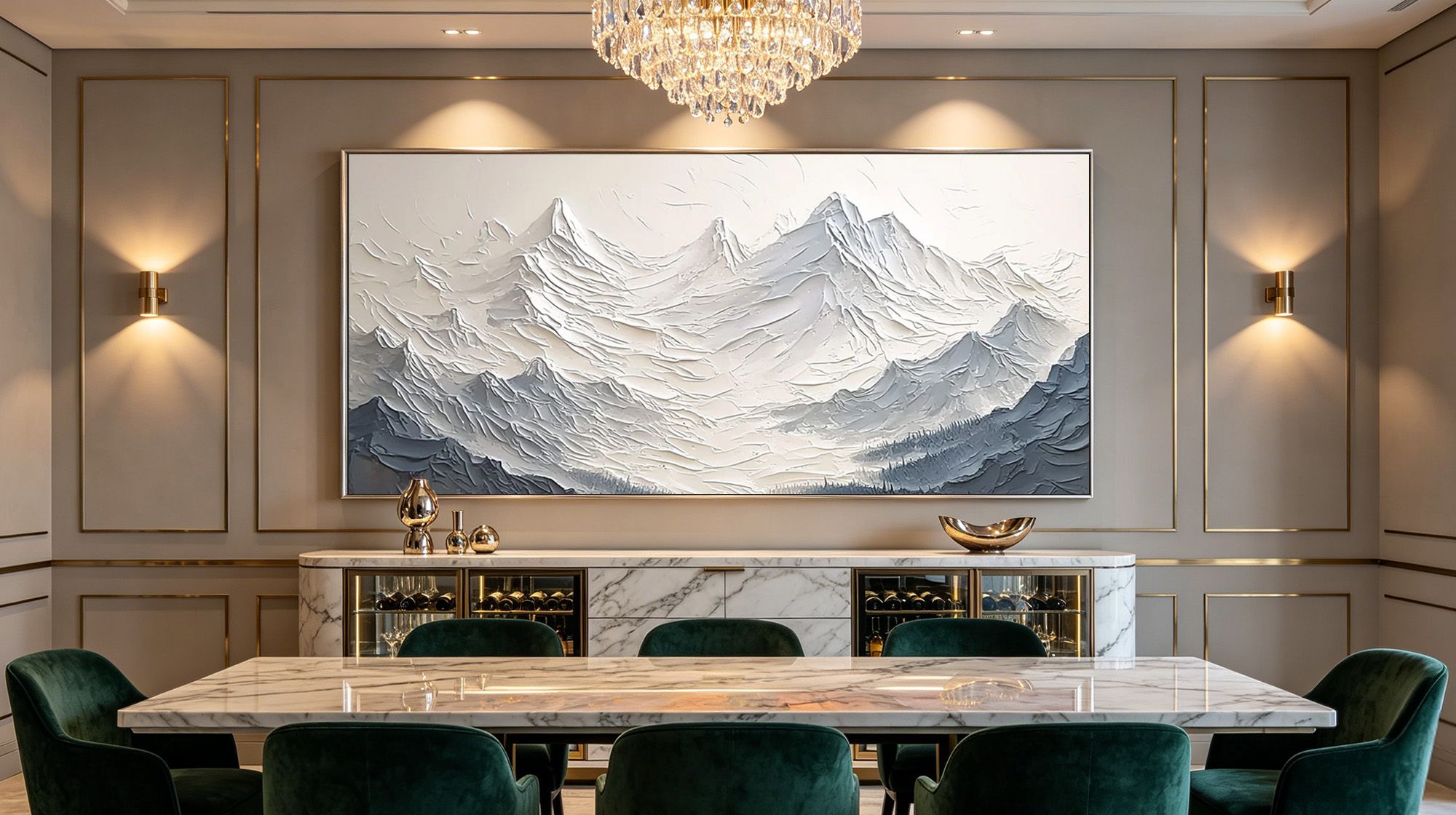
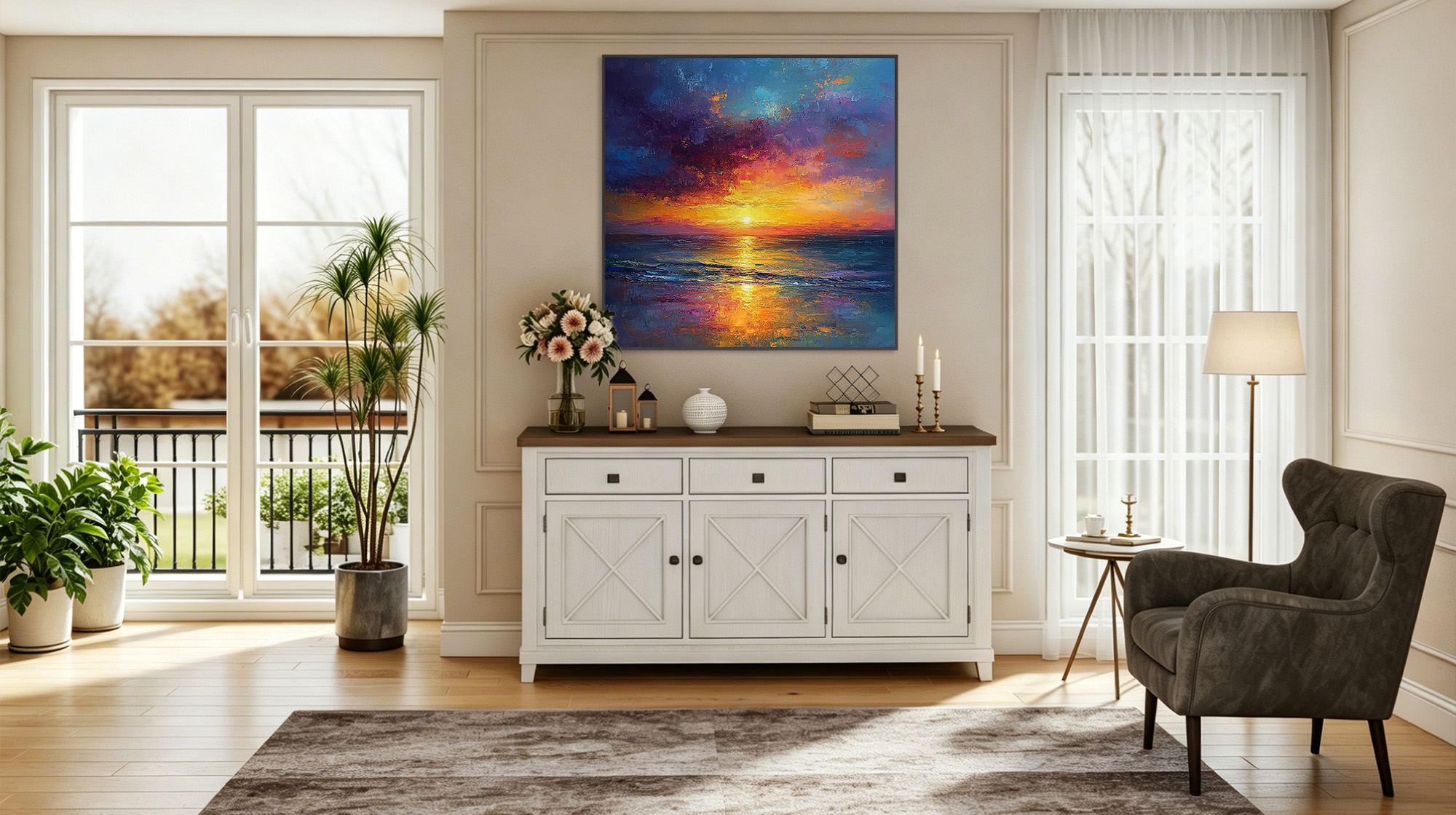
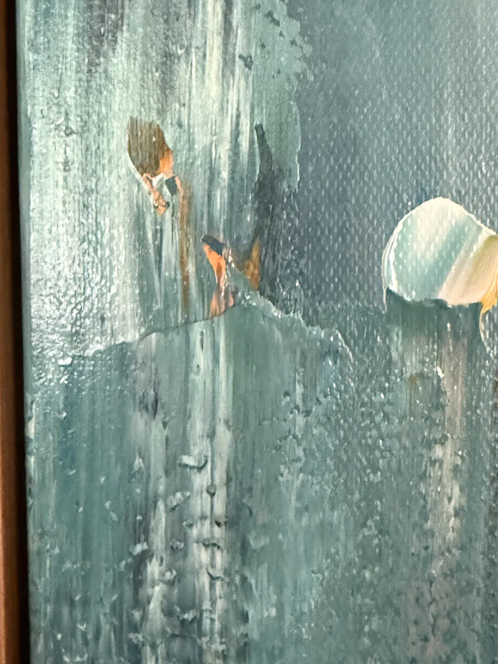
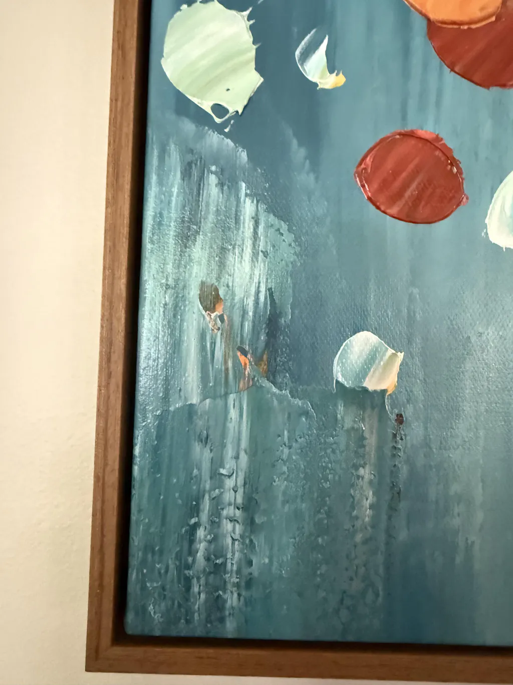
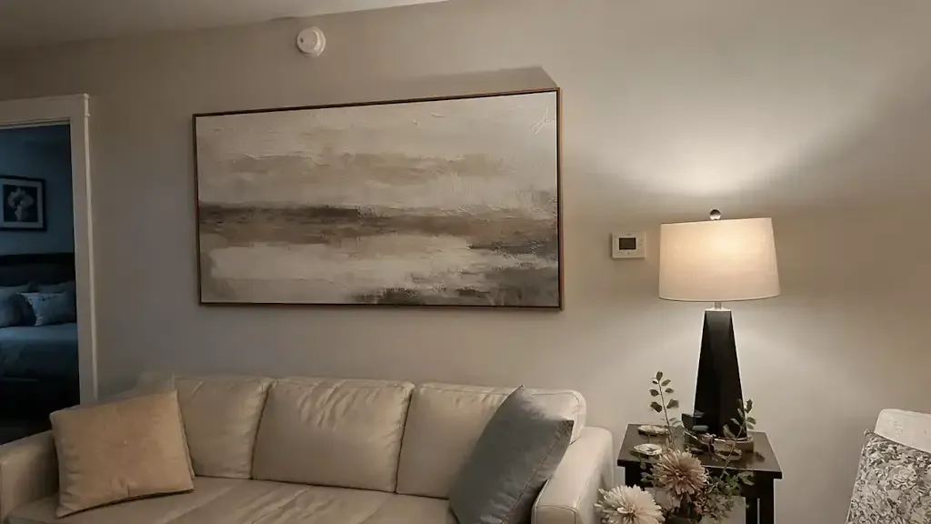
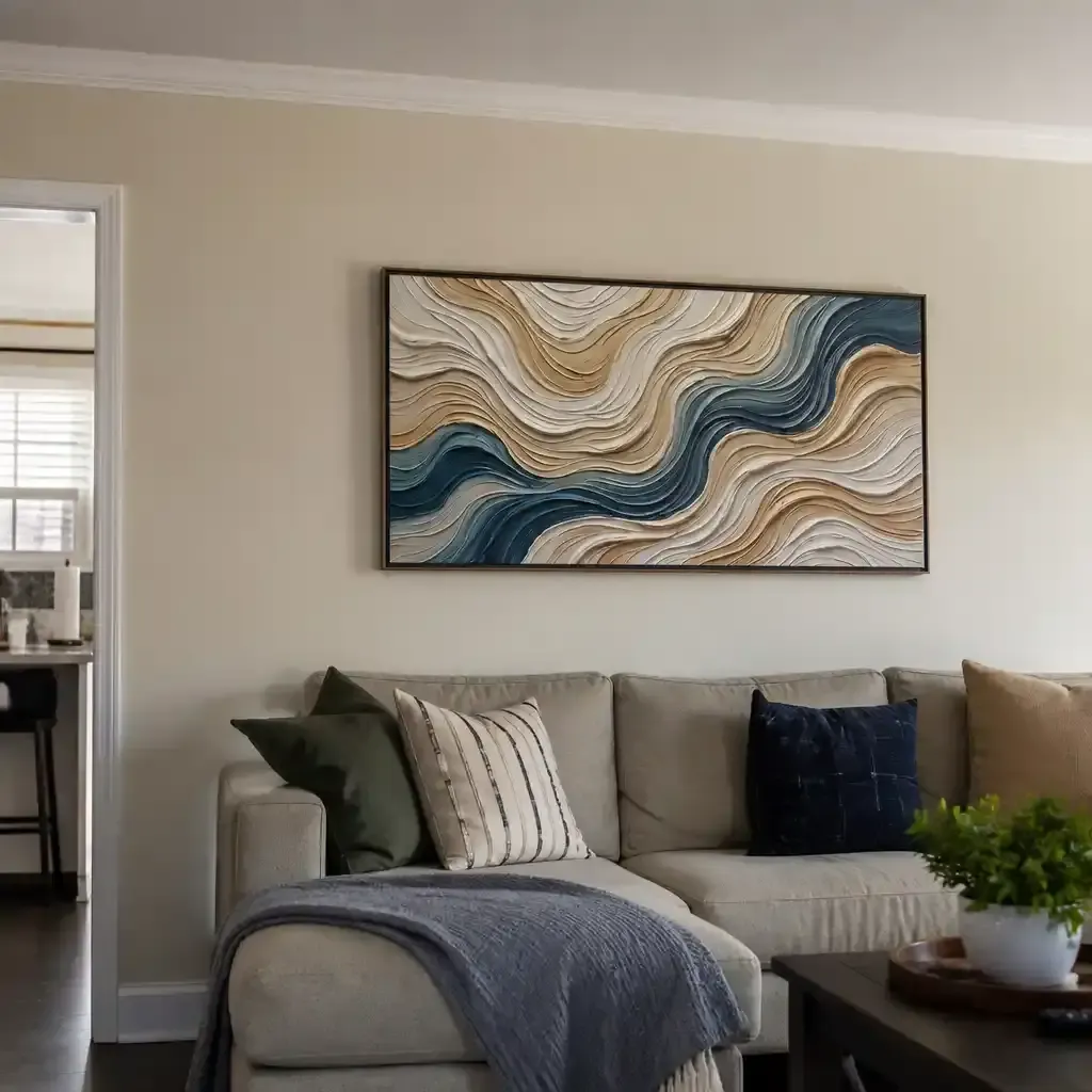
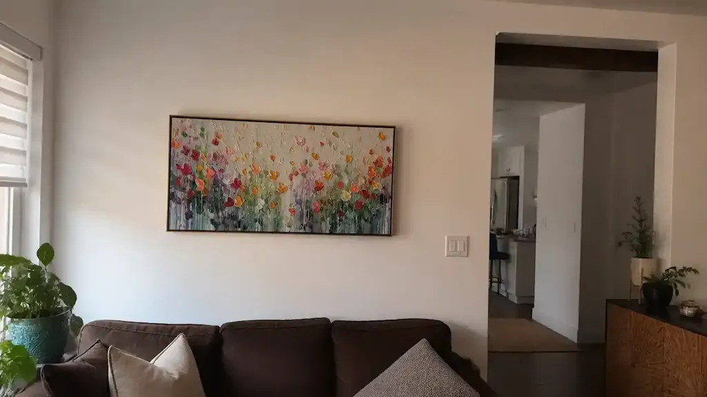
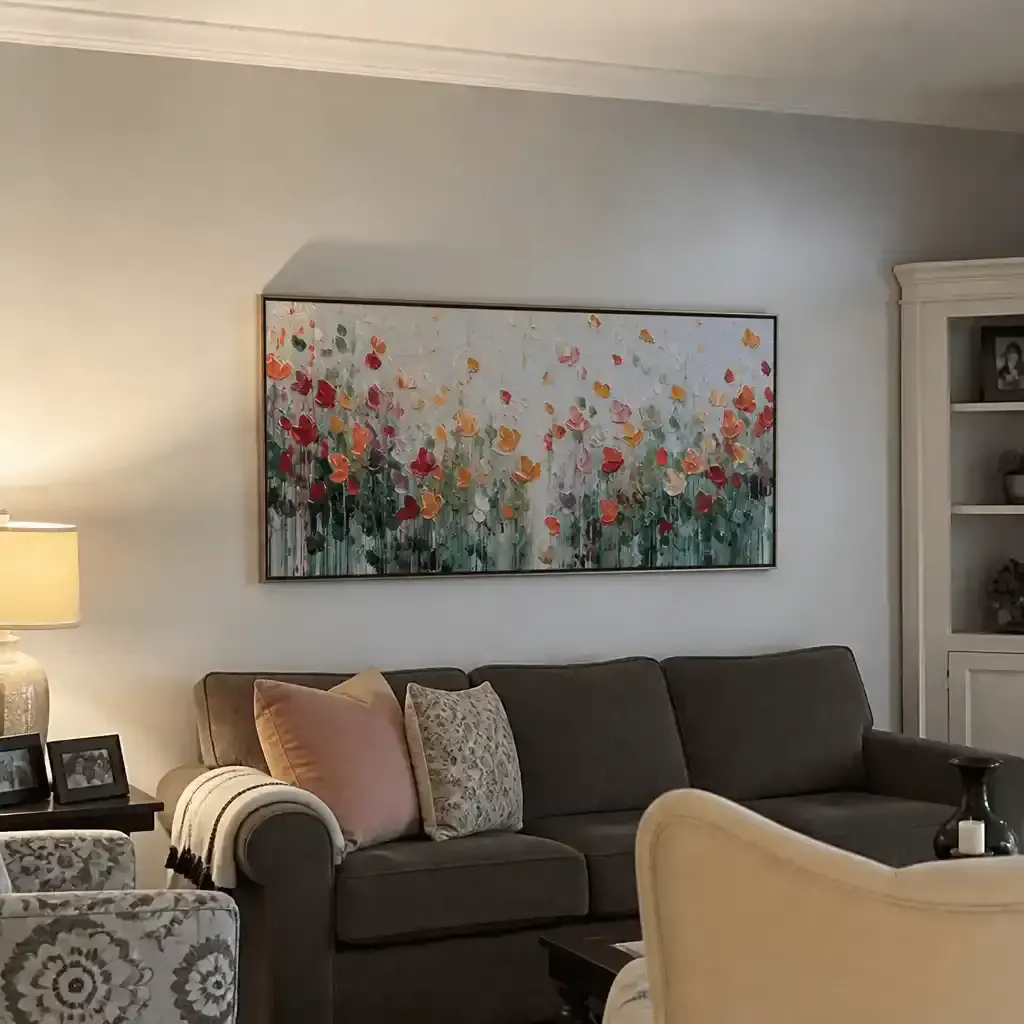
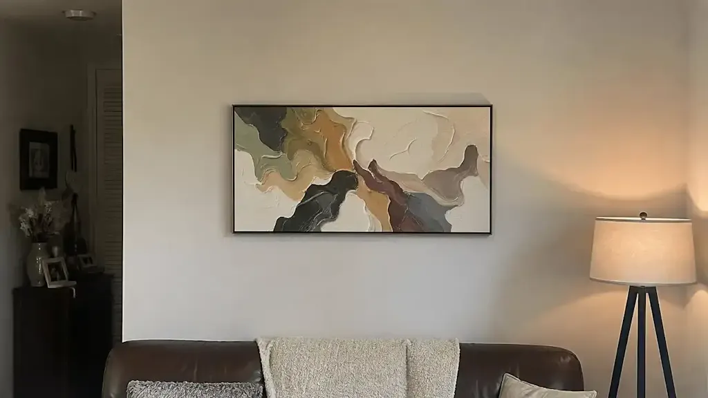
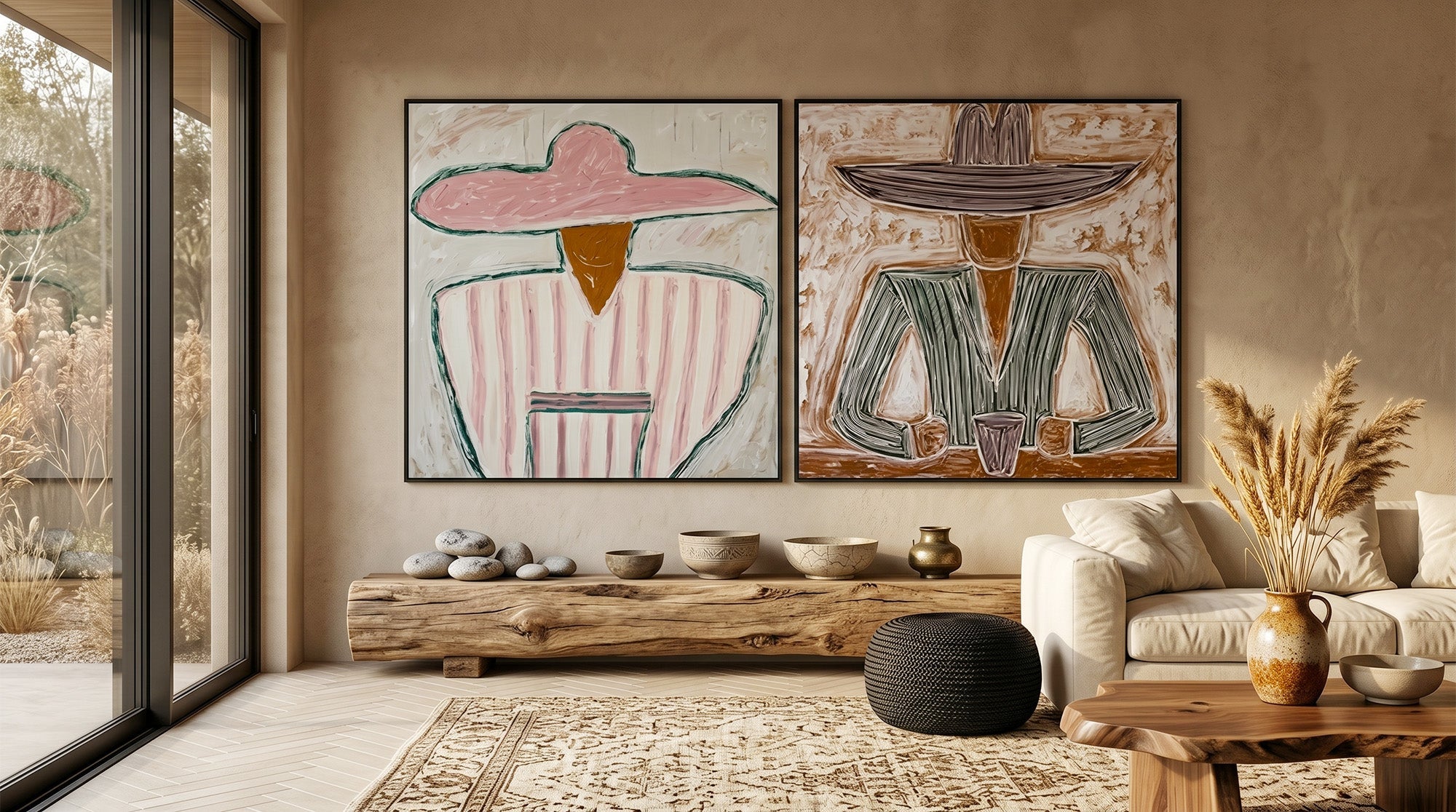
Abstract paintings work particularly well in this role. A piece with strong texture or a wide color range carries more visual weight than a same-sized photograph. It creates a gravitational center that other pieces can naturally cluster around.
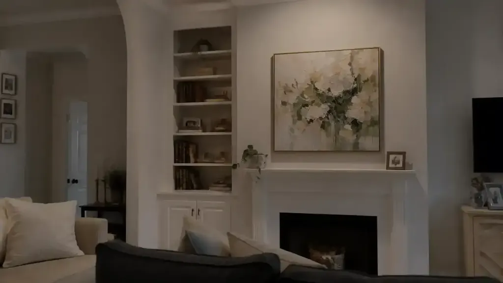
Test a potential anchor by hanging it alone for a few days. If you still want to add pieces around it after that time, it's working as an anchor. If it already makes the wall feel complete on its own, a gallery arrangement may not be the right format for it.
How to Plan the Layout Before You Touch the Wall
The Floor Method
Lay all your candidate pieces on the floor and rearrange them until the grouping feels right. This costs nothing and lets you move pieces freely. The limitation: a floor arrangement shows horizontal relationships clearly, but doesn't fully simulate how height differences read on a vertical surface. What looks balanced lying flat sometimes reads as uneven on the wall.
The Paper Template Method
Cut sheets of paper to match the exact dimensions of each piece, then tape them to the wall. This is the most precise method, and the best choice if you're concerned about drilling in the wrong place. Mark the hanging hardware position on each template before removing it, then drill directly through the mark.
The Spacing Rule That Works
Two to three inches between pieces (5 to 8 cm) creates the standard gallery wall density: close enough to read as a group, spaced enough for each piece to be seen. For a more open, contemporary look, push spacing to five or six inches.
The most common spacing error: inconsistent gaps between different pairs of pieces. Use a ruler on every adjacent pair. Consistent spacing is what separates deliberate from accidental.

How to Mix Frames Without It Looking Like a Mess
Mixing frames isn't a problem. Mixing them without a ratio is.
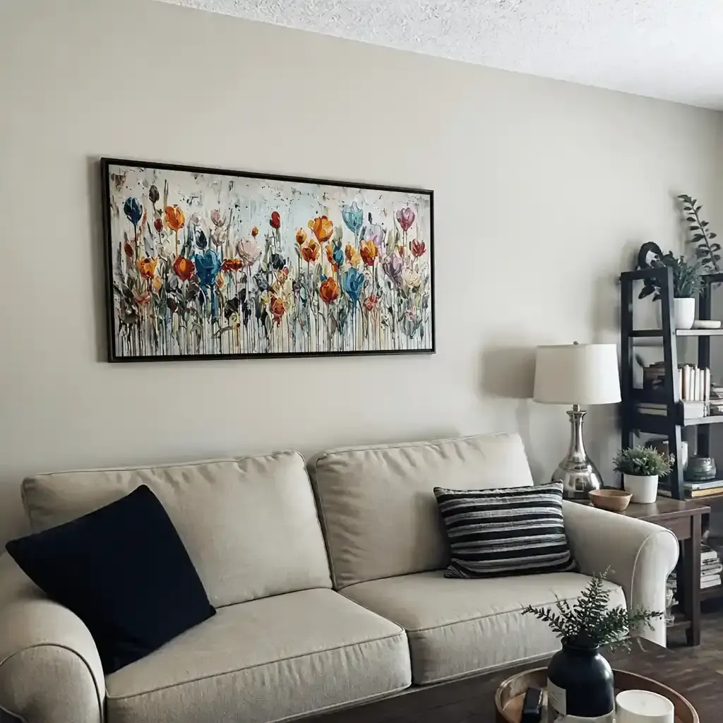
A proportion that holds together visually is 60 percent of your frames in one finish, 30 percent in a second, and 10 percent in a third. Mostly black, some raw wood, one or two in gold or white, for example. The dominant finish gives the eye a home base. The variation reads as considered rather than accidental.
Two variables are hard to manage simultaneously: frame color and frame shape. If you're already mixing finishes, keep profiles more consistent: similar widths, similar depths. When color and shape both vary at random, the result looks unplanned.
One useful exception: when your content is already highly varied, photographs alongside oil paintings alongside prints, let the frames provide the unity instead. Use all black or all white. The frames recede into containers, and the work inside carries the variation.
How to Know When Your Gallery Wall Is Done
There's no objective finish line, but two tests make the judgment concrete.
The step-back test. Move ten to twelve feet from the wall and look at the whole arrangement. At that distance, does your eye see a wall or a collection of separate frames? If you can scan across the full arrangement without counting pieces or stopping on awkward gaps, the wall is done. If you start counting, something likely needs adjustment.
The add-one remove-one test. Mentally take away any single piece. Does the wall improve? Then mentally add one piece anywhere. Does it still hold together? If removing anything makes the wall feel incomplete, and adding anything makes it feel crowded, you've found the right density.
Common signs of overcompletion: no single piece has enough space around it to register independently, and the eye has no place to rest. Gallery walls can also change over time. You don't need to fill every inch on the first day.

Build Your Gallery Wall Around Art You Love
A gallery wall that works doesn't look like it followed a set of instructions. It looks like someone collected things with care and arranged them with attention. That starts with the individual pieces. If you're looking for hand-painted originals to anchor a grouping or fill a space with the right visual weight, Montcarta's abstract and landscape collections offer work with the texture and presence a gallery wall calls for. See what's available at Montcarta.
Frequently Asked Questions
Q1: How Many Pieces Do I Need for a Gallery Wall?
There's no fixed number. A smaller grouping above a sofa typically works well with three to five pieces. Larger walls can hold ten or more. What matters more than quantity is that every piece shares at least one unifying element, and the full arrangement passes the step-back test, meaning the eye can move across it without stopping.
Q2: Can I Mix Paintings and Photographs on a Gallery Wall?
Yes. The most reliable approach is to unify both through frame finish: all black frames, for example, place photographs and paintings in the same visual family. Converting photographs to black and white reduces color competition and gives painted pieces more room to carry the color variation across the arrangement.
Q3: What Height Should I Hang a Gallery Wall?
The visual midpoint of the full arrangement should sit at roughly 57 to 60 inches from the floor (145 to 152 cm), which corresponds to average standing eye level. This applies to the group's center of gravity, not each individual piece. Position the composition's midpoint at that height and build outward from there.
Q4: How Do I Create a Gallery Wall in a Rental Without Damaging the Walls?
Use 3M Command strips rated for each piece's actual weight. Weight limits are printed on the package. Match the strip type to the painting weight before applying. Alternatively, use a floor-standing easel or lean pieces along a shelf or ledge. Both approaches create a gallery arrangement without drilling a single hole.
Q5: Should a Gallery Wall Be Symmetrical or Asymmetrical?
Both work, depending on the effect you want. Symmetrical grid arrangements read as ordered and precise, which suits minimalist or contemporary spaces well. Asymmetrical arrangements feel more organic and collected, a natural fit for eclectic or art-forward rooms. Abstract paintings as the main pieces tend to support asymmetry naturally, since their own compositions already carry internal movement and balance.