Boho interiors are often relaxed, expressive, and personal. However, there is a fine line between a room that feels collected and one that simply feels crowded.
The difference is not only the number of objects. It is whether the colors, textures, and shapes have a clear relationship.
Boho wall art can help create that connection. It can repeat an earthy color, add movement to a quiet wall, or give the room one clear focal point. The artwork should support the surrounding textiles, plants, and furniture rather than compete with all of them.
The goal is not to fill every empty surface. It is to make the room feel personal while giving the eye places to rest.
Why Some Boho Rooms Feel Collected and Others Feel Busy
A collected room contains variety with a sense of order. The furniture may come from different periods, and the materials may not match exactly. Still, one or two visual ideas hold the room together.
Those ideas might include:
- a warm earth-tone palette;
- repeated curved or organic shapes;
- natural wood and woven materials;
- a limited group of accent colors;
- one dominant piece of artwork.
A busy room has no clear visual hierarchy. A patterned rug competes with printed cushions, a detailed gallery wall, several plants, and objects on every surface.
Boho wall decor does not need to be minimal. It does need a balance between active and quiet areas.
If the room already contains many patterns, choose calmer artwork. If the furniture and textiles are simple, the painting can carry more color, texture, or personality.
Give the Room One Strong Visual Anchor
One way to control a layered room is to establish a main focal point.
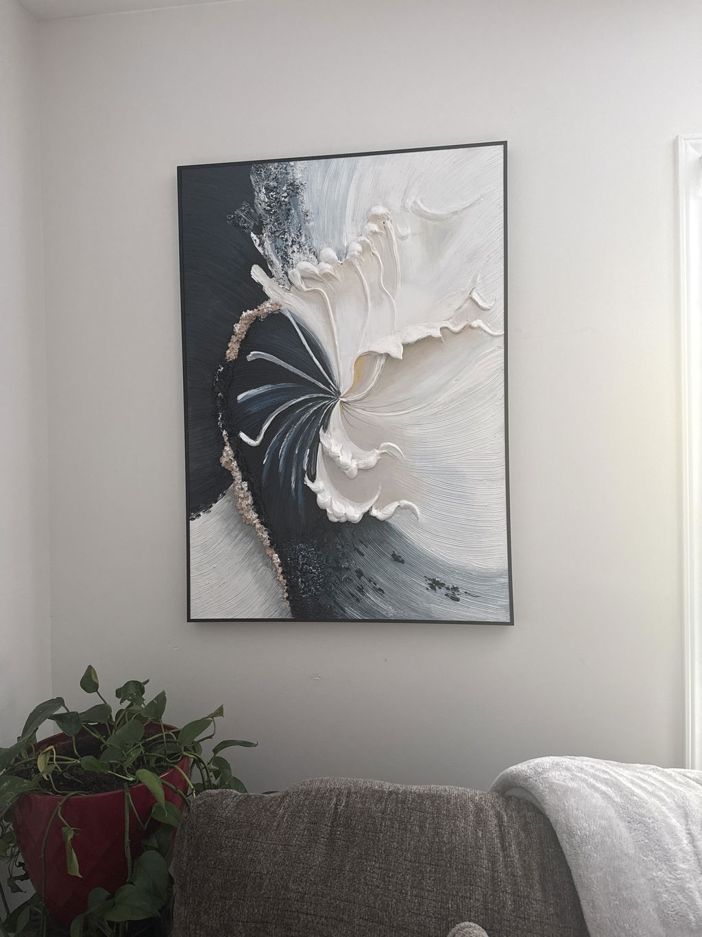
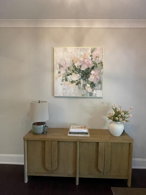
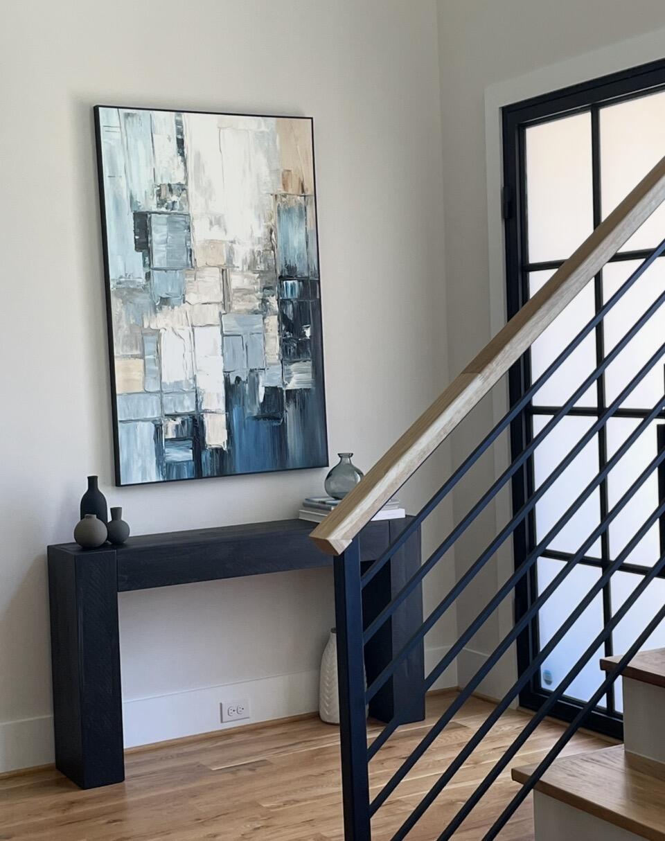
Large boho wall art can perform this role above a sofa, bed, sideboard, or console. One substantial painting gives the eye a clear destination. Smaller decorative objects can then support it.
This approach is useful when the room already contains plants, woven baskets, ceramics, patterned textiles, or mixed wood tones.
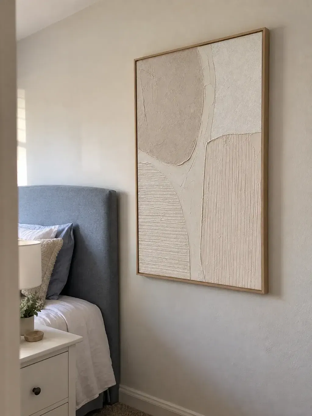
A large painting does not have to be bright or dramatic. Neutral artwork can anchor the room through scale, surface texture, and strong shapes.
Before choosing a piece, view the wall from the room’s main entrance. Decide what should attract attention first.
If the painting is the intended focal point, avoid placing several equally strong objects beside it. One plant, lamp, or small group of ceramics may be enough.
A gallery wall can also suit a boho interior. Keep the spacing consistent and give the arrangement a clear outer boundary. Without these controls, several small pieces may look scattered rather than collected.

Build the Palette Around an Undertone
Boho style often uses terracotta, rust, ochre, sage, beige, cream, brown, and muted gold. These colors work together because many have warm or earthy undertones.
The room does not need to contain all of them.
Start with the colors already present in the largest elements:
- flooring;
- sofa or bed;
- rug;
- curtains;
- wooden furniture;
- wall color.
Next, identify the dominant undertone. Does the room feel warm and golden, soft and neutral, or cooler and greener?
Choose artwork that repeats one existing color and introduces one supporting color. This creates a connection without making everything match.
For example, a painting with terracotta and beige can connect warm wooden furniture with cream upholstery. Sage details may relate to plants without making the entire room green.
MontCarta’s guide to terracotta, rust, ochre, and sienna explains how these closely related earth colors differ.
Neutral boho wall art is another option. Cream, ecru, beige, taupe, and greige can add warmth while keeping the room calm. Use the neutral wall art color guide to compare their undertones.
Balance Painted Texture with Physical Texture
Texture is an important part of boho style. It often appears in rugs, cushions, linen, wood, rattan, baskets, ceramics, and plants.
Textured boho wall art adds another layer, but the room still needs balance.
If the space already contains a thick rug, woven decorations, patterned upholstery, and several baskets, highly detailed artwork may make the wall feel overloaded. A simpler composition with controlled texture may work better.
If the furniture has clean lines and the textiles are plain, visible brushwork or raised paint can add character.
Physical and painted textures do not need to look identical. They only need to feel compatible.
For example, rough wood and woven materials may work with softer painted movement. A smoother modern room may support more pronounced surface texture.
Lighting affects the result as well. Light from the side can reveal raised marks and subtle shadows. Flat frontal light may make textured artwork look smoother than it is.

Choose Art Based on What the Room Is Missing
Boho wall art is not limited to one subject. Abstracts, florals, portraits, landscapes, and coastal scenes can all work.
Choose the subject according to what the room needs.
When the Room Needs Movement
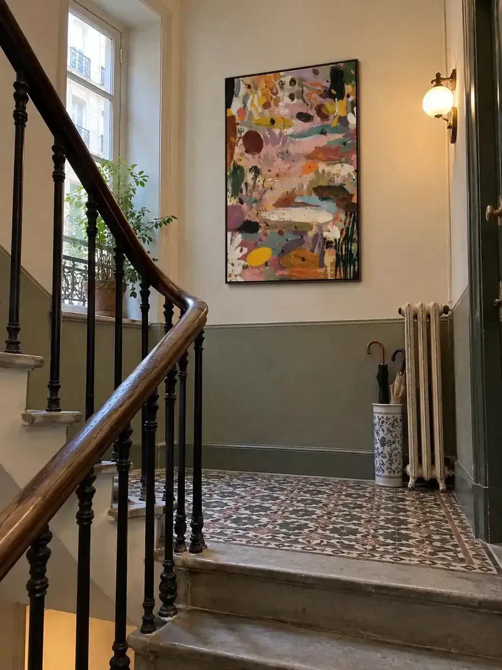
Use earthy abstract art when the space feels too plain or static. Abstract shapes can connect several colors without forcing the room into a specific theme.
This works particularly well in living rooms with simple furniture and neutral walls.
When the Room Needs Softness
Floral and botanical paintings can soften straight furniture lines. They are well suited to bedrooms, reading areas, and relaxed living spaces.
If the room already contains many plants, choose artwork that supports the natural atmosphere without repeating every leaf and stem.
When the Room Needs Personality
Figurative art can make an entryway, living room, or home office feel more individual. Give the painting enough open wall space so the subject remains the focal point.
Keep nearby décor quieter when the artwork contains a strong face, figure, or narrative.
When the Room Needs Calm
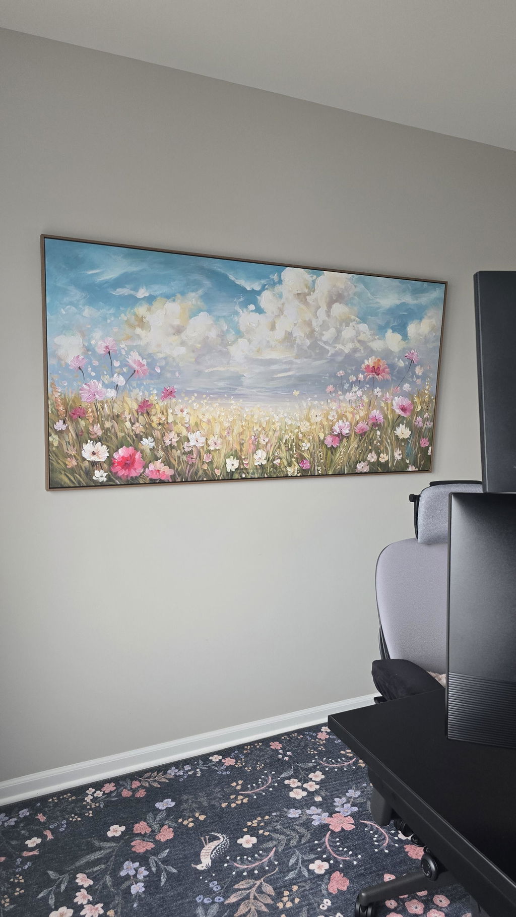
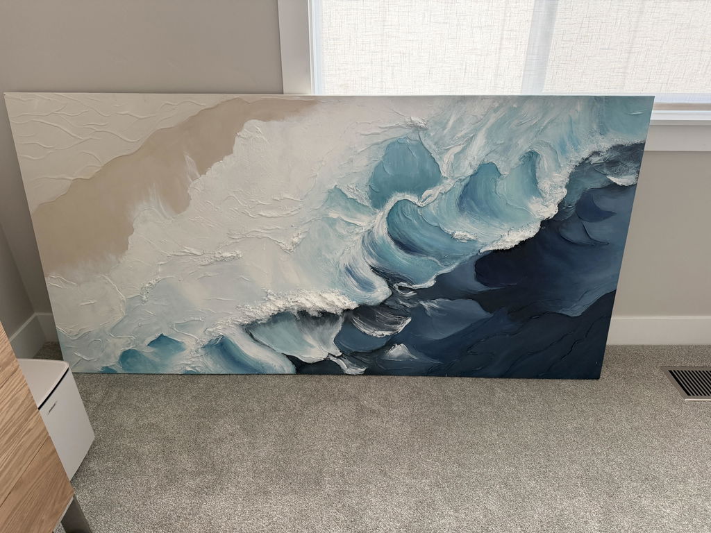
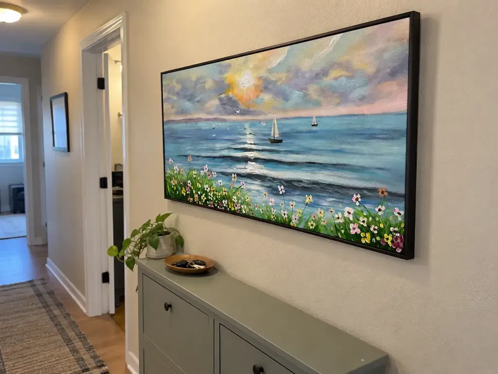
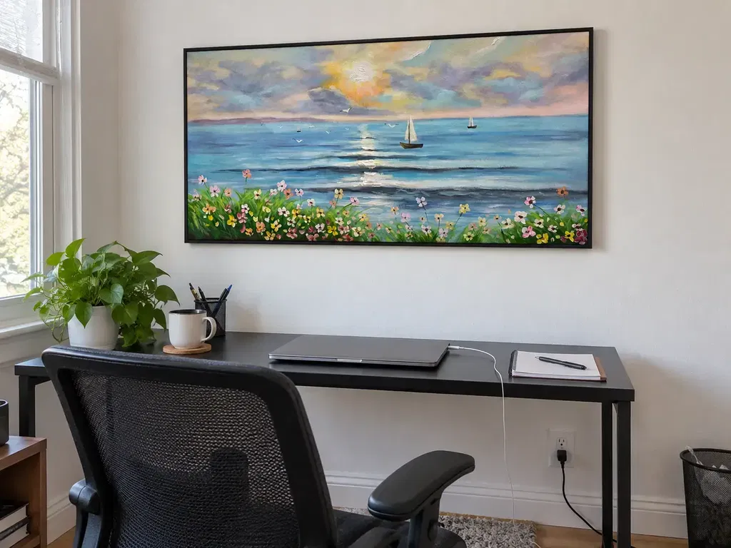
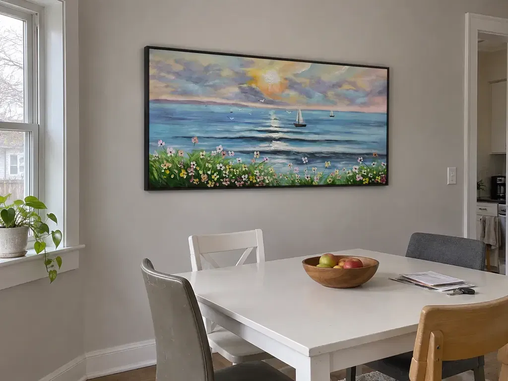
Landscapes and coastal scenes can create a sense of distance. Muted skies, natural horizons, and soft earth tones often work well with wood, linen, and woven materials.
In a bedroom, choose calmer movement and softer contrast. In a living or dining room, the artwork can carry more color and visual energy.
MontCarta’s boho wall art collection includes earthy abstracts, florals, figurative paintings, landscapes, and textured compositions for different rooms.
Edit the Room Before Adding More Décor
When a boho room feels unfinished, the first reaction is often to add another object. Sometimes the better answer is to remove or reposition something already there.
After placing the artwork, step back and ask:
- Is there one clear focal point?
- Does the painting repeat a color from the room?
- Are too many patterns competing nearby?
- Is there enough open wall around the artwork?
- Would removing one object improve the arrangement?
Take a photograph from the entrance. A photo compresses the room into one frame and makes visual clutter easier to notice.
Temporarily remove any objects that compete with the artwork. Add back only the pieces that support the room’s palette, texture, or mood.

Boho Style Needs Connection, Not More Objects
A successful boho interior feels collected because its elements are connected. Color, texture, shape, and personal objects work together without demanding equal attention.
Boho wall art can provide that structure. One painting may anchor the room, connect earth tones, or add personality to a quiet wall.
Start with what the room is missing. Then select artwork that provides that element without repeating everything already present.
The result should feel relaxed rather than empty, expressive rather than random, and layered without becoming crowded.
Frequently Asked Questions About Boho Wall Art Without the Clutter
What Colors Are Common in Boho Wall Art?
Terracotta, rust, ochre, sage, beige, cream, brown, and muted gold are common choices. Blue, black, or brighter colors can also work when they connect with the room’s existing palette.
Can One Large Painting Work In a Boho Room?
Yes. One large painting can give a layered room a clear focal point. It may feel calmer than several small pieces, especially when the room already contains plants, textiles, and decorative objects.
Does Boho Wall Art Have to Be Colorful?
No. Neutral boho wall art can use cream, beige, taupe, brown, and natural canvas tones. Texture, organic shapes, and visible brushwork can create interest without a bright palette.