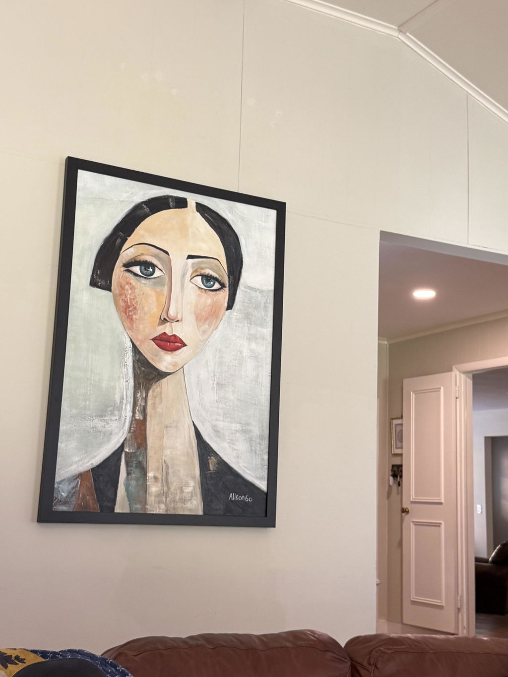
Yes—textured wall art can work in a modern farmhouse home when its relief, palette, framing, and visual weight fit the room. Choose a piece that adds depth while leaving enough breathing room around existing wood grain, linen, stone, patterns, and architectural details.
Why Textured Wall Art Can Suit Modern Farmhouse Rooms
Textured wall art can bridge the tactile character of farmhouse materials and the clean lines of modern furniture. The fit is conditional: judge the piece as part of the entire wall, not as an isolated image on a product page.
Relief That Adds Depth Without Visual Noise
Readable relief can give a wall more dimension alongside wood furniture, linen upholstery, stone accents, and metal hardware. The key consideration is visual load. Texture that creates a few noticeable ridges, tonal shifts, or soft shadows may act as a quiet layer, while dense or highly directional texture can become the room's main visual event.
Before deciding, view the piece from across the room and consider how it looks in daylight and softer evening light. If the wall already contains prominent grain, woven layers, patterned upholstery, or a strong mantel, start with the least busy composition. A piece that looks subtle up close may still draw attention through contrast or directional movement. For a general explanation of how raised surfaces contribute to depth, see how texture adds depth.

Warm Neutrals and Controlled Contrast
Beige, cream, taupe, soft white, and restrained charcoal often provide a flexible palette for modern farmhouse interiors. They can echo plaster, linen, light wood, stone, or aged surfaces without requiring an exact match. That is why a neutral textured painting with wood furniture can feel connected even when its tones differ from the table, console, or cabinetry.
Use dark accents selectively. A limited charcoal or black note may relate to a fireplace surround, window hardware, or aged metal. Large, stark black-and-white contrast can feel sharper and more contemporary, especially when the rest of the room relies on softened neutrals. Compare the artwork with the room's largest surfaces rather than with a single accessory.
Framing, Irregularity, and the Rustic-Modern Balance
A clean edge or simple frame can make organic texture feel deliberate. It gives an irregular surface a visual boundary, helping it sit comfortably beside structured furniture, straight shelving, or a squared-off console. An unframed edge may also work, but it should look intentional against the wall and surrounding finishes.
Wabi-Sabi-inspired art for a modern farmhouse home is best treated as an aesthetic direction, not a certification or fixed product standard. Controlled variation, softened edges, and natural-looking irregularity may suit a room that already includes aged wood, handmade ceramics, stone, or linen. If the surrounding composition is already uneven or highly layered, additional irregularity may make the wall feel unfinished rather than relaxed.
Neutral Abstracts, Botanicals, and Landscapes Compared
A neutral abstract usually minimizes coordination risk, a botanical adds an organic reference, and a landscape creates more directional movement. Choose among them based on the wall's role and the room's existing visual activity. Use this comparison before browsing neutral abstract wall art, rather than choosing by title alone.
| Art direction | Visual energy | Color demand | Best room condition | Main trade-off | When it may feel too busy or formal |
|---|---|---|---|---|---|
| Neutral textured abstract | Low to moderate; shape and relief do most of the work | Low if the palette stays restrained | Layered living rooms, bedrooms, or walls beside strong wood grain and textiles | May recede if the wall needs a clear focal point | Too much relief or contrast can still compete with patterned furnishings |
| Botanical-inspired piece | Moderate; organic forms guide the eye | Moderate, depending on foliage detail and green tones | Rooms that need a nature-led reference without a literal landscape | Detailed leaves can introduce another pattern | Dense botanical detail may compete with fabrics, wallpaper, or collections of décor |
| Textured landscape | Moderate to high; horizon, terrain, or directional marks create movement | Moderate to high if the scene uses several colors | Relatively spare walls that can carry a stronger focal point | It may set the room's mood more forcefully than an abstract | A busy room can make the landscape feel crowded; a formal scene may also feel less casual |
| Restrained geometric or line-led abstract | Moderate; clean direction adds structure | Usually low to moderate | Rooms with simple furniture and clear modern lines | Can pull the room toward a more contemporary reading | Strong lines may feel too sharp beside heavily rustic or distressed elements |
Apply a low-visual-load filter first: if the room has strong patterns, mixed metals, prominent beams, or dramatic wood grain, choose the option with fewer competing shapes. If the wall is quiet and the furniture is simple, a botanical or landscape can provide needed movement. The same subject can read differently depending on scale, contrast, relief, and the objects around it, so these are starting points—not universal style rules.

Match the Artwork to Wood, Linen, Stone, and Metal
A successful textured art piece in a modern farmhouse room does not copy every finish. Coordinate it with one or two existing cues, then preserve enough contrast for the artwork to remain legible.
Wood Furniture and Natural Grain
Compare warmth and visual weight rather than trying to imitate the wood grain. A warm-neutral piece can sit comfortably with honey, oak, walnut, or weathered wood when its overall contrast is controlled, but the exact undertone still matters. Hold the artwork near the room's largest wood surface or compare swatches in the same light.
Also check for competition. Relief may feel excessive beside a prominent live edge, mantel, beam, or heavily grained console. If the furniture is the room's strongest surface, choose simpler texture or a quieter subject. If the wood is smooth and visually restrained, the wall may have more room for irregularity.
Linen, Upholstery, and Soft Layers
Linen, slipcovers, bedding, rugs, and woven baskets already bring tactile interest. In that setting, quiet texture and softened neutrals can support the room without adding another loud pattern. Reduce complexity when several fabrics already have visible weave, stripes, checks, or fringe.
For a bedroom, this often means comparing the art from the bed and doorway rather than only from directly in front of it. The piece should add structure without becoming the first thing you notice when the room is meant to feel restful. If the textiles are plain and the wall is bare, more legible relief may provide useful contrast.
Stone, Black Details, and Aged Metal
Stone, tile, fireplaces, black fixtures, and aged-metal hardware can supply selective contrast cues. A restrained deep neutral in the artwork may connect to those details without turning the entire composition into high contrast. Look for repetition of one accent, not a black-and-white treatment that overwhelms the warmer materials.
Stark contrast, crisp geometry, and very directional marks can shift modern farmhouse abstract wall art toward a sharper contemporary feel. That may be appropriate in a room with streamlined lighting and simple furniture, but it can clash with softer linen, distressed wood, or rounded forms. Step back and ask whether the art supports the room's existing line quality.
A Practical Buying Checklist Before You Choose
Use this checklist to separate aesthetic fit from facts that only the individual listing can confirm. If a listing does not provide a needed detail, treat it as unresolved and contact the seller before ordering.
- Measure the wall context. Note the available wall area, nearby furniture, doors, windows, beams, and sightlines. Decide whether the artwork should be a focal point, a quiet layer, or a nature-led accent.
- Identify undertones and accents. Record whether the dominant wood, fabric, stone, and metal details lean warm, cool, pale, dark, matte, or reflective. Use one or two cues instead of trying to match everything.
- Assess relief under different lighting. Look for close-up and side-view information when available, then consider the piece in daytime and evening light. Treat shadows and surface visibility as inspection cues, not proof of construction quality.
- Compare visual weight. Count competing patterns, tactile surfaces, directional lines, and focal points. If several are prominent, start with a quieter neutral composition.
- Choose the subject's job. Select a neutral abstract for calm contrast, a botanical for a nature-led reference, or a landscape when the wall can absorb more directional movement. Choose Wabi-Sabi-inspired work for intentional-looking variation, not for the label alone.
- Verify listing facts. Confirm dimensions, orientation, materials, finish, frame or edge treatment, care instructions, shipping terms, and return policy on the specific product page. Do not infer these details from a title, style phrase, or photograph. You can use a Terra Firma painting or Terra Veil painting as a browsing starting point, but verify its current listing information before deciding.
- Preview the candidate in the room. Use a paper outline, digital mockup, or temporary placement when possible. Review it from across the room, then check scale, negative space, repeated shapes, contrast, and texture visibility.
This process separates a style match from a product assumption. If a listing leaves a needed specification unresolved, ask the seller or omit the claim.
Final Room-By-Room Fit Checks
Room placement changes the decision because sightlines, furniture, lighting, and pattern density change with it. Use these final screens before ordering textured wall art.
- Living room: Relate the piece to the sofa, mantel, console, or main seating sightline. It can serve as a focal point, but it should not compete with a prominent fireplace, gallery arrangement, or heavily patterned upholstery. If the room is layered, favor calmer relief and controlled contrast.
- Bedroom: Start with quieter contrast and less directional movement. Check the view from the bed, doorway, and any reading area; a piece that feels balanced head-on may seem too dominant from the side or at night.
- Entryway: A clearer focal moment can work when the wall has breathing room and circulation remains open. Check that nearby mirrors, hooks, doors, and lighting do not create a crowded cluster of competing shapes.
- Dining area: Compare the artwork with the table scale, pendant or chandelier, chairs, and nearby patterns. Texture may add interest, but a strong landscape or high-contrast abstract can compete with the table setting and overhead fixture.
Finish with an across-the-room review. Is the scale proportional to the furniture? Is there enough negative space? Do repeated curves, lines, or dark accents create a useful connection—or too much repetition? Can you still see the relief in brighter and softer light? If the answer is uncertain, compare a simpler neutral textured painting with wood tones before choosing a higher-energy piece.
Once you have a shortlist, choose one direction—quiet abstract, organic botanical, or more directional landscape—then verify the specific listing and compare it with the actual room before adding it to your cart.
FAQs
These questions cover edge cases involving irregularity, changing light, exact coordination, and details on the individual listing.
Can Wabi-Sabi-Inspired Art Work With Rustic Decor?
It can when the irregularity looks intentional beside the room's natural variation. Check the piece's visual boundary, composition, and surrounding space; the label alone does not establish a fit.
What Texture Pairs Best With Wood and Linen?
When wood grain and woven textiles already attract attention, begin with restrained relief and a limited palette. Compare the artwork with the largest wood and fabric surfaces, then reduce complexity if the room contains several tactile layers.
How Does Lighting Change the Look of Textured Wall Art?
Raised surfaces may appear more or less noticeable as light and viewing angle change. Inspect side-view or close-up images when available and consider the piece in daytime and evening conditions. If the listing does not answer the lighting question, request more photos.
Should Textured Art Match the Wood Furniture?
No exact match is required. Repeating the wood's general undertone or one nearby accent is more flexible than copying its grain or finish. Keep enough contrast for the artwork to remain visible.
What Should I Confirm Before Ordering an Original Textured Painting?
Confirm the listing's dimensions, orientation, materials, finish, framing or edge treatment, care instructions, shipping terms, and return policy. If any item is missing, ask the seller before ordering rather than treating the style label or product image as a specification.