Texture Mapping: Syncing Art with Living Room Rugs
A cohesive living room is more than a collection of expensive items; it is a choreographed dialogue between vertical and horizontal planes. In high-end interior design, the most critical conversation happens between the wall art and the floor covering. When these two elements are out of sync, the room feels fragmented, increasing "commitment anxiety" for homeowners who prioritize a camera-ready, socially validated aesthetic.
The modern art market is currently undergoing a structural shift that favors this integrated approach. According to Marketplace, high-end auction sales for vanity pieces plummeted 44% year-over-year in 2024. This retreat from purely financial art assets suggests a return to "real application value," where buyers prioritize how art functions within their actual living environments rather than its speculative resale potential.
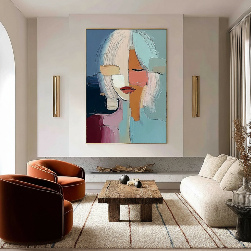
To achieve true visual harmony, designers use a process known as "texture mapping"—aligning the physical properties, color ratios, and scale of wall-mounted art with the rugs beneath them.
The 70-30 Color Extraction Strategy
The most frequent mistake in living room curation is attempting a 1:1 color match between art and rugs. This often results in a flat, monochromatic environment that lacks the "soul" consumers crave. Instead, professional curators employ a 70-30 ratio for color coordination.
The Mechanics of the 70-30 Rule
This heuristic suggests that 70% of the art’s color palette should directly reference the rug’s dominant hues to establish a baseline of certainty. The remaining 30% should introduce complementary contrast. This contrast prevents the "assembly-line" look and provides the visual interest necessary for social validation.
- Dominant Hues (70%): Pull the primary "ground" color of the rug into the larger fields of the painting.
- Accent Hues (30%): Look for minor thread colors in the rug weave and amplify them as focal points in the art.
Logic Summary: This ratio is a practical baseline used by interior designers to ensure cohesion without sacrificing depth. It assumes a standard residential lighting environment and aims for a "designed but organic" look.

Physicality and the "Essential Identity" of Texture
While digital tools can simulate color, they often fail to capture the physical "roughness" and "reflectivity" that define a premium space. Research from the University of Chicago indicates that consumers perceive a collapse in value when art lacks an "essential identity"—a soul that digital prints and replicas cannot replicate.
Mapping Weave to Brushstroke
Texture mapping requires analyzing surface properties such as roughness (0.1–0.9 scale) and anisotropy (the way light reflects in different directions).
- Geometric Rugs: Pair well with abstract art featuring similar angular forms or "hard-edge" techniques.
- Organic/Floral Rugs: Harmonize with painterly, heavily textured artworks (impasto) that mimic the natural irregularities of wool or silk fibers.
- High-Pile Rugs: Require art with significant physical relief. The MUNCH Museum has found that physical relief textures exponentially stimulate intrinsic motivation and satisfaction in viewers.
The irreplaceability of hand-painted pigments lies in their micro-physical texture. According to research published in Sensors (MDPI), the mm-scale texture of oil and acrylic paintings provides tactile data that the human eye perceives as "authenticity," a key driver for 2026 design trends which favor "understated elegance with texture as its soul."

Scale and Proportion: The 60-75% Heuristic
A common source of decision anxiety is the fear that art will either disappear on a large wall or overwhelm the furniture. To maintain visual balance, a practical heuristic is that the art’s width should be approximately 60-75% of the rug’s width (or the width of the furniture it anchors).
| Element | Recommended Proportion | Rationale |
|---|---|---|
| Art Width | 60–75% of Rug Width | Prevents the art from looking "lost" or "top-heavy." |
| Vertical Placement | 57–60 inches from floor | Standard "eye-level" for gallery-style viewing. |
| Rug Coverage | Should extend 12–18" past sofa | Anchors the seating group as a single "island." |
Methodology Note: These ranges are derived from common gallery staging practices and interior design standards. They may vary based on ceiling height (e.g., vaulted ceilings may require larger vertical scale).
For those managing high-visibility purchases, Planning for Installation: Curing Timelines is essential to ensure the art is ready for the wall the moment the rug is laid.
The Psychological ROI of Integrated Art
Beyond aesthetics, syncing art with your environment has measurable health benefits. A review by the University of Pennsylvania noted that 73% of patients reported significant mood improvements when surrounded by environmental artworks.
Biophilic Design and Stress Reduction
Integrating nature-themed murals or paintings that echo the organic textures of a rug can trigger the brain's emotional regulation circuits. NCBI research shows that passive art viewing activates the medial prefrontal cortex (mPFC), optimizing stress regulation. This is particularly effective when using "Biophilic Design"—landscapes that produce the same stress-reduction effects as being outdoors.
Furthermore, a well-curated room can impact property value. The Royal Society found that neighborhoods with higher "art" geo-tags saw greater relative house price ranking gains. On a micro-level, a room that feels "professionally curated" reduces the buyer's perceived risk and increases the perceived value of the home.
Safety and Sustainability in the Living Room
For high-end home improvers, "luxury" now includes safety and ethics. The Wharton School found that 87% of consumers believe artists should receive fair compensation, and a similar percentage are concerned about the environmental impact of their purchases.
Indoor Air Quality (IAQ) and Pigment Safety
When selecting hand-painted art, the chemical composition of the pigments matters. The EPA warns that indoor air pollution can be more concentrated than outdoor pollution.
- Low-VOC Paints: Ensure your artist uses low-VOC acrylics or walnut-oil-based paints, which replace toxic solvents like turpentine.
- Heavy Metal Awareness: While IARC classifies cadmium as a carcinogen, modern high-end artist brands often use "hue" alternatives or strictly controlled formulations that meet ASTM D-4236 safety labeling standards.
When Balancing Heavily Textured Art with Minimalist Decor, it is vital to ensure that the materials used do not off-gas in small, enclosed living spaces.

The Technical Reality: Light and Longevity
The final step in syncing art with rugs is accounting for lighting. Texture perception changes dramatically at different viewing angles (30°, 45°, and 90°).
Lightfastness and the ASTM D4303 Standard
Rugs are often subject to heavy UV exposure from windows. To ensure your art doesn't fade at a different rate than your floor covering, look for pigments tested under ASTM D4303. This standard uses xenon-arc tests to simulate years of sunlight exposure, ensuring the "chromatic dialogue" you've created lasts for decades.
The Approval Process
To reduce commitment anxiety, the approval process for custom art should always include room context photos. Seeing the art (even digitally overlaid) in the actual lighting conditions of the room—next to the rug—allows for "color translation" adjustments before the final brushstrokes are applied.
By focusing on these technical parameters—the 70-30 color ratio, the 60-75% scale rule, and the physical alignment of textures—home improvers can move past the uncertainty of "decorating" and into the certainty of "curating." This integrated approach ensures that every element of the living room supports a single, cohesive visual narrative that is as safe and ethical as it is beautiful.
Disclaimer: This article is for informational purposes only. When dealing with structural changes, heavy installations, or chemical sensitivities, always consult with a certified interior designer or environmental health professional. Ratios and heuristics provided are based on common industry practices and individual results may vary based on specific room dimensions and lighting conditions.
Sources
- Marketplace: High-end Art Market Trends 2025
- The Art Basel and UBS Art Market Report 2024
- Columbia University: Human-Made vs. AI Art Study
- Royal Society: Quantifying the link between art and property prices
- WHO Scoping Review on Arts and Health
- EPA: Indoor Air Quality and Low-VOC Paints
- ASTM D4303 Standard Test Methods for Lightfastness


