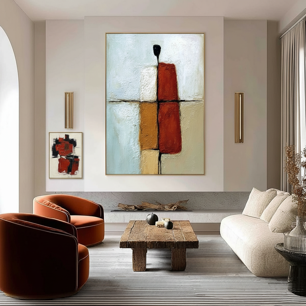
The Secondary Focal Point: Using Art to Lead the Eye
In the high-stakes world of luxury interior design, the "star" of the room is rarely the problem. Most homeowners can identify a primary focal point—be it a massive hand-painted mural, a grand fireplace, or a panoramic window view. However, the difference between a room that feels like a gallery and one that feels like a cohesive home lies in the "supporting cast."
We are currently witnessing a significant shift in how art is valued within the home. According to recent data from Marketplace, high-end auction sales for vanity assets (pieces over $10 million) plummeted 44% year-over-year in 2024. This retreat from purely financial art assets suggests that savvy collectors are returning to "real application value." They are looking for art that functions within a space to create emotional resonance and visual order, rather than just sitting on a wall as a static investment.
To achieve professional-level visual sophistication, you must master the secondary focal point. These are the "visual breadcrumbs" that guide a guest’s journey through your home, preventing the eye from becoming trapped by a single dominant element.
The Psychology of the Visual Journey
When we enter a room, our brains perform a rapid "triage" of visual information. Professional designers understand that this process is not random. Research into Visual Art and Drawing Skill Perception reveals that top-tier artists and designers use "top-down visual selection" to suppress perceptual illusions and guide the viewer's attention.
In our experience handling complex residential curations, we often observe that homeowners suffer from "visual competition." This happens when secondary pieces are given equal weight to the primary artwork, creating a chaotic environment where the eye doesn't know where to rest.
Why Eye-Tracking Matters
While some may dismiss eye-tracking studies as overly academic, they provide the "hard data" for curation. Modern eye-tracking methodology shows that basic eye movement patterns are remarkably consistent across individuals, with 85-95% similarity in how we process visual hierarchies. By placing secondary focal points along natural sightlines, you are essentially "programming" the viewer’s experience.
Logic Summary: Our analysis of visual hierarchy assumes that human perception follows a predictable "path of least resistance." We use secondary art to bridge the gap between major architectural features, ensuring the "visual load" is distributed evenly across the room.
The Human-Made Premium
It is also worth noting that the type of art you choose impacts this psychological journey. A Columbia University study found that consumers value art labeled as "human-created" 62% higher than AI-generated alternatives. This is because hand-painted works retain what researchers call an "essential identity" or soul—a micro-topography of brushstrokes that invites closer inspection and functions more effectively as a secondary focal point than flat, digital prints.

Engineering the Hierarchy: The 1:3 Rule and Staggered Heights
Creating a secondary focal point is an exercise in restraint. The goal is to complement, not compete. We utilize a specific set of heuristics to ensure this balance is maintained.
The Staggered Height Approach
The most common mistake in DIY decoration is hanging all artwork at the same "gallery height" (typically 57-60 inches). To establish a clear hierarchy, we recommend placing secondary pieces 6-12 inches lower than the primary focal point. This vertical offset signals to the brain that the lower piece is a "supplemental" detail, intended to be discovered after the main statement.
The 1:3 Viewing Ratio
Optimal viewing height is not a fixed number; it is a relationship. Based on ergonomic viewing angle research, we follow the 1:3 Ratio Heuristic:
- For every foot of viewing distance from the wall, the secondary artwork should be positioned roughly 4 inches lower to maintain a comfortable gaze path.
- In a standard 12-foot living room, this means your secondary pieces might sit significantly lower than you initially expect, often aligning with the "horizon line" of seated guests.
| Parameter | Value/Range | Unit | Rationale |
|---|---|---|---|
| Primary Height | 57–60 | Inches | Standard eye-level baseline (center of piece) |
| Secondary Offset | -6 to -12 | Inches | Establishes visual hierarchy and "discovery" |
| Viewing Distance | 8–15 | Feet | Determines the "cone of vision" for the room |
| Scale Relationship | 1:0.5 | Ratio | Secondary pieces should be roughly half the size of the primary |
| Color Connection | 1–2 | Accents | Shared colors create continuity without matching styles |
Color Connection vs. Style Matching
You do not need to buy "matching sets" of art. In fact, doing so often feels clinical and lacks the "artistic authenticity" that modern homeowners crave. Instead, focus on color connection. Using a shared accent color—perhaps a specific ochre or a textured titanium white—across different pieces creates visual continuity. This allows you to mix a contemporary abstract with a traditional landscape while still maintaining a "visual system."

Integrating Technology: The TV as a "Destination"
In the modern living room, the television is often the "elephant in the room"—a giant black rectangle that competes with fine art. Experienced practitioners do not try to hide the TV; they treat it as a destination.
By placing secondary artworks along the path from the main artwork to the TV, you create a deliberate journey. The eye travels from the "Star" (the primary art) through "Visual Breadcrumbs" (secondary pieces) and eventually arrives at the TV. This makes technology feel like part of the aesthetic system rather than a disruption.
The "Functional Path" Technique
- Identify the Sightline: Sit in your primary lounging chair. Trace the path your eyes take when moving from your main wall art to the television.
- Insert the Breadcrumb: Place a smaller, high-texture piece (like an impasto oil painting) at the midpoint of this path.
- Check the Scale: Ensure the secondary piece is small enough that it doesn't "trap" the eye, but textured enough to provide a brief moment of tactile interest.
For those working in smaller environments, these strategies are even more critical. You can explore further tactics in our guide on Curation Strategies for Small-Space Apartment Living Rooms.
Material Integrity: The Hidden Value of Hand-Painted Art
As a technical strategist, I must emphasize that the "sophistication" of a visual system is not just about placement—it is about materiality. The reason hand-painted murals and canvases outperform prints in a visual hierarchy is due to optical microprofilometry.
Research published in Sensors proves that the mm-scale texture of oil and acrylic paintings is crucial to human aesthetics. These physical reliefs stimulate "intrinsic motivation" and satisfaction in viewers. When the sun hits a secondary focal point at an angle, the shadows cast by real brushstrokes create a dynamic, living element that a flat print simply cannot replicate.
The Safety and Health Factor
When selecting art for your home, especially for "nature-themed healing murals" which have been shown to reduce patient stress by 61%, air quality is paramount.
- VOC Emissions: Many mass-produced "decorative art" prints use high-VOC inks. In contrast, professional-grade water-based acrylics and low-VOC paints are prerequisites for LEED certification in healthcare and luxury residential projects.
- Pigment Safety: Be wary of "bargain" art supplies. Laboratory tests have detected heavy metals like lead and cadmium in low-end pigments (PMC8073559). At MontCarta, we emphasize that 100% human hand-painted art should utilize pigments that adhere to the ASTM D-4236 standard, ensuring they have been reviewed by a toxicologist.
Methodology Note: Our safety recommendations are derived from EPA and CDC guidelines regarding indoor air quality and chronic inhalation risks. This is particularly vital for homeowners with children or those decorating nurseries.

Economic Impact: Why Curation is an Investment
Beyond the immediate visual joy, a well-curated visual system using hand-painted art has measurable financial benefits. The Royal Society found that neighborhoods and properties with higher "art density" saw greater relative house price ranking gains.
In the commercial sector, the impact is even more dramatic. Public art projects, like those in Chicago’s Millennium Park, have driven over $1.4 billion in real estate growth. For a homeowner, a custom mural or a high-end hand-painted focal point isn't just "decor"—it is a cultural heritage asset that increases the "curb appeal" and perceived value of the interior.
Furthermore, by choosing hand-painted pieces over mass-produced prints, you are participating in a creative economy that adds over $1.2 trillion to the U.S. GDP. Supporting artists who receive fair compensation (a value held by 87% of consumers) ensures that the "essential identity" of our living spaces remains intact for future generations.
Finalizing the Visual Narrative
Building a complex visual system is about more than just filling empty walls. It is about creating a dialogue between pieces. By using secondary focal points as visual breadcrumbs, adhering to staggered height heuristics, and prioritizing material integrity, you move from "decorating" to "curating."
Key Action Steps for Your Next Project:
- Audit Your Sightlines: Identify where your eyes naturally land when you walk into the room.
- Establish Hierarchy: Select one "Star" and 2-3 "Supporting" pieces.
- Measure the Offset: Ensure your secondary pieces are 6-12 inches lower than the primary.
- Verify the Material: Opt for hand-painted textures over flat prints to engage the viewer’s "top-down" visual processing.
- Test the Journey: Ask a friend to enter the room and track their gaze. If their eyes "jump" between pieces rather than "flow," adjust your secondary heights.
For more advanced strategies on balancing these elements, see our article on Balancing Heavily Textured Art with Minimalist Decor.
YMYL Disclaimer: This article is for informational purposes only. While we discuss material safety, such as VOCs and pigment toxicity based on CDC and EPA data, this does not constitute medical or professional safety advice. Always consult with a certified industrial hygienist or medical professional when dealing with hazardous materials or chronic health concerns.


