The Designer’s Language: Specifying Color Values for Custom Art
In the current global art market, a profound shift is occurring. While high-end auction sales for works over $10 million plummeted by 44% year-over-year in 2024, the broader creative economy remains a titan, with creative services exports reaching a record $1.4 trillion (UNCTAD Creative Economy Outlook 2024). For the interior design professional, this signifies a retreat from speculative "vanity assets" toward art with real application value.
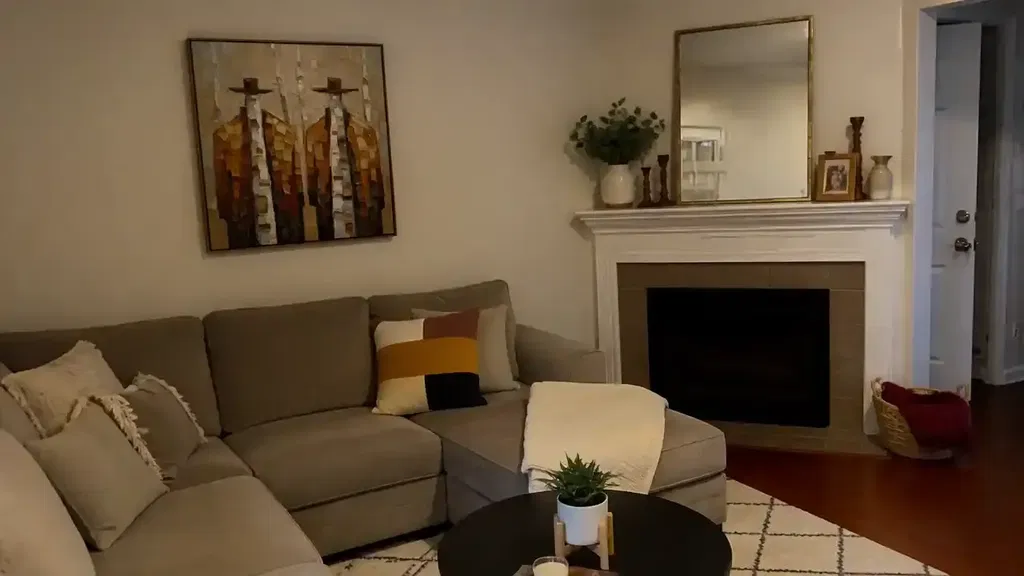
However, the transition from a digital mood board to a physical oil-on-canvas masterpiece often encounters a "translation gap." Designers frequently find that a color which looked perfect on a MacBook Pro screen feels disconnected or "off" when it arrives at the project site. Achieving "retail-grade certainty" in custom commissions requires moving beyond artistic intuition and into the technical specification of color values, pigment chemistry, and light-wave physics.
The Economics of Authenticity: Human vs. AI
For high-end residential decorators, the "decision safety" of a commission rests on its perceived value and longevity. Recent research from Columbia University confirms that consumers value art labeled "AI-generated" 62% lower than authentic human-created art. This value collapse is rooted in what University of Chicago researchers call "essential identity"—the psychological belief that a physical canvas retains an irreplicable soul and artist presence that digital prints lack.
By specifying hand-painted murals and canvases, designers are not just decorating; they are installing "cultural heritage assets." In commercial sectors, this translates to tangible ROI. A Royal Society CAR model analysis found that neighborhoods with higher art geo-tags saw significant relative house price gains. In the hospitality sector, the 2025 Hospitality White Paper emphasizes that integrating local hand-painted art provides the "absolute authenticity" that modern travelers crave, far outpacing the impact of mass-produced decor.

The Specification Gap: Why HEX Codes Fail
The most common mistake in custom art specification is the reliance on HEX or RGB codes. While these are the standard for digital displays, they fail catastrophically when translated to a physical palette.
- Limited Mapping: Data indicates that only approximately 3,397 paints across 36 major brands are digitally cataloged. This leaves over 60% of professional art materials digitally unmapped, forcing artists to manually approximate digital values (Color2OilPaint Analysis).
- Lack of "Value" Depth: Digital codes represent light emitted from a screen, whereas oil pigments rely on light reflected from a surface. Digital codes lack the "value" (lightness/darkness) depth and tactile texture inherent in physical media.
- Metamerism: This is the phenomenon where two colors match under one light source but differ under another. A HEX code calibrated for an sRGB gamut will appear fundamentally different in a north-facing room with 3000K LED lighting.
The Professional Solution: Designers should provide physical color references, such as Benjamin Moore or Sherwin Williams paint codes. Professional artists can then use physical fan decks to match these "anchor colors" (the 2–3 most critical hues in the room) against their pigment mixtures.
Logic Summary: The Color Matching Heuristic Our recommendation for using physical paint codes over HEX is based on common industry heuristics derived from the Getty Conservation Institute's application of the Kubelka-Munk equation. This model assumes that pigment reflection is dominated by absorption and scattering coefficients that digital RGB values cannot accurately simulate.
Physics of the Palette: Drying Down and Metamerism
Understanding the chemical behavior of oil paint is essential for "approval-based workflows." A primary challenge is the "drying down" effect. As the solvent (typically turpentine or mineral spirits) evaporates, dark values often appear flatter and less saturated.
To maintain the intended depth, designers should specify a final gloss or satin varnish. This not only protects the pigment but also restores the refractive index of the surface, ensuring that deep umbers and blacks retain their "wet" vibrancy.
Furthermore, designers must account for Illuminant Metamerism. According to research on Visual Art in the Built Environment, color perception is entirely dependent on the Spectral Power Distribution (SPD) of the light source.
| Light Source | Color Temperature | Effect on Oil Pigments |
|---|---|---|
| North-Facing Daylight | 6500K - 7500K | Enhances blues/cool tones; flattens warms. |
| Warm LED/Halogen | 2700K - 3000K | Intensifies reds/yellows; can "muddy" teals. |
| Neutral Studio Light | 5000K | The industry standard for color-accurate approval. |
To ensure a 99.9% match promise, the approval photo of the finished commission should be taken under neutral 5000K lighting with a physical Grey Card in the frame. This allows the designer to calibrate their screen view to the artist's studio conditions.
Material Integrity: Safety and Longevity
In high-end residential and healthcare design, "aesthetic" is secondary to "safety." The EPA warns that indoor air pollution can be significantly more concentrated than outdoor air. For projects seeking LEED or WELL certification, specifying low-VOC (Volatile Organic Compound) materials is a strict prerequisite.
While traditional oil painting often involves toxic solvents like turpentine, modern professional studios are shifting toward eco-friendly alternatives. Aalto University experiments have shown that coatings on properly prepared substrates emit significantly lower VOCs during the curing process than previously assumed. Designers should specify the use of walnut oil as a binder and solvent-free cleaning systems to ensure the artwork meets stringent Indoor Air Quality (IAQ) standards.
Lightfastness Standards: To prevent the "fading blue" tragedy seen in many historical works, designers should require pigments that meet ASTM D4303 standards. This protocol uses xenon-arc testing to simulate years of indoor light exposure, quantifying color change via the CIE 1976 Lab* equation (Micom Laboratories).

The Biophilic Impact: ROI Beyond Aesthetics
Custom art specification is increasingly viewed as a "public health intervention." A UPenn review noted that 73% of patients reported significant mood improvements when exposed to nature-themed artwork. This is not merely subjective; neurological research shows that viewing realistic nature murals consistently activates the medial prefrontal cortex (mPFC), optimizing emotional regulation.
For corporate clients, this translates to reduced "cognitive fatigue." In high-density office environments, nature-based biophilic design has been shown to intervene in employee burnout. By specifying large-scale murals in workstations, firms can potentially reduce stress-related sick leave—a significant financial ROI for HR departments.
Modeling the "Match Promise"
To achieve the 99.9% match promised in professional specifications, we utilize a deterministic parameterized model for color verification. This is a practical baseline for designers to use when evaluating progress photos.
| Parameter | Recommended Value | Rationale |
|---|---|---|
| Reference Point | Physical Swatch (e.g., BM HC-154) | Eliminates sRGB gamut limitations. |
| Capture Lighting | 5000K (CRI > 95) | Prevents metameric failure during approval. |
| Calibration Tool | 18% Neutral Grey Card | Provides a known value for digital white balance. |
| Primary Focus | "Anchor Colors" (Top 3) | Ensures harmony with the room's major surfaces. |
| Final Finish | Specified Varnish (Gloss/Satin) | Locks in "drying down" value shifts. |
Modeling Note: This verification framework is a scenario model based on common trade practices and is not a controlled laboratory study. It assumes the designer's monitor is calibrated to at least 90% Adobe RGB coverage.
Closing the Loop: The Approval Workflow
The path to a successful commission is paved with technical clarity. By adopting "The Designer's Language"—specifying physical paint codes, demanding ASTM-rated lightfastness, and requiring 5000K approval environments—designers can eliminate the "Gotchas" of custom art.
This professionalization of the art deliverable ensures that the final piece is not just a creative expression, but a spec-compliant asset that enhances the property's value, the client's well-being, and the designer's reputation for precision.
References
- Art Basel and UBS Art Market Report 2024
- Columbia University: Human-Made vs. AI Art Study
- Royal Society: Quantifying the link between art and property prices
- UPenn: Visual Art in the Built Environment Review
- Getty Conservation Institute: Color Science for Conservators
- EPA: Indoor Air Quality and Low-VOC Paints
Disclaimer: This article is for informational purposes only and does not constitute professional legal, financial, or medical advice. For specific projects involving LEED certification or clinical health interventions, consult with a qualified environmental consultant or healthcare professional.
Related Insights: