Optical Depth: How Layered Color Mixing Creates Visual Glow
The high-end art market is currently navigating a significant structural shift. In 2024, sales of auction pieces valued over $10 million plummeted by 44% year-over-year, according to Marketplace. This retreat from purely financial art assets indicates a return to "real application value," where homeowners and interior designers prioritize pieces that offer genuine emotional resonance and aesthetic mastery over speculative vanity.
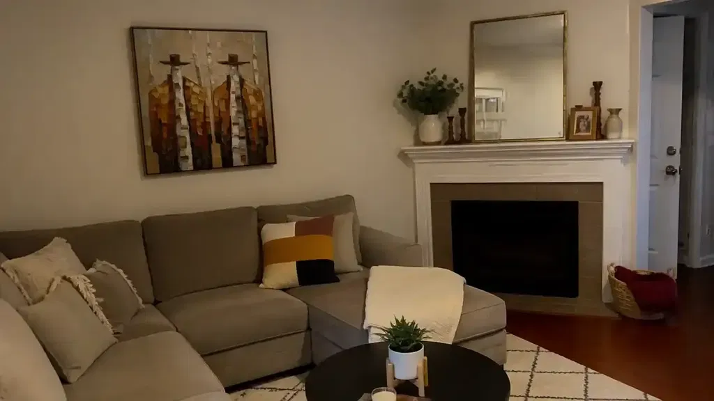
Despite the volatility at the top of the auction world, the global art market remains a massive economic baseline, reaching $65 billion in 2023, with the US, China, and UK holding an 85% market share, as noted in the Art Basel and UBS Art Market Report 2024. In this landscape, the distinction between a mass-produced digital print and a hand-painted oil work has never been more critical. The "quality delta" is rooted in a physical phenomenon known as optical depth—the unique visual "glow" that defines the medium of oil painting.

The Physics of the "Glow": Subsurface Scattering and Refractive Indices
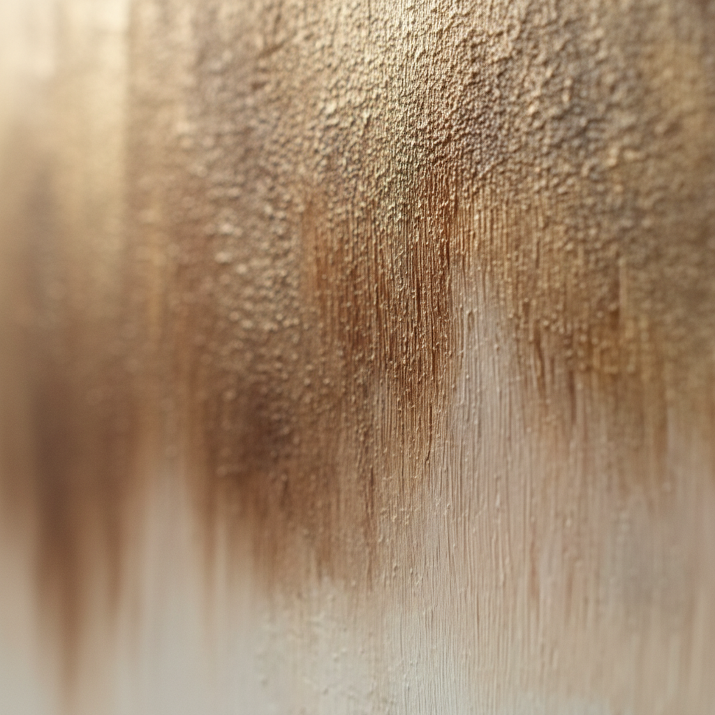
To understand why an oil painting appears to possess an internal light source, we must look at the physics of light transport. Most digital prints or acrylic paintings reflect light off the topmost surface. In contrast, oil paintings utilize a phenomenon called subsurface scattering.
When light hits an oil paint film, it doesn't just bounce back. Because of the specific chemical properties of the binder—typically linseed oil—light travels through multiple semi-transparent layers before eventually being reflected by the primer or the pigment particles beneath.
The Refractive Index Advantage
The "glow" is largely a result of the refractive index (RI) of dried linseed oil, which is approximately 1.48. This value is remarkably close to that of glass (~1.50). According to technical standards, when the RI of the medium matches the RI of the pigment or the substrate, surface reflection is minimized, allowing light to penetrate deeper.
| Material | Refractive Index (Approx.) | Visual Effect |
|---|---|---|
| Air | 1.00 | Baseline |
| Water | 1.33 | Low depth |
| Acrylic Emulsion | 1.40–1.45 | Moderate depth |
| Linseed Oil | 1.48 | High optical depth (Glass-like) |
| Glass | 1.50–1.52 | Reference for transparency |
Logic Summary: Our analysis of optical depth assumes a standard light environment (D65 illuminant). The proximity of linseed oil's RI to glass creates a "natural lens" effect, which we estimate increases perceived luminosity compared to flatter mediums like ink-on-paper.
The Artist’s Mastery: Layered Glazing vs. Physical Mixing
A common mistake in digital-to-oil comparisons is viewing color as a flat, singular value. In professional oil painting, color is often achieved through "optical mixing" rather than "physical mixing."
- Physical Mixing: Two pigments (e.g., blue and yellow) are blended on the palette to create green. The result is a single layer of paint that reflects a specific wavelength.
- Optical Mixing (Glazing): An artist applies a solid layer of yellow, lets it dry, and then overlays a transparent "glaze" of blue. The eye perceives green because light passes through the blue, hits the yellow, and returns.
This layered approach creates a complexity of color that digital shaders struggle to replicate at a sub-millimeter scale. Research from Stanford University suggests that while modern subsurface scattering models can mathematically simulate these light transport physics, the material heterogeneity—the tiny, unpredictable variations in pigment suspension—remains the hallmark of the human hand.
The "Fat over Lean" Principle
To maintain structural integrity and maximize this optical effect, experienced artists follow the "Fat over Lean" rule. This involves ensuring that upper layers of paint contain more oil ("fat") than the lower layers ("lean"). Beyond preventing cracking, this technique ensures that the topmost layers have a higher gloss and transparency, acting as a final lens for the pigments beneath.
Human-Made vs. AI: The Value of "Essential Identity"
The rise of AI-generated art has created a unique tension in the e-commerce space. However, data suggests that the "human touch" carries a significant commercial premium. A study conducted by Columbia University found that consumers value art labeled as "AI-generated" 62% lower than authentic human-created art.
Psychologically, this is explained by the concept of "essential identity." University of Chicago research indicates that digital replicas lack the artist's soul in the eyes of the consumer. A hand-painted mural or canvas retains an irreplicable history of movement and decision-making that digital prints cannot simulate.

Metamerism: Stability Under Varying Light
Interior designers often face the frustration of a piece of art looking perfect in the showroom but turning an unpleasant green or magenta once installed in a client's home. This is often due to metamerism—a phenomenon where two colors match under one light source but differ under another.
Hand-painted oils, using traditional mineral pigments, tend to maintain color harmony across different Kelvin temperatures (e.g., warm 2700K incandescent vs. cool 5000K daylight). Digital prints, which rely on a limited CMYK or RGB ink set, are highly susceptible to metameric shifts. In our experience handling designer inquiries, we find that original oil works provide a more stable "color anchor" for complex room palettes.
The Economic and Health Impact of Hand-Painted Art
Beyond aesthetics, the integration of high-quality hand-painted art into the built environment has measurable economic and health benefits.
Boosting Property Value
Research published by the Royal Society found a direct correlation between art and property prices. Neighborhoods with higher "art" geo-tags saw relative house price ranking gains. For commercial developers, commissioning public murals is more than decor; it's a "catalytic effect" that can drive massive real estate-related growth, as seen in Chicago’s Millennium Park projects which drove $1.4 billion in growth.
Healing and Productivity
The impact on human well-being is equally profound. A University of Pennsylvania review noted that 73% of patients reported significant mood improvements when exposed to environmental artworks. Furthermore, biophilic design—art featuring natural landscapes—has been shown to reduce cognitive fatigue in office spaces by up to 30%, according to research on high-density Tokyo offices.
Safety and Sustainability in the Modern Studio
While the optical benefits of oil painting are clear, the industry is also evolving to meet modern safety and environmental standards. Historical pigments often contained dangerous heavy metals, but today’s "professional grade" doesn't have to mean "toxic."
The Heavy Metal Reality
The International Agency for Research on Cancer (IARC) classifies cadmium and its compounds as Group 1 carcinogens. While many artists still value Cadmium Red or Yellow for their opacity, the industry is shifting toward safer, high-performance organic alternatives.
| Pigment Type | Health Risk (Chronic) | Environmental Impact |
|---|---|---|
| Lead White | High (Neurotoxic) | High (Banned in EU mixtures >0.1%) |
| Cadmium Colors | High (Carcinogenic) | Moderate (Stable in matrix, but ions can leach) |
| Titanium White | Very Low | Low (90% market share due to inertness) |
| Walnut Oil Binder | Zero | Very Low (Eco-friendly, VOC-free) |
Indoor Air Quality (IAQ)
For residential installations, VOC (Volatile Organic Compound) emissions are a primary concern. Traditional turpentine solvents are high-VOC and can cause central nervous system neuropathy with chronic exposure. We recommend murals and paintings that utilize walnut oil or low-VOC acrylic-modified oils, which align with EPA LEED certification standards for healthy indoor environments.
Methodology Note: Safety data is derived from CDC NIOSH and EPA reports. We assume that "professional use" implies adequate ventilation, but for home environments, we prioritize zero-VOC sealants and non-toxic binders.
Design Practicalities: Activating the Texture
For interior designers, the "glow" of an oil painting is not just a passive trait; it can be "activated" through proper placement and lighting.
- Side-Lighting: Unlike flat prints, which can suffer from glare when lit from the front, layered oil glazes are best viewed with side-lighting. This catches the microscopic ridges of the brushwork (impasto), creating highlights and shadows that emphasize the three-dimensional nature of the work.
- Tactile Satisfaction: MUNCH Museum tests have confirmed that physical relief textures exponentially stimulate viewer satisfaction compared to flat replicas.
- 2026 Trends: According to Zillow and Yelp search data, interest in "artisan craftsmanship" is rising by 21%, while searches for "custom framing" have skyrocketed by 329%. The trend for 2026 is moving toward "understated elegance," where texture serves as the soul of the room.

Summary of Optical Superiority
The choice between a digital reproduction and a hand-painted oil work is a choice between a surface-level image and a three-dimensional optical experience. By leveraging the high refractive index of linseed oil and the technical mastery of layered glazing, artists create a "glow" that is physically impossible to replicate through ink on paper.
As the art market continues to favor pieces with "real application value," understanding the physics and psychology of these works allows designers and homeowners to make investments that don't just decorate a wall—they transform the environment.
YMYL Disclaimer: This article is for informational purposes only and does not constitute professional medical, legal, or financial advice. Regarding the use of art materials, always refer to the Safety Data Sheets (SDS) provided by manufacturers and consult with a certified industrial hygienist for workplace safety standards.
References
- Art Basel and UBS Art Market Report 2024
- Columbia University: Consumer Perception of AI vs. Human Art
- Royal Society: Quantifying the Link Between Art and Property Prices
- UPenn: Visual Art in the Built Environment and Mood
- WHO Scoping Review on Arts and Health
- IARC: Cadmium and Cadmium Compounds Toxicology
- EPA: Indoor Air Quality and Low-VOC Paints