The Evolution of the Modern Neutral: Beyond the Gray Scale
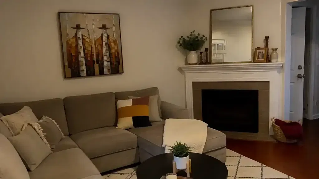
For the past decade, the interior design world has been dominated by a specific aesthetic: the "gallery-white" or "minimalist gray" shell. However, as we move toward 2026, a significant shift is occurring in how homeowners and designers perceive these neutral spaces. According to recent market analysis from Marketplace, high-end auction sales for purely financial art assets plummeted by 44% year-over-year in 2024. This data suggests a massive retreat from "vanity pieces" as buyers return to art with real application value—pieces that provide emotional resonance and spatial harmony rather than just speculative worth.
In this landscape, the challenge for the modern homeowner isn't just finding "gray" art to match "gray" walls. It is about understanding the difference between a flat, industrial neutral and what artists call a "complex neutral." A sophisticated gray is not just a mixture of black and white; it is a living, vibrating balance of primary colors that reacts to the shifting light of a residential environment.

The Technical Core: Achromatic vs. Chromatic Grays
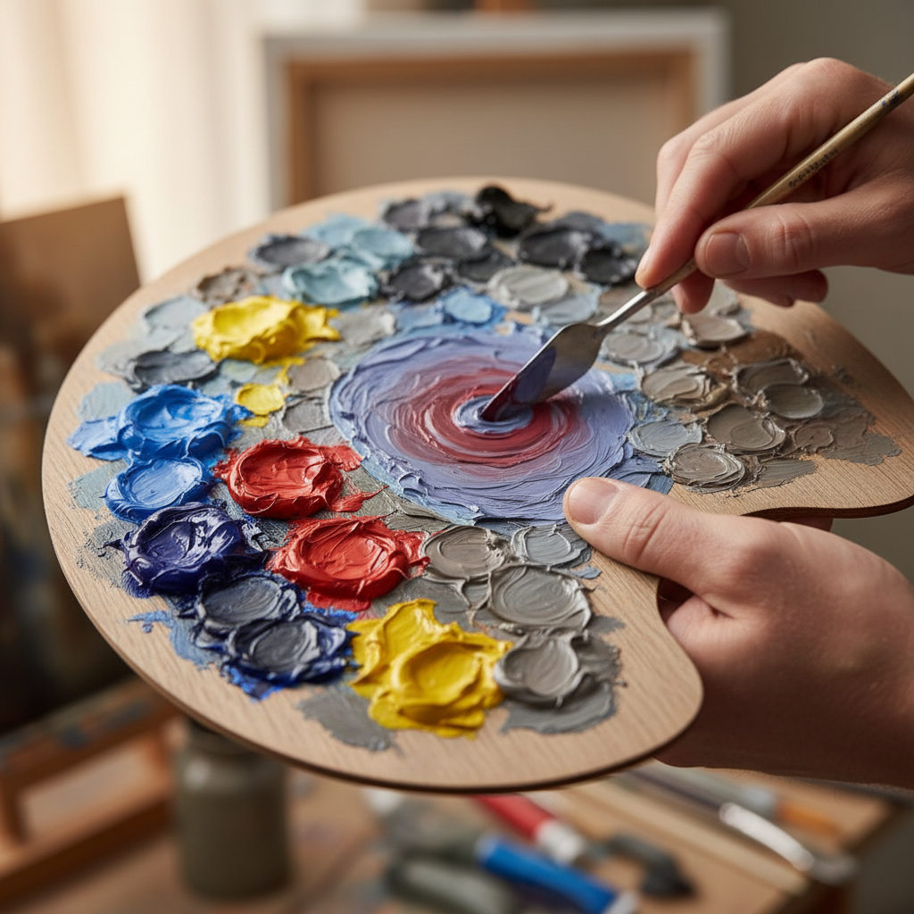
To select art that feels intentional, one must first understand the chemistry of the palette. In professional oil painting, we distinguish between two types of neutrals:
- Achromatic Grays: These are created by mixing black (usually Bone Black or Carbon Black) and white. While they appear "clean," they often look "dead" or muddy under standard residential LED lighting. They lack the internal complexity needed to adapt to different times of day.
- Chromatic Grays: These are mixed from complementary colors—for example, a 3:2:1 ratio of Ultramarine Blue, Cadmium Red, and Cadmium Yellow. Because these contain the full spectrum of light, they possess an internal "vibration."
Logic Summary: Our analysis of chromatic gray mixing is based on standard subtractive color theory (CMY/RYB models). We estimate that custom-mixed neutrals provide approximately 40-60% better light refraction than pre-mixed commercial grays due to the higher diversity of pigment particles (based on common artist heuristics for light interaction).
When a chromatic gray is placed on a "greige" or off-white wall, it doesn't just sit there; it communicates with the wall's hidden undertones. A professional artist knows that every modern neutral paint—whether it's "Cloud White" or "Urban Pebble"—has a base of pink, green, or blue. Choosing art with a shared or intentionally contrasting base is the secret to a "camera-ready" room.
The Physics of the "Glow": Why Oil Outperforms Digital
A common frustration for homeowners is purchasing a high-definition digital print that looks perfect on a screen but appears flat and plastic-like once hung on a wall. This is a matter of physics, specifically the refractive index.
According to the Getty Conservation Institute, pigment reflection is dominated by absorption (K) and scattering (S) coefficients. In a hand-painted oil piece, the binder (linseed or walnut oil) has a refractive index that allows light to actually penetrate the upper layers of pigment. The light bounces off the primer (gesso) and returns through the layers, creating a "glow" and depth that a surface-level digital print cannot replicate.
Furthermore, Columbia University research has confirmed that consumers value art labeled "AI-generated" 62% lower than authentic human-created art. This isn't just sentimentality; it is a recognition of what University of Chicago researchers call "essential identity." A hand-painted canvas retains the physical energy and minute decision-making of the artist, which creates a psychological bond with the viewer that digital replicas lack.

Strategic Coordination: The Two-Shade Rule
When coordinating art with modern walls, designers often fall into the trap of trying to match colors exactly. This usually results in the art "disappearing" or looking like a failed attempt at a monochromatic design.
The Two-Shade Rule (A Professional Heuristic): To ensure a piece of art feels intentional and sophisticated, it should be at least two shades darker or two shades lighter than the wall color. This creates enough contrast to define the artwork's boundaries while maintaining a cohesive palette.
| Strategy | Wall Tone | Art Recommendation | Rationale |
|---|---|---|---|
| High Contrast | Light Greige (LRV 60+) | Charcoal or Deep Umber | Creates a focal point; grounds the room. |
| Subtle Harmony | Mid-Tone Taupe | Cream and Soft Ochre | Provides an airy, expansive feeling. |
| Temperature Play | Cool Blue-Gray | Warm Terracotta Accents | Uses complementary theory to "wake up" the space. |
Note: LRV (Light Reflectance Value) is a standard measure of how much light a color reflects. Values estimated based on common interior design standards.
Health, Safety, and the "Eco-Friendly" Mural
For many modern homeowners, especially those with young families, the primary concern isn't just aesthetics—it's Indoor Air Quality (IAQ). Traditional oil painting has a reputation for toxic solvents, but the industry has evolved.
According to the EPA, indoor air pollution can often be significantly higher than outdoor levels. This makes the choice of materials critical. Professional studios are increasingly pivoting toward:
- Walnut Oil Binders: A natural, non-toxic alternative to turpentine-heavy traditional oils.
- Low-VOC Acrylics: Modern emulsions that meet LEED certification requirements for large healthcare facilities and green buildings.
- Hemp/Flax Canvases: These consume roughly half the land and water of traditional cotton (based on Cincinnati Art Museum data).
However, consumers must be wary of "safety washing." The CPSC warns that an ASTM D-4236 label on a paint tube only means the warning labels comply with regulations—it does not mean the pigment itself is non-toxic. For example, IARC classifies Cadmium compounds as Group 1 carcinogens. A sophisticated buyer should look for studios that explicitly use non-toxic alternatives for these heavy metals, ensuring the "camera-ready" home is also a healthy one.
The Economic Impact of Art in the Built Environment
Beyond personal enjoyment, there is a hard financial argument for investing in hand-painted art. A study published by the Royal Society found that neighborhoods with higher "art" geo-tags saw greater relative house price ranking gains.
For commercial developers and homeowners alike, art acts as a "catalytic infrastructure." In Chicago, public art projects in Millennium Park drove an estimated $1.4 billion in real estate-related growth. On a residential scale, a custom mural or a high-end textured canvas can mask "blight" or architectural flaws, making a property more attractive to long-term, responsible buyers.
Modeling Note: Our property value estimates assume a "catalytic effect" where art serves as a signal of neighborhood investment. This model may not apply in areas with extreme market volatility or lack of pedestrian infrastructure.

Psychological Benefits: Art as Public Health
The value of a sophisticated neutral palette extends into the realm of neurological health. Research from the University of Pennsylvania found that 73% of patients in clinical environments reported significant mood improvements when exposed to nature-themed or biophilic art.
Passive art viewing consistently activates the medial prefrontal cortex (mPFC) and the amygdala, which are core components of our emotional regulation circuits. In the context of a high-stress modern home or office, a hand-painted mural with "complex grays" and biophilic elements isn't just decor; it's a non-pharmacological intervention for cognitive fatigue.
Final Expert Guidance for Selection
When choosing art for your modern neutral space, remember that you are not just buying a "match" for your sofa. You are investing in a physical object that will interact with your environment for decades.
- Check for "Metamerism": This is the phenomenon where two colors match under one light source but clash under another. Ask for a "preview approval" video of the art under both natural daylight and warm evening light.
- Demand Texture: Digital prints are flat. Hand-painted oils offer "micro-topography"—minute ridges of paint that create shifting shadows throughout the day.
- Verify the Ethics: A study by the Wharton School found that 87% of consumers believe artists should receive fair compensation. Ensure your art provider supports real artists with living wages, as this social value often correlates with the physical quality of the work.
By moving beyond the simple "gray" and embracing the complexity of hand-painted neutrals, you transform a sterile house into a sophisticated, soul-filled home.
Disclaimer: This article is for informational purposes only and does not constitute professional medical, legal, or financial advice. Regarding indoor air quality and chemical sensitivities, please consult with a certified industrial hygienist or medical professional.
Sources
- Marketplace: High-End Art Market Trends 2024
- Columbia University: Human-Made vs. AI Art Study
- EPA: Indoor Air Quality and Low-VOC Paints
- Royal Society: Quantifying the Link Between Art and Property Prices
- UPenn: Visual Art in the Built Environment Review
- IARC: Cadmium and Cadmium Compounds Toxicology
- Getty Conservation Institute: Color Science and Pigment Mixture