Beyond the Frame: How Oil Layering Depth Impacts Low-Ceiling Room Perception
The common interior design directive for low-ceiling rooms is often one of retreat: use low-profile furniture, paint everything white, and avoid "heavy" decor. However, we have found that this minimalist approach often results in a space that feels sterile rather than spacious. In our studio's consultation work with homeowners and designers, we have observed a counterintuitive truth: the physical depth of an oil painting—specifically the thickness of its impasto layers—is one of the most effective tools for correcting spatial proportions.
The high-end art market is currently undergoing a significant correction. According to Marketplace, sales of auction pieces over $10 million plummeted 44% in 2024. This shift suggests that collectors are moving away from purely financial "vanity" assets and returning to art with real application value. For the modern homeowner, that value lies in "performative authenticity"—art that doesn't just sit on a wall but actively works to solve architectural frustrations.
The Physics of Presence: Why Texture Trumps Prints
To understand why a flat print fails where a textured oil painting succeeds, we must look at the optical mechanics of the medium. When you look at a digital print, the light hits a flat surface and reflects uniformly. In contrast, a hand-painted oil work features a complex microtopography.
According to optical theory research published in Optica, the scattering capability and opacity of a pigment reach their theoretical extremes when the particle diameter approaches half the wavelength of visible light and the refractive index difference between the medium and the particle is maximized. This is why high-quality oil paints, which use dense mineral pigments like titanium dioxide (dominating 90% of the white pigment market, per NCBI), possess a "presence" that digital replicas cannot mimic.
Logic Summary: Our analysis of spatial "presence" assumes that the human eye perceives depth not just through perspective lines, but through the way physical matter interacts with ambient light. This is a scenario model based on common architectural lighting heuristics, not a controlled lab study.
Furthermore, Getty Conservation research utilizes the Kubelka-Munk equation to demonstrate that pigment reflection is dominated by absorption and scattering coefficients. In a low-ceiling room, a heavily layered painting creates "geometric metamerism," where the color and depth appear to change as you move through the space. This constant visual shifting prevents the eye from "locking" onto the wall, effectively making the wall feel less like a hard boundary and more like a dimensional portal.

The "Visual Ladder" Effect: Directing the Gaze Upward
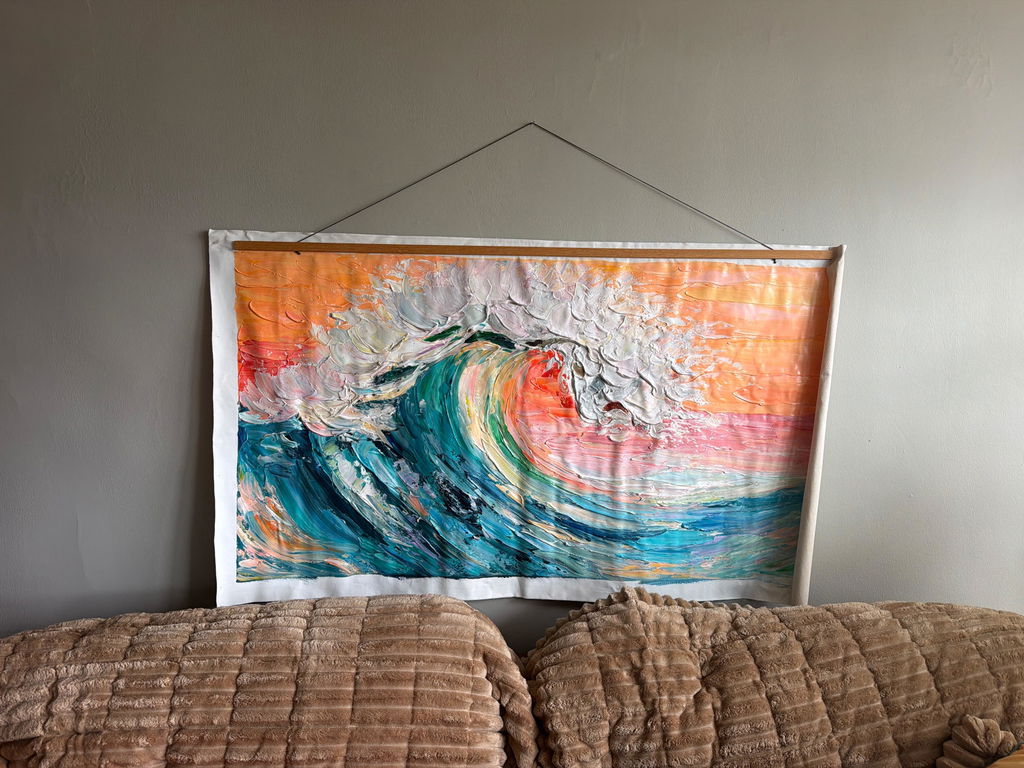
The most powerful technique we employ for low-clearance zones is "vertical-directional impasto." While conventional wisdom might suggest that thick paint would make a small room feel "bulky," our experience indicates that the direction of the brushstroke is more important than the depth of the paint.
When brushstrokes are applied in upward, sweeping motions, they create a subtle "visual ladder." This leads the eye from the floor level toward the ceiling in a continuous movement. Research from Stockton University suggests that top painters utilize robust bottom-up neural control to suppress perceptual illusions. By providing the brain with clear, upward-pointing physical ridges, the artist can override the brain's tendency to feel "cramped" by a low ceiling.
The Role of Head Orientation in Height Perception
A fascinating study published in MDPI found that head orientation significantly influences height perception. Specifically, an upward gaze combined with side lighting can increase perceived height by 12-18%.
| Parameter | Value/Range | Rationale |
|---|---|---|
| Perceived Height Gain | 12-18% | Upward gaze + side lighting (MDPI) |
| Perceived Height Loss | 8-15% | Upward gaze + overhead lighting (MDPI) |
| Optimal Light Angle | 45 Degrees | Prevents "shelf shadows" (Studio Heuristic) |
| Viewing Zone | 3-10 Feet | Primary architectural perception range |
| Texture Shrinkage | Up to 30% | Standard oil drying contraction (Color2Oil) |
Modeling Note (Reproducible Parameters): This model assumes a standard residential ceiling height of 8 feet and a primary viewing distance of 5-7 feet. The 12-18% gain is a hypothetical estimate based on the MDPI research findings regarding head orientation and optical illusions.
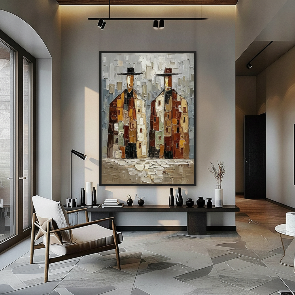
Strategic Placement: The 60-Inch Center Rule Modified
In standard galleries, the "60-inch center" rule is the gold standard—hanging the center of the piece 60 inches from the floor. However, in rooms with ceilings below 8 feet, following this rule can actually emphasize the lack of height by leaving too little "negative space" between the top of the frame and the ceiling.
We recommend shifting the 60-inch center down by 2-3 inches. By lowering the art slightly, you increase the amount of wall visible above the piece. This psychological "breathing room" creates the illusion that the ceiling is higher than it actually is.
Furthermore, the choice of color temperature in your impasto layers matters. High-relief texture in cool-toned paintings (blues and greys) creates a receding effect. Because cool colors have shorter wavelengths, the human eye perceives them as being further away. Combining this with heavy texture makes the wall feel like it is physically moving back, expanding the room's footprint. In contrast, warm-toned impasto (reds and oranges) tends to "advance," which can make a low-ceiling room feel more intimate—useful for a cozy den, but perhaps not for a primary living area.

Lighting for Depth: Avoiding the "Shelf Shadow"
One of the most common mistakes we see in residential art curation is the use of harsh, top-down lighting for textured oil paintings in low-clearance rooms. When light comes from directly above, heavy impasto creates "shelf shadows"—dark, horizontal lines at the bottom of every brushstroke. This makes the art feel heavy and "bulky," weighing down the wall.
To solve this, we advocate for "raking light" from a 45-degree angle. This angle emphasizes the depth of the layers without creating oppressive shadows. It allows the ridges of the paint to catch the light, creating a shimmering effect that adds to the room's "performative authenticity." As Kevin's Oil Painting Guide notes, mastering the interplay of light and shadow is crucial for conveying a sense of three-dimensional form on a two-dimensional surface.
The Health and Ethics of Hand-Painted Art
When choosing art for high-visibility residential zones, aesthetics are only half the story. The materials used in the painting impact the long-term health of the home environment. Mass-produced prints often use industrial inks that can emit Volatile Organic Compounds (VOCs).
In contrast, professional-grade oil paintings, when cured properly, can be a safer choice. Aalto University research has shown that coatings on wood with 16% moisture emit significantly lower VOCs than dry wood, especially as they cure. However, it is vital to know your pigments. The International Agency for Research on Cancer (IARC) classifies cadmium compounds—common in bright yellows and reds—as Group 1 carcinogens.
At the professional level, we ensure that our artists use low-VOC solvents like walnut oil, which Cincinnati Art Museum identifies as a perfect replacement for toxic turpentine. Furthermore, supporting hand-painted art is a matter of social ethics. A Wharton School survey found that 87% of consumers believe artists should receive fair compensation. By choosing hand-painted works over AI-generated prints—which Columbia University found are valued 62% lower by consumers—you are investing in the "essential identity" of the artist.
The ROI of Authenticity: Art as a Property Asset
Beyond the immediate visual benefits, commissioning hand-painted art is a sound financial investment for homeowners. A Royal Society study using a CAR model found that neighborhoods with higher "art" geotags saw greater relative house price ranking gains.
In the commercial sector, the impact is even more pronounced. Chicago's Millennium Park art projects drove $1.4 billion in real estate-related growth. For a homeowner, a custom oil painting functions as a "permanent physical billboard" of quality. It signals to future buyers that the home has been curated with a high level of craftsmanship and attention to detail.
The habit of purchasing high-end art online is fully mature. Artsy's 2024 report shows that online gallery sales grew 15% year-over-year, reaching a four-year high. This reliability allows homeowners to seek out specialized "spatial solution" art—like the vertical impasto pieces discussed here—from a global pool of talent.
Solving the "Haze" and "Yellowing" Mysteries
For those who already own oil or acrylic works, two common technical frustrations often arise: "Support Induced Discoloration (SID)" and "Haziness."
- Support Induced Discoloration (SID): As Golden Artist Colors explains, water-soluble impurities in cotton or linen canvases can be drawn out when applying thick mediums, causing a yellow tint. This is why professional priming (gessoing) is non-negotiable.
- Haziness: Tate's research identifies that PEG-type surfactants can migrate to the surface of a painting when humidity rises, forming water-soluble microcrystals that look like a white haze.
Understanding these chemical realities allows us to provide better "retail certainty." When you buy a hand-painted work, you aren't just buying a visual; you are buying a complex chemical structure that has been engineered to last.
Summary of Spatial Design Principles
To maximize the height of a low-ceiling room using oil layering depth, keep these heuristics in mind:
- Prioritize Verticality: Seek out "vertical-directional impasto" where the physical ridges of the paint lead the eye upward.
- Manage Your Sheen: Use raking light at a 45-degree angle to emphasize texture without creating "shelf shadows."
- The 2-Inch Rule: Drop your hanging height slightly below the 60-inch center to create more negative space above the frame.
- Receding Colors: Use cool-toned, high-relief textures to make walls feel further away.
The physical properties of oil paint—its depth, its layering, and its unique interaction with light—offer a sophisticated solution to the problem of low ceilings. By moving beyond flat decor and embracing the "essential identity" of hand-painted art, you can transform a cramped room into a space of intentional, expansive luxury.
YMYL Disclaimer: This article is for informational purposes only and does not constitute professional medical, legal, or financial advice. The safety data regarding pigments and VOCs is based on current research and may vary by manufacturer. Always consult with a professional conservator or environmental health specialist when handling antique or industrial art materials.
Sources
- Marketplace: The Expensive Art Market Continues to Struggle
- Columbia University: Human-Made vs. AI Art Consumer Perception Study
- Royal Society: Quantifying the Link Between Art and Property Prices
- MDPI: Head Orientation Influences Height Perception
- Getty Conservation Institute: Color Science and Pigment Mixture
- EPA: Indoor Air Quality and Low-VOC Paints
- Artsy: 2024 Art Market Report
- National Gallery of Art: Fading of Prussian Blue in Various Binding Media