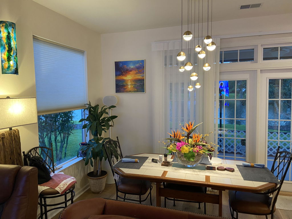
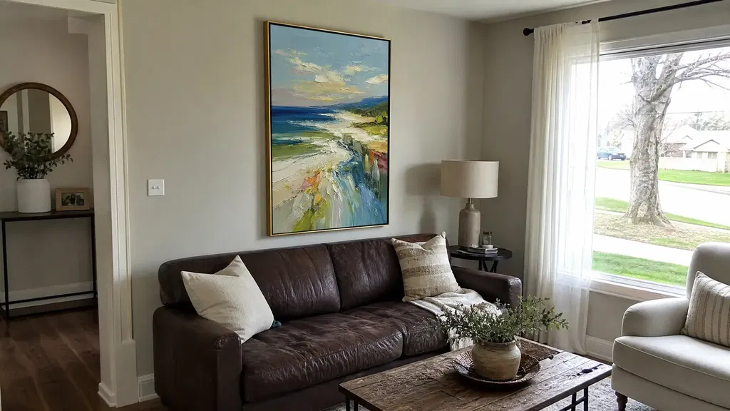
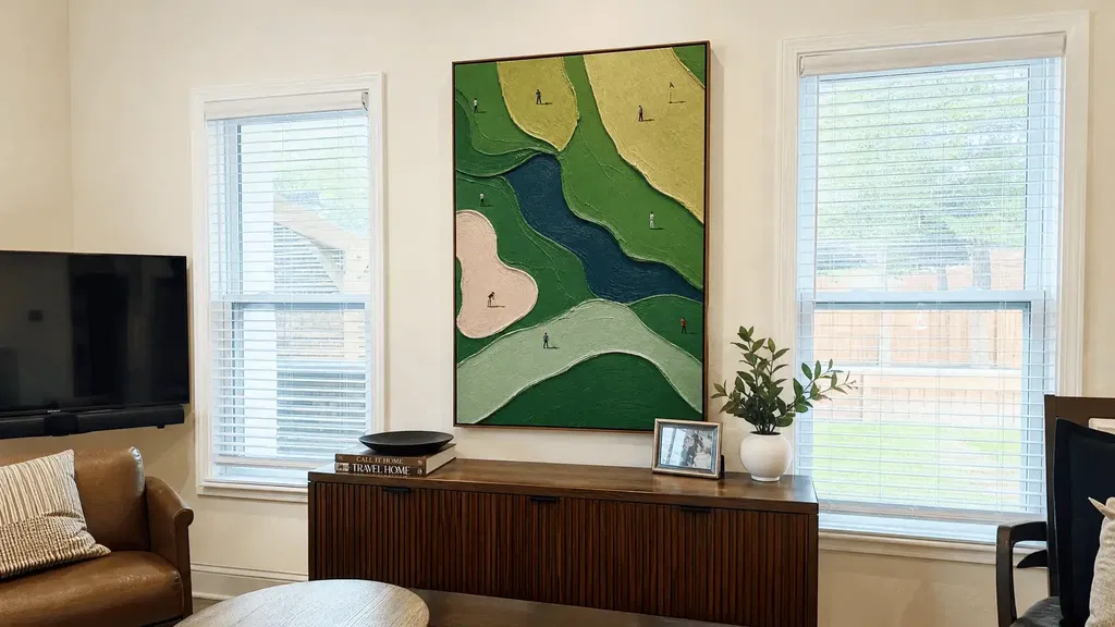
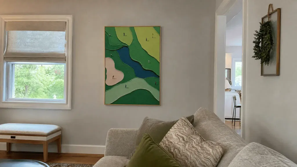
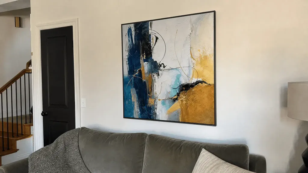
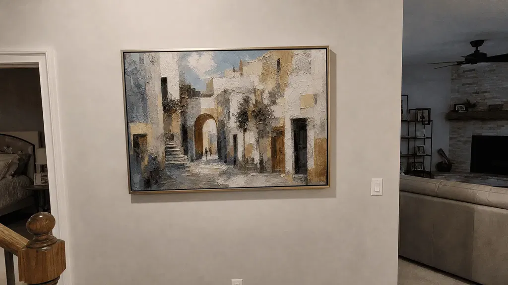
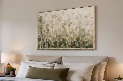
Start with what you can see, not what you assume the painting means. When looking at famous abstract art, notice the overall impression, identify the elements directing your attention, describe their relationships, record your response, and only then suggest a tentative interpretation. Abstraction does not require a hidden literal subject; lines, colors, shapes, space, and surface can be the subject of your observation. This approach also gives you practical language for comparing abstract paintings at home.
A Beginner's Framework for Famous Abstract Art
A useful way to understand abstract art is to move from visible evidence to personal response and then to possible meaning. Formal analysis likewise begins with visual properties before subject matter or history, while museum learning resources recommend slowing down and describing what you see (formal analysis begins with visible visual properties; slowing down to describe what you see). Treat this as a flexible starting point, not the only valid way to interpret a work.
MoMA describes abstraction as work that may not depict recognizable scenes or objects, so you do not need to solve a hidden picture before you begin (MoMA's definition of abstraction). Try this five-part worksheet in a museum, on a collection page, or while browsing art for your home:

- Overall impression: What do you notice in the first few seconds—quietness, density, brightness, motion, or something else?
- Dominant elements: Which two or three features control your attention: a color field, a large shape, directional marks, or a busy surface?
- Relationships: What contrasts, repeats, overlaps, interrupts, or recedes? Describe connections rather than isolated objects.
- Personal response: What does the work make you notice or feel? Keep this as your response, not a claim about everyone's reaction.
- Tentative interpretation: Complete the sentence, "Because I notice ___, the work may suggest ___." Remove the final phrase if you cannot support it with visual evidence or reliable context.
Color Relationships Set the First Emotional Cue
Color often sets the first emotional cue, but its effect comes from relationships rather than a universal code. Compare neighboring hues, brightness, temperature, repetition, and quieter areas before suggesting what the palette might mean. Color perception is complex and individual, so a warm, crowded area may feel energetic to you without proving fixed symbolism (color perception is individual and relational).
Useful sentence patterns include: "The bright area pulls my eye because it contrasts with the darker field," or "The repeated cool tones may make the composition feel more spacious." On a screen, surrounding colors, room light, device settings, and image editing can change the impression. Treat online color as a first clue, not a final verdict.
Shapes and Space Build the Composition
Shapes organize attention through size, position, overlap, edges, and the space around them. Describe them first as geometric, organic, fragmented, repeated, or partly concealed; style labels can wait until reliable artwork context supports them.
- Shape type: Are the forms angular, rounded, irregular, or mixed?
- Position and overlap: Do forms cluster at the center, press against an edge, or sit over one another?
- Negative space: Where can your eye rest, and where does the composition feel crowded?
- Balance and hierarchy: Which mass dominates, and which smaller accents redirect your gaze?
- Eye movement: Does the open space lead you around the canvas or hold you in one area?
This checklist describes composition without ranking one arrangement as better. Two viewers can agree that a large dark shape dominates while disagreeing about whether that dominance feels calm or oppressive.
Color Relationships Set the First Emotional Cue
Read the palette by comparing parts of the painting, not by assigning one meaning to each hue. Look for light-versus-dark contrast, warm-versus-cool temperature, bright and muted passages, repeated accents, and areas where color becomes visually quiet. Then describe the effect as a possibility: "The sharp contrast may create tension," rather than "This color means tension."
The same color can change substantially beside a different neighbor, under different lighting, or on a different screen. If you are practicing the meaning of color and texture in abstract art, separate three statements: what the palette does visibly, what response it produces in you, and what symbolism a source actually documents. Only the first two are available from looking alone.

Gesture Reveals the Direction of Attention
Visible marks can make a painting feel sweeping, interrupted, measured, or restless. To analyze an abstract painting through gesture, trace what the marks do across the surface; do not treat them as proof of the artist's mood, intention, or working order. MoMA's discussion of abstract painting describes energetic, gestural lines and varied processes, supporting close attention to action marks while keeping process claims bounded (energetic and gestural lines).
- Trace the dominant movement. Follow the strongest line or mark and note whether it travels vertically, horizontally, diagonally, circularly, or in a sweeping path.
- Find repetition and interruption. Look for marks that echo one another, stop abruptly, change direction, or break into shorter passages.
- Describe the resulting pace. Say that the surface "creates a sense of acceleration" or "appears interrupted." That describes your visual reading without claiming what the artist felt.
A photograph may show direction but hide pressure, thickness, or the order in which marks were made. Without direct documentation, keep chronology and technique out of your conclusion.
Shapes and Space Build the Composition
When you look at abstract paintings, shapes and empty space work together to establish hierarchy and eye movement. Identify the largest visual mass, compare it with smaller accents, and notice whether open areas balance or intensify crowded ones. This gives you a concrete description even when no recognizable object appears.
Use the shape-and-space questions from the opening worksheet, but add one comparison: if you mentally cover the largest form, where does your eye go next? That change reveals hierarchy without claiming that the dominant element is the painting's "real subject." Descriptive language is safer than an unsupported movement or artist label.
Layering Creates Depth and Visual Tension
Layering is visible when one passage covers, interrupts, scrapes back, or sits over another. Describe the finished surface as dense, open, concealed, exposed, or unstable, but do not assume which passage came first or how the artist worked. An apparent underlayer can support a statement about what remains visible; it cannot establish a documented studio sequence.
Check five surface relationships: overlap, interruption, exposed underlayer, density, and visual tension. Ask whether concealment makes your eye search, whether open passages provide relief, and whether foreground-like areas compete with background-like ones. The effect may resemble depth without proving literal depth or a specific material technique. For a separate room-focused comparison of surface choices, see texture and smooth canvas.
Read Texture and Scale as Physical Experience
Texture changes how active the surface appears, while scale changes viewing distance, field of vision, and spatial presence. Assess both in the real viewing environment: an online image can suggest surface activity, but it cannot by itself confirm physical depth, material, or exact size. The Met's discussion of abstract painting supports treating scale as part of the viewer's spatial experience, not as a quality ranking (scale changes viewing distance and spatial presence).
| Check | What to observe or verify |
|---|---|
| Surface | Note smooth, raised-looking, scraped, or varied areas; confirm physical texture through current documentation rather than the image alone. |
| Close-up evidence | Look for close-ups and side-angle views that show changing light or surface variation. |
| Dimensions and orientation | Check the stated height, width, and orientation; do not estimate them from the screen. |
| Wall and furniture | Compare the work's footprint with the available wall, nearby furniture, and intended viewing distance. |
| Lighting | Consider how daylight and lamps may reveal or flatten apparent surface activity. |
Texture Changes Light and Attention
A varied surface may catch light differently from a smooth passage, causing your eye to linger in some areas. From an image, phrase this as "the surface appears active" rather than "the painting has deep texture." If the distinction matters to a purchase, use the current listing's material description and close-up evidence. General visual guidance cannot confirm a specific artwork's physical construction.
Scale Changes the Work's Presence
Larger dimensions can occupy more of your visual field and require a different viewing distance, but size does not make a work more important or successful. Use painter's tape to mark the approximate footprint on the wall, then stand where you normally view it. Compare that result with furniture height, walking paths, and the amount of surrounding negative space. A small work may create a focused pause; a large one may establish a room-wide field.
Use Context Without Letting It Dictate the Reading
Context is most useful when it tests or refines what you have already observed. First label a statement as seen, felt, or inferred; then identify the work before making claims about its artist, date, movement, influence, symbolism, or intent. A university museum teaching resource similarly treats context as part of an exploratory reading rather than a replacement for looking (using context to refine visual observation).
Separate Observation From Interpretation
| Layer | Example | Cautious phrasing |
|---|---|---|
| Observation | "A narrow black line cuts across a pale field." | "I notice…" |
| Response | "The interruption makes me pause." | "It creates a sense of…" |
| Interpretation | "The line represents conflict." | "It may suggest…, but this remains provisional." |
This distinction lets viewers share evidence while disagreeing about response or meaning. A documented statement from an artist or institution can strengthen an interpretation; a confident guess cannot substitute for it.
Check Context Before Naming Meaning
- Identify the work. Confirm the title, artist, date, collection, and available medium information from a museum, collection, foundation, or exhibition record.
- Verify the claim. Look for reliable documentation before naming a movement, influence, symbol, technique, or artist intention.
- Revise with uncertainty. If sources are unavailable or disagree, return to the visual evidence and use "may," "appears," or "in this documented context."
This is especially important with famous abstract art: recognizing a well-known name does not make every interpretation automatically confirmed.
Turn Visual Vocabulary Into Smarter Art Shopping
The same vocabulary can help you compare contemporary abstract paintings without asking which one is objectively better. Record each candidate's visual behavior, translate your reaction into a room-fit statement, and then verify the listing details that photographs cannot establish. A work may fit because you want high contrast, directional movement, quiet color, visible surface variation, or a particular orientation—not because it reproduces the meaning of a canonical artwork.
Compare Paintings by Visual Behavior
| Lens | Comparison question | Fit clue |
|---|---|---|
| Palette | Is the contrast bright and sharp or muted and blended? | Choose the relationship that suits the room's existing colors. |
| Shape | Does one large form dominate, or do smaller forms repeat? | Match the desired focal point or visual quiet. |
| Gesture | Do marks sweep, break, repeat, or remain still? | Choose movement that complements the room's rhythm. |
| Layering | Does overlap create density or open breathing room? | Use density for a busier focal wall; openness for a calmer one. |
| Texture | Does the surface appear smooth or visibly varied? | Check whether lighting will reveal the surface you want. |
| Scale | How much wall and field of vision will it occupy? | Compare verified dimensions with the actual wall. |
| Room relationship | What will sit beside, below, or across from it? | Judge the composition in its intended surroundings. |
For browsing, you can start with the abstract paintings collection, then compare candidates using the same lenses instead of relying on the first thumbnail that catches your eye.
Verify the Online Details That Photos Can Hide
Before treating a candidate as a fit, separate visual appeal from facts that require a current product page or store policy:
- Mark the listed dimensions and orientation on your wall with painter's tape.
- Look for close-up and side-angle images; treat screen color and apparent texture as approximate.
- Confirm the stated medium and surface details in the current listing rather than inferring them from a photograph.
- Check how lighting in your room may change the palette or visible surface.
- Review current shipping terms separately from visual fit.
- Review current return terms and any warranty information separately; do not assume they apply without checking the relevant policy.
These checks are practical safeguards, not guarantees about any particular listing. If you want another buying-focused reference, use verify details before buying online after you have narrowed the visual comparison.
Frequently Asked Questions About Famous Abstract Art
These answers address common edge cases without assigning one universal meaning to abstract work.
Why Do People Like Abstract Art?
People may respond to color, rhythm, texture, scale, personal associations, or the freedom to form their own reading. A strong preference tells you about your response, not necessarily about the artist's intended meaning. If you are unsure why you like a work, name the visual feature you would miss if it were removed.
Can Abstract Art Tell a Story Without Showing Objects?
It can create a sense of progression through repetition, contrast, movement, sequence, or changing density. That feeling is not automatically a documented narrative; check the work's reliable context before describing a specific story, event, or intention.
Do I Need to Know Art History to Understand Abstract Paintings?
No. Direct observation is enough to begin and can produce a meaningful personal response. Art history becomes important when you want to make specific claims about a date, movement, influence, style, or artist intent, so verify those claims with an authoritative record.
How Can I Compare Abstract Paintings Online When Photos Look Different?
Use verified dimensions, multiple angles, close-ups, and a room-scale reference such as painter's tape. Treat screen color and apparent texture as approximate, then check the current listing and seller policies for material, shipping, returns, and warranty details before buying.